
Here's something I really think Game Freak dropped the ball on from Generation 7 onward: boss room theming. But let's start from the beginning.


Generic rooms! Granted, it was on the Game Boy, so this is forgivable. I love the purple in Lance's room though.


in FRLG they gave em pillars but...yeah still kinda generic. What about Let's Go?


Okay that looks WAY better, to the point I kinda wanna get the game just for how it looks. Beautiful. If they had to stick with the pillars, they did the best they could.
Onto GSC.

Yay MORE generic rooms! However...


If there's one thing I really DO like about HGSS, it's the Elite 4 room design. Excellent color palettes used, and it set the stage for Gen 5 later. Gen 3...

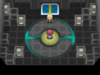
G-g-generic and yes it's on the GBA


Those hallways in ORAS are phenomenal. Love everything about them.


Still generic but it looks fine enough and the hallways make up for it. Champion room itself is pretty good too. Onto DPPT (not showing anything BDSP here if people wanna go in blind and I haven't really seen the stuff for myself):


Yeah you can clearly tell this is where each room stopped becoming "same room but with a few different colors." These are great.


Sidenote but I think I like the Champion's Room more in the original DP than in Platinum. Sure black fits Cynthia but that futuristic platform is so cool man!
Unova time!


10/10. Each has fancy animations before the fight and BW2 made the rooms even better. Absolute perfection, and also ties in nicely with the Badge Check Gates of BW1. While Unova routes may be all shades of generic, they didn't hold back one bit with the endgame stuff. XY time!


I think these might even top Unova's. For all the complaints you can have about X and Y, the League visual design shouldn't be one of them.
And then we get the Champion's room, like holy wow, it's like Lance's on crack.

HOW IS THIS USED TO HOUSE THE MOST FORGETTABLE CHARACTER IN THE UNIVERSE IT LOOKS PHENOMENAL-
And then we get Alola. I'm sorry Yung Dramps, but these are terrible.


Okay, they don't look Gen 1 bad, but they look way too similar to each other now - it's obvious they palette swapped the rooms. Look how the same crystal textures are repeated throughout the room. Generic Poke Ball battlefield we've long since moved past is also back. An exceptionally boring 5 second animation where the only one who looks vaguely impressive is maybe...Olivia?
I love the idea of a League in a hollowed out mountain and crystals are always awesome no matter the context but these are seriously underwhelming. Champion room is a bit better but not by much. If it wasn't for the fact the Title Defense challenger was randomized, you'd have a contender for weakest Pokemon League in the series, both visually and debatably gameplay wise (seriously aside from Sturdy nonsense they really are not that hard compared to the rest of the game). Also it goes without saying but all the above pictures are much more comprehensible in the actual games when you can see the animations and such. Edit: After thinking about it some from an in-story perspective it makes since why the rooms are so basic as it was just constructed but that shouldn't be an excuse for lame visual design.
I can't find many SWSH pics from a quick search but aside from coloration they kinda leaned back toward generic too (the Gym Leaders being better at this than the tournament). The tournament is a complete flop visually speaking (gameplay is fine as it is different enough) since it's all on a grassy field. I love how each boss's room in the previous endgames were personalized, but now it's all boring, lame, sucks, and I don't like it. I do like the battles in the tournament, it's just a shame it came at the cost of some of the atmosphere (a stadium would be cool if every Gym wasn't also a stadium).
I can't believe I'm saying this but more games should follow the X and Y / Let's Go visual template.
Generic rooms! Granted, it was on the Game Boy, so this is forgivable. I love the purple in Lance's room though.
in FRLG they gave em pillars but...yeah still kinda generic. What about Let's Go?
Okay that looks WAY better, to the point I kinda wanna get the game just for how it looks. Beautiful. If they had to stick with the pillars, they did the best they could.
Onto GSC.
Yay MORE generic rooms! However...
If there's one thing I really DO like about HGSS, it's the Elite 4 room design. Excellent color palettes used, and it set the stage for Gen 5 later. Gen 3...
G-g-generic and yes it's on the GBA
Those hallways in ORAS are phenomenal. Love everything about them.
Still generic but it looks fine enough and the hallways make up for it. Champion room itself is pretty good too. Onto DPPT (not showing anything BDSP here if people wanna go in blind and I haven't really seen the stuff for myself):
Yeah you can clearly tell this is where each room stopped becoming "same room but with a few different colors." These are great.
Sidenote but I think I like the Champion's Room more in the original DP than in Platinum. Sure black fits Cynthia but that futuristic platform is so cool man!
Unova time!
10/10. Each has fancy animations before the fight and BW2 made the rooms even better. Absolute perfection, and also ties in nicely with the Badge Check Gates of BW1. While Unova routes may be all shades of generic, they didn't hold back one bit with the endgame stuff. XY time!
I think these might even top Unova's. For all the complaints you can have about X and Y, the League visual design shouldn't be one of them.
And then we get the Champion's room, like holy wow, it's like Lance's on crack.
HOW IS THIS USED TO HOUSE THE MOST FORGETTABLE CHARACTER IN THE UNIVERSE IT LOOKS PHENOMENAL-
And then we get Alola. I'm sorry Yung Dramps, but these are terrible.
Okay, they don't look Gen 1 bad, but they look way too similar to each other now - it's obvious they palette swapped the rooms. Look how the same crystal textures are repeated throughout the room. Generic Poke Ball battlefield we've long since moved past is also back. An exceptionally boring 5 second animation where the only one who looks vaguely impressive is maybe...Olivia?
I love the idea of a League in a hollowed out mountain and crystals are always awesome no matter the context but these are seriously underwhelming. Champion room is a bit better but not by much. If it wasn't for the fact the Title Defense challenger was randomized, you'd have a contender for weakest Pokemon League in the series, both visually and debatably gameplay wise (seriously aside from Sturdy nonsense they really are not that hard compared to the rest of the game). Also it goes without saying but all the above pictures are much more comprehensible in the actual games when you can see the animations and such. Edit: After thinking about it some from an in-story perspective it makes since why the rooms are so basic as it was just constructed but that shouldn't be an excuse for lame visual design.
I can't find many SWSH pics from a quick search but aside from coloration they kinda leaned back toward generic too (the Gym Leaders being better at this than the tournament). The tournament is a complete flop visually speaking (gameplay is fine as it is different enough) since it's all on a grassy field. I love how each boss's room in the previous endgames were personalized, but now it's all boring, lame, sucks, and I don't like it. I do like the battles in the tournament, it's just a shame it came at the cost of some of the atmosphere (a stadium would be cool if every Gym wasn't also a stadium).
I can't believe I'm saying this but more games should follow the X and Y / Let's Go visual template.
Attachments
Last edited:


