Let's advance to Hoenn:
* We may be far from Galar but both Zigzagoon families keeps rocking on with a unique "3" pattern based on their body markings!


* They tried with the Wurmple family. Wurmple, Silcoon, and Cascoon are a solid turquoise green for their Bug-type, but Beautifly and Dustox add a twist by making it a gradient based on their secondary Type: turquoise/sky blue for Beautifly and turquoise/lavender for Dustox. It's an attempt without doing a full unique pattern.


* Um, someone may want to send out help for that "3" soon...
* Spotted a spotty Spinda spinning spot:
* Okay at this point as we sure Zangoose & Seviper are still enemies? Zangoose comes with a Seviper scale while Seviper has ahickey scar made by Zangoose. Jokes aside, while neat they have unique logos, I'm confused why Zangoose has a Seviper scale instead of what you would think a scar from Seviper's tail blade or fangs would look like.


* Like Espeon & Umbreon, Lunatone & Solrock got a night and day logo, though less complicated. Lunatone is a purple/orange gradient looking like a moon put at dusk while Solrock is a bright sun in a sky blue/yellow gradient sky.


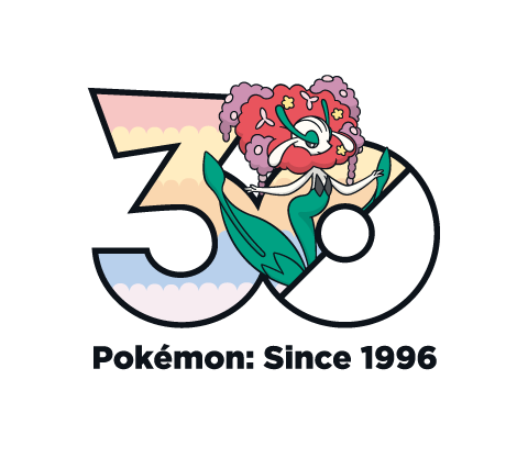
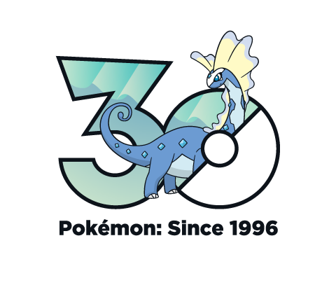
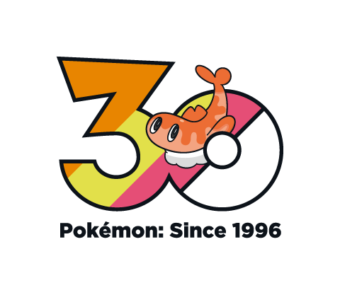
* Now this is surprising. Feebas starts with a faded blue gradient, only for Miltoic to surprise with a multicolor lustrous gradient to remind you whose the Pokemon the Pokedex describes as the most beautiful. The reason its surprising is because the Feebas family are counterparts to the Magikarp family, yet both Magikarp and Gyarados were a solid light blue. I thought about mentioning, but thinking about it the only thing I'd suggest would making Magikarp's orange and we've established for the most part families are going to have a single color or gradient for each member. Except when that's not the case like here; go figure.


* Castform may not have a logo for each of its forms, but that's not going to stop it from having a gradient making it look like its enjoying a nice sunny day.
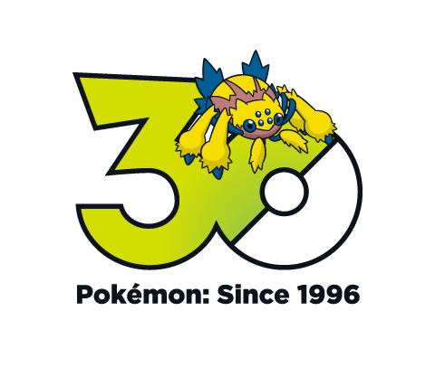
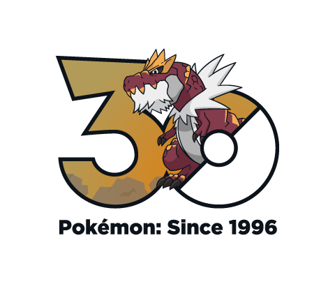
* In a way, the Legendary Giants logo follows in their footsteps of a simple design with a small intricate detail. All the Giants, including Regigigas, have their color match their Type sometimes with a slight gradient: 'Rock is orange, 'Ice is blue, 'Steel is metallic gray, 'Gigas is light gray, 'Eleki is yellow, and 'Drago is reddish. But, much like the detail added onto their elemental body, their "braille face" is included as a way to make them stand out just a bit more.
(You kind of need to be zoomed in to see them so I'm just including Regigigas, but the others are there I assure you (or better yet check it out yourself))
* Eon Duo have a red/blue gradient which swaps around, expected but nice to see.


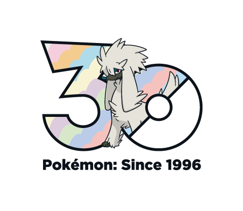
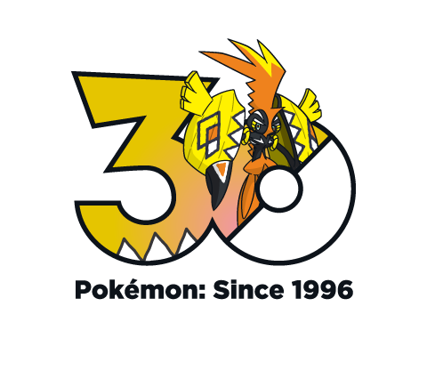
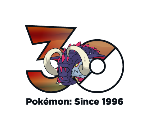
* Upon seeing what they did with The Super Ancient Pokemon, it dawned on me what they were doing. Not just with the rest of the Mascot Legendaries, but why the Kanto Starters colors were solid while all other Starters were a gradient. All Version Mascot Pokemon have their "3" in the style of their boxart background! A very fun idea and nice way to callback to the older gen games without being so direct. So for the Super Ancient Pokemon their "3" is like a solid color gem of their respective color with a bright white glare spot in the corner. Priceless.


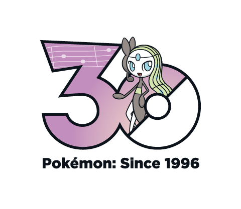
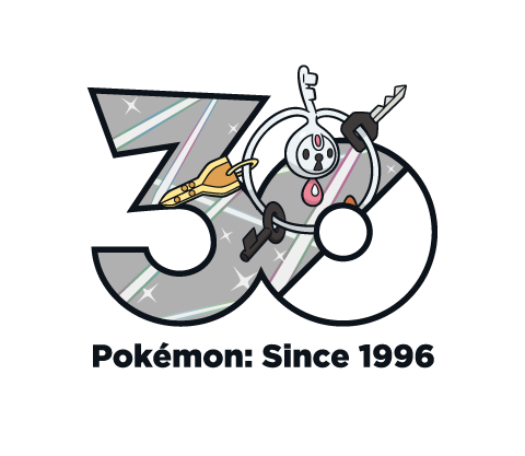
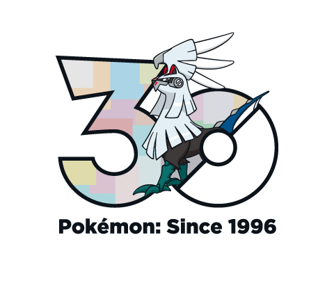
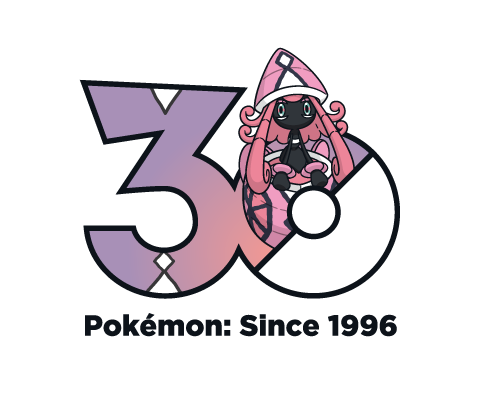
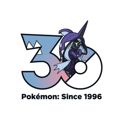
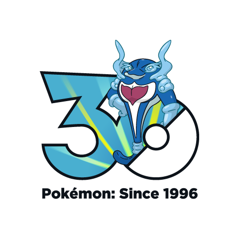
* Both Jirachi and Deoxys brings to mind "space", but in different ways. While Jirachi has the metallic "sheen" like most other Steel-types, oddly its color is purple. If you were to take a step back, to me in addition to being a metallic sheen, I could maybe see the pattern resembling a tail of a comet like the one Jirachi wakes up to. Similarly, the dark blue/pink gradient of Deoxys is reminiscent of what the outer atmosphere looks like; you know, like where you battled Deoxys in ORAS.


Sorry to cut this short, but I do have some other things to do that this has been distracting me from. More tomorrow, hopefully I'll get through all of these before the 27th. But before I leave:
Hoenn Missed Opportunities:
* Ralts family's color is a solid light pink, which is fine for the initial three being Psychic/Fairy, but I think at least Gallade deserved a gradient which added a red, orange or brown to represent its Fighting-type.
* Surskit family is a solid light blue, but I feel they could have made Surskit a deeper blue to represent its connection to water, and then Masquerain having the lighter blue representing how its now a bug of the skies.
* Volbeat and Illumise have a slight difference in their gradient; Illumise has a little more turquoise green. But, when the Pokemon just before you are Plusle & Minun, both them and the firefly Pokemon meant to showcase Double Battles, who had a much more notable differences in their colors, if feels a lot more disappointing. You couldn't even make Volbeat a turquoise/red and Illumise a turquoise/blue gradient.
* After seeing Milotic and Castform, it only makes Kecleon look even blander! It's Kecleon, you couldn't think of a color gimmick for the Pokemon with the Ability Color Change! Not even a red zigzag stripe somewhere on the "3".
* I feel Luvdisc should have been pink.
* We may be far from Galar but both Zigzagoon families keeps rocking on with a unique "3" pattern based on their body markings!
* They tried with the Wurmple family. Wurmple, Silcoon, and Cascoon are a solid turquoise green for their Bug-type, but Beautifly and Dustox add a twist by making it a gradient based on their secondary Type: turquoise/sky blue for Beautifly and turquoise/lavender for Dustox. It's an attempt without doing a full unique pattern.
* Um, someone may want to send out help for that "3" soon...
* Spotted a spotty Spinda spinning spot:
* Okay at this point as we sure Zangoose & Seviper are still enemies? Zangoose comes with a Seviper scale while Seviper has a
* Like Espeon & Umbreon, Lunatone & Solrock got a night and day logo, though less complicated. Lunatone is a purple/orange gradient looking like a moon put at dusk while Solrock is a bright sun in a sky blue/yellow gradient sky.
* Now this is surprising. Feebas starts with a faded blue gradient, only for Miltoic to surprise with a multicolor lustrous gradient to remind you whose the Pokemon the Pokedex describes as the most beautiful. The reason its surprising is because the Feebas family are counterparts to the Magikarp family, yet both Magikarp and Gyarados were a solid light blue. I thought about mentioning, but thinking about it the only thing I'd suggest would making Magikarp's orange and we've established for the most part families are going to have a single color or gradient for each member. Except when that's not the case like here; go figure.
* Castform may not have a logo for each of its forms, but that's not going to stop it from having a gradient making it look like its enjoying a nice sunny day.
* In a way, the Legendary Giants logo follows in their footsteps of a simple design with a small intricate detail. All the Giants, including Regigigas, have their color match their Type sometimes with a slight gradient: 'Rock is orange, 'Ice is blue, 'Steel is metallic gray, 'Gigas is light gray, 'Eleki is yellow, and 'Drago is reddish. But, much like the detail added onto their elemental body, their "braille face" is included as a way to make them stand out just a bit more.
(You kind of need to be zoomed in to see them so I'm just including Regigigas, but the others are there I assure you (or better yet check it out yourself))
* Eon Duo have a red/blue gradient which swaps around, expected but nice to see.
* Upon seeing what they did with The Super Ancient Pokemon, it dawned on me what they were doing. Not just with the rest of the Mascot Legendaries, but why the Kanto Starters colors were solid while all other Starters were a gradient. All Version Mascot Pokemon have their "3" in the style of their boxart background! A very fun idea and nice way to callback to the older gen games without being so direct. So for the Super Ancient Pokemon their "3" is like a solid color gem of their respective color with a bright white glare spot in the corner. Priceless.
* Both Jirachi and Deoxys brings to mind "space", but in different ways. While Jirachi has the metallic "sheen" like most other Steel-types, oddly its color is purple. If you were to take a step back, to me in addition to being a metallic sheen, I could maybe see the pattern resembling a tail of a comet like the one Jirachi wakes up to. Similarly, the dark blue/pink gradient of Deoxys is reminiscent of what the outer atmosphere looks like; you know, like where you battled Deoxys in ORAS.
Sorry to cut this short, but I do have some other things to do that this has been distracting me from. More tomorrow, hopefully I'll get through all of these before the 27th. But before I leave:
Hoenn Missed Opportunities:
* Ralts family's color is a solid light pink, which is fine for the initial three being Psychic/Fairy, but I think at least Gallade deserved a gradient which added a red, orange or brown to represent its Fighting-type.
* Surskit family is a solid light blue, but I feel they could have made Surskit a deeper blue to represent its connection to water, and then Masquerain having the lighter blue representing how its now a bug of the skies.
* Volbeat and Illumise have a slight difference in their gradient; Illumise has a little more turquoise green. But, when the Pokemon just before you are Plusle & Minun, both them and the firefly Pokemon meant to showcase Double Battles, who had a much more notable differences in their colors, if feels a lot more disappointing. You couldn't even make Volbeat a turquoise/red and Illumise a turquoise/blue gradient.
* After seeing Milotic and Castform, it only makes Kecleon look even blander! It's Kecleon, you couldn't think of a color gimmick for the Pokemon with the Ability Color Change! Not even a red zigzag stripe somewhere on the "3".
* I feel Luvdisc should have been pink.