

i'm newish to drawing and i was working hard from like october-february grinding it daily, and then i kinda just burnt out. and then today i drew something. and it was fun, so imma do that more and post stuff hopefully because hopefully there will be stuff to post
when i post stuff i might yap and post some WIPs along words, that will be a second spoiler dropdown, i will use this as a diary and have notes on shit. pls feel free to give feedback, i really value it, esp. direction in learning
some stuff from before I burnt out:
and then today, I drew this
when i post stuff i might yap and post some WIPs along words, that will be a second spoiler dropdown, i will use this as a diary and have notes on shit. pls feel free to give feedback, i really value it, esp. direction in learning
some stuff from before I burnt out:
in order of oldest to newest
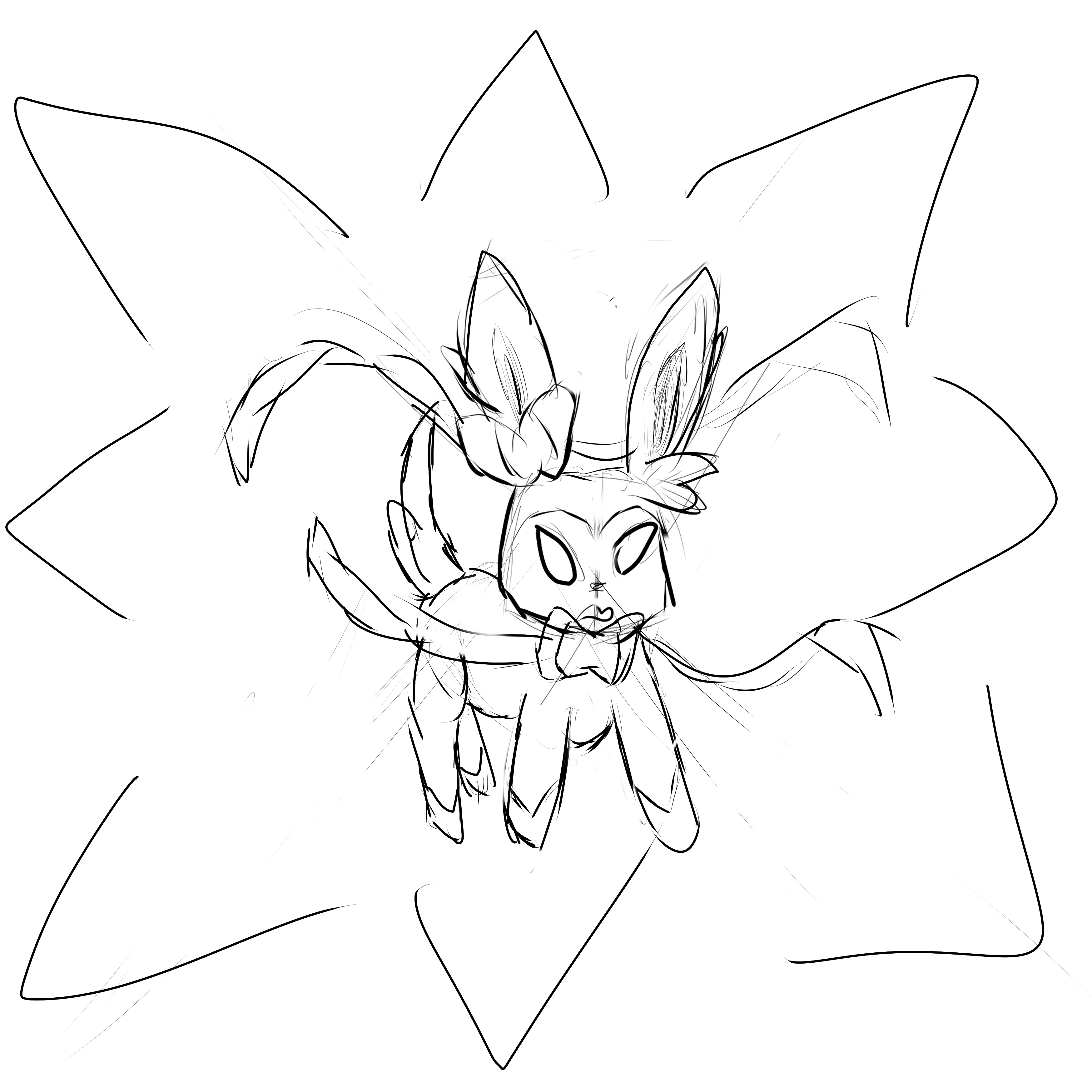
sylveon
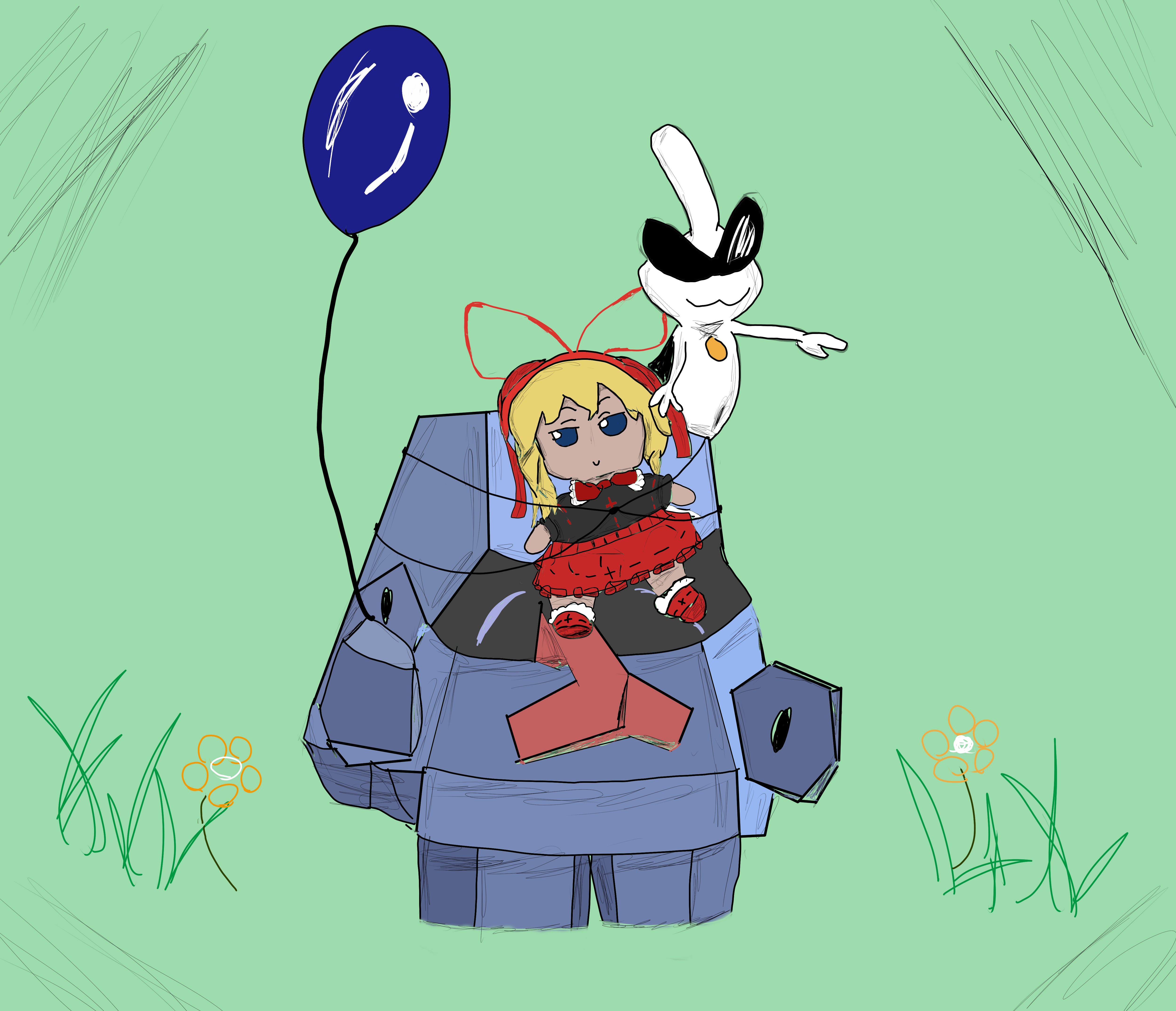
bday gift art for the goat
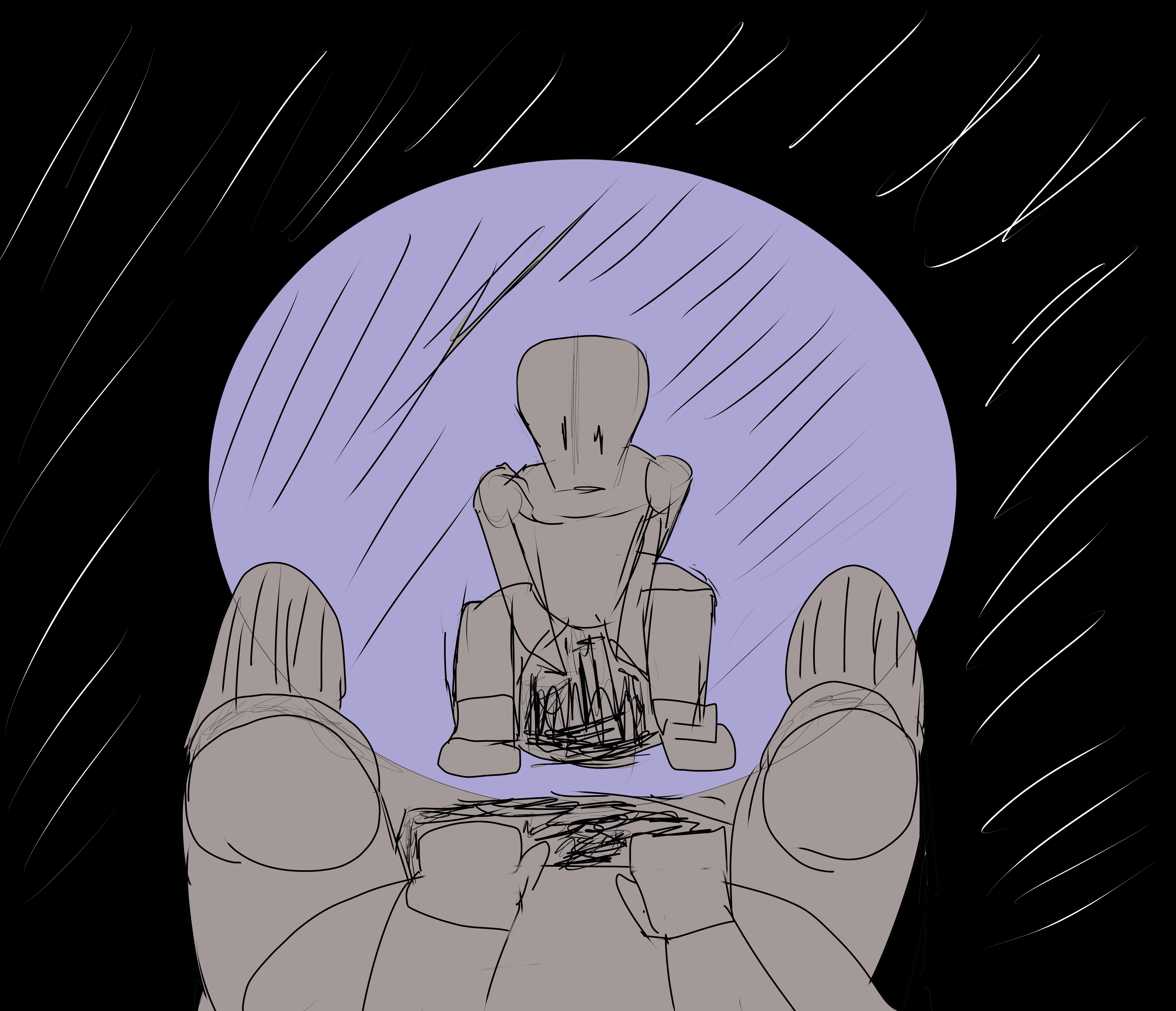
i dont really know what this one is tbh. just kinda did it
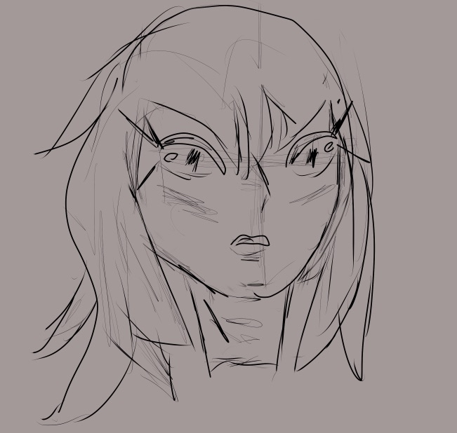
i think i was practicing eyes
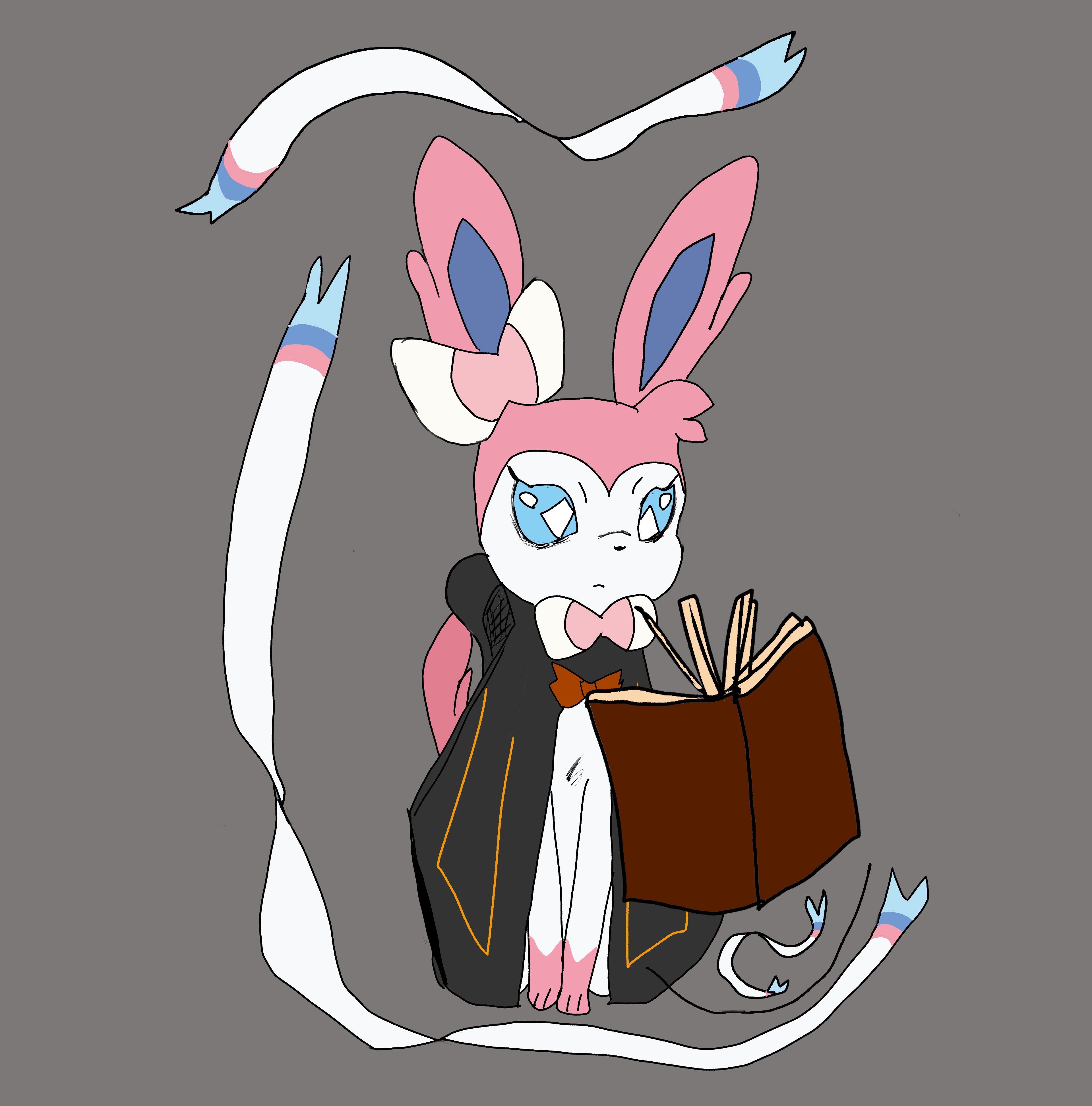
did like a mage sylveon thing
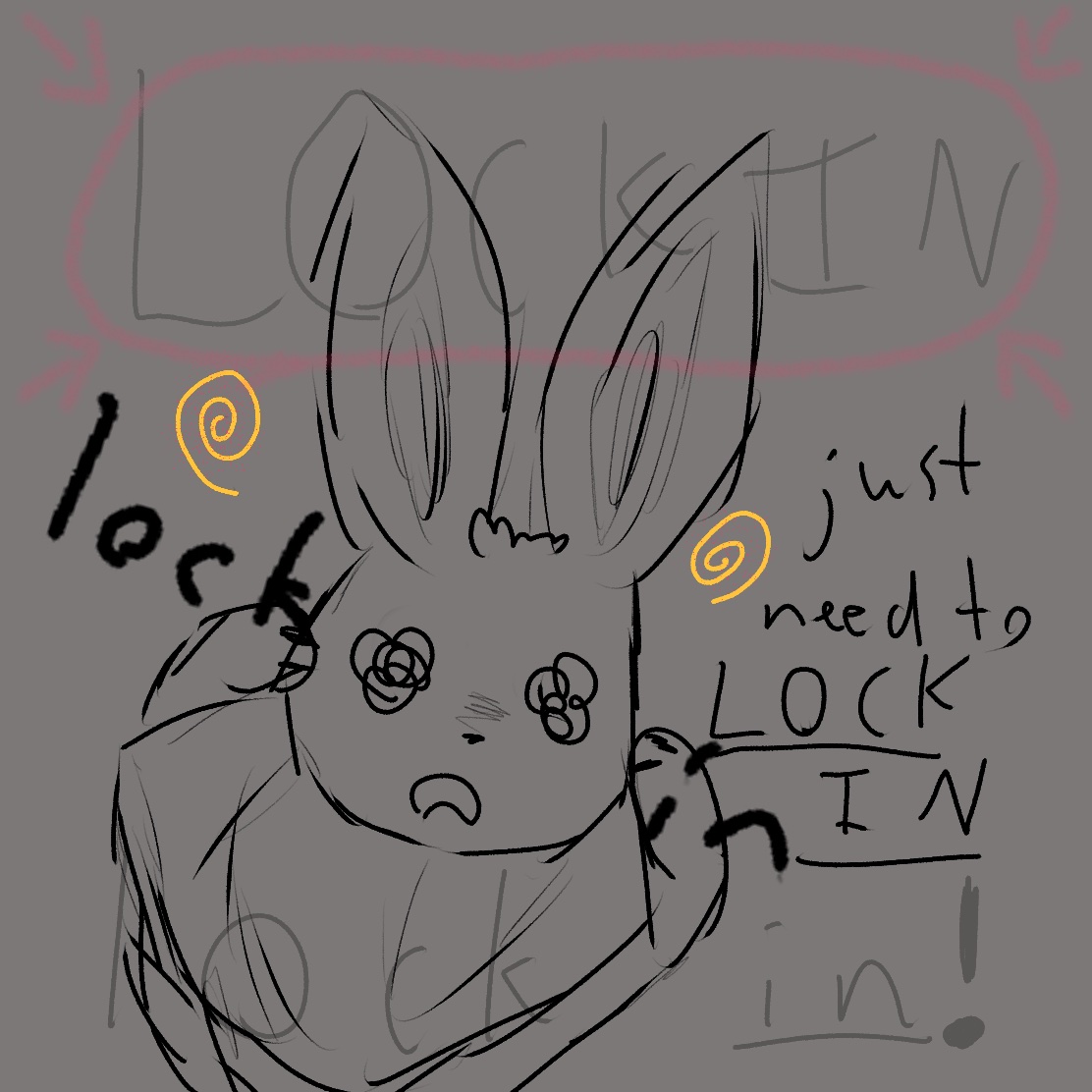
"nuh uh im totally not burnt out im just drawing this because my mental is very normal and healthy rn"
sylveon
bday gift art for the goat
i dont really know what this one is tbh. just kinda did it
i think i was practicing eyes
did like a mage sylveon thing
"nuh uh im totally not burnt out im just drawing this because my mental is very normal and healthy rn"
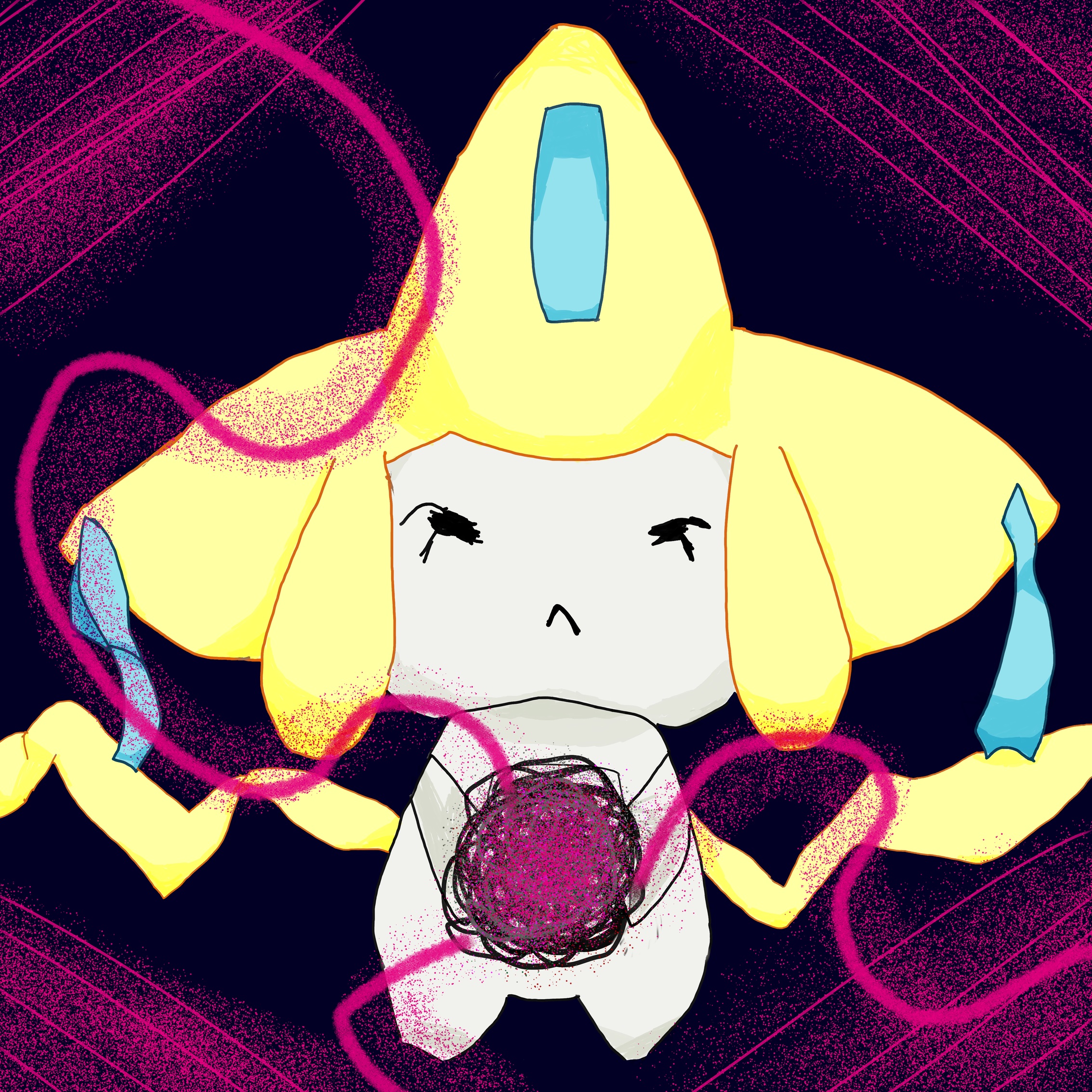
and then today, I drew this
so I actually wasn't gonna do a full piece today because I'm lazy, but I kept coming back to it after I drew the initial idea which was this and my friends said it gave a neat vibe
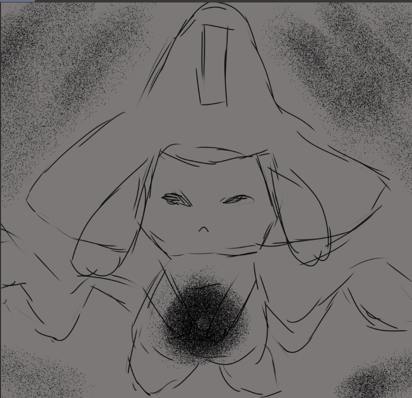
now do not ask what the thing in the middle is I just like poses where a character is holding something, maybe it's a black hole, i dunno
i lined it out pretty quickly and found that due to how kinda bad i drew the jirachi itself, when i used the color scheme of jirachi it looked bad, so i tried to cheat and use weird colors and ended up with this super noisy thing
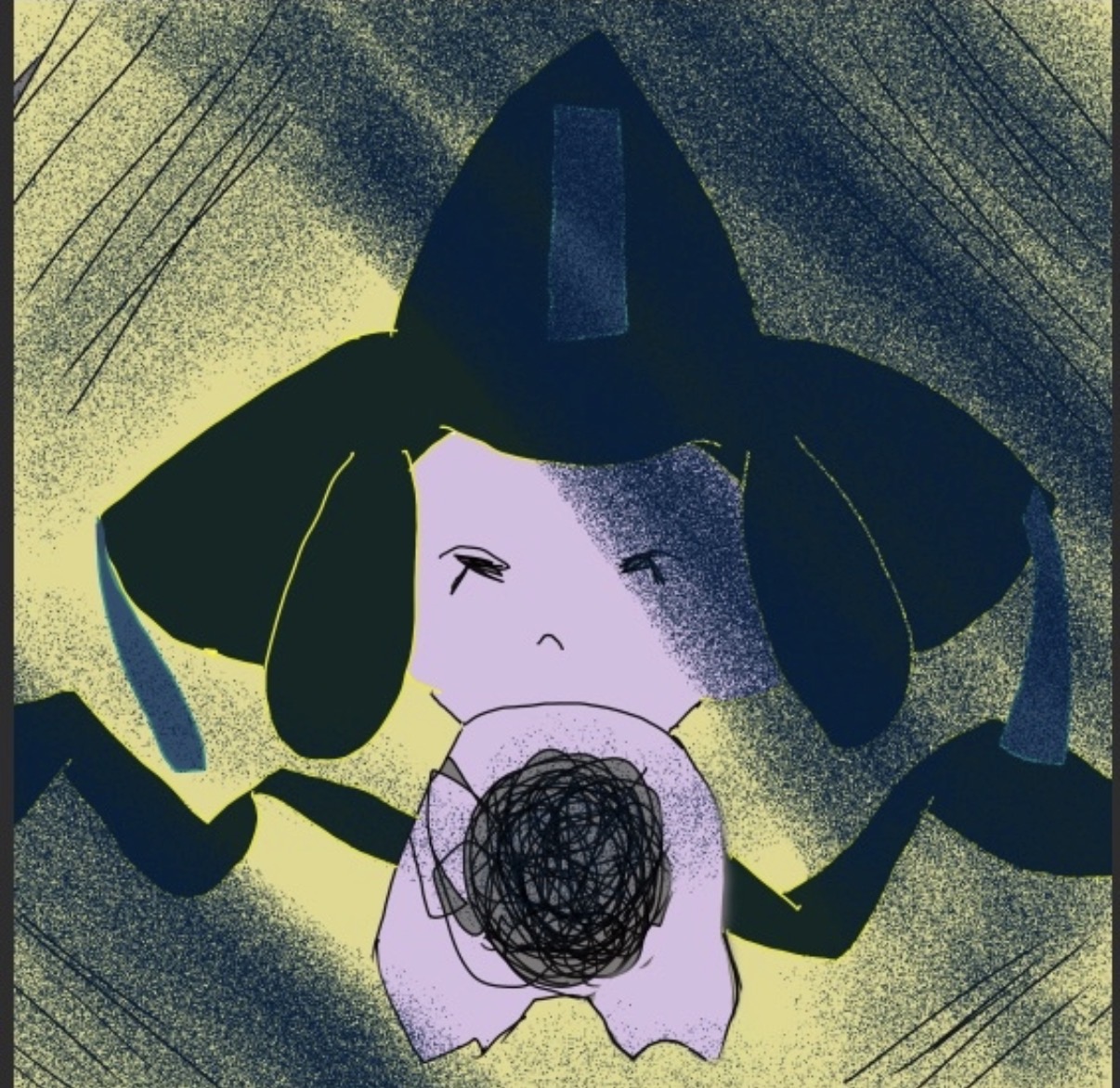
now i kinda fuck w this and its because i think the outlines make it stick out, and i said i wasnt gonna finish it or polish it so of course i came back to it a bit later
i redid the outline twice and this is where the real vod review begins, i found that these colors didn't actually work with the new outline and im not really sure. i tried similar colors, and even colorpicked from this worse version (imo at least), and it just didn't look the same
i tried some other colors before going back to using the official jirachi colors (bdsp's model screenshot) and it looked much better, so i was like uh i guess im doin this instead. im glad i did because it felt like the weird colors i used were not because i understood colors or lighting or anything, nor did i feel i learned much from using them, it felt like a way for my brain to escape how well i knew jirachi (goat mon love it) and therefore be less distasteful of the result in my head

the next outline
i focused a lot on the nub feet and trying to make the ribbons on the side more dynamic, also i felt the arms especially weren't well-done, another thing i was able to soft-cheat and hide behind the Demon Ball Of Death or Whatever The Fuck, this time since it was multiple layers i put more effort into it and like the result more
also i spent more time judging the volume and ratio for the head shapes in general. i find that im really bad at making things even and i need to work on drawing things across the picture, for some reason i struggle with drawing the side that my left hand is worse at (im left handed), but when ive asked some artists before they've told me their handedness doesn't really effect their drawings. i feel like i gotta be missing something or its just a fundamentals thing (almost certainly true either way)
next i did the layer with all the noisy shit on top, at first i tried those squiggly lines from all directions with different colors, but it felt really unfocused, also you can tell i really like the noise brush which i dont think is probably good, i just like it LMAO
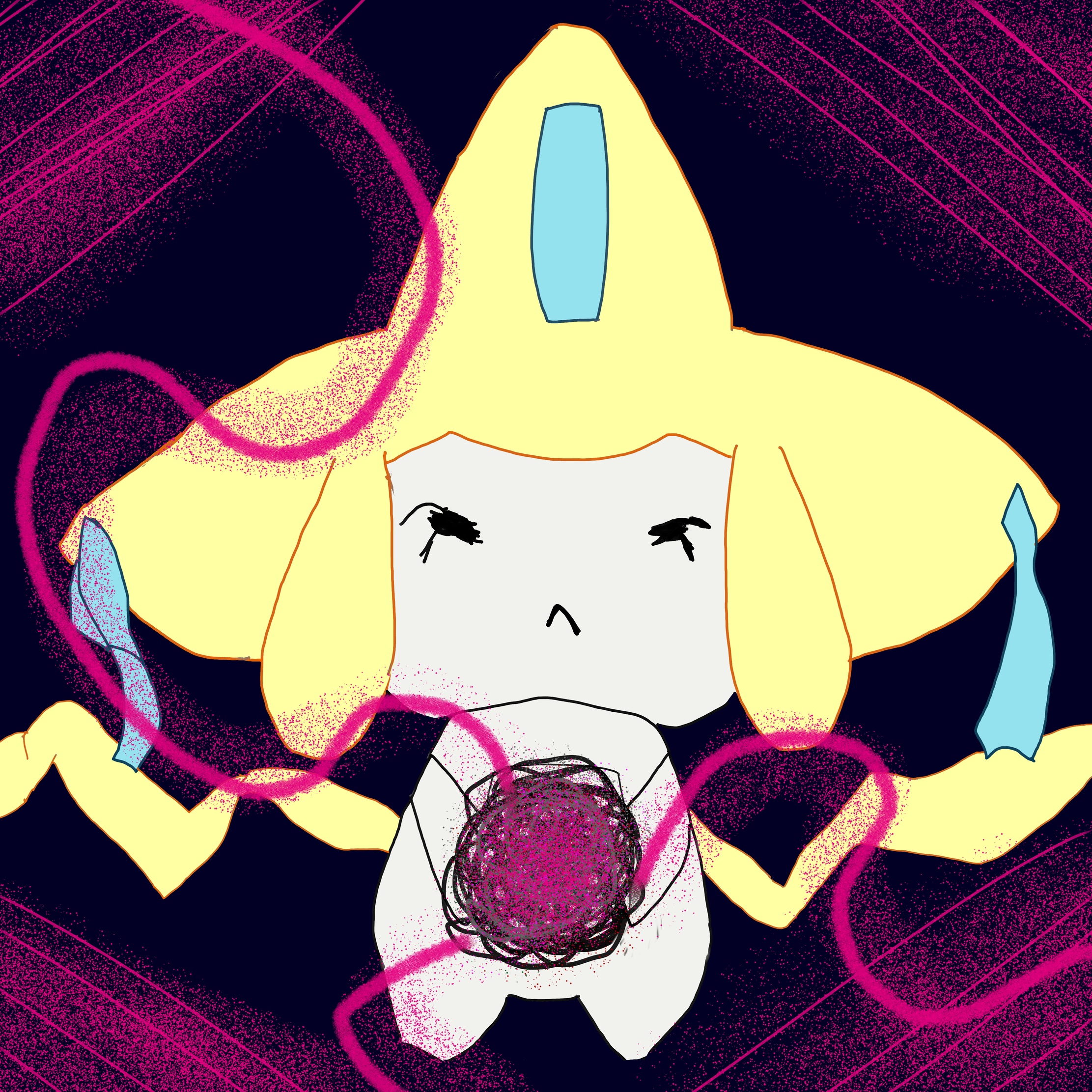
without shading
so im really bad at lighting/volume and its one thing im tryna work on hard, but i feel like it takes me a while because i only usually practice it when doing one of these larger pieces, and only at the end when im usually tired. i also kinda usually just bullshit it and pray it works
if i were to redo the shading on this one i'd try something more focused around the death ball
final result
so i am mixed on this. one thing i hate and is part of why i burnt out is there's a lack of polish or that next level of understanding that i, obviously, dont understand
of course the line quality could be much better, but i think a lot of it is in fact in the lighting quality, and maybe even just composition. its giving mspaint (no knock to ms paint ive seen the insane shit people can do in it), its giving flat (imo). maybe the background esp. its supposed to be giving a sort of space vibe, maybe it should have stars to help sell depth- i usually dont go hard on backgrounds
for the next time i do a full piece i want to do more with the background and lighting, i might need to do more of the (in my opinion some like them) boring exercises with volume and lighting stuff
also just line quality but whenever i do those exercises my wrist starts to get tired/feel pain quickly which makes me not wanna do it, but it really is important
something im not sure how i feel: the actual star-hat-whatever is slightly crooked, part of the whole bad at doing uneven bits, but i actually think it looks nice and when i was gonna fix it i kinda left it a bit more crooked on purpose than i couldve made it. i think i wanna play with tilting stuff more
now do not ask what the thing in the middle is I just like poses where a character is holding something, maybe it's a black hole, i dunno
i lined it out pretty quickly and found that due to how kinda bad i drew the jirachi itself, when i used the color scheme of jirachi it looked bad, so i tried to cheat and use weird colors and ended up with this super noisy thing
now i kinda fuck w this and its because i think the outlines make it stick out, and i said i wasnt gonna finish it or polish it so of course i came back to it a bit later
i redid the outline twice and this is where the real vod review begins, i found that these colors didn't actually work with the new outline and im not really sure. i tried similar colors, and even colorpicked from this worse version (imo at least), and it just didn't look the same
i tried some other colors before going back to using the official jirachi colors (bdsp's model screenshot) and it looked much better, so i was like uh i guess im doin this instead. im glad i did because it felt like the weird colors i used were not because i understood colors or lighting or anything, nor did i feel i learned much from using them, it felt like a way for my brain to escape how well i knew jirachi (goat mon love it) and therefore be less distasteful of the result in my head
the next outline
i focused a lot on the nub feet and trying to make the ribbons on the side more dynamic, also i felt the arms especially weren't well-done, another thing i was able to soft-cheat and hide behind the Demon Ball Of Death or Whatever The Fuck, this time since it was multiple layers i put more effort into it and like the result more
also i spent more time judging the volume and ratio for the head shapes in general. i find that im really bad at making things even and i need to work on drawing things across the picture, for some reason i struggle with drawing the side that my left hand is worse at (im left handed), but when ive asked some artists before they've told me their handedness doesn't really effect their drawings. i feel like i gotta be missing something or its just a fundamentals thing (almost certainly true either way)
next i did the layer with all the noisy shit on top, at first i tried those squiggly lines from all directions with different colors, but it felt really unfocused, also you can tell i really like the noise brush which i dont think is probably good, i just like it LMAO
without shading
so im really bad at lighting/volume and its one thing im tryna work on hard, but i feel like it takes me a while because i only usually practice it when doing one of these larger pieces, and only at the end when im usually tired. i also kinda usually just bullshit it and pray it works
if i were to redo the shading on this one i'd try something more focused around the death ball
final result
so i am mixed on this. one thing i hate and is part of why i burnt out is there's a lack of polish or that next level of understanding that i, obviously, dont understand
of course the line quality could be much better, but i think a lot of it is in fact in the lighting quality, and maybe even just composition. its giving mspaint (no knock to ms paint ive seen the insane shit people can do in it), its giving flat (imo). maybe the background esp. its supposed to be giving a sort of space vibe, maybe it should have stars to help sell depth- i usually dont go hard on backgrounds
for the next time i do a full piece i want to do more with the background and lighting, i might need to do more of the (in my opinion some like them) boring exercises with volume and lighting stuff
also just line quality but whenever i do those exercises my wrist starts to get tired/feel pain quickly which makes me not wanna do it, but it really is important
something im not sure how i feel: the actual star-hat-whatever is slightly crooked, part of the whole bad at doing uneven bits, but i actually think it looks nice and when i was gonna fix it i kinda left it a bit more crooked on purpose than i couldve made it. i think i wanna play with tilting stuff more

