Doug I like the finished design a lot. It didn't appeal to me at first until I saw it cleaned and colored. :)
In my opinion, the red color scheme looks best, but I just think red makes everything look cooler.
With that said, I honestly believe I've done all I could for my dude, so I'm making this my Final submission post.
Final Submission

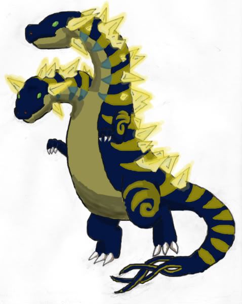
This design was originally not meant to be a pokemon at all. It was first drawn as a boss Maverick in my old Megaman X fangame many years ago. The original boss was an Electric Eel named "Bolt Strike Eel". It just so happened that his design was lexible enough to adapt into a pokemon.
So after a few hours of manual tweaking in photoshop, Bolt Strike Eel later went on to become this pokemon, who I've preemptively named Styrm. (Stom + Wyrm) I'm hoping this dude is well recieved and that my artistic sabbatical paid off and people saw an increase in my skills from last CaP.
Supporting Detail


 [URL=http://img297.imageshack.us/my.php?image=battlemons.png]
 [/URL]
In my opinion, the red color scheme looks best, but I just think red makes everything look cooler.
With that said, I honestly believe I've done all I could for my dude, so I'm making this my Final submission post.
Final Submission
This design was originally not meant to be a pokemon at all. It was first drawn as a boss Maverick in my old Megaman X fangame many years ago. The original boss was an Electric Eel named "Bolt Strike Eel". It just so happened that his design was lexible enough to adapt into a pokemon.
So after a few hours of manual tweaking in photoshop, Bolt Strike Eel later went on to become this pokemon, who I've preemptively named Styrm. (Stom + Wyrm) I'm hoping this dude is well recieved and that my artistic sabbatical paid off and people saw an increase in my skills from last CaP.
Supporting Detail


 [URL=http://img297.imageshack.us/my.php?image=battlemons.png][/URL]