Welcome to Smogon! Take a moment to read the Introduction to Smogon for a run-down on everything Smogon, and make sure you take some time to read the global rules.
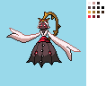
Took on board some critique and made a little potential shiny sprite.
Changes include: widening of the hood, thickening of the vine near the back, alterations to teeth all around the body, arm sleeve puffed out some more, larger and hopefully clearer eyes on dress, better curve on dress and changed some shades. Total colour count: 12.
The shiny itself is rather simple. Blue for it's opposite with red and with some nice contrast from the reddish dress and a muted 'dead' green for the plant. White didn't change since that shares the palette with teeth and eyes and there's precident for that in the games, like Swanna.
When front is completely finalised I will provide full and seperated out parts to the sprite for animation use. It's almost impossible to have nothing obscured in a sprite like this so it's a good thing to do. I urge other artists to do the same even if you're planning to do animation yourself.
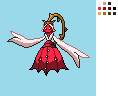
Quick background test using mspaint defaults. Testing your sprite against a varity of different backgrounds is a good thing! It's normally only the outline that accounts for this so focus on that if there's problems. Also to other artists, don't worry too much if your sprite struggles on pure black, a lot of the official ones do too and it'll never need to be used on such a dark background.
And a check against other Pokémon sprites. It's a little big in general but seems to fit in okay against sprites of similar complexity. The pose also does fine thankfully. (note, this is the smallest I can personally get the sprite without losing detail on the head.)
MektarTheOverlord: I would personally prefer it if she was a little bigger, but since you chose to represent her as small then I respect your choice. Only thing is have you tried it with both arms down? I know you are trying for a 'pose' with the arm raised but it looks a little strange to me.
Wyverii: I'm really digging the badass pose you gave her. Not much for me to say, except I'd love to see it completed!
Ice-cold Claws: I like the pose on this one too. I prefer the bottom one with the bigger dress myself.
Doran Dragon: Maybe you could afford to extend her dress out a little more to the sides, otherwise it's looking good so far!
Quanyails: It's a little hard for me to judge since it's the most complete sprite, but I'm really liking how you interpreted her back sprite.
The Reptile: There's just something about that 'messy hair' get-up that makes her seem cuter here... A-hem! Like Mektar's, it might look better if the arms were both down instead of facing like this.
I'd like to remind everyone that BW sprites use neutral poses, and that action poses, or poses that intentionally obscure parts of the body, are really not in-line with what a CAP BW sprite must be. I say this for everyone, but I think it's particularly relevant for you, Doran Dragon!
As another thing: aren't BW sprites animated? I can understand the usage of .PNG format being a holdover from the 4th-gen CAP project (it can be converted to .GIF later when animating it comes around.) But still, I'd guess that's why BW sprites tend to have neutral poses. As for obscuring parts of the body, I guess it could be allowed for portions of the animation, but not for the default still sprite.
As for my opinions of the poses...
Wyverii: Heh. I like the vibe this pose gives... kind of like "What do you want?" or "You want a piece of me?" Cute, yet no-nonsense. "You can look, but you can't touch!" Plus it looks like the sort of sprite that would fit right in with the rest of Pokémon Black and White.
Qunyails: Pfft, "Come at me bro"! Priceless. Yet, I can't bring myself to like this pose... it just doesn't look like it fits well with the design's miko inspiration. That is, unless it's supposed to be some sort of Crucified Hero Shot. Does CAP2 learn Healing Wish, Memento, and/or Final Gambit without having to Sketch it? Because this pose totally looks like it's about to use one of those moves.
The Reptile: Sweet graceful action pose. CAP2 totally looks like it's ready to kick some ass in this one.
Doran Dragon: Now this is a miko pose! When it comes time to animating this sprite, I can totally see it working with the different variations of this design, having its arms by its side by default but occasionally bringing one arm up to cover its face while it giggles. Awww. It's like it's taunting its adversary! I want to like it, but... color it in and then we can talk.
MektarTheOverlord: Gah, even without proportion fail, it's a bit too docile. It looks like it's trying to shrink into the background. In other words, this pose makes CAP2 look like a [deformed] coward. No thanks.
Yeah, Wyv, yours is a bit big, but the design is bulkier than similar humanshapes like Gardevoir, so it doesn't really surprise me that much. I think you're right on the limit for size, but it works good for you. I also really dig the muted blue shiny colors. Good call there.
Quanyails said:
Rising_Dusk: I only dithered at the bottom of the dress on the backsprite. Maybe you mean to say those shaded pixels that aren't attached smoothly to others?
34 seems a bit large; I'd guess you're counting both normal and shiny colorations. Even so, I should have less than 17 for both, unless I accidentally slipped a pixel of a different color in there somewhere.
Yeah the dithering doesn't fit where it's used, but the stark shading on the front isn't really fitting either. Also, your normal sprite has 22 colors, which is 6 colors over what is used in-game. My previous comment about cutting out some of those colors still stands!
@ ICC
I love the pose, shape, and structure of the sprite. It's right in-line with size next to Gardevoir and still maintains the shape properly. I'd like to see it colored, to know if it really does the details of the concept justice. Good luck!
I kinda did a shoddy job of shading, but heres kinda a rough idea of what it looks like. Most of the colors are ripped right from the picture, so i may end up changing them so that it looks a bit better. I also made the dress fuller with yilx's suggestion. I figure, its their desicion, i should probably take their advice ya?
Wyverii, I love everything about yours - almost! I'm just concerned still about the eyes on the dress, they still look a tiny bit too small for me, and the teal stem on the shiny sprite with the dark blue lines draws attention to the space limits. I don't know why exactly, but I think a different colour would suit the look of the stem better on the shiny sprite.
I leaned her forward a little bit, partly to give her the impression of floating in a ghostly way. But the main reason was to use perspective to make her head a bit larger so I could work in all the the head details. IMO the head is the real masterpiece of Yilx's design, and I don't want to short-change it because of small size.
The sprite itself is tall in terms of total pixels, but Miko's main body (not counting the top vine) is not too terribly large. I wish I could have made the whole thing smaller, but I just can't. Not without bastardizing her proportions completely, or losing a lot of pizzazz in the head. I can't bring myself to do either of those things. So overall size is almost certainly going to stay roughly where it is now.
I still have work to do on coloring and some linework. But this gives you a good idea of what I'm working towards. I hope you like it!
Edit: Someone pointed out some positioning problems with her dress, so I intend adjust that a bit too.
Doug: You've done an amazing job on the sprite! Great shading, good colors, nice pose; the only flaw is the head size: it's a little too wide. You could try to fix it, but if it messes the rest up, feel free to leave it that way.
Shouldn't the limit be around 80x80? Nintendo only seem to use 96x96 when they need the extra space for legendary pokemon, Wailord, and animations like flapping wings.
Seriously, check anything. Steelix is only 81x80. This pokemon looks about 4 feet tall, it shouldn't be anywhere near 96 pixels high.
Secondarily, to clarify what Rising_Dusk wrote, 8-bit color means you have a maximum of 16 colours, INCLUDING transparent and black.
96x96 is the actual size limit of the sprites in-game, so that is the actual limit we use. It is entirely subjective as to when 96x96 is appropriate or when smaller is appropriate, and that's why I'm suggesting to people to keep it not using the whole canvas if you can avoid it. Reasoning like Doug's as to why it's large is fine, as that's a conscious decision he's making as the spriter; my recommendations are just that. I see no reason why we should require spriters not use the canvas size fully if they so choose. If you don't think big is appropriate, let your votes in the polls down the road reflect that.
@ The_Reptile
You now have some perspective issues, as one arm looks seriously longer than the other when it shouldn't. Also, I feel compelled to note that your sprite's face eyes get lost in the sea of the teeth of similar color. I recognize that the art design's face makes it really hard to separate the eyes and teeth of the face, but I'd say that it's important that you work on that more.
More minor edits; don't think I got rid of the 'umbrella' problem, though I got the colors organized. Fixed the bow's colors so that it matched Yilx's description.
Shouldn't the limit be around 80x80? Nintendo only seem to use 96x96 when they need the extra space for legendary pokemon, Wailord, and animations like flapping wings.
Seriously, check anything. Steelix is only 81x80. This pokemon looks about 4 feet tall, it shouldn't be anywhere near 96 pixels high.
Secondarily, to clarify what Rising_Dusk wrote, 8-bit color means you have a maximum of 16 colours, INCLUDING transparent and black.
This entire post is retarded and bad mini-modding. It's your first post here, which is the only reason this stupidity was not infracted.
But just to be clear to all the spriters who may or may not know the real rules around here:
1) There is no size limit other than the 96x96 limit stated in the OP. What this pokemon "looks like" in terms of size is total bullshit, because the size has not been determined yet. And even if it was decided, CAP has no spriting rules that tie a pokemon's size to the size of the sprite. And for the record, Pokemon is INCREDIBLY inconsistent with its sprite sizes, so don't bother to quote game canon in this thread any more than you can quote fictional "How to make proper pokemon" rules in any other CAP thread.
2) 8-bit true color DOES NOT mean a 16 color limit. I have no idea where you pulled that totally false assumption from, but you obviously don't know much about color representations. Here's a link:
There is no limit on sprite colors for CAP sprites. There are MANY reasons for this, and I am not going into that here. However, general CAP tradition is that all spriters try to stay at or below 16 colors. But that is NOT enforced by the CAP moderation staff, and I don't want to see people calling out spriters for the number of colors in their sprite, since there is no rule preventing them from using as many colors as they like.
If you don't like the size of a sprite or don't like the number of colors, then DON'T VOTE FOR IT. But do not attempt to make rules on the fly and quote them out to the spriters in this thread, and do not attempt to browbeat spriters with your mythical pokemon spriting style guidelines.
The rules are posted in the OP, and they are quite clear. Those are the only rules that apply for this competition.
Here's my attempt to fix the proportions issue. I also tried to decrease the size of the red "fangs" on her face without making them barely noticeable, however, the eyes still do get lost. Not as much as in the last one, but they still do. I would like it if you guys could tell me if the eyes are a serious problem to the sprite, as I do not wish to reduce the size of the fangs OR increase he head size. Also I changed the body a little bit, making the upper half slightly bigger. Oh, and eyelashes.
Everyone has such amazing sprites!! It's gunna be killer to decide the design when we are up to that part....Gun6 I'm loving your sprite design but the dress's teeth kinda throws me off since they look a little tiny ^ ^" it is not bad at all but maybe if they were more prominent it would be perfect ^_^
clearly just an outline and base colors, also I'll get to the eyes and other small details (irises on the leg eyes, thorns on the later once I start shading
Feedback is greatly appreciated (specifically about the head vine, is it in the right position? is it to thick? are the thorns to big?)
I kinda did a shoddy job of shading, but heres kinda a rough idea of what it looks like. Most of the colors are ripped right from the picture, so i may end up changing them so that it looks a bit better. I also made the dress fuller with yilx's suggestion. I figure, its their desicion, i should probably take their advice ya?
I Personally really like this one, but it seems like the shirt-thing could be lighter, it kinda blends in too much with the actual body. Also real wuick, is there any particular reason that people are conparing the design with gardevoir? I mean theyre not that similar of pokemon.
I'm only using Gardevoir as a comparison for purposes of what I personally think is the ideal size for the sprite inside of the canvas. I presume that others are now using it for comparison because I did originally. There is no actual limit or requirement for size within the canvas; that's just something that I personally think, as a voter, is important. Whether a sprite artist or not listens to such comparisons is completely their prerogative.
clearly just an outline and base colors, also I'll get to the eyes and other small details (irises on the leg eyes, thorns on the later once I start shading
Feedback is greatly appreciated (specifically about the head vine, is it in the right position? is it to thick? are the thorns to big?)
Your interpretation of the head vine is badass, and definitely not out of shape.
Couple of things:
1. The red eye on the left of the dress, it's huge. Make it smaller.
2. The arm on the right (the one closer to us) is disproportionately large. Make it sleeker like Gardevoir's arm, but longer.
Otherwise, it's as good as anything, and I can't wait to see it in full color. Luck to you!
*******************
To all who gave me feedback, many thanks! Gonodactylus: Hmm...I tried it and it was too round. Besides, it made one side too cramped and the other too open. Thanks though.
Anyway, after hours of taking and editing colors from Darkrai and Tropius, I have this:
It's looking good, but I really dislike the color take you've gone with the vine. Looks too... Alive for the design. I think it'd be much better received if you stayed truer to the art concept. Also, now that I think about it, I think the vine might be a bit too long and might be taking up too much vertical height. It looks a lot longer and more imposing than I feel it should be. I also think the eyes could use to be a pixel or two higher on the face, since right now she looks slightly depressed and like she's staring at her hand instead of the opposing Pokemon.