When I say the design doesn't look like it has an Electric typing, I don't want to tell everyone to just "make sure to color it like a Grass/Electric type." Most of the submissions are likely going to be green and yellow anyway, I realize that. But unlike Psychic or Dark, which can be conveyed through other traits like a Pokemon's personality, innate abilities, or theme, an Electric-type Pokemon would need some way to actually fire off a thunderbolt or other Electric move, at least in my eyes. This could be through static fur, lightning bolt-shaped appendages, or other electricity-related body parts. Don't want to start an argument here, just wanted to state what I see and think.Not all designs have to make it obvious that it's a electric type you know, sometimes color or theme is enough for that. Look at Delphox you don't really see a distinct connection to Psychic except the theme of a Mage or Incineroar where it's secondary typing is shown through it's color such as the color Black

-
Check out the relaunch of our general collection, with classic designs and new ones by our very own Pissog!
-
The moderators of this forum can be found in the CAP forum staff directory.
-
Welcome to Smogon! Take a moment to read the Introduction to Smogon for a run-down on everything Smogon, and make sure you take some time to read the global rules.
You are using an out of date browser. It may not display this or other websites correctly.
You should upgrade or use an alternative browser.
You should upgrade or use an alternative browser.
CAP 25 - Part 6 - CAP 25g Art Submissions
- Thread starter Quanyails
- Start date
- Status
- Not open for further replies.
WIP

So here's an actual concept and not the art equivalent of an earworm. Really rough rn, and I'm still trying to naturally incorporate a more 'grass' aspect. I had tried leaves along the spine but it didn't seem to be working.
The idea is a Parasaurolophus with a theme of bioluminiscence. The lines, spheres and patterns are going to be either neon green or acid blue because of that. I was planning on incorporating aspects from the monstera deliciosa plant with the leaves, but I may be back to the drawing board now on that end.

Got both my posts deleted ‘cause I messed up with the images, hopefully did it right this time
WIP
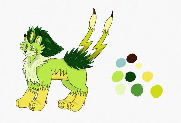
I took inspiration from a bunch of stuff and meshed it together, namely big cats (lynx, lion, etc.), the Fila-mint family from PVZ 2 (the Lightning Reed and Magnifying Grass) and Lion-O’s fabulous hairdo. Feedback heavily appreciated!
Other stuff:
Concept Art
Power Whip, Thunderbolt & co.
WIP
I took inspiration from a bunch of stuff and meshed it together, namely big cats (lynx, lion, etc.), the Fila-mint family from PVZ 2 (the Lightning Reed and Magnifying Grass) and Lion-O’s fabulous hairdo. Feedback heavily appreciated!
Other stuff:
Concept Art
Power Whip, Thunderbolt & co.
Last edited:


So a few pieces of feedback and my thoughts.
Reiga: I love the design. I have always hoped that there would be a grass pteranodon starter. I feel you captured grass and electric well, while still leaving it open to specialization. I would reccommend however trying to reconcile the fact it strongly feel a it should also be flying type/have levitate. Maybe give it more of a grounded glider style wing.
Shunosaurus: There is a lot of flavor in this design (heh). It is an interesting idea and I can see this Pokémon fitting one of multiple specialized niche super well. I agree with a few other people however it just doesn’t feel like a 3rd stage Pokémon yet. It is very balanced, while most 3rd stage Pokémon visually become more back heavy or front heavy.
Magistrum: The revises Druid deer with the cannon is an awesome idea. It feeds into the typing well. An area I would look to improve it definitely focusing a specialization into the design. It screams to me glass cannon Aggro, but that doesn’t fit the secondary prompt with this Cap as well.
Wolfinator: I feel the design is a bit basic right now. Visually it doesn’t have a lot distinct about it. However I have an incredible amount of respect for the level of research and though you have put into it. This cap is a fantastic use of flavor, and if you keep looking for ways to incorporate flavor into its design (adding oak themes to fit the alternative representation is a great direction) I have no doubt it will be amazing.
I haven’t gone over my thoughts on everybody’s CAP designs, but I want to make sure I can give specific feedback and try and make it as useful as possible.

WIP
Hey everyone! First off, I love what I am seeing so far. Some incredible designs are being showcased leaving me super torn on what I actually want to win.
However, I would also like to throw my hat in this competitive race. I present to you coffee cat!

When the typing of Grass/Electric was decided, I couldn't help but think of coffee, or more specifically the coffee plant. Coffee, as we all know, is packed with energy. However, I wanted to incorporate coffee and its energizing effects into an animal-based design because starters are always animals, and never plants or materials.
So I tried to think of animals that eat coffee in some form or another and I immediately thought of a civet. For those of you who don't know, a civet is a nocturnal, wild cat typically found in tropical Asia and Africa. They often eat coffee cherries and excrete the beans in their feces (sorry if that is too graphic).
I loved the idea of a caffeinated civet with the coffee plant actually growing on its back, useful for easy coffee cherry consumption. Some civets have paterns on their hide similar to that on leopards and other big cats. I changed those boring circles into the silhouettes of coffee beans to further cement the coffee addiction of this mon.
Civets also have rings on their tails and black patches on their faces. I decided to change these into lightning bolt patterns to more fully incorporate the electric typing. There is also a bolt of electricity circling the tail which I plan on possibly incorporating into the coffee plan on its back.
If anyone has any ideas on a cool or interesting color way I should try please let me know and I would love to try it out. Also, any other constructive criticism is more than appreciated.
If you've made it this far, thanks for reading. I hope you like my design as much as I do, and good luck to all the other artists!!
Hey everyone! First off, I love what I am seeing so far. Some incredible designs are being showcased leaving me super torn on what I actually want to win.
However, I would also like to throw my hat in this competitive race. I present to you coffee cat!
When the typing of Grass/Electric was decided, I couldn't help but think of coffee, or more specifically the coffee plant. Coffee, as we all know, is packed with energy. However, I wanted to incorporate coffee and its energizing effects into an animal-based design because starters are always animals, and never plants or materials.
So I tried to think of animals that eat coffee in some form or another and I immediately thought of a civet. For those of you who don't know, a civet is a nocturnal, wild cat typically found in tropical Asia and Africa. They often eat coffee cherries and excrete the beans in their feces (sorry if that is too graphic).
I loved the idea of a caffeinated civet with the coffee plant actually growing on its back, useful for easy coffee cherry consumption. Some civets have paterns on their hide similar to that on leopards and other big cats. I changed those boring circles into the silhouettes of coffee beans to further cement the coffee addiction of this mon.
Civets also have rings on their tails and black patches on their faces. I decided to change these into lightning bolt patterns to more fully incorporate the electric typing. There is also a bolt of electricity circling the tail which I plan on possibly incorporating into the coffee plan on its back.
If anyone has any ideas on a cool or interesting color way I should try please let me know and I would love to try it out. Also, any other constructive criticism is more than appreciated.
If you've made it this far, thanks for reading. I hope you like my design as much as I do, and good luck to all the other artists!!

WIP
Hey everyone! First off, I love what I am seeing so far. Some incredible designs are being showcased leaving me super torn on what I actually want to win.
However, I would also like to throw my hat in this competitive race. I present to you coffee cat!
When the typing of Grass/Electric was decided, I couldn't help but think of coffee, or more specifically the coffee plant. Coffee, as we all know, is packed with energy. However, I wanted to incorporate coffee and its energizing effects into an animal-based design because starters are always animals, and never plants or materials.
So I tried to think of animals that eat coffee in some form or another and I immediately thought of a civet. For those of you who don't know, a civet is a nocturnal, wild cat typically found in tropical Asia and Africa. They often eat coffee cherries and excrete the beans in their feces (sorry if that is too graphic).
I loved the idea of a caffeinated civet with the coffee plant actually growing on its back, useful for easy coffee cherry consumption. Some civets have paterns on their hide similar to that on leopards and other big cats. I changed those boring circles into the silhouettes of coffee beans to further cement the coffee addiction of this mon.
Civets also have rings on their tails and black patches on their faces. I decided to change these into lightning bolt patterns to more fully incorporate the electric typing. There is also a bolt of electricity circling the tail which I plan on possibly incorporating into the coffee plan on its back.
If anyone has any ideas on a cool or interesting color way I should try please let me know and I would love to try it out. Also, any other constructive criticism is more than appreciated.
If you've made it this far, thanks for reading. I hope you like my design as much as I do, and good luck to all the other artists!!
I like the idea here but, I have 2 problems
1. I don’t really see the electric type here. Coffee doesn’t really like electric type. Maybe make the fur more jagged. I would say color the fur yellow to drive the electric type home
2. I feel like you went overboard. The amount of stuff going on in your drawing can be a bit over whelming, and might look bad in the sprite.
Other wise, this is great!

WIP

For my grass starter I decided to do something a little different than the reptilian starters of past generations, so this design is supposed to be a plant/humanoid. It kind of looks alien while also being cool enough to be a mascot. I also tried to make the design flexible enough to fill different roles in the meta if need be. Its body is oddly magnetic towards plant life and the leaves and white tufts are actually plants that cling on to its body. The black lines on its body are pathways for electricity to go through. The tufts of hair sticking out are used to receive and expel electric energy and the "lemon eyes" light up when it uses an electric attack.
Going along with the alien theme, I made another design with the same aesthetics but it is based on the Flatwoods Monster. You can see both of the designs here. Let me know which one you think is better. I've also heard that starters are supposed to be based on animals, so let me know if I should make my design more salamander-like or something. Good luck to everyone else.
Last edited:
I haven't really worked on my 25g submission yet, so I will get to that later, but in the meantime I decided to make some comments on the existing designs. Don't take my comments too personally, they're just some quick thoughts. Sorry if I miss anybody.
ZardX I'm not really sure how all of the bushiness on the body is going to come together without looking too busy or just generally strange. The floatie things on the neck also look weird.
ShunosaurusLii So I love dinosaur Pokemon, but I think yours looks a little like a prevo. It needs to be beefed up a little bit to look like a final evolution. Get some spikes on the tail or something. The other concern I would have is most dinosaur pokemon are fossil Pokemon, not starters or the like, but I suppose we could choose to break that rule if we wanted to.
Magistrum I like your second version better than your first, the first was very Chrismas-y. It still lacks the Electric element a little bit in my mind, because I think the railgun antlers can still look a little like branches. May a little bit of shock decorations on the legs or around the antlers. I really like your art in general, so I'm being a little picky because I know it will be a very plausible option for 25g if you get a good designed nailed down.
Quanyails Personally, I like where the giraffe is going. The dandylion is cute, but almost too cute for a final starter evolution. Plus, giraffes deserve more love than just Girafarig in the Pokemon world. I'm not quite sure about the antennae, because they look sort of bug-ish to me, but I really want to see another iteration of it. The only other thing that I'm not sure about is the leaves on the legs, but I think they could work if they were sized and colored correctly.
Nektùll This is my favorite entry so far. It's just the right amount of ridiculous, but also well drawn and fits the concept super well. I don't mind that the body supposedly looks Grovyle-ish (I honestly don't really see it) I like that shade of green, and starters often have similar coloring - take a look the line-up of Fire starters through the years and compare the shade of orange used in like the first five of them. Go on. I'll wait. Yes. They used almost exactly the same shade of orange somewhere in almost all of them, often for a large chunk of the body. I don't even have a suggestion. I like it the way it is.
StephXPM I really like the mad scientist concept and the art you have for it so far. It might be a little hard to tell that it's a Grass type, but color can always play a big part in that. I like the flytrap idea because it adds to the plant elements.
Zephias This is kind of an odd design for a starter Pokemon, because they always have faces as far as I can remember. It makes them more identifiable. (They're also usually animals, but I'm not too attached to that.) Maybe blend Audrey and an animal instead of a machine would help it look more like a Pokemon.
DrifblooomCF Like I said above, I like dinosaur Pokemon but it is a little unusual for them to not be fossil Pokemon. Assuming we're willing to ignore that, I have some other comments. The hair is kind of odd. I get it once I read your background text, but at first the afro with random black dots seemed out of place on the design, like it had a second set of eyes. I like how chill it looks though.
Wulfanator72 It's too bad you don't have much time, because I would like to see your design fully fleshed out. I think you have a good start. See the above comment I left for Drifblooom regarding dinosaur Pokemon as starters. A little decoration on the back to make the body less empty might also be nice.
DatHeatmor Vast improvement on the first design, now it really looks like a fully evolved Pokemon. I like the tail more than I expected to based on the first design. The pose and the colors are good also. Its head looks a little short to me, but maybe that's just because it's at an awkward angle?
Gravity Monkey I like the concept and the headdress. I'm looking forward to see what changes you will make to the bottom of it. Maybe it would be interesting to see what it would look like with a little more height on it?
Jackii I don't think your design if overdone at all. Other than the snail, which just amuses me hugely, yours is one of my favorites submitted so far. I think a little bit of yellow in the color will be important to show the typing, but I like the level of decoration and the frill behind its head. The arms look like they're at a bit of an awkward angle, though.
Zephias Aaand, we have another dinosaur. That's unusual for a starter Pokemon, dinosaur Pokemon are usually fossil Pokemon. If we assume that minor deviation from the usual is okay, you have a pretty cool design that needs a little sprucing up. Maybe it would look a little more like a final starter evolution if you added some grass decorations behind the head, or along the limbs. Just something to try out.
Brodaha This is super funny. It doesn't really look like a starter Pokemon, and I'm not sure how to make that happen, so I don't have much to comment on from an art/design perspective, but thank you for sharing this amusing take on the typing with us. More grass elements would definitely be a good thing to make it look more starter-y.
Nuukia I like the concept and the coloring, but something about the proportions of the head to the paws looks a little awkward to me. The head also seems to be reared back. I think a little bit of work on the proportions and pose could leave you with a pretty excellent entry.
Liam Nee-san Your entry looks pretty cool, other than it looks like it should maybe be Electric/Flying instead of Grass/Electric. I'm not sure off the top of my head how to incorporate more Grass elements into your existing design, but that would be something to think about.
Lukas0803 Your entry is very cute, but it doesn't really look like a fully evolved starter at this point. A little more complexity in the design of the body or face might help. Think more leaves or something. Also, think about how the legs are actually connected to the body, because right now I have no idea how that connection would look if it were made into a sprite.
SunriseInBlue I like your design pretty well, and I'm onboard with the alien theme. I looked at your alternate design, and I actually like that better. Maybe because I feel like it resolves into a coherent entity better, or something. I'm not really sure where you're going with the lemon eyes though. I'm also trying to figure out what texture the skin would be, since there's fluff all over the rest of the body. Is it shorter fur? Is is smooth, like alien skin? The world may never know.
There. Done, for now. Possibly for a long time. So much commenting. Why do I do this to myself.
WIP

After several complaints, electric pterodactyl now stands fiercely on the ground, just like fellow winged starter Decidueye. Additionally, its wing markings have been slightly changed to go with that, and grassy tufts cover its body and wrists. Some proportion issues have been resolved, and its lightning rod tail now resembles a more natural trident-shaped leafy rod!
Crits are always appreciated.
Final Submission
a jumper cable crocodile that hides on the forest floor to hunt its prey

And the gender difference, the female version
a jumper cable crocodile that hides on the forest floor to hunt its prey
And the gender difference, the female version
Last edited:
WIP
I updated the limetrodon some to make it look more final evolution, although I'm still not happy with the relatively bland color scheme

I updated the limetrodon some to make it look more final evolution, although I'm still not happy with the relatively bland color scheme


I largened the flower to give it more of a solar panel feel. I added the lightning bolt to make it look a bit more like a generator, since generators typically have symbols on them. I added some lightbulbs to show power coursing through the body. The flower on the chest is would spin if it were moving. I didn’t quite understand what SuessMD meant with the legs, so I tried my best to fix what I think he might have meant.
Final Submission

Supporting material
This design is based on the Yale, an heraldic beast capable of freely bending its horns, blended with Thunder lilies (mostly Zephyranthes candida) and lightningrods: in particular, the flexible horns/rods make for the flower's stamina. Zephyrantes genus is said to bloom during thunderstorms, creating some sort of connection between grass and electricity; at the same time, lilies are a classic heraldic motif, just like the Yale. The pattern on the mane somewhat reminds of heraldry, too.
Modedit: Do not poll-jump.
Last edited:


WIP
Update

Added some spines. I liked the the idea of these nubby branches/tree stumps on the body. I added some minor variation so it wasn't just the same thing repeated 6+ times. I forget who suggested it, but I was told to incorporate some norse patterns on the design. I don't know how I feel about them. They definitely make the body seem less bare.
Update
Added some spines. I liked the the idea of these nubby branches/tree stumps on the body. I added some minor variation so it wasn't just the same thing repeated 6+ times. I forget who suggested it, but I was told to incorporate some norse patterns on the design. I don't know how I feel about them. They definitely make the body seem less bare.

WIP
An amber... dryad! Fun fact: the word "electric" comes from the Greek word for amber, as it exhibits static electricity. Amber forms from tree resin so that's where the links to typing come from.
WIP

Presenting, a tree that got struck by lightning and absorbed its power.
The design is more or less done, but I'm not sure I'm satisfied with the color scheme, specifically on the lower body. It didn't look right when the whole body was black, so I left some un-charred bark behind (save for the lightning scar that runs down one of the legs all the way to the ground) and gave it a margin of burning embers. Please let me know if you think the lower body looks strange.
Edit: added some supporting material. I've swapped the colors of the mouth and eyes since drawing these.


Modedit: Use image tags, not media tags.
Presenting, a tree that got struck by lightning and absorbed its power.
The design is more or less done, but I'm not sure I'm satisfied with the color scheme, specifically on the lower body. It didn't look right when the whole body was black, so I left some un-charred bark behind (save for the lightning scar that runs down one of the legs all the way to the ground) and gave it a margin of burning embers. Please let me know if you think the lower body looks strange.
Edit: added some supporting material. I've swapped the colors of the mouth and eyes since drawing these.
Modedit: Use image tags, not media tags.
Last edited:

WIP

very messy for now, but here's the start of my grass sub. its based on a thorny devil, senna shrub and fairy lights! Thorny devils have a sort of "bulb" on the back of their head, and I took that idea further and thought about it sprouting into a long "mane" of vines and flowers. The spikes will hopefully add some "electric" flair to the design and the vines have lots of lightbulb-like attachments which can be used to generate electricity and light. Thats it for now... Ill be working on it more later down the line, hopefully it fits with the ability we choose :0
very messy for now, but here's the start of my grass sub. its based on a thorny devil, senna shrub and fairy lights! Thorny devils have a sort of "bulb" on the back of their head, and I took that idea further and thought about it sprouting into a long "mane" of vines and flowers. The spikes will hopefully add some "electric" flair to the design and the vines have lots of lightbulb-like attachments which can be used to generate electricity and light. Thats it for now... Ill be working on it more later down the line, hopefully it fits with the ability we choose :0

Preliminary design for a porcupine themed entry, because I've always thought that would be a great animal to make into a Pokemon. And the electric quills could look pretty darn cool. Cyndaquil doesn't count because it ends up looking more like a badger.
I'm not convinced that I actually like how the lineart came out for this, so I'm very open to commentary, even things that would involve large changes. I think I'm going to try adding a neck frill or something and see how it looks.
Pipotchi I'm beginning to suspect I'm just a fan of your art in general; so far I like where your design is going. The only thing I'm not sure about is the fairy lights on the body, which look great as a sketch concept right now, but I feel like could potentially look out of place depending on how bright they are and they're actually connected to the body.

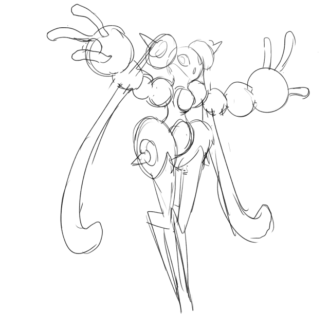
Golurkyourself I think the design is very interesting and could turn out to be a interesting take on a starter! While the electric attribute is present on the design there needs to be more plant elements to it. I recommend making the long ears into sundews, would serve to be practical in flavor and would fit well into the design maybe they could be secondary arms for it! I'm guessing the orbs linking the arms are made of amber, maybe you could lace some vines so it would show how it's connect! The legs are obviously shaped like typical lightning, but maybe at the end of the point of the lightning you could add some roots to serve as toes or a heel for the design. Hope you find my opinion helpful for your design!
- Status
- Not open for further replies.