Don't worry, Kadew - I'll remove the background in my final submission.
-
The moderators of this forum can be found in the CAP forum staff directory.
-
Welcome to Smogon! Take a moment to read the Introduction to Smogon for a run-down on everything Smogon, and make sure you take some time to read the global rules.
-
Congrats to the winners of the 2023 Smog Awards!
CAP 4 Pre-evos - Part 2 - Art Submissions
- Thread starter jas61292
- Start date
- Status
- Not open for further replies.
All right, I'm just about ready for my final submission, but in the meantime, here's a bit of prevo-to-prevo interaction!
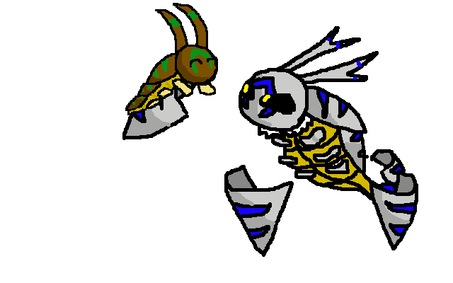
Enjoy!

Enjoy!
THIS IS NOT MY FINAL SUBMISSION! This is some reasoning.
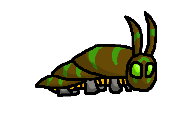
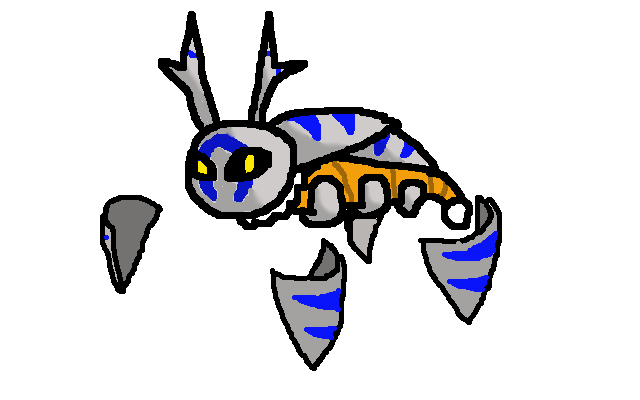
And now, my prevos' story:
My bronze caterpillar is a happy, friendly, playful baby. Its protective plating sheds tiny particles so much that it can use Shield Dust. Its antennae can read the emotions of others, and its presence can comfort anyone.
As my caterpillar evolves, it turns from bronze to silver, and its psychic powers are enhanced considerably. It can now levitate a few feet from the ground, and, employing its own psychic-magnetic field, it can control the four pieces of its sloughed-off armor as it would a part of its body. They serve as its legs, since its real ones are now vestigial, and it also uses their sharp points in combat. It can also "feel" the emotions and thoughts of nearby humans and Pokemon, and people near it feel a sort of otherworldly presence.
When it evolves into Aurumoth, the last of its plating falls off and turns gold, its body floats upright, and it is able to fly, and do whatever else Aurumoth does. I have also slightly deviated from the traditional larva-pupa-moth chain.
So I've been working on that middle-stage and can't decide which way I want the, uhm, wings (?) to be placed around the body, so I'll just post my sketches and hope for feedback


The concept of the second stage is a maturation of the small larva you can go visit on the last page, meant to protect the gem it used to be dependant of. Yes yes, you guessed, the gem is the same you can see on aurumoth's abdomen. I pictured that gem providing energy/psychic powers/whatnot, helping CAP4 survive during the first stages of its life.
As you can see, the wings CAP4 developed when it evolved can be used either as protection (mainly to prevent the gem for breaking, as it is the source of psychic abilities, much like Spoink's) or locomotion, which I'm not sure I want to include considering the fact that most second stages of a three stages bug type evolutionary line are meant to be a cocoon. But people here seem to be a bunch of hipsters and prefer not to take this route, so IMA LET YOU DECIDE.
@Eol: I would go with enveloping the gem+wings. While I prefer the image using them as a wall, it doesn't appear as synergistic with the other evolutionary stage you made and aurumoth.
@Umbreons: I would suggest thinning out your middle-stage a bit. It and the first stage appear to have similar body size while Aurumoth looks ridiculously skinny in comparison. The middle-stage dropping a few pounds would give the evolutinary line a bit more progression.
I don't have much to add to the other entries other than they appear to be coming along well, but that isn't really feedback.

I haven't been working on art much, since I've been busy, but I felt like I should update with what I drew half a week ago. Because of size limits and my odd, 2-1 proportioned caterpillar-stage drawing, I decided to put the design in a different pose to fulfill them. There's a slight change in proportions in here as well, perspective aside.
Comments:
- Eol: Your first stage reminds me quite a bit of Calad's designs in cuteness. :) It brings out the Psychic aspect of the design, though there is less of the Bug-type in there compared to other designs. That may be good, seeing as trying to make the design look bug-like is common among most designs, and yours would stand out from that perspective. The secondary stage, even though it's only a sketch, seems neat--sentry-like, I'd say. I'm just concerned over the folded abdomen and how that would look.
- Umbreons: Your latest designs, I must admit, are mini-Aurumoths. With evolution comes variety, instead of multiplying wings and growing a shape. Your first first-stage designs was more distinct with the wing-shells, though, hmm, the second stage is tricky to find a design for without looking too similar to other designs.
- Kadew: Oh, hey, you're using my idea, whether you knew that or not. o3o Puffy chest on the cocoon can bring out a bit of pompousness, which is nice in bringing together the entire design.
- The Steam Punk: Your designs seem okay, but your art needs a bit of sharpening. Your drawings are rather crude in line and shape, so may I suggest to make the curves smoother and fuller? The first pre-evolution has a bit of a flat face, and I am confused about the pose of the second stage. I understand that my caterpillar is not so bronze-y/coppery, but it'd replicate Kadew's or be too similar otherwise. :/ Would you have any unique suggestions? An additional note: you don't decide on height/weight for the pre-evolutions.
- CBMeadow: Whoo, personality in your character, even if that translates to punkishness more than half the time. Is it just me, or does it have longer fur than Aurumoth's? Is that intentional? :P Either way, I do like the difference you made in the middle-stage line, as it's a difference between first and last without going for the cocoon.
Thanks for your review, Quanyails. I was also concerned about the fact the first-stage didn't look bug-type at all, so I reworked it - needless to say, I wanted to change a bunch of things. First of, I changed the appearance of the mouth (well, actually, I removed it completely) to make it look a bit more aurumoth-like, and I changed the color scheme in its entirety to give it a beetle-y feel. Re-did the shading as well.


Eol: Cute as ever, but the color scheme doesn't work for me, stick to the old one IMHO. And I still would like to see a concept with the eyes open.
That said, as far as stage 2 goes, I think wither the wall, or the gem+wings are the best bets. Kind of a blooming flower thing going through the stages with the wings.
On a side note, do both stages have to be done by the same person, or are we voting on them individually?
That said, as far as stage 2 goes, I think wither the wall, or the gem+wings are the best bets. Kind of a blooming flower thing going through the stages with the wings.
On a side note, do both stages have to be done by the same person, or are we voting on them individually?
So I whipped up this quick design of the 1st stage evo. Still running through ideas of the 2nd. This is not my final submission.
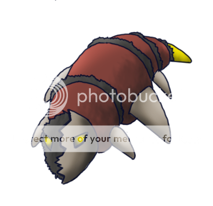
Whenever I look at Aurumoth it looks like it's wearing a voodoo mask to me, so I went with that - the 2nd pre-evo will have more of the mask, and then Aurumoth has the full look.
Although I get the impression that a lot of people like the cute pre-evos, I don't do cute so well so I stuck with this.
Personally, I think my colour scheme is really letting me down, any help?
Juicy Fruit: I understand what you mean. To me, your prevo looks more like Bug/Dark type than Bug/Psychic. Maybe, you could lighten up the color scheme a bit; maybe replace the black with something softer? Also, the face doesn't remind me of Aurumoth in any way, so consider that.
I'm in the midst of revamping my first-stage prevo... If anyone knows whether taking back a final submission is illegal, let me know. If it's perfectly fine, then I'll have hand-drawn drafts of my prevos up very soon.
It is perfectly fine to change your final submission. You can only have one final sub, but there is no reason you can't change it before this thread closes. Either edit your previous post and remove the final submission tag or just change the images when you have your new ones. There is still a decent amount of time left for people to get art in, so feel free to make some changes if you want to. The stats will likely go to a vote tomorrow, and then after those polls, which could take a few days, I will likely post a 48 hour warning for this thread. So yeah, if you want to change your art, just edit your previous post.I'm in the midst of revamping my first-stage prevo... If anyone knows whether taking back a final submission is illegal, let me know. If it's perfectly fine, then I'll have hand-drawn drafts of my prevos up very soon.
Also as a general note, if no one has posted since your last post, it is prefered that you edit your previous post rather than posting twice in a row.
@The Steam Punk: You can always edit your final submission post when you feel your design is complete.
---OKAY. So I think my First-Stage designs are done, however I have to choose between four (hurray for democracy). I'm just gonna go ahead and post them all, wait for critique and choose accordingly.


I have to say I'm pretty satisfied considering I just began tablet-drawing, but personally I feel the blue color palette is the best to me, as it really stands out and gives it that insect appearance the white one lacks, as well as looking swell along with the secondary colors.
But IMA LET YOU DECIDE.
EDIT: Considering its ability is supposed to be Keen Eye, it would effectively be smarter to go with the eyes open, but if flavor-lovers out there don't mind, eyes closed with keen eye as an ability would be pretty awesome to my taste.
---OKAY. So I think my First-Stage designs are done, however I have to choose between four (hurray for democracy). I'm just gonna go ahead and post them all, wait for critique and choose accordingly.


I have to say I'm pretty satisfied considering I just began tablet-drawing, but personally I feel the blue color palette is the best to me, as it really stands out and gives it that insect appearance the white one lacks, as well as looking swell along with the secondary colors.
But IMA LET YOU DECIDE.
EDIT: Considering its ability is supposed to be Keen Eye, it would effectively be smarter to go with the eyes open, but if flavor-lovers out there don't mind, eyes closed with keen eye as an ability would be pretty awesome to my taste.
Thanks, Jas. Wild Prevos should appear soon!
Here they are, as promised!
I give you, the first sketches of my redesigned LC prevo!
Prevo #1
Now, my larva is a child that really wants to grow up. Since it can't levitate yet, it suspends itself from tree limbs or ceilings with its silk to emulate the effect. It can still sense emotions with its antennae/horns, which are quite sharp (allowing it to use Megahorn). It is almost completely covered by its bronze plating, since without it it would be too vulnerable. It sheds metallic dust constantly, letting it use Shield Dust.
And here are some new sketches of my NFE!
Prevo #2
Its design and traits haven't changed. The sketches are different viewpoints of the same Pokemon. For those of you who don't quite get its pose/movement, think of it moving and standing like Yilx's mummy-scorpion from Aurumoth's art poll.
My new final submission will have refined, color images of both.
So, tell me what you think! Be honest.
Blue, eyes-closed is by far the best, Eol. So adorable. Though personally I preferred your very first one (white with purple accents instead of red and the different mouth). You might also consider making the "pearl" a more amber color. That way you can do the Bronze-Silver-Gold development everyone seems so keen to have. But I'm really excited to see your second stage!
I guess I can give feedback:
Okay, that's it.
TheSteamPunk:First of all, I love the concept you have with the first prevo (coughkadewcough), but the main brown colour is sickly and should be changed, preferably to a bronze colour to use the bronze->silver->gold. Your second prevo looks a little awkward, and it seems like you've just added Aurumoth's wings onto your first prevos body, bar a few minor edits. Sadly, this is an art contest, and so your prevos need much more detail. Your lineart is thick and edgy, and more definite shading is needed. Also, rather than making new posts, I'd edit in some of your older posts, as Jas said, especially if nobody has posted since you last posted. You've already posted a ton of times on this thread, which is unnecessary.
Eol: I'm lovin' the concept at the moment with your first prevo. It's very unique and looks lovely. Your sketch-esque art is also beautiful. Regarding your first prevo's colour scheme, I dislike both options. I'd look at Aurumoth's colour scheme and then take ideas from there. The blue option makes your prevo look like a ghost or dark type, whilst your white option is too bright and doesn't make sense for an Aurumoth prevo, especially those red bands. I also love the current look of your second prevo. I too suggest that the enveloping the gem + wings is the better choice, although all look great.
Juicy Fruit: I think you should stick with cute haha. Aurumoth doesn't really fit the "evil" bug look which your prevo shows, which also makes your prevo look ghost or dark type. I also dislike those legs; I don't know what they're trying to represent. I'd choose a lighter colour scheme, and a major rework of your submission, since I don't really like it at all. Sorry if I appear too harsh.
Quanyails: It's looking fine at the moment, but some work needs to be done in terms of art and perspective. The furry hest doesn't look furry, and so some extra detail would be nice to show its floofiness. I also don't get the perspective of its head. If you haven't realise, when your prevo is on the floor without propping the top half of its body up, it seems like the eyes and face would be looking downwards. I can't really imagine the prevo moving its head at all. due to the fact that you've given no room between the head and floofiness for a neck of some sort; it seems a bit stiff in that sense. Regarding your second prevo, it seems a little too... evolved? Like you'd expect a final evolution to be. It's also quite plain, and so I'd add some patterns on the shields. :P
Kadew: I absolutely love it. Your first prevo maintains cuteness (and floofiness) which works well and loks great (I'd keep the coloured tip). I also love the look of the second prevo, although I'd try adding Aurumoth's "stinger" onto the bottom of the cocoon, and seeing what that does. It might not work, but I'd give it a go. I also love the progression you've given your prevos, colour is utilised well, and whilst hardly original, the bronze->silver->gold colour scheme is great. Yu're definitely a frontrunner!
Koa: Ah Koa, I'm not really a fan of yours. The first prevo just doesn't make any sense. I have no clue what those little "fang" things are on the face, or why there are extentions of the fur, which look like it could possibly be an extra set of hands/arms. I don't like the pink body, or the human-like eyes. I also don't understand why the "antlers" are shaped like that. Your second prevo, by comparison is much better. I'm still not a fan of the antlers though, and I do agree that it looks a little too evil for an Aurumoth prevo. I also don't understand why you've added cyan/light blue parts all over your prevos, when there's none featured on Aurumoth. The stingers progress from light blue, to light blue, to yellow, which doesn't make any sense.
CBMeadow: It's a real shame about the abilities, since I adore your prevos and the fact that you've strayed away from the generic moth evolution process which we see so frequently in pokemon. I don't have much to say... I absolutely love it, but the abilities are very restrictive. I liked the agile look of your sketched second prevo, whilst your coloured version seems a little more bulky.
Okay, that's it.
After waiting on feedback ill go ahead and make changes to my designs, by redoing them altogether. Although I did want to clear up a couple things about the first form. Namely that I took it in a more biological and organic direction than Auromoth. Being larval, I wanted it to seem young and alive, as opposed to the more mature and hollowed Auromoth. This explains why it has fangs and such, so it can feed and grow into its next stages. I will admit the eyes looked wonky though.
As for the general body shape, no it isn't curved upwards like that, I just drew it in a rearing pose, like some caterpillars do. The appendages in the fur are forearms, though not expressed enough.
I'll take a different direction with the redesigns and maybe instead of referring to it in an organic sense, I'll try a spiritual one to reference the celestial nature of aurumoth.
Ahh no! Yours were probably my favourite KoA, especially the second stage. The first stage I thought was very cute and adorable, although I agree that the eyes looked a little funny. I also didn't like the front legs which were oddly the same colour as the fluffy bit. The concept of Life>Death>Rebirth was excellent though imo and if you just edited your first stage slightly it would have been great.
Well, I did some tweaking to both stages, and even did a quick alternate form.
I edited the caterpillar by changing the eyes and making the forelegs separate from the fur. I also made the body a more rusted silver color.
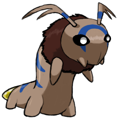
Now compare that with the alternate form here:
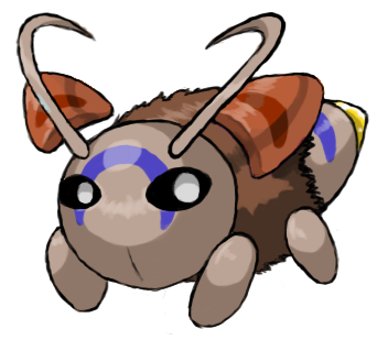
This one doesn't take the larva route and instead just makes it a baby bug. The idea is that the can't upon hatching already tests its psychic powers by controlling pieces of its egg shell for defense. There are two sets of legs and a pair of "wings", which are its egg shells.
Both designs flawlessly evolve into the stage two pupal form, which takes the discarded shell of its previous evolution and uses them as wings. In this sense, it's much like a knight in armour. It uses these shells for attack and defense.

Notice it trades a set of arms for an extra set of "wings". When it evolves into Aurumoth, it will repeat this tend and give up the last set of arms for its third pair of wings. Note that Aurumoth uses its second stage's shell as its wings, just like the stage before it.
So which first stage design should I use? Personally I like the rustypillar, but baby bug works well too for the concept. Also goddam I do not recommend doing this crap from a phone. :(
I edited the caterpillar by changing the eyes and making the forelegs separate from the fur. I also made the body a more rusted silver color.

Now compare that with the alternate form here:

This one doesn't take the larva route and instead just makes it a baby bug. The idea is that the can't upon hatching already tests its psychic powers by controlling pieces of its egg shell for defense. There are two sets of legs and a pair of "wings", which are its egg shells.
Both designs flawlessly evolve into the stage two pupal form, which takes the discarded shell of its previous evolution and uses them as wings. In this sense, it's much like a knight in armour. It uses these shells for attack and defense.

Notice it trades a set of arms for an extra set of "wings". When it evolves into Aurumoth, it will repeat this tend and give up the last set of arms for its third pair of wings. Note that Aurumoth uses its second stage's shell as its wings, just like the stage before it.
So which first stage design should I use? Personally I like the rustypillar, but baby bug works well too for the concept. Also goddam I do not recommend doing this crap from a phone. :(
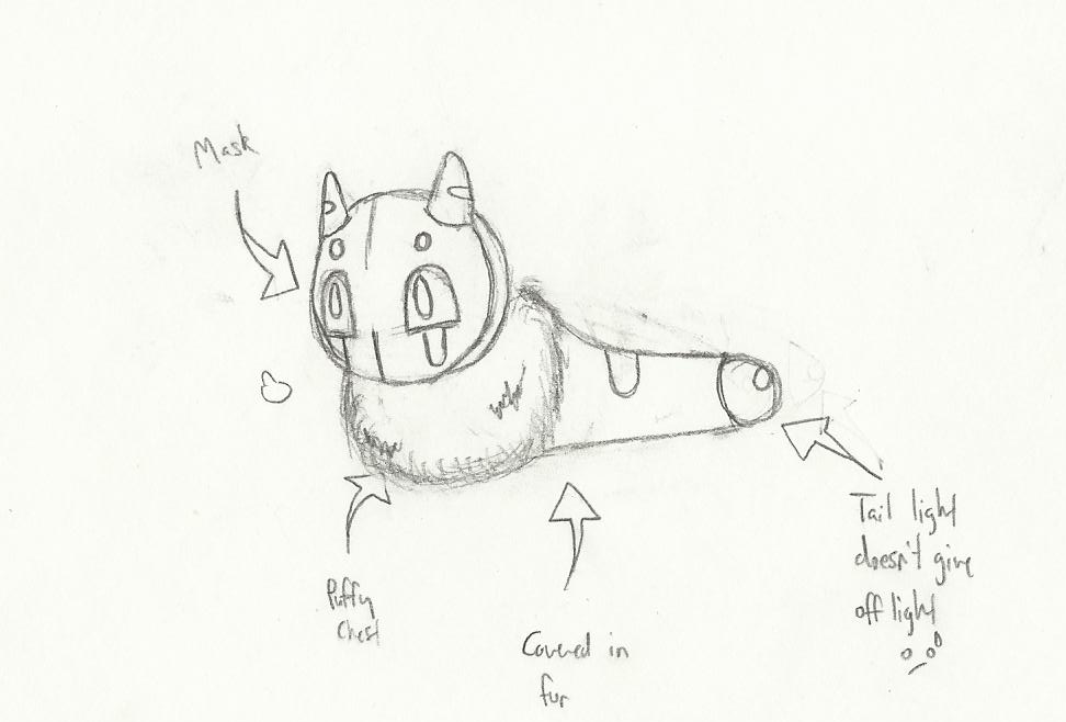
So I'm not hugely artistic, but I had fun participating in the CAP 4 deisgn process and I think I came up with some pretty not bad designs, so let me know what you think :3
LC prevo:
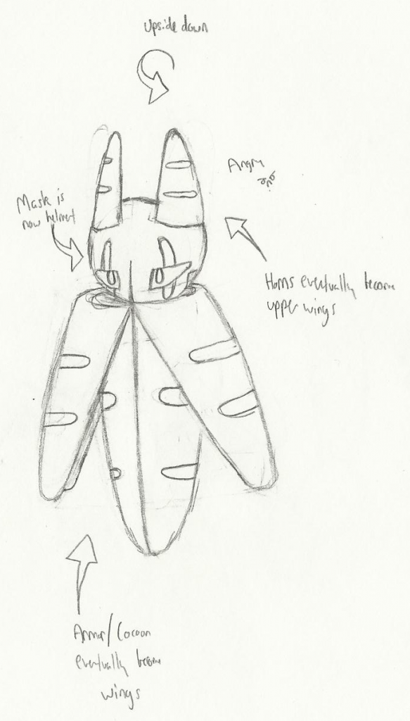
NFE prevo:
Sorry if the lineart isn't as clean is it could be. I spent twenty minutes drawing and then erasing everything while marathoning Glad You Came by The Wanted D:
My prevo's follow the standard metamorphosis line, but I tried to add some different things. Mainly, in the LC form, Aurumoth's ominous helmet is actually little more than a mask, which can even be removed. My thought process was that baby Aurumoths make the masks themselves and wear them in order to be more like their full-grown selves (a-la Happiny and her egg stand-in), but the idea of a caterpillar with no arms crafting such an intricate mask is a little hard to swallow. Also, ignore the sketch-note that says "covered in fur." Originally it was, but I changed it to just having a puffy chest.
For Aurumoth's NVE form, I went with the idea Koa stated in that Aurumoth's wings are actually the shell of it's former evolution, although it's a bit more blatant here. In this form, the LC's mask has become more of a helmet (although if you look closely, you can see it doesn't cover his whole head). I also toyed with the idea of Aurumoth's upper wings being initially part of his helmet, and they detach and float above him at some point in evolution. BTW, if you noticed my sketch-note that says "upside-down," my original idea with the NFE was that he hung upside-down from trees for the majority of this stage in his life, although I actually rather prefer the idea of him floating around better.
COMMENTS FROM SOMEONE WITH DEMONSTRABLY MINIMAL ARTISTIC KNOWLEDGE:
LC prevo:

NFE prevo:

Sorry if the lineart isn't as clean is it could be. I spent twenty minutes drawing and then erasing everything while marathoning Glad You Came by The Wanted D:
My prevo's follow the standard metamorphosis line, but I tried to add some different things. Mainly, in the LC form, Aurumoth's ominous helmet is actually little more than a mask, which can even be removed. My thought process was that baby Aurumoths make the masks themselves and wear them in order to be more like their full-grown selves (a-la Happiny and her egg stand-in), but the idea of a caterpillar with no arms crafting such an intricate mask is a little hard to swallow. Also, ignore the sketch-note that says "covered in fur." Originally it was, but I changed it to just having a puffy chest.
For Aurumoth's NVE form, I went with the idea Koa stated in that Aurumoth's wings are actually the shell of it's former evolution, although it's a bit more blatant here. In this form, the LC's mask has become more of a helmet (although if you look closely, you can see it doesn't cover his whole head). I also toyed with the idea of Aurumoth's upper wings being initially part of his helmet, and they detach and float above him at some point in evolution. BTW, if you noticed my sketch-note that says "upside-down," my original idea with the NFE was that he hung upside-down from trees for the majority of this stage in his life, although I actually rather prefer the idea of him floating around better.
COMMENTS FROM SOMEONE WITH DEMONSTRABLY MINIMAL ARTISTIC KNOWLEDGE:
Kadew: Nothing that hasn't already been said before; you're LC is adorable and you NFE is very well done. I especially like how you did his puffy chest beneath his armor; I don't know how to describe it, but he looks like he's wearing clothes of some kind, so that's adorable/badass all at once. I'm not sold on the idea of having two different specialized shells for offense and defense, since I feel like it's kind of pointless asymmetry, but I'll let you be the judge.
Quanyails: I much prefer your new LC to your old one, as I'm pretty sure everyone does, and I really like the knight theme going on with your NFE. Not much else I feel I can say about it; keep it up and show us some more of your NFE sometime :D
Eol: I love how you approached the bug concept from something other than a caterpillar, which has been a pretty popular idea so far. Making the primary focus of his design the light is also pretty cool. I much prefer his blue design to his white one, but I found that it makes him look hauntingly creepy with his eyes open. That's not a bad thing, mind; I just want to make sure it's something you intended with your design. Cute-but-creepy Pokemon are always winners to me.
The Steam Punk: Your LC is adorable, and the notion of him suspending himself from tress with silk to imitate levitating is very creative and well done. I'm not quite as sold on your NFE though; you incorporated the psychic flavor nicely by having him walk around on his levitating shells, but using those shapes as legs just doesn't feel natural to me.
Koa: The new eyes look much better :3 As far as design goes, I'm not sure if I care for either of your LC's just yet. The baby bug just seems kind of bland and the caterpillar still seems kind of awkward in that stance. I feel like the perfect LC is resting somewhere between those two points, however. Maybe if I could see your LC in different positions other than "reared-up," I could form a better opinion. I do like the fact that you didn't make your prevo "cute," though. He looks like something alien, and I think that works pretty well with Aurumoth's mysterious nature.
CBMeadow: I feel like I've said this a hundred times by now, but you LC is also very adorable. Kudos for not doing a metamorphosis line, by the way. I think your NFE lacks a bit of personality though, if that makes any sense. I get he's supposed to be a volatile wasp that learns to chill the fuck out when it evolves, but his design really doesn't go much farther past "Aurumoth, but angrier and silver." He looks too much like Aurumoth is what I think I'm trying to say here.
Hello everyone. With the stats poll having just concluded, it is time to start wrapping up Art Submissions. We are in no major hurry and I want to make sure artists can get in final submissions if they want to, but at this point I am going to put up a preliminary 48 hour warning. If it becomes aparant that we need more time for people to get in their submissions, then I will not hesitate in extending this, but I'd like you to try and get your final submissions in within the next two days if possible.
Final Submission (It is legal, I hope?)


Comments:


Comments:
- Eol: Ah, I admit I'm not too fond of blue, but I do like the added similarities to Aurumoth. I like it and it's quite adorable! :)
- Juicy Fruit: Hmm, spooky, and quite a distinction from the sacredness that is Aurumoth. It could creep under your bed and nibble your hair while you sleep. I see the design as fine and enough of a deviation from Aurumoth without being too overly so.
- The Steam Punk: Ah, I like your reasoning for the first-stage design, though I do wonder if it detracts from the psychic-ness of it. As for the second stage design--if you can make it work, do so! I'm rather uncertain as to if you will be able to, though. Prove me wrong. :P
- Eagle4: I am but a standard to which other people determine their own designs around. Always the example, but never the result, as I've said. I suppose I encourage others to be creative with their designs. Other than the short discussion on IRC, I'll be stubbornly keeping my designs. If you dislike them, well, that's what other designs are for!
- KoA: Hmm, I like both pre-evolutions; the first for its difference compared to other designs and caterpillar-esque-ness. The second shows more of the psychic typing with the floating bronze/copper bits and provides the lure of cuteness that will be sure to entice voters. I provide no advice to your decision. The second one fits well again in my book. :)
- RabidChipmunk: The first-stage design is quite a standard design, though the abdomen looks quite skinny and inorganic-looking. Standard designs are standard--works well, though not outstanding (like mine, so I'm not trying to deprecate your design). I definitely encourage you to make a final submission, if mostly for your second-stage design having those wings as a cloak. You've managed to pull off the sage-like look very well!
OK, here is what I have for the middle stage. Critics are appreciated!

Oh, and some comments:

Oh, and some comments:
Amazing. Your artwork is clean and looks great and unique. The only thing I can see being a problem is the second stage looking kinda steel-type, but other than that your work is irreproachable.
The new approach for the caterpillar definitely helps, and it actually looks much better than the other one. The middle stage looks as good, with the long antennas, the only thing I disliked about it, being gone.
Impecable. Hurry and make your final submission!
Gonna jump on the bandwagon here and admit your design seems too dark-type to my taste. The overall design alos looks kinda bland compared to the other ones displaying colourful patterns, antennas and other cool stuff, but that's just me. The mask concept, though, is VERY interesting, and if you can play with that on the second stage, you'll definitely earn bonus points.
Your new LC is adorable, and the second stage very unique in terms of pose and concept. What you need to work on is the actual drawings, with thinner and smoother lines being a thing to incorporate. Other than that, the color palette is great and the sketches beautiful.
The first stage is awesome, unique and skillfully drawn. The second stage, on the other hand, is way to close to Aurumoth in terms of complexity, and needs editing. It is beautiful, though. Just too evolved.
Thanks, Eol!
I'm making high-quality images of my prevos for my final submission, coming soon!
I'm making high-quality images of my prevos for my final submission, coming soon!
- Status
- Not open for further replies.


