
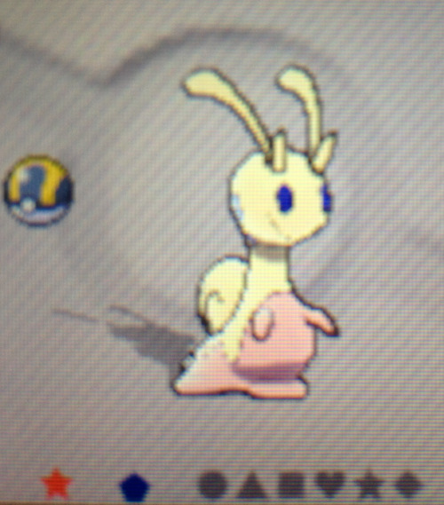
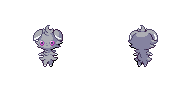
Not only that, but the eyes seem a bit too large. Also, the base of its antenna things should be slightly thinner.Also, took like a half an hour earlier and made this, the eye seem a bit dark:


-
Welcome to Smeargle's Studio! Please be sure to review the studio rules. Feel also free to check out our hub to learn more about this place!Welcome to Smogon! Take a moment to read the Introduction to Smogon for a run-down on everything Smogon, and make sure you take some time to read the global rules.Congrats to the winners of the 2023 Smog Awards!
Sticky X/Y Sprite Project
- Thread starter Layell
- Start date
I didn't change the eyes at all from the sprite I found on the sprite generator.Not only that, but the eyes seem a bit too large. Also, the base of its antenna things should be slightly thinner.
I was talking about fletchinder, not fletchling, lol. I'll see what I can do about it.Axl said:What're you on about, man? You still did over half of the animation on Fletchling as far as I can remember, so your name will definitely stay on the chart.I did a quick change on Pyroar, made two if it's like pointy flame thingies sharper and changed the eye color, it was too bright.
Old:New:
EDIT 2:
Also, revamped the Phantump's colors and tried to make tail "wispier", also made the brown less orange-y and made the eyes paler.
 Last edited:
 As a note to random newcomers and Chesnaught: please avoid cluttering the thread with shiny versions of sprites that aren't ready for animation. Check the chart to see what's ready.princessofmusic , yes, I'm sorry, got a bit carried away, I'll just save them for when they're ready. Thank you~
So, wait, according to the chart a few things are unreserved, I'd like to reserve a few things for when it is at the process for which I may post them:
- Mega Alakazam (lol, I just made one, won't post it until given the nod of approval though)
- Goodra
- Sliggo
- Carbink
- Noivern
I will delete my posts containing these, only will post things I think should be edited from now on.
But, when would be the right time to post these?
Did a QC for fletchinder. Sorry if I ruined it, PoM xD May/Will need improvement. More QC is appreciated. =D
Animation plan- Make the wings flap up and down, like the animated model seleccion supplied.
aXl - I said fletchinder, not fletchling. I've hardly started animating it. =/ May do it now, but can't spend too much time
princessofmusic - Your QC is nice but the aromatisse backsprite looks too straight... it would be nice if you could perhaps tilt it clockwise a bit.
Nice job on that froakie! But I kind of think it should have part of its hand show as well. Maybe just the fingers. Just because if you look closly at the front, his fingers do extend a bit further than his bubble cape. Also having his fingers would avoid it being another "pangoro" with it not matching up completely.The sprite is finished, and syncronyzed, but i don't know why they jump in different time when i post it:


Anyway, I'll get florges and klefki finished up maybe today sinceI got big breaks in my schedule with nothing to do (for now at least)So much for that idea lol :sLast edited: I'll be making some more comments on shiny spites in a bit. That said if anyone here would also like to help with sprites on PS in another capacity please check out this thread: https://www.smogon.com/forums/threads/3498398/
I'll need lots of help there too, if you know your way around a pixel art program I'd love your assistance with that project.Hi... I've been lurking this thread for a while. I am a spriter, but still an amateur. I can't animate for crap, but I can help out. I mostly do Gen III style sprites, for a hack I'm making.
Anyways, the main reason I came here right now is that while I was creating a UU team, I noticed that Mega Blastoise has a slightly different design when he's shiny.
The Normal one is looking to it's right, full on, but the shiny one looks like he's looking at his opponent. Also, the large blaster on his back on the shiny one has a slightly larger firing-hole. The shiny one just looks like it's head was fixed a little bit before changing the palette.
So basically, I'm just reporting an error. Personally, I prefer the shiny one's figure. I would fix it myself, but unfortunately I don't have access to my program right now.
Ok my small note on shinies in general
1. There are probably a few small changes in shiny vs normal sprites, mostly because we keep editing them and in the past I've thrown up random shinies, I don't do this much any more.
2. Reserving shinies is the least important thing. For most shinies I can make them in 5 minutes.
Your best opportunity to get a shiny is probably once something is approved for animation and I haven't already needed to edit it to make it 'shiny ready', so that it's a perfect palette swap.
What do I mean by making something shiny ready? Well:


Explanation: These are exact palette swaps that I made to ensure that animations can be recoloured by computer rather than by hand. I had to play around with the main sprite and remove a few random colours to make it work. They are also exactly 15 colours. These are the kind of recolours I need really.
Also princessofmusic I'm going to approve these, you should take a look at them now too sometimes, we have eager animators ready.Last edited:
Finally they are almost ready! :D Got such a great idea for heliolisk. Anyway, heres the shiny tyrantrum you asked for.
I'm aware that theres a chance this guy's sprite might need to be fixed but if its unavoidable, dont let my animation stop you. Just would take a while to reanimate though.I noticed something odd about Helioptile, and I just couldn't put my finger on it, but, I soon realized that maybe this pixel shouldn't be there and edited them:


It seems to be a leftover pixel on the left ear, I removed it from this picture. Anyways, I'm asking again because I am very curious, when should I post the shiny Sprites I have worked on?Well, apparently living in the southern United States isn't all hillbillies and moonshine. Turns out a 30% chance of less than an hour of snow on a 40 degree night did what approaching zero polar vortex temperatures couldn't, which is causing the local school board to panic and give us a free day off tomorrow. In case you guys couldn't tell, snow is about as rare as finding an actual unicorn down where I live (I think I've seen snow three times in my entire life), so when it actually comes up everyone loses their minds and gets into wreaks due to a lack of experience. Go figure.
Personal good fortune aside, I come bearing updates. First let's start with
Noivern
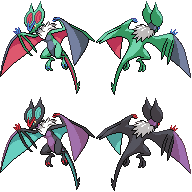
Did a few seriously minor edits to this thing, as the current one looks pretty much complete.
-Smoothed the frontsprite's right wing and right wing fins out a bit
-Editted the shading a smidgeon
-Made the frontsprite's right wing claws a bit longer
And that's it. I also threw together a quick shiny pallet because why not.seriously neon green and blood red what is this gamefreakBut yeah, great work, princessofmusic . +)
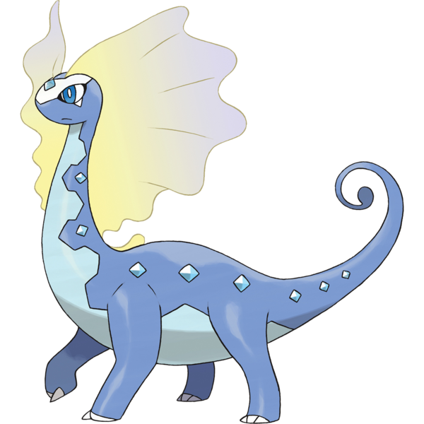
Aurorus
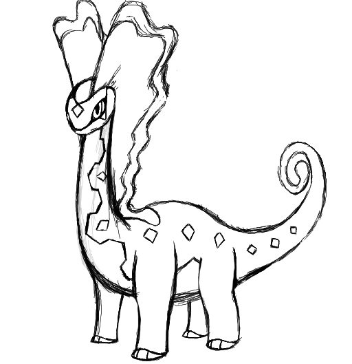
3DS drawing software is both a cheap and simple solution to not having a Cintiq lol.
wow I actually drew something I haven't done that in months
But yeah in all seriousness I decided to finally sketch out a pose for Aurorus. This is just to scout and see if people are cool with the proportions/positioning before I use this as reference for the new frontsprite. In terms of proportions, I'll probably do most of the fixes during lineart phase and from that point on it should be smooth sailing. But yeah, if you guys like the pose and all, just give me the all's-clear and I'll start work on remaking the front sprite.(oh golly a scratch sprite I haven't done one of those in weeks just the thought makes me excited)
Aside from that, if Gourgeist XL is cleared, I should be able to start making the other sizes over the weekend. In addition, I'll see if I can't do my earlier promise to fix Mega ChariXard's wings at long last, and I'm also reserving QC for Espurr, because it doesn't look mentally scarred enough.
So yeah, Sláinte!
EDIT: Yeah, totally editing Espurr.
 Last edited:
 Happy birthday, Legitimate Username! Oh wow, you remembered, thanks!
Anyways, I did some Zygarde edits.

This is a redone version of Noscium's, with the colours and shading patterns of Seiku's. I figured that the ideal sprite would take the best of both versions, so gave that a try and I think it came out pretty well. Of course, the real challenge is making a the backsprite, but with the available references, it should be manageable.
Also, I did some minor work with Aegislash again.


I finally fixed the blade forme's left hand, and made some other minor pixel changes here and there. I'm reluctant to call it 100% done given how many edits have gone into this, but I'll have to say I'm pretty happy with it.
EDIT: princessofmusic, yeah, I noticed the colours got a little messed up for reasons I can't entirely understand. When my computer decides to stop ruining them I'll get it fixed. Also, Zygarde not having the green hexagons on the tail is intentional, they shouldn't be visible from that angle.
UPDATE: Fixed most of the necessary changes as posted below.Last edited:
Happy birthday, LU!! I didn't know when it was. </3 Did you do anything special?
Chesnaught Reading comprehension aside, I don't understand the edits you made at all. They don't help Noibat look more accurate. Also, the image editing software you use seems to automatically change the colours of an image when you save it.
To answer your question, it's nice that you want to contribute, but as Layell said: he/anyone can do them in five minutes. In fact, he's the best person to do them, being the one who uploads them in the end. If you're absolutely hell-bent on putting together shiny versions, it would be best to do so after the sprites have been approved, or even better, if the animations are done but there are no shiny sprites.
aXl It's a gorgeous sketch. I'm wondering whether the style and anatomy are spot on, though. I can draw, but there are three reasons I don't for this project:
- My scanner hates me/I have a tablet too but I'm lazy
- I'm worse at drawing Pokémon than people
- I can't draw Pokémon in the official style
Finally, I'll just leave these here.


I changed a few details and made some of the colours better.
First off, let me begin by saying thanks for the compliment. +)aXl It's a gorgeous sketch. I'm wondering whether the style and anatomy are spot on, though. I can draw, but there are three reasons I don't for this project:
- My scanner hates me/I have a tablet too but I'm lazy
- I'm worse at drawing Pokémon than people
- I can't draw Pokémon in the official style
Anyway, I probably should have linked my references for the sketch in my original post, so I shall post them below to account for that. This is something completely different than my usual output, so it's certainly worth more explanation than my usual stuff.
These references were the ones I used as guidance on proportions and the like. I studied them intensely while I was sketching this, so most of the proportions should be relatively correct. However, as I have been known to screw up proportions to some extent in the past, I figured I'd post asking for checks just to be safe. For instance, in the final product, I plan on adding a pixel to the height of the sprite's neck, as I think I made the length slightly off in the sketch. As for style, as long as its relatively similar to the official model/art and I continue to use these pictures as references as I sprite Aurorus out, the style should largely blend in with the rest of the sprites made here. But the references are important for a few other reasons in regards to the pose I wanted to create.
Notice how in the in-game model, Aurorus is literally facing straight ahead. In the sprite, I wanted to display most of Aurorus's length while still displaying both sails on top of its head. I could have turned it to face the typical angle, but then foreshortening would have messed with the body's proportions. If I had kept the camera at a broad angle, then it would have been facing incorrectly and the background sail would have been concealed more than I'd have liked. In addition, the ingame model has its neck bent down somewhat, which is something I thought would look weird in sprite form. Likewise, the Sugomori artwork suffers for having weird sails and some oddly bent legs, so it was also off the table. So I instead decided to opt for a pose that was still a broad-frame shot, but with Aurorus's neck facing slightly to the side in order to better display the twin sails.
I really should have posted all of my reasoning for this in my original post, so I apologize for that. I know for a fact that the toe-claws are whack in the art I drew up, I just kinda threw them together mainly to denote facing and mark about where they should be on the sprite. Aside from that, the legs are were primarily based off of the ones featured in Reference 3. The head is something that I do plan on messing around with in the sprite, but I feel in terms of facing, it's not at that bad of an angle. Funnily enough, there are actually a few pokémon on this very page that share a similar angle. But yeah, I'll toy around with it until I get something I like.
Hopefully this addresses everything I missed as well as some of your comments, princessofmusic . +)
Sláinte!
Ok finished up editing klefki's back animation along with (hopefully) making sure there was no extra colors left behind. Still have no idea where those extra colors came from but I deleted them and also made sure that weird shading on the copper key doesnt show up. Now for the change, I made his ring not juggle quite as far but I dont think it made all that much of a difference. Ah well. Its still something.
Next up to edit, florges. But that aurorus tho. nice drawing there axl!Ok now unfortunately, both my computers burned down (long story how), and I can only buy a new computer after my final exams, which are in march. =/ I'll no longer be in this sprite project until mid-march.
So princessofmusic , I wanted to ask for more time to finish that fletchinder (only that) if you don't mind. I finished around 7 frames of the animation, and it looks good so far imo. Sorry I can't post it =/
Typhlito I did it

You now have one colour to make the open mouth, considering how many colours are shared here among everything I may also suggest you utilize a separate coloured version for animating.
This is all assuming of course princessofmusic approves this of course.
Not to outdo myself I did some fixes on axl's clawitzer (noivern will probably be next too)


I did a bit of cleaning as well as taking out one yellow and adding one black to better give the backs some depth. Other spriters feel free to pass me some feedback, I'll be ready to set this to animation level soon.
Also remember when I said Noivern? I lied.
We could use some more cleaning and maybe shiny checking, I might hit this up later.Last edited:Sorry to bother you, but is it okay if I can help out a little bit? I pretty good at cleaning up, and I sort of feel bad that I'm sitting back and watching all of you work and I'm not contributing at all. Unfortunately the only samples I have for this is this one I did for Lucario a few months ago, because I was making a Pokémon Ruby hack, and I was putting Lucario in it, but I wanted it to look more like the up-to-date version, and look like the gba palette.
< D/P moving sprite< My version
(Please excuse the purple box; When I tried to remove it, it messed with the border colors)
If there's any way I can help out at all, please tell me, because I would really like to be of any kind of helpHi everyone. I can officially say I did one of the four things I said I'd do this weekend. Tbh I knew completing two was probably going to be my limit, but I was kind of hoping I'd have some progress on one of the other three. Eh, w/e. I blame Normal Boots coming back online.
ESPURR QC TIME
Old:
New:
So, let's talk about Espurr.
-Now taller, and more proportionate to the ingame model as a result.
-Colors brightened in order to make him "pop" some more.
-Eyes now peer into the trainer's soul as they should. (aka increased the contrast and made them contain multiple shades. Mouth also moved to proper location between the eyes, which actually makes the expression more eerie as a result.)
-Most tufts of fur redrawn or editted to better match the in-game model.
So yeah, that's Espurr in a nutshell. Curious to hear what you guys think about this guy. Did I get the stare right? Does he look more like the washed-up kitten he is? Leave a comment to tell me what you guys think. +)
So, onto the other stuff before bed.
Siiilver That sucks. I can only imagine how rough my life would be if my computers got wasted, and it's something I'd rather not think about. I hope everything works out better for you in the future, man.
Typhlito Not sure if I ever actually called you out on the new badge in-thread, so I'll do so now. Congrats on the new badge! Aside from that, Klefki looks much better now. I can't help but feel the white highlights on the keyring might be too bright, but aside from that, it looks perfect to me, and that's likely just a nitpick anyway. Great job on the animation, and I look forward to seeing what you do with the Helio line.
Speaking of the Helio line, Layell I think it looks pretty good at the moment. I wanted to point out that on Clawitzer, it looks weird to me now that its whiskers don't end in points in all cases barring the back left whisker. I'd file those back down a bit, as it just looks weird to me knowing that they're supposed to end in points. Also, not sure if this was intentional or not, but the Shiny Backsprite has an extra dark shade on the blue compared to the shades of black on the regular sprite. Barring those issues, the new edits look fine to me, and the shiny looks very classy as well.
I think I may edit Mega Aggron's tail outline a bit more, as having the outline be all one color makes it seem a bit flat in some areas. I'll need to crosscheck it with the base sprite for reference on that, but it just seems off to me right now. I can tackle that on the two-hour drive back home tomorrow likely.
Also, princessofmusic , I said I'd do Noivern edits to the claws and colors a bit more, but that ended up going south after I realized I had spent an hour and a half messing around with the same foot and claw with very little progress being made. I decided to move onto bigger things that actually gave me some sense of self worth, and that's why there is an excess of psycho feline and an absense of boombox wyvern in this post. Sorry about that.
(p.s.: In case anyone was wondering why I decided to put on random trance/tribal/idek music instead of the Lavender Town theme remixes you were all likely expecting, it's because I happened to be listening to this band today as part of my journey to listen to one full album from all of the bands performing at the Coachella Music Festival this year. The path to music discovery is a long and arduous one. Wish me luck, I'll probably shoot myself once I get past the headliners. Maybe before then if the hip-hop/rap gets lower than OutKast was willing to go)
Last but not least, I wanted to get a final call started in regards to both Gourgeist primarily and Aurorus on the side. In Gourgeist's case, I feel it'd probably be better to get any QC concerns out of the way before I resize this thing three times, as it creates less work down the line. I'd like to get an OK from as many people as possible before starting it, and now is definitely the time to bring up any concerns you may have regarding her. For Aurorus, this isn't nearly as important, but if anyone else has any proportions issues or the like, I'd like to hear them now so I can take them into account when making the lineart. Currently I'm already going to be keeping princessofmusic 's concerns in mind, as well as my previous concern that the neck may be too long. So yeah, any other comments would be much appreciated before I advance onwards. [Compliments are nice too. Thanks Typh. +)]
So that was a near-50 minute post and I'm going to be driving a two-hour trip to the city 8 hours from now, so it's best I get my seven hours of sleep while I still can. Goodnight everyone. +)
Sláinte!
edit: this post took way too much editing to format correctly.Last edited:I tried recolouring Mega Aggron with it's shiny colours, granted the background is black and some colors need to be more darker/lighter then they are now and some pixels might still be grey/black-ish but this is my first time attempting this sort of stuff and I wanna know if it's maybe any good ornot. [url]http://gyazo.com/33441647c73d5eb382015f2f9f0a88be [/URL]
Edit: I also tried to recolour Mega Mewtwo's sprite giving it the more lime green and Y's red eyes. Also alterened the whiteness a bit. If only I knew how to make the background transparant. http://gyazo.com/df4614eecb1bc961d2769ae919d31653 Left is my recolour attempt, right is the original sprite.Last edited:
Yeah don't do gour sizes until we both approve the biggest size for animation, then reduce in turn.
anyways here is a goat.
I fixed a lot of the blacks so they'd work for the shiny, for some reason every mon that goes black > some bright colour has huge shiny problems I wonder why.
I'll probably send in an update now.
more things that should be worked on:
is this too tan now, not enough? Pass me some thoughts.Last edited:Users Who Are Viewing This Thread (Users: 1, Guests: 2)
- ... and 1 more.


