
Please please please please do give me some comments.
Particularly on what you like and dislike about my art.
I accept very harsh critics too (if they have a point.)
Because I AM struggling on figuring out what would be popular and what not, and my recent art is not being popular.
My most recent art:
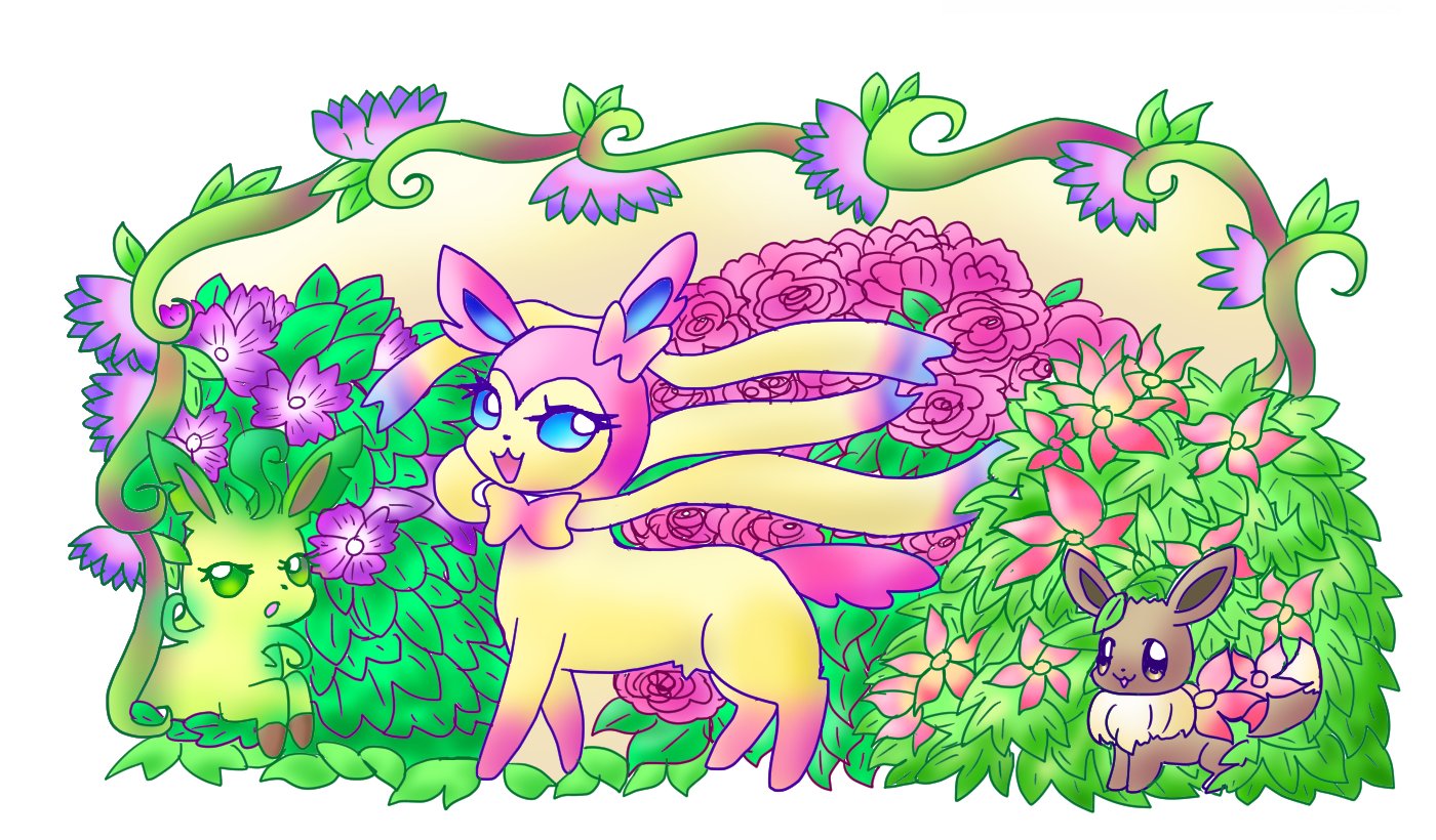
2016:
I drew this "Eeveelution Garden" January 2016.
Program used: Clip Studio Paint (known as Manga Studio in USA)
2015: (openCanvas 5.5)


"Shiny Mega Queen" --- (This one was more popular than I would expect.)

My other Gardevoirs:

:origin()/pre05/8465/th/pre/f/2010/165/b/f/gardevoir_bride_by_j2y8n2x.png)
:origin()/pre03/3ec3/th/pre/f/2008/255/5/a/moon_fairy_gardevoir_by_j2y8n2x.jpg)
:origin()/pre15/a3ff/th/pre/i/2014/080/d/e/dominatrix_by_j2y8n2x-d7b1oz6.png)
:origin()/pre15/025c/th/pre/f/2015/190/c/9/mega_gardevoir_x_chandelure_dress_by_j2y8n2x-d90l78b.png)
Other Pokemons:
============================
----------------------------------------------
Crafts, anyone?
I'm very new to polymer clay. There are things I like about polymer clay and of course things I do not.
I decided to make some Pokemon.
Anyone give me some advice, please?
I know I'm really bad at this-- it took me ages to figure out how to do it.
* I don't know how to properly joint 2 parts (sticking eyes/ beaks on)
* I can't properly control the shape, because I keep squeezing it when I'm shaping another side of the work.
:origin()/pre02/d6c7/th/pre/f/2015/077/4/6/for_sale__swablu_resin_pendant_or_charm_by_j2y8n2x-d8m5jvl.png)
:origin()/pre06/4b63/th/pre/f/2015/184/6/9/mega_altaria_jewel_stand__polymer_clay_by_j2y8n2x-d8zqdxq.png)
:origin()/pre07/93fe/th/pre/f/2015/170/3/3/fluffy_gengar_by_j2y8n2x-d8y044q.png)
:origin()/pre05/5119/th/pre/f/2015/174/7/3/shrink_plastic_gardevoir_butterfly_wings_by_j2y8n2x-d8yaaqd.png)
================================
================================
Oh, by the way, I made some plushies.
View attachment 45426
Particularly on what you like and dislike about my art.
I accept very harsh critics too (if they have a point.)
Because I AM struggling on figuring out what would be popular and what not, and my recent art is not being popular.
My most recent art:
2016:
I drew this "Eeveelution Garden" January 2016.
Program used: Clip Studio Paint (known as Manga Studio in USA)
2015: (openCanvas 5.5)
"Shiny Mega Queen" --- (This one was more popular than I would expect.)
My other Gardevoirs:
Other Pokemons:
"Kirlia Cake" ---


"Twinkle Twinkle Little Cleffa" ---

:origin()/pre13/e65e/th/pre/f/2014/080/0/3/froslass_in_sakura_snow__kimono_fabric_version_by_j2y8n2x-d7b1e05.png)

"Twinkle Twinkle Little Cleffa" ---
----------------------------------------------
Crafts, anyone?
I'm very new to polymer clay. There are things I like about polymer clay and of course things I do not.
I decided to make some Pokemon.
Anyone give me some advice, please?
I know I'm really bad at this-- it took me ages to figure out how to do it.
* I don't know how to properly joint 2 parts (sticking eyes/ beaks on)
* I can't properly control the shape, because I keep squeezing it when I'm shaping another side of the work.
================================
================================
Oh, by the way, I made some plushies.
View attachment 45426
Last edited:


