Gen VII: Pokémon Sun and Moon (New info Post #5834)

Status
Not open for further replies.
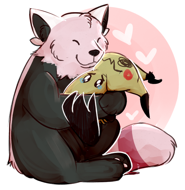
Based on the back of the bear, I'm pretty sure it's more like a Red Panda Pokémon (well, pink panda)? It has the racoon tail, black body, and little ears like red pandas.


Yep definitely based on red pandas and teddy bears. That makes it even more disappointing to me, as I actually LOVE red pandas. With that size, I find difficult for it to have an actual evo (maybe it's a base mon, or maybe already a stage 1), but I'm still hoping for it. Hoping the 3d'll be beneficial too, even if its "white mask" is so terrible that I'd find it difficult...
 
I was thinking about the design of Kiteruguma is that the official artwork makes it look too...flat. Like it doesn't have the right shading to show its actual depth. That's my main problem with it.
 
To be honest, I've felt most of the official Sugimori artwork hasn't really done a good job of portraying the brand new 3D Pokemon since XY, so it might actually look really good in game.

Besides, whose saying we won't get a 15 foot red panda evolution xD
 

Pikachu315111

Ranting & Raving!
is a Community Contributoris a Top Smogon Media Contributor
To be honest, I've felt most of the official Sugimori artwork hasn't really done a good job of portraying the brand new 3D Pokemon since XY, so it might actually look really good in game.

Besides, whose saying we won't get a 15 foot red panda evolution xD
I thought it was said/theorized none of the new artwork is Sugimori's style?
 
Alright, I'll bite -- I think you'd have to be fucking design illiterate to produce something like Kiteruguma, at least in the way it appears right now

It's shaped like a medicinal pill, even looks like one (by virtue of a fucking horizontal line separating the head and body), has a random butterfly hairband thing that looks like it would fall off the front at any moment in addition to resembling Princess fucking Leia's twin buns. Complete stumps for feet, rounded stumps that make it look like it could trip just by standing still, and we're supposed to believe somehow that this thing warrants warning signs across the region. Haha, no. Fuck thyself.

Yknow, it actually looks excusable from other angles (e.g. the left picture where it actually shows that the black on its belly has boundaries) so I hope it's salvaged in 3D. I really do.
 
Oh, So Ghostachu is based on those youkai that inhabit discarded/unwanted possessions. Interesting. The "20 years" bit is interesting given what anniversary this is :P
That being said, it would be better if it were a Clefairy disguise, considering it was going to be the series mascot in the first place.
 
  • Like
Reactions: JES
That being said, it would be better if it were a Clefairy disguise, considering it was going to be the series mascot in the first place.
Maybe it'll be a sort of Vivillon type thing? Where, depending on where you catch it, It has a different sheet?

It probably wouldn't work as an actual location type thing, but rather as your location in the region?
Or maybe there'll be special events with different disguises.
 

Pikachu315111

Ranting & Raving!
is a Community Contributoris a Top Smogon Media Contributor
That being said, it would be better if it were a Clefairy disguise, considering it was going to be the series mascot in the first place.
Actually I think the original intent was having the Starters as the mascot. However when the anime made the decision to use Pikachu (over Clefairy, who was the star of one of the Pokemon manga, as yellow is a more gender neutral color (and was also sort of a secondary main Pokemon in the manga)) and the anime was one of the driving forces that made Pokemon popular it was made into the official mascot. It's just how things worked out.
 
I've seen lazier.

*cough*Gen 1*cough*

I don't understand why people say this. There was no other precedent to judge Gen 1 as lazy. When you say something is lazily designed, you're comparing it to previous designs. Nothing existed.

I wish they had done a grass type Asian black bear with sap sipper or a sloth bear instead -- I love bears but not big on the mascot concept.

The ghost might be too disturbing for some kids. They both look interesting though.
 
it's literally a red panda, it's supposed to look like that. It's a bit underdesigned and stuff but you can't hate on the sudden color palate changes when that's exactly what the real animal's fur does.

granted, yeah, it looks pretty badly uninspired. But it's getting a lot more hate than it deserves imo. A 3D model would do its side views justice.
 
I really don't like the bear. It seems so bland compared to other Pokemon we have seen. Hopefully it will evolve into something nice though.

On the other hand, I love the little rag! It's cute, seems to be like Ditto but keeps a general shape, and it has an interesting typing. I'm willing to guess these two will be version exclusive.
 
So basically this bear is lumineon a Pokemon that looks so much like a cartoon version of the real animal it feels forgettable, yet given that he is a leak, and getting focused on by fans expecting something big that fits their wishlists, seems to be hated harder than it should.
 
I don't understand why people say this. There was no other precedent to judge Gen 1 as lazy. When you say something is lazily designed, you're comparing it to previous designs. Nothing existed.
But we can compare it to the later gens now, and in comparison to gen one even Unova looks more inspired.
Anyways, I actually like the red-panda plush pokemon, it looks really cute. Please don't evolve into something like Pangoro ;-;
 
Now I know why I recognize the bear.
For me it reminded me of Monokuma.

I know the solution for Mimikkyu to solve it's problem with the sunlight we just need the Stone Mask and the Red stone of Asia. (Avalon song starts to sound.)

Mimikkyu: I awakened my master!!

On a serious note I think these two were decent one way or another at least they have nice types and I'm most curious of their abilities because with those typings in the offensive side they are really good with a good ability it would top it off.

I think GF is showing lots of pokemon this time around and really interesting at it too be it through videos, corocoro or any other way.
 
I don't understand why people say this. There was no other precedent to judge Gen 1 as lazy. When you say something is lazily designed, you're comparing it to previous designs. Nothing existed.

I wish they had done a grass type Asian black bear with sap sipper or a sloth bear instead -- I love bears but not big on the mascot concept.

The ghost might be too disturbing for some kids. They both look interesting though.
I my experience people tend to insult gen 1 whenever someone says something bad about anything newer then gen 2. Because apparently if you don't like something new, you are obsessed with gen 1 stuff or something. That being said, the designs that a lot of people give shit to in gen 1 are really clever imo along with pokemon like Klefki who also seems to get shit on a lot.

On to new stuff, I like the ghost fairy a lot. A LOT. I love darker pokemon, and double so when they are adorable. The bear/red panda is stupid looking imo. Just looks so bland, but maybe the games will reveal a bit about why it looks so through dex entries or whatnot.
 

Pikachu315111

Ranting & Raving!
is a Community Contributoris a Top Smogon Media Contributor
Now I know why I recognize the bear.
Yeah, I thought that too but didn't want to bring up the whole "new Pokemon look like Digimon" issue. Though this hasn't escaped some artists:

Of course, my observation hasn't either:

Though joking aside, fanart is making Kiteruguma look better.

 
Status
Not open for further replies.

Users Who Are Viewing This Thread (Users: 1, Guests: 1)

Top