
-
Check out the relaunch of our general collection, with classic designs and new ones by our very own Pissog!
-
The moderators of this forum can be found in the CAP forum staff directory.
-
Welcome to Smogon! Take a moment to read the Introduction to Smogon for a run-down on everything Smogon, and make sure you take some time to read the global rules.
You are using an out of date browser. It may not display this or other websites correctly.
You should upgrade or use an alternative browser.
You should upgrade or use an alternative browser.
CAP 6 CAP 6 - Art Submissions
- Thread starter darkie
- Start date
- Status
- Not open for further replies.


Final submission
The true final submission.
main design

It's new!
Support:
This link leads to the submission I had before.
http://i382.photobucket.com/albums/oo264/ThrenodyofThunder/Eeligator6.jpg
You see? This is what happens when a pencil artist tries to draw something on paint for the second time. Overall though, it looks really good. The colors make it look less poison and the extra band around his arm makes him look more fighting.
Vipers are really cool mythological creatures. They have always been portrayed as agile and mercurial. Slithering quickly with his glazed body, he pounces on his opponents who are unable to get a grip on him. His onslaught of punches and snaps cannot be blocked due to his inconstantness. This viper of mine was difficult to finish, trying to decide on what I could put on his chest to fill up that empty space was arduous. But in the end, when I tried it on paint for the first time, it turned out better than I had expected. (go ahead and compare it to my first wip picture :D)
This is my final submission and you better like it!
The true final submission.
main design
It's new!
Support:
This link leads to the submission I had before.
http://i382.photobucket.com/albums/oo264/ThrenodyofThunder/Eeligator6.jpg
You see? This is what happens when a pencil artist tries to draw something on paint for the second time. Overall though, it looks really good. The colors make it look less poison and the extra band around his arm makes him look more fighting.
Vipers are really cool mythological creatures. They have always been portrayed as agile and mercurial. Slithering quickly with his glazed body, he pounces on his opponents who are unable to get a grip on him. His onslaught of punches and snaps cannot be blocked due to his inconstantness. This viper of mine was difficult to finish, trying to decide on what I could put on his chest to fill up that empty space was arduous. But in the end, when I tried it on paint for the first time, it turned out better than I had expected. (go ahead and compare it to my first wip picture :D)
This is my final submission and you better like it!

Well here are my two designs. Not sure which one is my main entry but I will decide before the due date based on how they are received. This First one is a Koi Samurai. Its probably too complex for pokemon but I thought it was worth showing anyway.

The next one is an angler fish that has a punching bag instead of the little glowing thing coming off it's head. It hones its fists by punching it whenever it can.
 Its tail is a little cut off but thats not too important
Hope you guys like them.
The next one is an angler fish that has a punching bag instead of the little glowing thing coming off it's head. It hones its fists by punching it whenever it can.
Hope you guys like them.

Very solid submissions, NinjaSquirtle. Siamese fighting samurai fish FTW!


Okay, I have finalized versions of both my designs.

Mantis Shrimp

Anemoninja
And here's the poll:
http://www.misterpoll.com/polls/372673
This will determine which design I will submit as my final. Once that is decided, I will compile as much supporting material as possible.
Mantis Shrimp
Anemoninja
And here's the poll:
http://www.misterpoll.com/polls/372673
This will determine which design I will submit as my final. Once that is decided, I will compile as much supporting material as possible.

Wowzerz looks like some solid competition this time around. I'm just letting the sprite artists know that no matter which design wins, KoA's back and will be competing in the spriting polls this time around. Also, I kinda adopted Wyverri as my official rival, if she don't mind that. :P

Okay, I am torn between Caldboldg's, Wyverill's, And Atroyoki's.
This is going to be a hard vote!!!
This is going to be a hard vote!!!


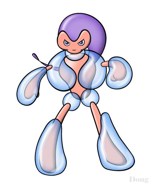
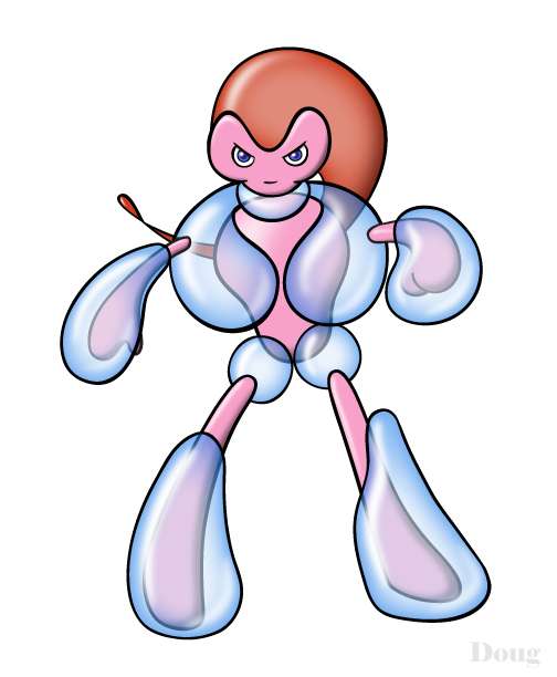
I know it's a bit late in the thread to be introducing new designs, but I was on a business trip over the past few days, and I started sketching on some new Water/Fighting concepts. I starting playing with some ideas of a pokemon that could use water as battle armor. I also wanted to do a pokemon that looked more feminine than the average fighting pokemon, but not frail or dainty. I liked one sketch in particular, and decided to ink and color it. I'm still playing with colors, but I kinda like how this turned out. I'm curious to hear your feedback on this one.
doug, i think its great. better than the scuba diver one IMO


doug, i think its great. better than the scuba diver one IMO
Agreed. The scuba one looks... eh, but I think this is the better concept. I'm not sure I like the head though, or the size of the bubbles. Maybe make the bubbles bigger to reflect the stats, and make the head either more streamlined or bulkier, I'm not sure which. Right now the head doesn't look right.
Edit: The left hand (Right hand from behind) looks off, the bubble is sticking out. I think it would look better if it was more like a "boxing glove" and completely covered the hand, rather than just resting on top as it appears now.


Bubble shields are a great concept, keep working on it. I'd take advice about the colours, right now it's looks quite like a luvdisc evo. I think a single bubble at the pelvis might look better than the two small ones. Great idea.
For the concept I prefer the Scuba Wrestler than the Bubble Armor.
It looks fragile in some way [and bubbles are fragile], but, for me, It doesn't look femenine because It has a big torso and a little pelvis [in femenine must be the opposite, I think].
And reminds me the guy from NiGHTS.
Good job with the colors!
It looks fragile in some way [and bubbles are fragile], but, for me, It doesn't look femenine because It has a big torso and a little pelvis [in femenine must be the opposite, I think].
And reminds me the guy from NiGHTS.
Good job with the colors!

Eh. Both the Scuba Wrestler and the Bubble-woman don't appeal to me.
Maybe its just the "peripheral-ness" of it all.
Bubble Life Vest? I dunno, Buizel/Floatzel already got into Life Jacket territory, but at least they used inflatable sacs logic, something that does occur in actual morphology.
That and the hair is a retread of Nights into Dreams:

Maybe its just the "peripheral-ness" of it all.
Bubble Life Vest? I dunno, Buizel/Floatzel already got into Life Jacket territory, but at least they used inflatable sacs logic, something that does occur in actual morphology.
That and the hair is a retread of Nights into Dreams:
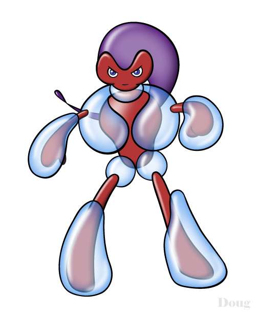
Here are several other color schemes I experimented with on the Water Fighter I posted above.
(click each thumbnail for the full picture)
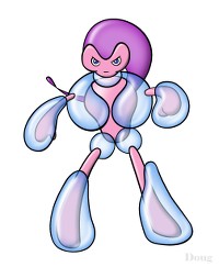


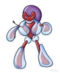
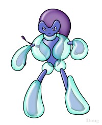
As you can see, I've experimented quite a bit. I like some of the darker colors, but I think the pastels might better fit the personality of the design. I'm not dead-set on any color scheme, so feel free to weigh in with opinions.
(click each thumbnail for the full picture)


As you can see, I've experimented quite a bit. I like some of the darker colors, but I think the pastels might better fit the personality of the design. I'm not dead-set on any color scheme, so feel free to weigh in with opinions.
The second one is nice because it reminds me of kelp (which we have a lot of in NZ, being an island) and that works well with the bubbles. The two blue-bodied ones look like classic water-types. Have you considered making the main torso bubble less like a ruff (masc) and more like a feather boa (fem, or at least drag :P)? I think Caladbolg had a point about the shape, too.


I really like the 3rd and 4th ones Doug. The 3rd one gives no doubt to its water typing, whereas the 4th one highlights the feminine aspects of the design.
It's a great design, but I have a small suggestion. To try and emphasise its Fighting elements a bit more, maybe try making the bubbles on its hands a bit bigger and rounder, sort of like boxing gloves made from water. Like I said, though, it's an excellent design, and I much prefer it over your scuba diver.
LR.
Could I have a little feedback on my design in general, and also on which of these colour schemes you guys think works better?
I prefer the red, myself, because she has a suitably 'water-y' morphology to get away with it. But I'm wondering if not everyone agrees. Tips?


I prefer the red, myself, because she has a suitably 'water-y' morphology to get away with it. But I'm wondering if not everyone agrees. Tips?
Hmmm... I kinda like the top one a little better. The red one is nice, and it does reflect the Fighting Type a bit better (and red is an interesting color for a water type), but I've always liked cooler colors. Maybe you could wedge in some small bits of gold on its body as well? I'm not too good at giving suggestions though, so take it with a grain of salt.
@Tea and blues: It doesn't look fighting type. In fact, it looks a lot like a water/steel. Perhaps you could find someway to make it look less defense oriented and more special defense oriented, as both leading stat spreads have it as more special defense than defense.
But it's a great drawing! Had CAP6 been a water/steel instead of water/fighting, your red one would have my vote.
And don't give him more than seven fingers on one hand please
But it's a great drawing! Had CAP6 been a water/steel instead of water/fighting, your red one would have my vote.
And don't give him more than seven fingers on one hand please
Heheh, now I'm struggling to decide if he *does* look to much like a steel-type, or if eel heads just look too much like Steelix. :P I'll ponder over this. Thanks guys! Any other comments are welcome.

doug, what about basing the body on something a little bit insectoid? it reminds me of a water skater a bit, and that could help some of the morphology problems...and it could still be suitably feminine. further, a lot of underwater insects use bubbles as homes, defenses, or just produce them by moving. donno.

Is it less like a steel-type with a little more colour and grit?
Final Submission
Here's my tipsy submission to CAP6! Loosely nicknamed "drunkmon," this fellow has as much fighting skills as he does alcohol in his blood :]
Main Design:

Supporting Material:
Although he may seem a bit silly, this fighting sea lion begs its opponent to underestimate its fighting skills.
Drunkmon will never be seen without his special cup either http://img408.imageshack.us/img408/9082/drunkensealionscanet0.jpg
whether it's on his nose or his head
I wish there was less competition for this CAP, but hopefully this guy brings something different to the table (or bar)
Good luck to everyone!
EDIT: Cross Chop!
Here's my tipsy submission to CAP6! Loosely nicknamed "drunkmon," this fellow has as much fighting skills as he does alcohol in his blood :]
Main Design:
Supporting Material:
Although he may seem a bit silly, this fighting sea lion begs its opponent to underestimate its fighting skills.
Drunkmon will never be seen without his special cup either http://img408.imageshack.us/img408/9082/drunkensealionscanet0.jpg
whether it's on his nose or his head
I wish there was less competition for this CAP, but hopefully this guy brings something different to the table (or bar)
Good luck to everyone!
EDIT: Cross Chop!
- Status
- Not open for further replies.