So I did some research and found out that some shrimps are bioluminescent. This gives me a new direction to go in.
http://img402.imageshack.us/img402/7638/shrimp.png
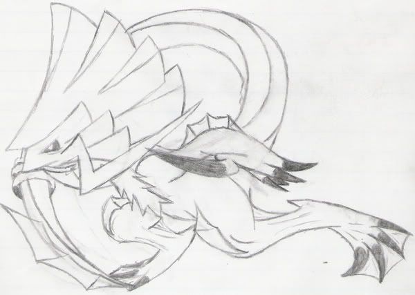
At first, it doesn't look too different from my previous version. But the glowing spots all over its body change color depending on the attack it's using. To see it best, you have to turn off the lights:
http://img52.imageshack.us/img52/7346/shrimp.jpg
(After-I-typed-the-below note: Yes, I realize how
freakishly long this post is. o.o; Sorry.)
I honestly have to say I was slightly disappointed when I first saw this, initially. I really disagree with your statement " it doesn't look too different from my previous version". It looks almost
too different to me...
First, I pretty much agree with everything Rhys29 said. Just getting that out there.
As for me typing out my own analysis... I did majorly like the
first version better. In color scheme, the new one looks too dark, which makes it looks fleshy and less "shiny and solid", (as in Armor). I feel it looks nicer when it was a bright pink & yellow. And I gotta say I liked the spiky body & tail better. The smoother roundness also makes it look a bit fleshier as well, especially with the "dangling" antennae, rather than jagged ones. Also, the face on the new one actually bothers me a bit. The eye, and the head's angle itself, both seem too high, and the deep yellow in the eye makes it look a bit strange... The higher head makes it's face look quite empty and a bit bland...? The first had this amazing as hell "intelligent" , "ominous", and "innocent" look, with it's low, blank eye, the stripe through it's face, and whiskers (which were awesome, IMO). The look was also enhanced with the fact that it's head looked down, while it's eye looked forward... I really have to say, I SERIOUSLY freaking loved that look. Though- you did get a really good idea from the new version. The luminescence. Great, great thing. Though, as Rhys said, trim down the spots on the body a bit. Arms and legs, on the antennae, and maybe the tail, and that's good.
(Feel free to skip ALL of this).
Sudden fangasm; (Based off the first image.)
Imagery; You are floating underwater... Your a bit from the surface- the water is getting dark. This thing is maybe, 3 feet tall.... About 10 feet from you? You're not completely sure- but no time to observe things like this... You are staring that thing straight in the eyes, in a standoff.... You're nervous beyond belief- and afraid any sudden movement you may make will result in it
somehow killing you. But that blank stare. You have no goddamn idea what is is thinking! What's going to happen!? It begins tugging at your nerves. You heart is racing. It feels like minutes are passing every second. And then, just before you go insane... A yellow luminescence from behind..? What is tha- and before you can turn around, you get shocked and killed from a thunderbolt, behind you. What the- Were you were just looking at an illusion? Was it those lights- did it hypnotize you? OR was it behind you the whole time? A Double Team? A Substitute? Too late to figure out now, as you're dead. It devours your body, and slowly floats away.
(Unimportant content ends here)
Holly hell I typed a lot more than I initially planned right there...Forgive me for the playing with the concept and getting carried away right there... And for having the crit above almost sound a bit demanding, and horrendously long... But... Well, yeah. I really didn't mean to type that much.
... I just love your concept. So much. I was keeping relatively quiet this contest (personally not sure I'm going to enter), thought that design is undoubtedly my favorite.
...Feel free to take and ignore whatever parts of this post you want. >_>;