CAP 11 CAP 11 - Art Submissions

Status
Not open for further replies.
Personally, I don't see the wrestler monster being much more complex than Machamp already is. Still entirely open to submitting my ninja guy too though based on feedback.

My favourites so far as Caladbolg's and DougJustDoug's. Kitsunine's idea and design is great, but I think it'd benefit from its proportions not being so human.
 
Okay I'm far out classed here but I'm going to give it another shot.
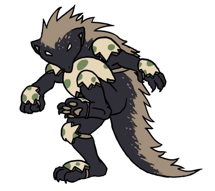
Redone version of the Shaman type I was going for before.


"CAP 11," [using it until a name is found] Shaman type pokemon. Love to collect odd materials and "trophies" from its enemies, "CAP11" cloaks itself in parts of "kills" to wear them with pride. Also know for being a trickly little thief, it often steals anything that isn't "nailed down."

I chose a shaman, because so far the Togekiss helper has been leaning more towards Special based tactics, thus a Shaman is magical and thus Special usually, but I could also see the monkey going physical as well.

Color Version that explains all of the items that is on the pokemon: http://www.deviantart.com/download/171673064/Dark_Fighting_CAPShamanV2Color_by_Ori_Corp.png

Any suggestions or comments?

Also Jakalope idea, if it helps Tort:http://www.deviantart.com/download/126638950/Rabbilope__the_Jakalope_Pkmn_by_Ori_Corp.jpg
Might be able to help alittle. Huh?

And now, a word on the other submitants [don't think its a work but I don't care]:
@Paras: Like the older one better but I could see this one working to [the wrester]; reminds be of something from "Nightmare before Christmas" or other Tim Burton's styles.
@redCyclops: Good start, now expand it.
@Doug: Very...umm.. Classy? I don't know if Jack qualifies as classy. Maybe add a Lanturn; Jack traditionally held a lanturn, which was supposed to be able to stun people.
@KingEmpoleon: Like where its going, very Knight-esque. Assuming going to be Black armored, like the black knight or headless horseman, yes?
@hand4hire: Looks very familiar. But I could see it going somewhere.
@Solstice: Interesting concept is all I can say.
@Kitsunine: Like the concept, since it is supposed to be a all out helper for Togekiss, but I think that is making it TOO "must help togekiss." Changing the pattern of the cloak would give it alittle more parting-ness from its "partner"
@Cricketpar: I can tell you're a great artist. Personally, I would take the Badger-y one; the ninja monkey, to me, looks like a cheap shot.
@WPS: Again, good start. I'd like to see the concept go further.
@Calaborg: Out classing me again, wow all the other artists here make me look like I suck. Good, I think, but darking the brown could make it more "fighting" looking, or maybe punching glooves on the puppets hands. Otherwise, Great! :D
@SEO: Again, making me look like a 5 year old in drawing standards. Great design, and could see it going either way, special or physical. Can't wait to see the finish.
@Venetor: like the design, and hope its gets off the lined paper [sorry, just one of my pet peeves, never really liked lined paper]
@pkmn-taicho: I like where its going, I like Girafarig, so I like the design :D
@Jeremiahsauce: First thing that came to mind when I saw it for no reason, "we must serve King K. Rool! ha HA!" But no, I like a furthering of the design, and want to see where it goes when its finished.

And to everyone, all of the artists work really hard on what ever they submit, so please, whether you can tell its from years of practice [Cricketpar, Calaborg, SEO, Paras, etc.] or crap of an artist [haha me], please give me some recommendation or some insight onto there work, even it critical, because it makes them feel acknowledged and not ignored, even if its the least. Just a small comment on each makes everyone happy.


Edit: for got SsAaVv: Looks very Demon-y, good for Dark, but reminds me more of a fire type with that.
 
@KingEmpoleon: Like where its going, very Knight-esque. Assuming going to be Black armored, like the black knight or headless horseman, yes?
It's not black armored. However it is more of a knight than anything.

Here's a (colored) version, although my scanner cut my quality. T_T


Vaieruin, the Sentiment Pokemon

Vaieruin was once a knight in his past life, but after his sudden death, his memories and heart merged with his armor, transforming it, creating this Pokemon. It still fights under the virtues of valor and chivalry.

Yes, this is much like Terra's Sentiment, i.e. the Enigmatic Soldier from KH:FM+, only fused with dark energies and reshaped.

Don't mind the weird shadowy head by it. I was starting to sketch something else but erased it last minute. Thanks for the feedback everyone! =D


???????
The Bruiser Pokemon

Fighting and Dark? Bruises are dark. You get bruises from fighting. Easy!

Whenever 'bruisemon' is struck on one of its sensitive growths, it sends a shocking pain signal to the brain, focusing its resolve to hurt the opponent really bad. It gets particular satisfaction from attacking the same spot over and over again, maximizing the damage done, and leaving the other Pokemon with one heck of a sore.

The red bruises on its fists allude to the idea of brass knuckles, and fists that are bloody and calloused from repeated strikes. The red blots on the nose suggest bloodied tissue stuffed up the nostrils to prevent flow (really, they're the most sensitive nerve tissue on its body. you reeeaaally don't want to hit it on the nose).

It can store up its pain reserves and release them as a Dark Pulse, or a Blast of Focused energy.
 
@Cartoons!: Very interesting idea, a good combo of dark and fighting. I'm not really liking the belly button, though, but then again, I just don't like belly buttons.

@ Lokon: Pretty cool, the gold cuffs are a nice touch. I think it could benefit from being more animal-like in appearance.
 
Man, I like Cartoons!' design the best so far. It reminds me of the art in the original 151 and the concept is great too
 
@SEO: I like how it's bulky and intimidating, but I think it could use a scarier pose. A pose where it's looming or jumping forward could work.

@Paras: I like how it looks mean and the beard adds to that nicely. This thing would probably fight dirty too, being a Mexican Wrestler. I have a question about the thing holding the mouth together, is it more like a spring or a rod?

@Cartoons: IS THAT A BATTLE TOAD?!!111ONE11ELEVEN11?
On a more serious note, I like how it's creepy and smug. I also like how it's sorta short and pudgy. I think that making some of the sores larger and othes smaller could really add something to this.

@Caladbolg: That clown-boxer is great, it's realy creepy! And for anybody whose never seen clown boxing, search for it on google or Youtube. It's pretty funny.
 
I made a new concept for the Dark/Fighting type: A Ninja. With Throwing Stars for hands. It would help this concept a lot if CAP 11 knew Spikes (helps for most electric types) and Rapid Spin (eliminates Stealth Rock)
 
@Zakkiorichalcum: Very creative idea, good work! I like the idea of having trinkets from other Pokemon on it. One of my faves so far.

@Cartoons!: Great concept. Love the idea of a bruiser.

@Caladbolg~: Love the Puppet guy. was one of my faves when you submitted it for a previous CAP.

@DougJustDoug: Great idea! The Jack the Ripper idea is very original. Great concept so far, can't wait to see it coloured!

@Paras Hilton: While I do like both of your designs, I personally like the ninja one better. I could really see that in the game.

@Cricketpar: Cool idea. I like what you did with the egg shell armour. Very creative.

@Tortferngatr: I love the Jackalope idea, but I think you need to expand on it a bit more. Great concept, though, and I love the way you described Pursuit!

@SEO: I like the concept. Can't wait to see what it looks like once you've expanded on it a bit more.

@Venator: Cool idea. I like the Boxer look to it. Looking forward to your next post.

@pkmn-taicho321: interesting concept, love the Girafarig reference.

@Deck Knight: I love the idea of a Clockwork soldier. Very unique. I think you need to bring the Dark typing out a bit more, but it's a great start.

@Mektar: Very cool idea. If it was expanded on a bit more, I think it could really go places.

@Hand4hire: As I previously stated, it looks a lot like an elite from Halo, still, I can see it going places, I just think you should tweak it a bit to make it look less Elite-like. However, I do like your new ninja concept, I'd run with that one over your previous.

@Arb: Very interesting and unique concept. would love to see it expanded on a bit more.

@WPS: Very cool concept. It is another Ninja concept, but, it is also unique in it's own way. Great start.

@Kitsunine: Cool concept, I never would have thought of a falconer. Very unique

@Solstice: another unique concept. I can see it going places.

@redcyclops2: Good first draft, but it needs to be expanded upon much more.

@Jeremiahsauce: to me, it looks a lot like Charizard without the wings. It needs a bit more work.

@KingEmpoleon: Another cool concept, though I don't think the colours really fit with it. I would love to see it in a different colour scheme.

@Lokon: LOVE IT! Great base concept, and although it looks rather ghost-like, I think the Dark is more prominent. It reminds me of something, what did you base it on?

@Zee-V70: Excellent concept, can't wait to see where this goes, although I do agree it looks more Ghost than Fighting.

I tried to comment on everyone's sorry if I accidentally missed one. great concept so far, guys, this is going to be a tough poll.
 
Thanks Assassinfred, great confidence boost that someone is actually reading my stuff and not just skipping over it (could also tell you read most of it because you did the thing I mentioned). Probably un-intentional confidence boost that I was mentioned first, but that my just be happen-stance. Any suggestions on how to make it better or items that my be seen as more memorable (like Kitsunoh's mask)?

@Calaborg: Don't like the clown idea mainly because I don't like clowns, but wailing on them in a pokemon match would be fun.
 
Thanks so much assasinfred your comment is a huge confidence booster!

My design either reminds you of sneasel, or the hat reminds you of mismagius
No problem! It's a very unqiue design. It does look rather Sneasel-like... That must be it.

@Caladbolg: love the clown. I'd say go with it over your puppeteer. can't wait to see it coloured. Very creepy, I get a huge Dark-Type vibe from it, and it makes me not want to like clowns. As it should. excellent job.

EDIT:

@ZakkiOrichalcum: Again, no problem! Your concept is one of my favourites so far, and I can really see it going places. As for how to improve on it, I think you could make it look like it's able to use physical attacks more, but, that could ruin it. To be honest, there isn't really anything I don't like about your design as is. Sorry I couldn't be of more help!
 
These are my favorites so far. SEO's has amazing potential and captures the "Fighting/Dark" theme really well. Paras's first design doesn't seem "serious" enough, but it looks great. Paras's second design is, as someone else said, a bit too "ambitious" for a Pokemon, but the idea is amazing. Cricketpar's talent is apparent, but I think the art resembles Skuntank a bit too much, and the egg coloring resembles Yoshi's egg a bit too much. Lokon's art is the most "Pokemon-ish" to me, and while it may not be as detailed as Paras's or Cricketpar's, I think it plays off the theme the best.
 
I really actually like the concept for the clown, but when its colored it needs to be clear that its dark type. Very nice job though.


DARK FIST AURAS.
 
Whenever I look at Paris Hilton's first one I see Duskull brach evo xD The color is just too similar. Maybe darken the gray a tad? I do love the design thoguh.

Cartoons! design is thus far my favorite though. Simply amazing.
 
New more fighty pic which is the right size. Unfortuantely the resolution is really bad making it look very messy. I give permission for people to copy and improve.
 

Arkeis

(づ。◕‿‿◕。)づ
is a Top Artist Alumnusis a Community Leader Alumnus
I'm currently at work so I've only spent like 5 minutes each on the following sketches. But please comment on all 3 of them and let me know what you think.

Starting off with Jack in the Box, Werewolf, and Vampire Bat:


LouisCyphre

heralds disaster.
is a Forum Moderatoris a Community Contributor
SEO's blew my mind. I could see that fitting just about any of the stat ratings being thrown about and suggested in the other thread.
 
Kitsunine's idea and design is great, but I think it'd benefit from its proportions not being so human.
I was totally thinking the same. In my head I was arguing that Machamp's the quintessential fighting type, and he's entirely human-shaped, but I'm definitely considering changing it.

@Kitsunine: Like the concept, since it is supposed to be an all out helper for Togekiss, but I think that is making it TOO "must help togekiss." Changing the pattern of the cloak would give it alittle more parting-ness from its "partner"
That's a legit point, but I'm going to dissagree. If we're going to make a Pokemon whose main point is to help Togekiss, why not look the part? If nothing else, Groudon/Kyogre/Rayquaza and Plusle/Minun set president for Pokemon that have thematic or stragetic relationships to have design themes that coordinate or relate.
 
I'm currently at work so I've only spent like 5 minutes each on the following sketches. But please comment on all 3 of them and let me know what you think.

Starting off with Jack in the Box, Werewolf, and Vampire Bat:


I like the werewolf the best. I don't think a Jack-in-the-box would fit the theme, and the vampire looks a bit too much like Gliscor in my opinion. Still, the fact that you drew these all in five minutes is extremely impressive.
 
Status
Not open for further replies.

Users Who Are Viewing This Thread (Users: 1, Guests: 0)

Top