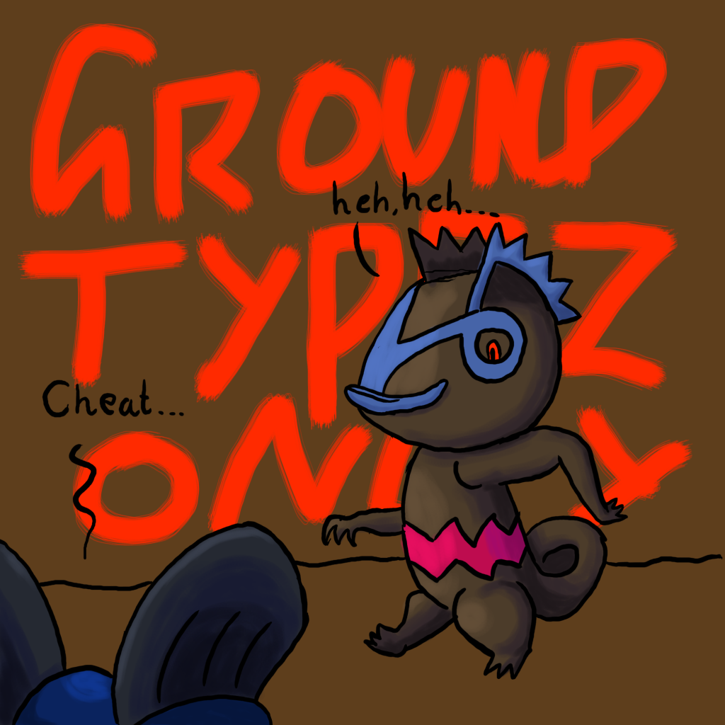
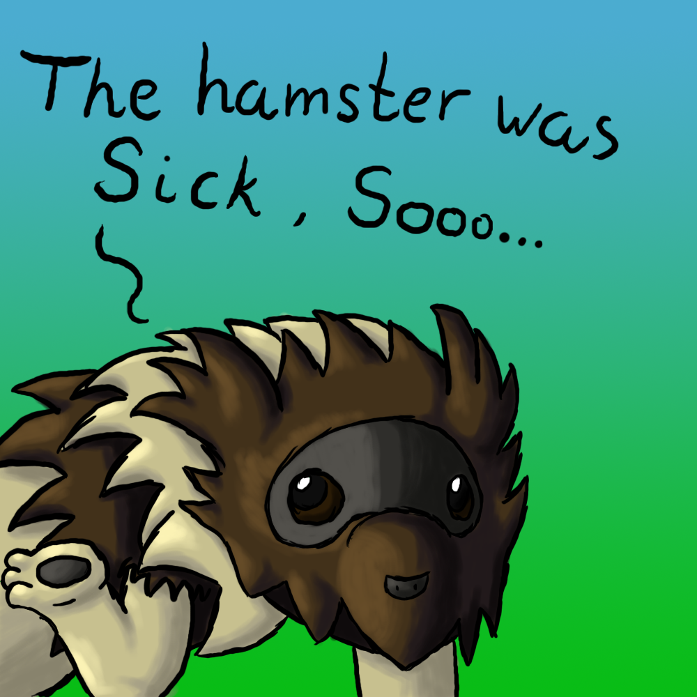
why must i quadruple post?
if you guys dont like it much please tell how i can improve
i would like feedback and requests
please..
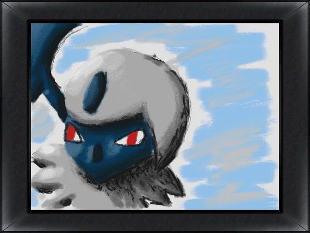
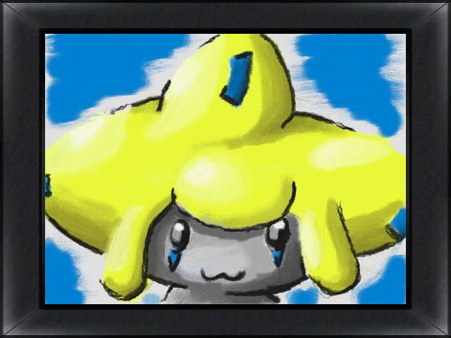
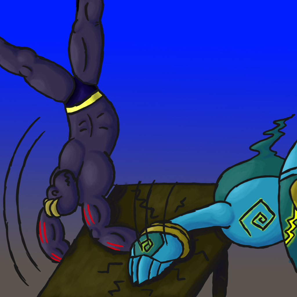
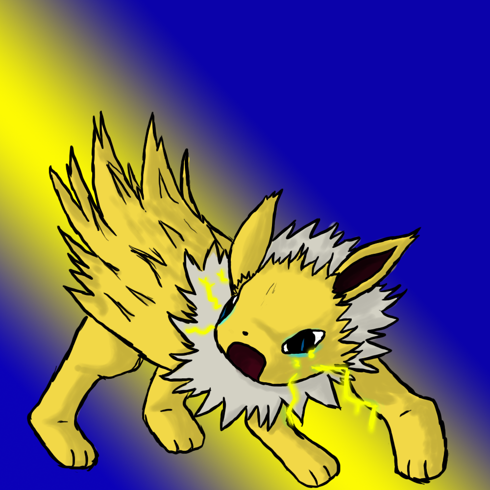
To start with, you can have less dramatic backgrounds. Bright colors like the one behind Jolteon steals attention away from it. If you tried to emphasize its electric attack, I would have used a radial gradient (as in, a circle/ball) around Joleton, while the blue could have been subsituted with a duller color (that is, closer to gray). Backgrounds can definitely add much to the image, but be careful not to make them stand out too much.
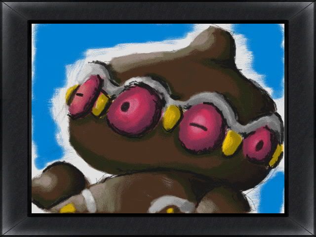
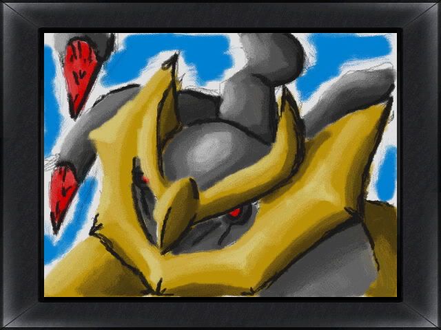
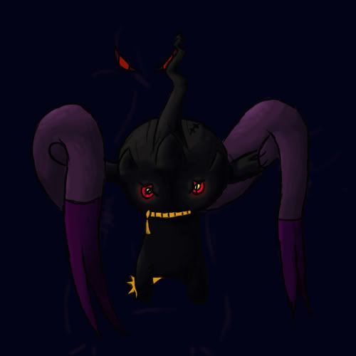
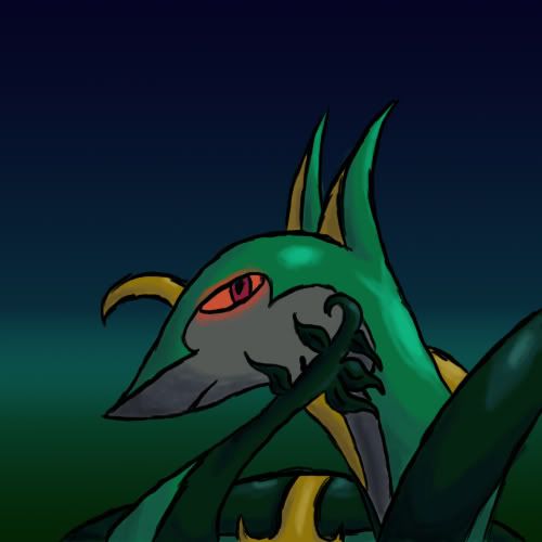
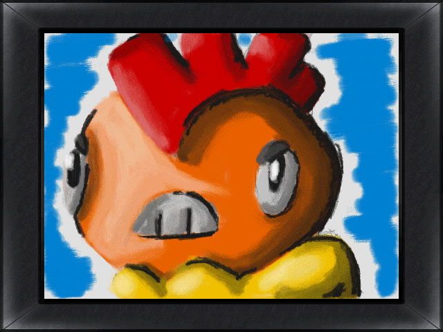
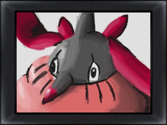
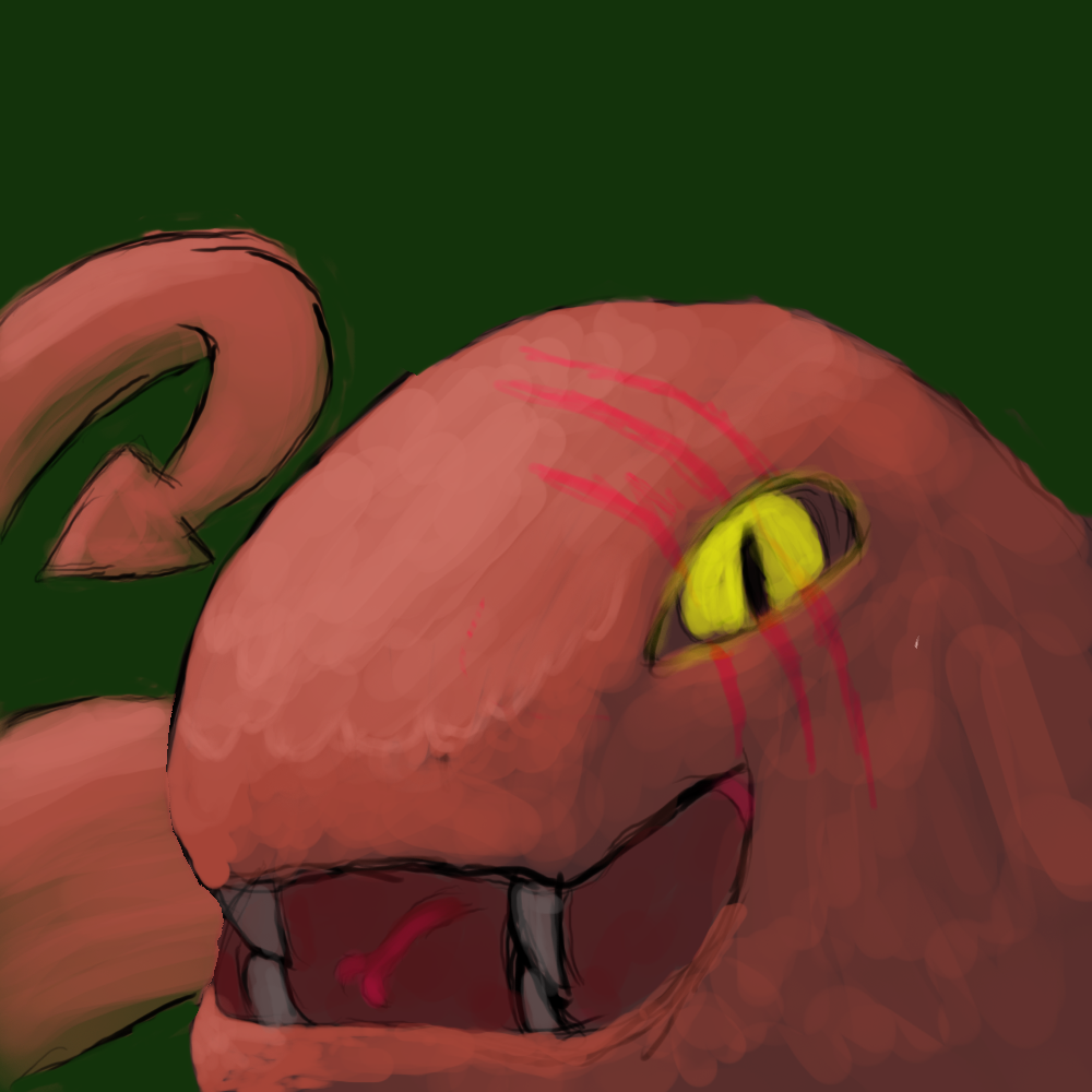
Secondly, try to make the lineart smoother. The black lines I've seen in your images are pretty shaky and doesn't form smooth, even lines. So while they don't need to be evenly thick, they certainly gain from not being wobbly.
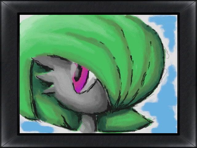
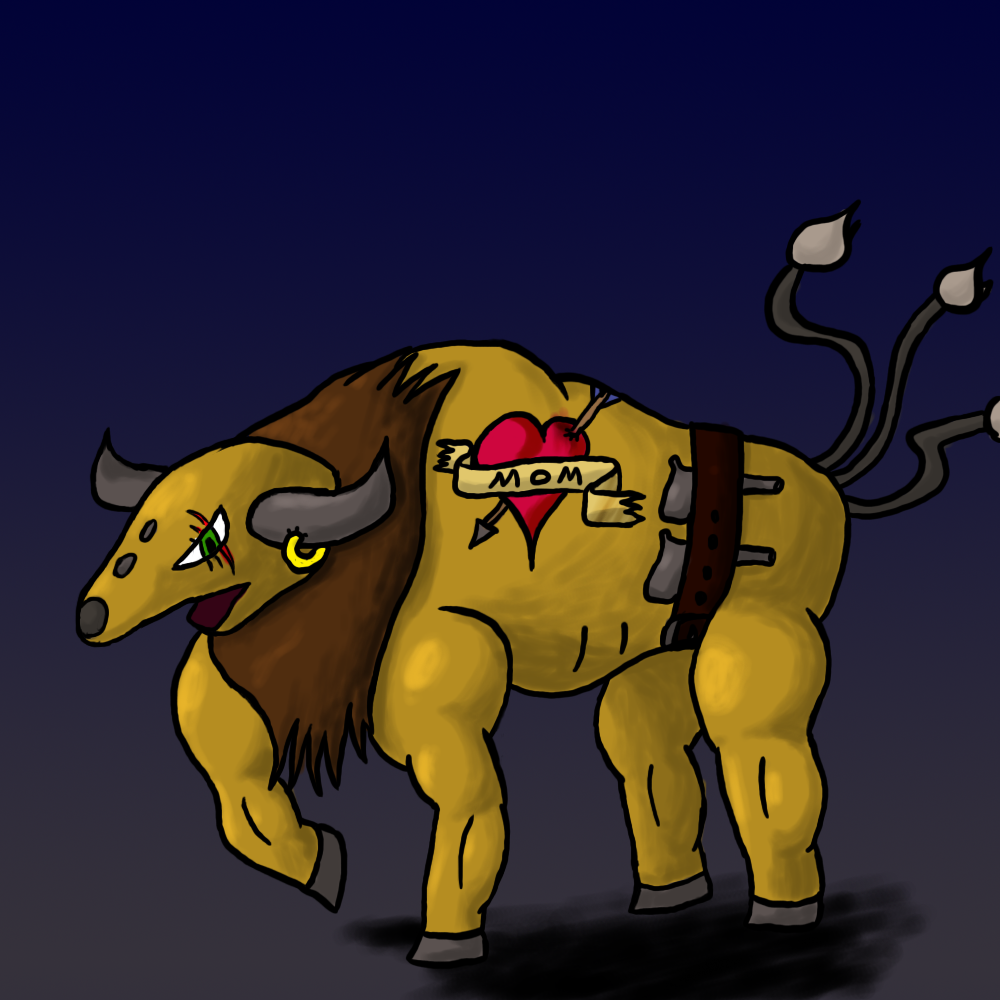
Thirdly, you can shrink down the images a bit before posting them here. Your last two images could be half in size and would be better off because of that. Not to mention that minor flaws doesn't stand out as much in smaller dimensions.
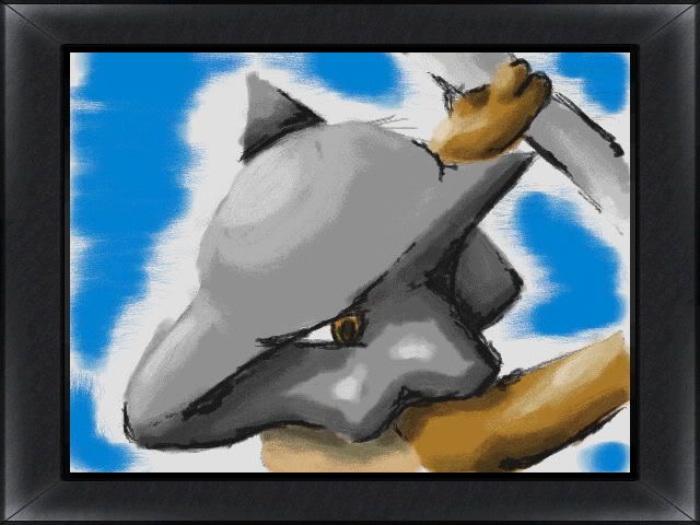
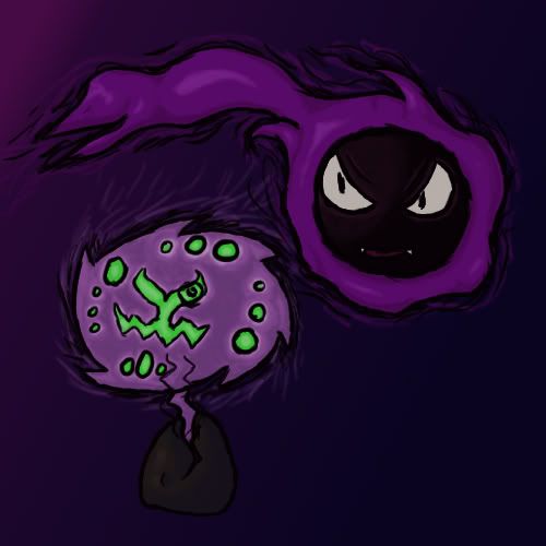
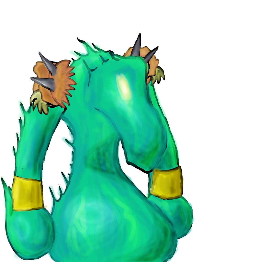
With that said, I like your 3D art (particularly that Wormadam), and you also seems to have a decent lighting sense. Before drawing anything else, be it an object, pokémon or anything else, look it up on Google images first and see how others have done when they've drawn it. Notice the details, get an idea of how they might have pulled it off, and then have your own shot at it.