So yeah, I'll be covering and showcasing some pixel artworks/ sprites that I've done for quite a long time.

My miiverse drawing :3 Because espeon is the epitome of cool, calm, collected
The list may or might include:
Why choose this style of art?
These were intended to be used for a revamped 3rd gen gs remake. Most of the drive for this (project if you will) was due to the lack of creativity on Game Freak's part in devising a solid (sprite-wise) remake of GS called HeartGold and SoulSilver. I mean come on, they literallytook reposed a lot of DPPt Sprites to make their life easier. This certainly did not do justice to what I was (a GSC FAN I AM) expecting out of Game Freak. Come on, FireRed and LeafGreen certainly got the best sprites (both trainer sprites and pokemon sprites) were given the best treatment. This is the sole reason why I decided to take this endeavor.
--
Tools
I use
-----
MS paint (classic)
Gimp (to make transparent pixel backgrounds)
--
So here are my works:
Note: You are certainly NOT ALLOWED to copy any of these images. However, I have the prerogative of negotiating with those who ask permission, if I find that the project you are working on would be interesting enough that would warrant you to have permission to add it. But of course, you NEED to give credit if ever, you would like to use any of these.
~ Trainers ~
My miiverse drawing :3 Because espeon is the epitome of cool, calm, collected
The list may or might include:
BACKGROUND:Since this thread doesn't permit non-scratched sprites (revamps, recolors, and whatnot, I'll be posting them in another place if anyone wants to see, you can contact me via PM)
Scratch Sprites (the true test of a spriter)
Why choose this style of art?
These were intended to be used for a revamped 3rd gen gs remake. Most of the drive for this (project if you will) was due to the lack of creativity on Game Freak's part in devising a solid (sprite-wise) remake of GS called HeartGold and SoulSilver. I mean come on, they literally
--
Tools
I use
-----
MS paint (classic)
Gimp (to make transparent pixel backgrounds)
--
So here are my works:
Note: You are certainly NOT ALLOWED to copy any of these images. However, I have the prerogative of negotiating with those who ask permission, if I find that the project you are working on would be interesting enough that would warrant you to have permission to add it. But of course, you NEED to give credit if ever, you would like to use any of these.
Do note that the sprites on the right are included as basis and are works of Nintendo Creatures GameFreak.
If a mod decides that they are irrelevant to the viewers, I will change every art to only include the scratches.
The list is still quite small because I've done a lot of revamps as opposed to scratches (and revamps aren't allowed so...), I may update this collection depending on schedule. Time constraints and other activities limit this thread's activity, so please be patient.
- Scratch Sprites (based off FR/LG - outfit, or coloring method)
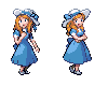
Lady
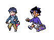
Picknicker F

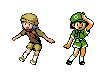
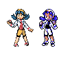
GSC Hero
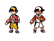
C Heroine (Kris > Lyra xD)
Picknicker F

GSC Hero

C Heroine (Kris > Lyra xD)

Feel free to give constructive criticism on any body proportions, pixels out of place, and whatnot. It's been a while since I last made a pixel art.
And before anything else, Please enjoy your stay and thanks for visiting. :)