-
Welcome to Smeargle's Studio! Please be sure to review the studio rules. Feel also free to check out our hub to learn more about this place!Welcome to Smogon! Take a moment to read the Introduction to Smogon for a run-down on everything Smogon, and make sure you take some time to read the global rules.Congrats to the winners of the 2023 Smog Awards!
nj art
- Thread starter Nastyjungle
- Start date
 nj do you want me to compile you an index in your op looking through this thread is like doing all sorts of mind injuries v_v
i will do it.....sometime...................................
I am sad that they aren't all posted :<I dig the animations you've been up to lately
wow my thread was all the way on the second page
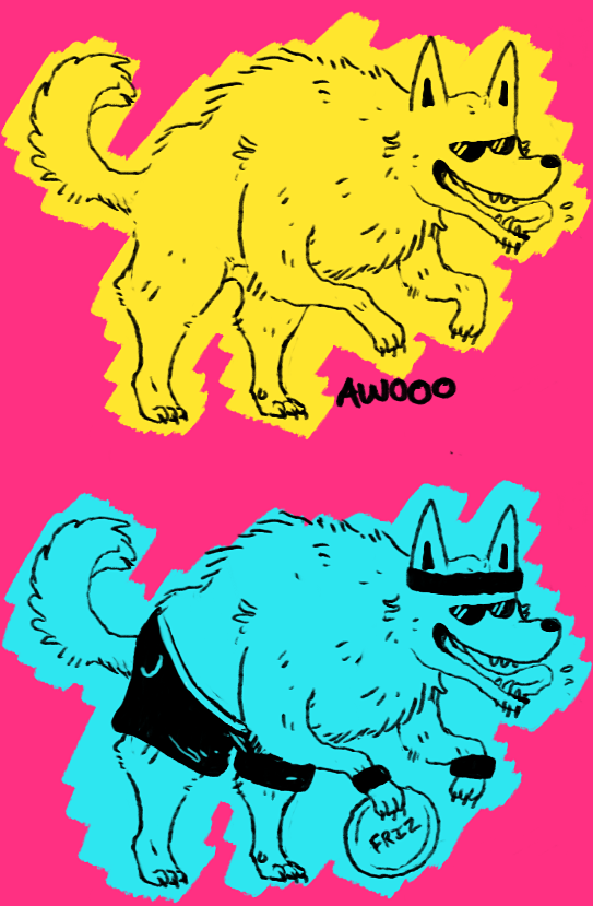
i drew rairty and twilight sprake haha idk i got this overwhelming urge?????
haha somebody plase just beat me over the head with a corwn bar or soemthinge
i feel like i have to clarify further that i dont watch this embarrassing show
the smogs ouuuut and i made cover art!!
 I'm not NJ so I can't know for sure, but if I had to guess... it's the same paper texture she uses for a lot of her pictures, just set at a higher opacity than normal. She downloaded it since PS doesn't come with anything worthwhile in terms of preset patterns (and has also mentioned finding it in the depths of google previously).
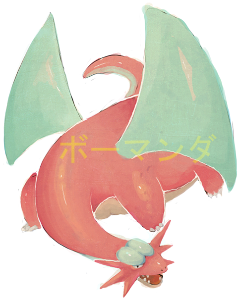
Also, looking good NJ! Are you planning on finishing the figure painting? yo man, i really really dig the pink salamence
how you painted over the black outline sketch but left little bits of it
and then went in with white and highlighted the limbs and belly
and the colors are really bright and warm
i dont know what the asian characters say but they look sick
and i really loved the smog cover and the drawing alone
awesome awesome shit dude
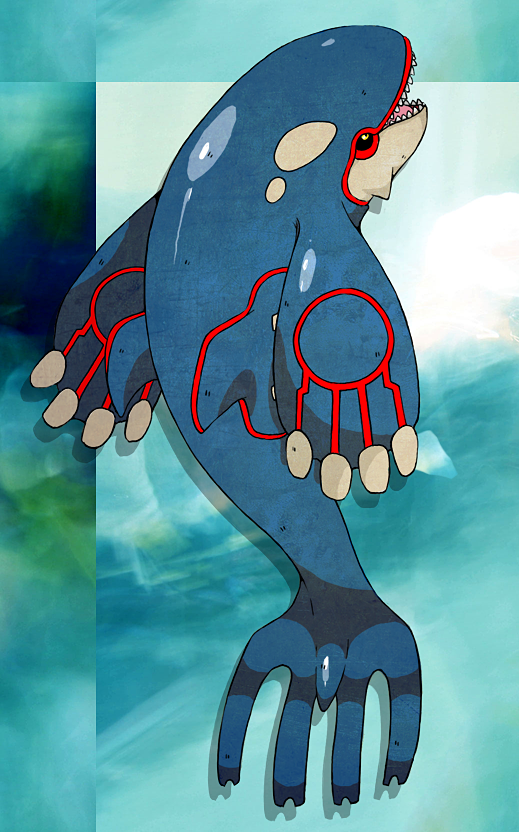
its a paper texture i posted somewhere else itt, elcheeso is riteOh man NJ, that texture on the kyogre. What texture is it? Is it a pre made one from photoshop, or did you download it?
probably not, im horribly horribly lazy........Also, looking good NJ! Are you planning on finishing the figure painting?
thanks for the kind words all
my art thread is nsfw if you havent figured that out by now its your fault
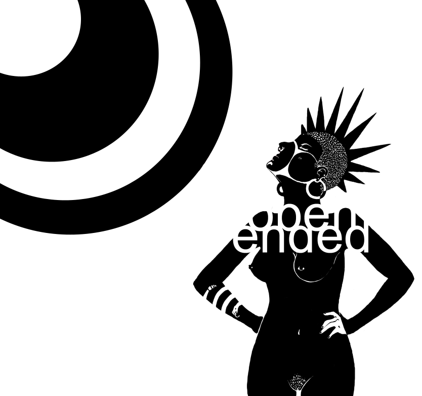
honestly this whole picture is anatomically goofy but suck my cockDig the typography, so arial
Really like how you've cut off the descender of the p and the ascender of the d, and yet it still reads very clearly to me
I really like that there are only two colors, and the way that the colors flip on that hand-on-hip -- I always find that sort of thing exciting, haha
very cool stuff :)ok honestly what is it with you and drawing naked girls
there is probably a 40% chance i am a homosexual
adding my two cents, womanly curves are so much more interesting to draw than blocky men. Lovin it NJ! :DThat is the cutest claydol the world has ever seen.Users Who Are Viewing This Thread (Users: 1, Guests: 3)
- ... and 1 more.