


WHOO! Last step and my 2k post. see what I give for you guys?
Anyways, just vote for which ever complete sprite you prefer. I will not be doing palette swaps, so choose the group of sprites that you feel fits Revenankh the best. You get one vote, and there may or may not be multiple polls depending on how close these votes are. I'm leaving town this Sunday, so I intend to finish Revenankh by then.
King of Anime:
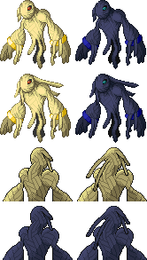
Atyroki:

Dragonzrule:


Flygon493

Have fun!
(KoA, you will have to color the official art once we decide on the sprite. Black and white art is a little annoying in Pokemon. We aren't playing on a Gameboy anymore.)


