
It doesn't have to look bulky; a mummy is automatically bulky. They look like twigs wrapped in paper, but they can take any hit and stay standing. This is true of every mummy in popular culture (though not of real ancient egyptian culture).

-
Check out the relaunch of our general collection, with classic designs and new ones by our very own Pissog!
-
The moderators of this forum can be found in the CAP forum staff directory.
-
Welcome to Smogon! Take a moment to read the Introduction to Smogon for a run-down on everything Smogon, and make sure you take some time to read the global rules.
You are using an out of date browser. It may not display this or other websites correctly.
You should upgrade or use an alternative browser.
You should upgrade or use an alternative browser.
CAP 2 Part Deux: Poll 14a - Final Spriting Poll
- Thread starter Hyra
- Start date
- Status
- Not open for further replies.

So...in order for any Pokemon to be considered bulky and a part fighting type it has to be 1) Blocky or Fat in shape and 2) In some dynamic pose amirite? But I see a problem in both of them.how is it a moot point when the one dragon has offered does look part fighting and bulky, yet half the people that decided this pokemon would be bulky and half fighting have voted for the one that in comparision doesn't fit this criteria.
Point 1: Being Fat or a brick in shape =/= Bulkiness. Uxie, Leafeon, Celebi, Umbereon, Jirachi, etc.... don't look bulky but have reasonable good defensive stats. Hell let's talk about Celebi and Jirachi, two of the most bulkiest little fucker I ever seen. Seriously...they can take hits like champs and they're only one to two feet tall.
Point 2: Pose doesn't alway mean easy to see typing


voted KOA because it looks more DP'ish.
dragonz looks too cartoonish. we arent making a cartoon mummy =/.
damn pegusus would come and invade our pokemons.
dragonz looks too cartoonish. we arent making a cartoon mummy =/.
damn pegusus would come and invade our pokemons.
Pokemon sprites ALL look cartoonish. I mean, really. Look at BLISSEY.voted KOA because it looks more DP'ish.
dragonz looks too cartoonish. we arent making a cartoon mummy =/.
damn pegusus would come and invade our pokemons.


oh so the fact that KOA's is too detailed for a pokemon sprite
Detail is bad?
, or that it doesn't even look part fighting,
Please explain. Those big hands hint to the fact better than you'd expect.
or the fact that it really does not fit the fairly bulky defences that were decided upon doesn't matter.
How does it not look bulky. Really. Explain this as well.
KOA's back sprite is better though
Dragonz looks more like fighting than ghost, and we've decided that fighting was it's secondary type, meaning it's a hijacker or in for the ride more than anything. That's why we have a "Main type" and a "Secondary type"
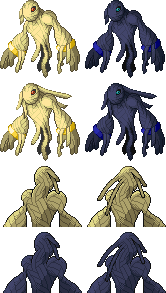
I love the hand of win, but it's just so big it makes the sprite, again, A giant hand with a mummy attached.

Blegh.
My biggest issue with Dragonzrule's sprite is probably the bandage outlines disappearing after they run for a few pixels. I mean, come on, there's practically as much solid space as there is bandage. Other than that (and perhaps the space-consuming hand previously mentioned), I don't have too much of a problem with it. But then, there's KoA's sprite in competition, and I don't see too many actual problems with it. So...
My biggest issue with Dragonzrule's sprite is probably the bandage outlines disappearing after they run for a few pixels. I mean, come on, there's practically as much solid space as there is bandage. Other than that (and perhaps the space-consuming hand previously mentioned), I don't have too much of a problem with it. But then, there's KoA's sprite in competition, and I don't see too many actual problems with it. So...


hahaha, you are comparing random sprites in position to go against KOA?
thats idiotic.
thats idiotic.
Random sprites? First of all, they're pokemon sprites, and if something is going into the same game, it's very reasonable to use in-game artwork to compare. Second, Ghost is a perfect example of a bulky Ghost Hariyama a bulky Fighting-type, so that's even more reasonable. You can disagree with me, but it's far from idiotic.
One thing I've noticed is that each generation tends towards a certain style in terms of artwork and design for their Pokemon (ala Butterfree and Beautifly). While Dusknoir is in an oddly similar pose, it doesn't really match Dusknoir in terms of styling and such.
In retrospect, why does Revenankh need to be compared to other Pokemon, again? Judge Revenankh by itself, and friggin' ignore that Dragonzrule's has hands in equal size of Hariyama's. This is the mold-breaker Pokemon, folks.
In retrospect, why does Revenankh need to be compared to other Pokemon, again? Judge Revenankh by itself, and friggin' ignore that Dragonzrule's has hands in equal size of Hariyama's. This is the mold-breaker Pokemon, folks.

YOU LEAVE BASE 600'S ALONE!!... SO WHAT IF THEY ARE UBER? ALL YOU ASk IS MORE AND M...
ill just stop with the criss crocker.
hyra, you and me both wish that.
ill just stop with the criss crocker.
hyra, you and me both wish that.


I WANT MOTHERFUCKING THUNDERPUNCH, NAO !!!!!!!!!!!!!!!!!.I wish this kind of passion went into the Stats and Movepool threads...
Okay, now I got that out that silliness out of the way, I'll just say that maybe it's because it's tirining to alway be arguing over shit lol
- Status
- Not open for further replies.