Welcome to Smogon! Take a moment to read the Introduction to Smogon for a run-down on everything Smogon, and make sure you take some time to read the global rules.
I thought the alternate interpretation of that other thread was pretty interesting but I was bothered with all the mon crap so here: illustrators, web designers, writers, journalists, typographers, and everyone else, what are the typefaces you like to use the most?
NOTE: PLEASE USE THE FONT FAMILY YOU ARE TALKING ABOUT
(either type something in Paint and save it as an image and display it here, or at the very least link to an image representing the typeface)
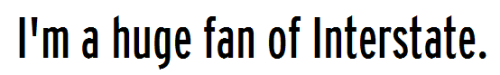
(also, fyi: Arial 9pt and Arial 10pt, for instance, are two different fonts of the same typeface)
I have a tremendous bias when it comes to typefaces-- as I imagine anyone who gives a crap about typefaces would-- and this bias is skewed heavily by the context in which I use them.
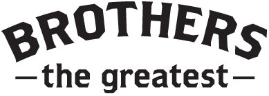
Right now, brothers gets my vote for favorite typeface.
an aside on why:
sports/entertainment logos traditionally place a tremendous value on immediate visual impact. In a media realm that sees hundreds of entities competing for attention, only those that draw the most attention to themselves are going to receive any acknowledgement whatsoever. Having visual impact means that it should take viewers seconds (or less) to evaluate how they feel about the logo in question, and by extension, the brand that said logo represents.
To that end, heavier (blockier/thicker) typefaces are typically better in sports design because they read with better impact. They also allow more room for additional detail work, bells, and whistles, and added effects (such as bevels). Sorry if it's super lame for me to cite my own work but I think this typeface really brings it:
Brothers in particular has an old-fashioned, handcrafted feel to it that I find subtle and wonderful.
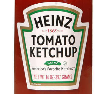
The arched Heinz logo
But it's more than a display font. Brothers also pulls off the supporting role pretty well (although it is often distinct/erring on the eccentric side maybe).
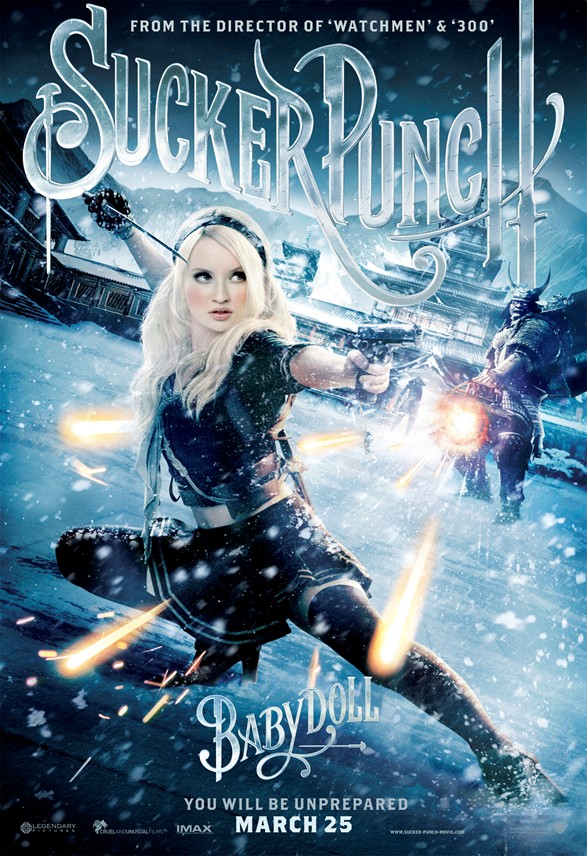
One place I remember seeing Brothers getting some love was in the poster campaign for the film Sucker Punch, which was advertising around this time last year.
brothers, carrying the day with that old-timey feel, so hot
I'm pretty sure that Tropicana also ran a campaign that used the typeface at some point last year, but I can't find it.
I could honestly sing the praises of this typeface all day, but I think you get the idea.
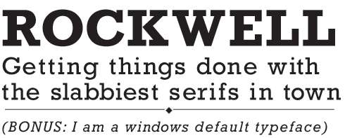
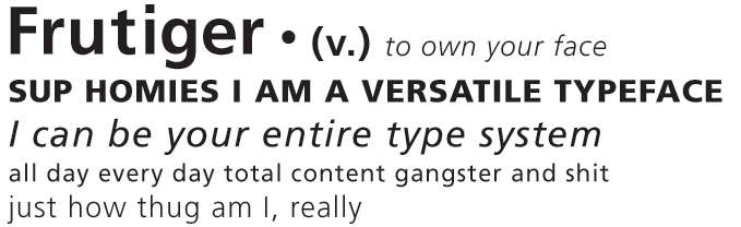
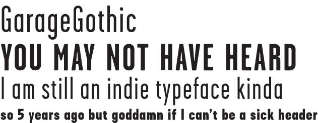
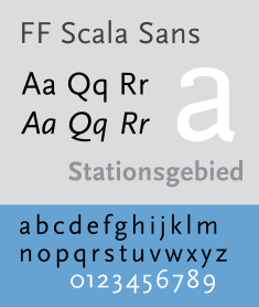
some other favorites (print typefaces, I am a web typeface scrub):
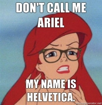
Hi I never understood the hate for Comic Sans???? I mean I get its totally unprofessional but when it isn't overused it can look good, esp. on things for children. It is light and fun and pleasant to look at imo. Unless you're Dan Gilbert in which case you shouldn't even have a basketball franchise for using it.