
-
Check out the relaunch of our general collection, with classic designs and new ones by our very own Pissog!
-
Welcome to Smeargle's Studio! Please be sure to review the studio rules. Feel also free to check out our hub to learn more about this place!Welcome to Smogon! Take a moment to read the Introduction to Smogon for a run-down on everything Smogon, and make sure you take some time to read the global rules.You are using an out of date browser. It may not display this or other websites correctly.
You should upgrade or use an alternative browser.Sticky X/Y Sprite Project
- Thread starter Layell
- Start date
 TeraVolt nice sprites. Think the eyes should be fixed on both though. Other than that it looks good.
Anyway, fixed mewtwo Y's front sprite and made its back animation too! (sorry siiilver. saw it was animation ready so went ahead and animated it. Didnt know you was still working on it >.<)
View attachment 4037 View attachment 4038
If theres something off just let me know. Gonna start on its rare animation at the mean time.
Still see a little bit of a warp on the bottom-mid of the head tail on the front/backsprites.
It shrinks a little when the bottom comes up
Looks great; almost done :)
EDIT: Is there anywhere where I can see the updated versions of all the sprites? Not the ones on PS but the more recent edits... If they're on the google doc can you show me where?
ThanksToday's actually my birthday, and I was going to post my QC of Fletchling and that new Fletchinder front I mentioned, but I'm not 100 percent sure that they're ready yet so I'd rather not rush.
Happy Birthday! I hope all will be well for you. c:
Well anyways, school works are still at high but I did managed to get a hold of Mega Gardevoir amidst this mess.
New Sprite
Old Sprite
I just did a quick edit with the positioning with the body and the head. Please do tell what you all like more; the previous one or the new one. I'll work on whichever will be preferred the most.
As always, comments and suggestions are welcomed.
Fixed Barbaracle so he has the right colors and number of eyes
The back sprite doesn't appear to be the same colour as the front? Also, having looked at the model in my game, the right arm on the shoulder of the sprite seems to be far too wide - not to mention there is that little blue bump (which obscures part of that protruding arm) that shouldn't be there (particularly given the angle of the sprite). Wobblebuns, I like the new Mega Gardevoir sprite better, it has a much better pose and expression, but I think it does need some fixing. The main thing is that the eyes are too squeezed, perhaps try raising the hair a pixel or so so it has more room. Also, the spikes on the right side of its head shouldn't be so visible, even though it's looking mostly straight ahead. Either less emphasis or just a removal would be fine.
You may want to make some other changes based on the official artwork as well. Please don't make the legs visible though, that would make animation way much harder.
About Barbacle, the top left arm on the backsprite is completely wrong. It should be facing right, not left, and the base should be obstructed by the blue rock-thingy since it's leaning forward. Just a small issue for whoever gets a chance to fix it (RedRooster, Layell, TeraVolt, I dunno).
EDIT: viperdk1, I do like the extra detail on the blade, but I'm not all that fond of the rest. The colours are generally brighter on sprites than on 3D models, so the hilt was better before. Also, the extra lines emphasized some of the crookedness of the blade, which needs fixing now. And for some reason you made the eye backwards? Since the edits require modifying only one part that doesn't even rotate, I'd be happy to fix the animation myself (it'll be easier than pasting it in frame-by-frame).Last edited: I've been of the opinion the current honedge brightness is fine, the 3D models have tended to be duller colours for some reason. I would really just need to animation to move at the same speed, seems really slow.
Yeah no Gardy legs visible k.
I am also fine with people tinkering with Barbaracle back as much as necessary. Ok I'll fix the warped parts but think I'll just make it do the wavy movement in the rare animation if thats ok. I'll take a look at his leg too.
and happy bday princessofmusic!EDIT: viperdk1, I do like the extra detail on the blade, but I'm not all that fond of the rest. The colours are generally brighter on sprites than on 3D models, so the hilt was better before. Also, the extra lines emphasized some of the crookedness of the blade, which needs fixing now. And for some reason you made the eye backwards? Since the edits require modifying only one part that doesn't even rotate, I'd be happy to fix the animation myself (it'll be easier than pasting it in frame-by-frame).
Only just noticed this now...looking at my own version again, it does seem a little bit dull on the hilt. The eye (I first thought) didn't look quite so right, so I had made an edit (probably not the best idea xD). Not quite sure what you mean by the bolded part (whether it refers to the hilt or the blade)
Either way, I've moved my blade onto the original sprite.
TeraVolt I alredy did a edit on barbarcle's colors and eyes
Fixed Barbaracle so he has the right colors and number of eyes
also going to do an edit on his back soon -
-


Alright, I made this earlier in the afternoon and wasn't planning on posting it until I finished the animation edits, but I just wanted to show what I was thinking would make it better.
One thing to note is that I edited the backsprite in a few other ways as well. The ribbon had a weird shadow that I didn't like, and the pattern on the back of the sheath was wrong (I had mistakenly copy-pasted the front pattern way back when I first edited it).
Anyways, I cleaned up the blade more so that it looked straighter, and I think that the minor changes really makes it look a lot better. Other than that, I think that princessofmusic's suggested changes aren't really necessary (I'm not a fan of Noscium's palette, to be honest, I think the current colours are great), but at this point I'm looking at more than some minor animation edits. Nothing I can't handle of course, but if you want to change anything, you'd best do so soon.
Also, whatever changes happen to Mega Gardevoir, I just want to point out that the dress trailing behind it looks really cool and I wouldn't want to see it left out.
EDIT: S0L1D G0LD, I'm not going to prevent you, but I kind of just invited more people to edit it, so you may want to hold off until then unless updating it will be literally no trouble at all.Last edited:
Am I allowed to update my shiny as such?

Alright, I made this earlier in the afternoon and wasn't planning on posting it until I finished the animation edits, but I just wanted to show what I was thinking would make it better.
I still need to fix a shadow on the backsprite, will edit it in shortly.
One thing to note is that I edited the backsprite in a few other ways as well. The ribbon had a weird shadow that I didn't like, and the pattern on the back of the sheath was wrong (I had mistakenly copy-pasted the front pattern way back when I first edited it).
Anyways, I cleaned up the blade more so that it looked straighter, and I think that the minor changes really makes it look a lot better. Other than that, I think that princessofmusic's suggested changes aren't really necessary (I'm not a fan of Noscium's palette, to be honest, I think the current colours are great), but at this point I'm looking at more than some minor animation edits. Nothing I can't handle of course, but if you want to change anything, you'd best do so soon.
Also, whatever changes happen to Mega Gardevoir, I just want to point out that the dress trailing behind it looks really cool and I wouldn't want to see it left out.
Edit got it, I'll wait to update the shiny. Hell, It's no trouble anyways though.Last edited:
I like the current gardevoir as well over the new one that is made. The pose just looks correct (and graceful) to me unlike the other one. Not saying its a bad sprite because it is. Just not a fan of the pose.
Anyway, I finished editing mewtwo Y.
Almost all my edits was done to the back sprite. Fixed the path the tail took so it would look smoother. Also think I fixed the warping. Fixed that leg a little as well by making hit upper leg more static so it would look like hes just bending his knees. Still left a little movement tho just to match the front sprite. As for the front sprite, the changes are very small so you probably wont notice them. Pretty much just cleaned up a couple stray pixels since I didnt notice anything wrong that stands out to me for it.
-
ito, I can tell you what makes the animation look off. It's the extra frames where the limbs stop but the tail keeps moving. Just make sure the limbs move too during those times as well, and it'll be much better.
Anyways, princessofmusic, what I don't like about Noscium's palette is that I don't think it matches BW style as well. This post is the best example of such. I'm not going to disagree with you on the hilt, or perhaps some less extreme palette changes, so I may give that a shot. Also, the eye is just one of those things that's just impossible to get perfect, and right now I'm just glad that it's actually properly looking to the left rather than straight at you, which would just be weird.
The whole bottom half of his tail is to straight when it is moving up. Other than that it looks good.I like the current gardevoir as well over the new one that is made. The pose just looks correct (and graceful) to me unlike the other one. Not saying its a bad sprite because it is. Just not a fan of the pose.
Anyway, I finished editing mewtwo Y.
View attachment 4107 View attachment 4106
Almost all my edits was done to the back sprite. Fixed the path the tail took so it would look smoother. Also think I fixed the warping. Fixed that leg a little as well by making hit upper leg more static so it would look like hes just bending his knees. Still left a little movement tho just to match the front sprite. As for the front sprite, the changes are very small so you probably wont notice them. Pretty much just cleaned up a couple stray pixels since I didnt notice anything wrong that stands out to me for it.
Edit: I think the pink parts should turn purple. The megas appear to be part pink while mewtwo is purple, but that's not the case.
Look at these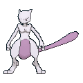

 Last edited:


You have no idea how long the changes to Mewtwo's palette have been bothering me for. I always just assumed the Mega formes naturally different colours, but now that I've seen they're the same, I wasted no time fixing it.
Also, both animations can be recoloured when they're complete. I think some people have been doing it frame by frame though? There are programs that let you do that all at once, I downloaded a simple one the other day (I'll find the link for it when I get the chance).
EDIT: Also, I believe I got the issues with Honedge's handle straightened out. And another edit, added the changes to the ribbon colour. By now, the changes have definitely passed the "quick animation fix" level, I'm going to have to almost completely redo it.


EDIT AGAIN: Trevenant done too. I love Thursdays.

 Last edited:I actually agree with princessofmusic about the colour changes. The colour of the ribbon is simply incorrect, when compared to the in-game model and official art. It's not just that it's not dark or light enough, it's not even close to the right colour! D:


