CAP 3 CAP 3 Art Submission Thread

Status
Not open for further replies.
These 3 are definitely my favorites.


I love the design here, I think something's a little wierd with the arm on the right side, possibly a bit too long but thats easy to revise, we really need to see this coloured though.


Great art, although i'm going to agree with some of the other posters in saying the cannons on its arms just seem a bit too simple.


I only like the 2nd concept but i like it alot. I think this pic isn't recieving the justice it deserves probaly since it's not coloured, but its really nice and is probaly my favorite.
I'll try to get my friend to color it, I'm only good at sketches ;[
 
wait is the art poll going be before the stat spread poll or not.
Most likely after the stat spread poll. Personally I say before but I good hunch most of the people submitting stat spreads are rooting for a certain submission and making spread accordingly. In theory that's a good idea but I alway say "Don't put all your hopes in one basket"
 
Well, sorry I'm late, but I'll have a couple of sketches u by the afternoon. And, shouldn't we know the movepool, to see if it gets body-part specific moves? Or does the Movepool depend on the art?
 
KOA, your Cockatrice looks great! I too would like to see it colored.

Doug, I'm still a fan of "Hallowmean;" however, I wonder if it might be better suited as a Fire/Ghost, Ghost/Fire, or even Ghost/Grass.

Elagune, your Gentle Giant never appeared to have blocks to me. I figured they were cannon-type appendages to fire Flamethrowers and such.

Wow, all of these submissions are just excellent! I'm getting interested to see what Woodman #2 would look like shiny (blue lizard please?)
 
Haha, great to see all this feedback on my designs. I realized that a lot of the sentiment amongst you guys was that the Woodman design, as you guys have named it, looks more like a physical wall than anything else and wanted flamethrowers on the arms.

Here is my offering.


Any thoughts?
when Sudowoodo and Charizard enter Bills Pokemon Transporter. That's what I think.
 
Hey, so I thought it'd be fun to try my hand at a submission.

Here's my impending-forest fire deer Pokemon.


Bambi meets Princess Mononoke??
 
Well, the way my drawing is going now, I wish we had the Build thread after the art, so we would have more freedom now...

EDIT: @ Cartoons: HOLY SHIT!
 
Wow i must say these arts are extremely impressive. This CAP art will truely be the hardest and closest competition yet. I am loving cartoon's Elk. It is so unique IMO and Its just beautiful to look at. All of Elagune's sketches have made my jaw drop, yet the more submissions coming in, the harder it is for me to pick a favorite. This definately will be an interesting poll.
 
Hey, so I thought it'd be fun to try my hand at a submission.

Here's my impending-forest fire deer Pokemon.


Bambi meets Princess Mononoke??
This is my favorite in the entire thread. It looks somewhat inocent yet destructive. And there aren't that many Deer pokemon ^^
 
Hey, so I thought it'd be fun to try my hand at a submission.

Here's my impending-forest fire deer Pokemon.


Bambi meets Princess Mononoke??
It give new meaning to "Don't start Forest fires". LOl Looks like Stantler's got a rival, that's really good, the brush strucks, how did you do they shading?
 
Hey, so I thought it'd be fun to try my hand at a submission.

Here's my impending-forest fire deer Pokemon.


Bambi meets Princess Mononoke??
This looks great and does remind me of the Princes Mononoke type creatures! Despite it being a deer (sort of like stantler) I feel it takes a very original look.
 
Elagune's revised woodman is absolutely amazing, though there's a lot of other good ones to pick from (I love the Pumpkin, though it looks slightly more Ghost/Grass-like). KoA's third one is good, too.
 

DougJustDoug

Knows the great enthusiasms
is a Site Content Manageris a Top Artistis a Programmeris a Forum Moderatoris a Top CAP Contributoris a Battle Simulator Admin Alumnusis a Smogon Discord Contributor Alumnusis a Top Tiering Contributor Alumnusis an Administrator Alumnus
Moderator


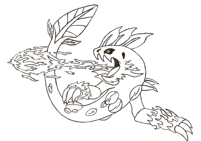
Since a lot of people have commented about the "Ghostliness" of my Jack-O-Lantern, I thought I might explain a few points about that.

1) It's intentionally very ghost-like. I didn't design a flaming pumpkin; I designed a Jack-O-Lantern. Jack-o-Lanterns are part of Halloween, which is deeply rooted in concepts of spirits and spooks. If I try to eliminate the ghost aspect of the design, then it becomes a vegetable that is lit on fire. That's not interesting or fun.


2) I think a Jack-O-Lantern design can work for any two of the following three types - Ghost, Fire, and Grass. In my design, I think there are very clear elements of all three.

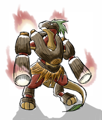
There are other pokemon like this. For example Beedrill is obviously a bee. A bee is a flying insect that stings. That connotes three workable types -- Bug, Flying, and Poison. Unfortunately you can only have two. Beedrill happens to be Bug/Poison despite the fact that the art has very prominent wings in the design. So, to acknowledge the obvious Flying connection, they gave Beedrill moves like Aerial Ace and Roost.

Another less-obvious example is Flygon. Although it is Dragon/Ground, it's artwork and pre-evos are very clearly Bug-like. That's why Flygon has Bug moves, and (most people forget this) it is part of the Bug breeding group. This acknowledges a third "hidden" typing that can't be part of it's official dual-type. (You could argue that Flygon actually has four types, with Flying being the fourth).

So, if this design were chosen, I could easily see us giving it some good Ghost moves like Shadow Ball. Maybe even give it core Ghost stuff like Destiny Bond or Pain Split. I wouldn't make it gamebreaking, but acknowledging a "third" typing via the movepool, is not unprecedented.


3) I'm not planning on changing the design, because I don't think it will win anyway. I think it's a good concept and I think I executed it well. But, even with modifications, I don't think it is a better concept than some of the others I've seen posted here. I think it is good enough to be included on the poll, but some of the other designs are more suited to CAP voter tastes.

In general, CAP tends to vote for things that are very literal translations of the intended typing and build. My design doesn't really fit that mold. Even with changes, it will still require a little "creative justification". There are several other designs that are easily identified as pure Fire/Grass, and are incredibly well-done.

If my design makes the poll, I'm not sure I will vote for it. That's how much I like some other designs. I don't want to spend time reworking a design that likely will not be selected. I only colored my pic, because based on feedback, it looked like it had a chance of making the poll. I didn't want to appear to be a slacker artist for not "finishing" my submission. Plus, whether it wins or not, I really enjoyed working on it. I think it looks extremely cool, and I would love to see that thing come out of a pokeball someday.


I drew my Pokemon in its attack-mode


Anyways, I'm going to explain more about this Pokemon I call Tranon.

Tranons are usually very weak, making it incapable of moving alot and instead it rests on its left-hand(cannon) most of the time. It's legs aren't that strong to carry itself and move from distance to distance. Despite its weak strength, its body is very sturdy making it just shrug a couple of hits from its enemies. Tranons also have the ability to shoot fatal shots from its cannon by turning solar energy into a flaming cannon ball made from its bark inside the cannon. Also, Tranons can only shoot a limited amount of cannon balls as it needs time to use solar energy to recover the bark used for its cannon. It then releases the leftover ashes by smoking it out from the hole on top of its head. Due to its very weak leg strength, Tranons can only attack by standing on its right hand, raise its cannon, aim, and shoot for a maximum of 5 seconds. Haha 5 secs? Do not be fooled, as its cannon balls are fatal when fully taken.
 

CTI

black


These 3 are my favorite currently. The lava snake is my next one after these :P Cartoons! will probably get my vote though, seeing as the fire salamander reminds me too much of grovyle, charizard, sudowoodo, and a bit of lucario mixed together e_e
 

My favourite so far, I love the quirkyness of it.

Cartoons you continue to blow me away, here I was thinking all you could make was those awesome gifs, but alas lookie what you have here. This is an amazing drawing.


Now my 3rd favourite, though I think if any alteration should be made is too remove the top shoulder cannons, I honestly cannot see how people would mistake this for not grass. Note Tail, Wood Armour and Skirt. Although it does look like a Cross between Charizard and Sudowoodo
 
For Elagune's "Wood-Burner-LizardMan", They're not back cannons, more like back burners/jets. Think of Burnerman: Here

Cartoon's Flaming Elk is awesome and original too, much like some of the other works.

Doug~ Don't negative stuff about you're drawing. I actually like your drawing very much and people are just sticklers for obivous connections and ways to express typing. I can see it being a grass/fire.

Edit: Too much altering of one picture may make it less appealing than when it was fist made.
 
Haha, great to see all this feedback on my designs. I realized that a lot of the sentiment amongst you guys was that the Woodman design, as you guys have named it, looks more like a physical wall than anything else and wanted flamethrowers on the arms.

Here is my offering.


Any thoughts?
The thing is, I think I like the ambiguity of the first one, meaning I liked that the first version didn't look too much like a lizard. I like the hair and tail though, nice additions, plus there's more than 2 colors =D

Like the others said, I think there should be 3 backburners visible.

Also, maybe you can make the cannons small like Blastoise's and hollow in the picture.
 
I really like Cartoons work, its definitely original and stands out alot in comparison to its competition in terms of the style it was coloured in. I actually dont like the purple slowers on it but still great work!

(Could you explain a bit more on how you did the colouring for this cartoon? and how long did it take you?)

From here on it seems Cartoonss and Blu's artwork get my vote.
 
Status
Not open for further replies.

Users Who Are Viewing This Thread (Users: 1, Guests: 1)

Top