
-
Check out the relaunch of our general collection, with classic designs and new ones by our very own Pissog!
-
The moderators of this forum can be found in the CAP forum staff directory.
-
Welcome to Smogon! Take a moment to read the Introduction to Smogon for a run-down on everything Smogon, and make sure you take some time to read the global rules.
You are using an out of date browser. It may not display this or other websites correctly.
You should upgrade or use an alternative browser.
You should upgrade or use an alternative browser.
CAP 3 CAP 3 Sprite Submission Thread
- Thread starter Gothic Togekiss
- Start date
- Status
- Not open for further replies.


Between it's tail, left arm, and left leg, there's that orange (skin colored) lump. Then it's also on it's right leg (stage left), between the skirt and foot.
I'm not sure what they are. Looks like it could be the upper parts of his legs, but it makes it seem like he would be REALLY tall if he stood straight up.


I think the problem is that everyone is too focused on cramming every last bit of detail onto the sprite all the while trying to get it in a cool pose. The wood armor doesn't have to have all that detail on it to still look like wood. Think Sudowoodo/Shiftry kids.


I've tried lowering the detail on the wood. I need to know if this is an improvement and if so, should I take it a step further?

I've been meaning to reply to this earlier, but Gloom and Time Mage and everyone else is right on the money. From day one I knew the problems with being overshaded and undersaturated (especially saturation- it's really really important in pokemon), but I was curious to see whether anyone would bring it up. Making the sprites more "pokemon-ish" is waaay harder than it sounds, though. Namely, with woodman the wood texture really fights with the "simple-shading" schema.
So sorry, you'll have to endure more of me fiddling with my sprite. Hopefully people aren't sick of it yet :p This is important, though.

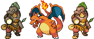
I made a Charizard sandwhich so you can see how more pokemon-ish this revision is and how it (hopefully...) looks much better this way... still not perfect, though. Old sprite is on the left.
The talent and work on this thread is great, and I give you all credit and admiration. However, I don't know if any of these sprites scream out "New Pokemon sprite" to me yet, but so far out of all of the ones I've seen I'm liking the Pokemonish style of this one.

Minor palette change.
Made it upbeat. :x
I'll work on the head and flames a bit later, I'm being bossed off the PC:

I really like this sprites body work and I think it looks very appropriate for a Pokemon, same with the coloring of it, looks almost perfect. The only thing that bugs me about it, is the head. It doesn't really look very anime or Pokemon like, seems like he's missing some expression in his eyes, or his facial structure is not too much alike to the image drawn by Elagune. Just my suggestion, I just say make the head on this look more pokemon like and this sprite has a good chance of winning.


Hey everyone,
I'm posting a WIP on behalf of my friend who is awaiting registration on the forum as parnig.

Hopefully soon he will be able to post the final piece himself, but in the meantime, what do you all think? I think the bulky look is a fine reflection of the stat distribution, personally.
Again, this is parnig's sprite, NOT mine.
(edit) cool, yeah, everything will be cleaned up in the final, tail added etc.
I'm posting a WIP on behalf of my friend who is awaiting registration on the forum as parnig.
Hopefully soon he will be able to post the final piece himself, but in the meantime, what do you all think? I think the bulky look is a fine reflection of the stat distribution, personally.
Again, this is parnig's sprite, NOT mine.
(edit) cool, yeah, everything will be cleaned up in the final, tail added etc.

Ok, since everyone says that the sprites have too much detail, I dumbed it down a bit on mine(as well as adding the slanted barrel opening thing, and I think it looks a lot better that way). Here is what it looks like without all of the wood detail:

I think that it does look more like a pokemon this way, but the armor doesn't exactly scream "wood!" this way. I'm currently working on the female/shiny versions. Comments on the "improved" sprite would be appreciated.
EDIT: I just saw Cartoons!'s(parnig's) sprite, and I must say that it looks very good. There are pixelation errors, but I am assuming that they will be edited out in the final piece.
EDIT2: I saw KoA's sprite, and no offence to him, but I do not like it much. I don't know, I think it may be the head, but it doesn't look right to me.
EDIT3: lol, a lot of edits. I am going to change the reddish skin color to a brighter tone.
EDIT4: Brighter toned, less detailed Woodman:

Hey everyone,
I'm posting a WIP on behalf of my friend who is awaiting registration on the forum as parnig.
Hopefully soon he will be able to post the final piece himself, but in the meantime, what do you all think? I think the bulky look is a fine reflection of the stat distribution, personally.
Again, this is parnig's sprite, NOT mine.
I think this spriting competition just got itself a fierce competitor. Kudos to Parnig.
I say if he has time he should try to add in a duplicate sprite with a tail just for the hell of it, and if he makes a crazy looking shiny form to match it (blue fire please) then that will definitely improve his chances of winning dramatically.
Hey everyone,
I'm posting a WIP on behalf of my friend who is awaiting registration on the forum as parnig.
Finally....a sprite worth liking, no offense to the others. The thing I'm wondering about is how it's going to look with the tail added, also really like how the head appears. How what a monitor lizard head.
I actually with you. The head on KoA sprite actually irks me in some way.EDIT2: I saw KoA's sprite, and no offense to him, but I do not like it much. I don't know, I think it may be the head, but it doesn't look right to me.

if cartoon's or his friend did something more pokemonish with the eyes i think it would be perfect. The others are good but don't really have the pokemon style.

Hey everyone,
I'm posting a WIP on behalf of my friend who is awaiting registration on the forum as parnig.
Hopefully soon he will be able to post the final piece himself, but in the meantime, what do you all think? I think the bulky look is a fine reflection of the stat distribution, personally.
Again, this is parnig's sprite, NOT mine.
(edit) cool, yeah, everything will be cleaned up in the final, tail added etc.
This is the only sprite I actually like... the others just seem to have strange poses or don't look fierce enough.
Awesome KoA, I think your my number one at the moment. The changes you made really gave it a happy, but though look, that fits the pkmn style. The shiny's cool too, but it's a bit to grey for me (or maybe it's the combination of colors, I dunno). Maybe changing to grey part (yellow on the original sprite)to something more colorful?
Parnigs cool though, but it seems a bit too wild for a pkmn. There just feels something wrong with it. Maybe that'll change with the final design though.
Parnigs cool though, but it seems a bit too wild for a pkmn. There just feels something wrong with it. Maybe that'll change with the final design though.

Might be a bit preemptive of me, but I made a shiny version.:

Can I use that as my avatar please?


I guess everybody has an opinion, but I think these sprites are FANTASTIC! KoA totally proved why he has that Art Badge, because his sprite look like a miniature painting. My jaw dropped when I saw it.
Also, a word of advice to the spriters -- be careful about listening to feedback about it "not looking like pokemon". Every art competition (design and sprite) we get a lot of people rallying behind the cry of whether something looks/does not look like pokemon. While I agree with a lot of it -- it is not a pre-requisite that your art look like Ken Sugimori.
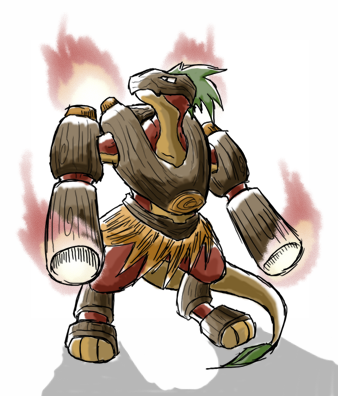
In fact, I advise against it. The more cartoony, simplistic pieces rarely win in the polls. Elagune's design is much more detailed than your average Sugimori design, but that was not much of a hindrance to his art posting the biggest sweep in CAP history. If you stay true to his design, the sprite will not look side-by-side comparable to a Charizard sprite, for example.
Also, you do NOT have to make a exact interpretation of all the elements of Elagune's design. Spriters are free to take liberties with the design. If you stray too far, you risk alienating a lot of voters that chose Elagune's design for a reason. But, there is no rule locking you into any specifics. Ultimately it is the sprite that is implemented on the server. Elagune's design is merely the inspiration for the final sprite.
I think all the sprites look damn good. A few of them are getting WORSE, as feedback is making you edit your sprites against their natural artistic style. Make a sprite you are proud of, and let the votes fall where they may. I'll be happy to see any of these designs come flying out of a pokeball on the battle server. I don't really care if it "looks like a pokemon" or not.
Also, a word of advice to the spriters -- be careful about listening to feedback about it "not looking like pokemon". Every art competition (design and sprite) we get a lot of people rallying behind the cry of whether something looks/does not look like pokemon. While I agree with a lot of it -- it is not a pre-requisite that your art look like Ken Sugimori.
In fact, I advise against it. The more cartoony, simplistic pieces rarely win in the polls. Elagune's design is much more detailed than your average Sugimori design, but that was not much of a hindrance to his art posting the biggest sweep in CAP history. If you stay true to his design, the sprite will not look side-by-side comparable to a Charizard sprite, for example.
Also, you do NOT have to make a exact interpretation of all the elements of Elagune's design. Spriters are free to take liberties with the design. If you stray too far, you risk alienating a lot of voters that chose Elagune's design for a reason. But, there is no rule locking you into any specifics. Ultimately it is the sprite that is implemented on the server. Elagune's design is merely the inspiration for the final sprite.
I think all the sprites look damn good. A few of them are getting WORSE, as feedback is making you edit your sprites against their natural artistic style. Make a sprite you are proud of, and let the votes fall where they may. I'll be happy to see any of these designs come flying out of a pokeball on the battle server. I don't really care if it "looks like a pokemon" or not.

This one is very, very good. Has a sort of Garchomp feel to it.Hey everyone,
I'm posting a WIP on behalf of my friend who is awaiting registration on the forum as parnig.
Hopefully soon he will be able to post the final piece himself, but in the meantime, what do you all think? I think the bulky look is a fine reflection of the stat distribution, personally.
Again, this is parnig's sprite, NOT mine.
(edit) cool, yeah, everything will be cleaned up in the final, tail added etc.
@KoA: Very good shiny.
Flygon, KoA, and parnig, are my Top 3.

Hey everyone,
I'm posting a WIP on behalf of my friend who is awaiting registration on the forum as parnig.
Hopefully soon he will be able to post the final piece himself, but in the meantime, what do you all think? I think the bulky look is a fine reflection of the stat distribution, personally.
Again, this is parnig's sprite, NOT mine.
(edit) cool, yeah, everything will be cleaned up in the final, tail added etc.
This one is my favorite, its got the look of a pokemon sprite down completely. Although its a little more bulkier then the original artwork it still looks awesome.

Another addition to CAP's amazing sprite collection I would say.

I can't get anything besides the head looking the way I want. I'll keep working, but I might not make the deadline.

When is the deadline anyway? I got one last paper to finish before I can fully devote my time to this.
- Status
- Not open for further replies.