CAP 8 CAP 8 - Art Submissions

Status
Not open for further replies.
Taicho's, Cartoon!'s and Buffalo Wings' are winning it for me at the moment.
Doug's and Yilx' are pretty close, though.
there's loads of good ideas being thrown around here, heck, I even signed up to say so!
 
I'll sketch some ideas with three-toed talons and see if it works.

Regarding our dragon "flying" -- I drew my sketch specifically to make it look like it could be floating above the ground (I did NOT say "levitate", since that won't be an ability on CAP 8). I'm really hoping this ends up with Magnet Rise in the movepool. Not only do I think it will be a nice competitive move for our ground-weak dragon -- but it gives us some justification for a design that looks like it could "fly". I am dead-set against giving my design any kind of wings, but I want it to look like it could slither through the air, not unlike Gyarados.

While on the topic, an interesting bit of fanboy trivia -- in the past, many people have remarked about Magnemite/Magnezone clearly floating in the air, yet being weak to Ground moves. Obviously this inconsistency was remedied in DP with the addition of the move Magnet Rise. Some fanboys have speculated as to whether Magnet Rise really connotes the ability to outright "fly", or if it simply allows Magnezone to hover slightly off the ground. I just beat the E4 in Platinum the other day, and was watching the credits roll by. If you look in the sky above the bicycling trainer, two pokemon fly high overhead. One is Drifblim, and the other is Magnezone!

SO -- Magnet Rise obviously gives the ability fly high above the ground. I'm banking on our CAP 8 to get Magnet Rise, which is why my design looks like it is floating in the air.

heh, I thought about bringing up Magnet Rise in my post; but I was worried I was getting too far ahead in the process and didn't want to go there; but that was also going through my head also! I'm also 100% agreeing against any type of wings on your design. Just to be clear though, I know you said you weren't a huge fan of the arm-talons; but I actually kind of liked the one-talon arms. I was thinking the 3-talon for the lower feet; but you do whatever, I'm sure it'll come out great.

I liked the fun-fact about a flying Magnezone too!

pkmn-taicho321 said:
I was kinda thinking about something along this lines or dragonite, who is quite fat, especially since it looks as if somewhat defensive is going to win

Hm, yes I see that. I wasn't really suggesting taking away the whole idea of it being kind of chubby; just slim it down in width a bit. Either way though, I'm still a fan of your design. The belly-button thing is hilarious in my opinion.

@Cartoons!: I'm not going to claim that there is some design mold for a dragon-type; but it just doesn't look like a dragon to me. Setting aside even my notions on what a Pokemon dragon is like (if I never played Pokemon, never seen any of the sprites, and just opened this thread); it doesn't hit me as being a dragon. No question that it is quite cool, I just don't see it as the CAP 8 design.

@nardd: The idea is cool (although physically I thought I'd point out gold can never act as a superconductor); but it's based a bit too strongly off the Chan Chu. Using real-world inspiration is really cool (and something I like); but maybe play around with it to give its own flavor as right now it's extremely similar to just a chan-chu drawing. In addition, I'm not sure if I could see a Toad fitting the bill for Dragon / Electric. I guess it's my preconceived notion that anything that is a toad in design should be a water-type but meh. I'd try to play around with the original design and see if you can come up with something that is based on chan-chu, but gives a bit of your own flavor too it.
 
Cartoons!' is easily my favourite right now. I like how it's not too dragon-like - we have enough of those.

Yilx' first sketch was also very good.

I really don't mean to be offensive, but the pink fluff monster? Probably my least favourite design.
 
Jesus, this CaP is bringing out the artist in everyone man!

Some great pieces of art!

Thumbs up go to Cartoons!'s Bulky Dragon, Cyvervisheen's number 2(though i like number 3, but the bias is against it), and last but not least the fluffy thing Atyroki came up with, if you recolor the pink.

Not sure who's going to win on this one...
 
I apologize for the long-windedness, but here are my two cents on some of the ones I like:

Wyverii - I love it! I wouldn't mind seeing how it looks in other colors, but I think the current scheme will probably end up being the best. The only other minor tweak I can suggest has to do with the "hair" spikes (the yellow ones) around its head. I'd like to see how it looks with those either modified or removed.

Princess_power - I really like the tail and the wings (minus the crescents). The whole thing works very well; however, ParadOxymoron mentioned "Faerie Dragons from Warcraft", and I feel this design is very similar to the WoW Dragonhawks. I love design, I just think it needs to do more to set itself apart. The WoW models are very smooth and flowing, whereas this is more jagged; that might be somethign to focus on in the refining process.

Caladbolg~ - I like your "child playing with something, in this case: electricity" concept best. It's very cute and playful. I'd like to see more details and a color scheme.

Cartoons! - Simply amazing! I love the uniqueness of this design. My only possible concern is in the snout, which, at the moment, reminds me a little of a bull or a boar.

Atyroki - Definitely a great "cute" design. I personally like the pink, but it's going to be too much for some people, so I'd recommend playing with the shade, or completely changing the hue. I think the shape of the head needs to be revised; lightning details look good, but the round head on the long neck remind me of a worm. The wings do a great job "toughening up" the cutness; I think the head needs to do the same.

aragornbird+ - Another awesome "cute" design. It's adorable, and looks like a defensive Pokemon, as many people seem to want. The one small change I would suggest is to either change the tail spikes into light bulbs, or change the bulbs on the head. I don't know if bulbs down the whole length would be "too much"; if so, maybe it could be one big bulb on the end of the tail?

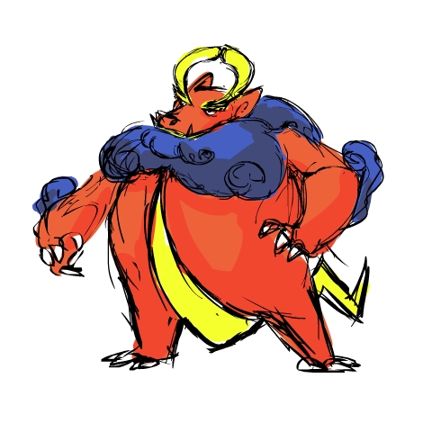
DougJustDoug** - Very cool looking! I like the general shape, the spikes on the back, and especially, the tail. I'm not sure if I dig the single talons, but I'm not totally sure what would work better in their place.

pkmn-taicho321 - I think your current design is really good. While I love that shade of blue, I personaly think a darker shade would work better for this design.

InHell 13 - I like the design with the ring around the tail.

VelvetEvoker - Fantastic concept! I really, really like the circuit idea, and the head is just plain cool. I also like the spike-things above the rear legs. More details and a color scheme!

RotationalBasis - I like the face; it kind of reminds me of a bear trap, with a lightbulb on top. I'd work on the frill more, or remove it--right now, it looks like one of those cones that vets put on dogs. I love the switch on the back! I think the blue colored one works the best.

CyzirVisheen - These look cool! I want a better scan!

Estranged - I like it. The yellow shoulder spikes are cool. I'd also recommend changing the general spikiness, and possibly the color as well. As is, it looks more like a Ground-type.

Yilx - I love the first one. The batteries look really cool, and I like the general shape and proportions of everything. I love the mischievious look the second one has. I think, though, that if you are to continue with this concept, the "fluffy" look doesn't quite work. I see this piece more as some barely-glimpsed creature viewed through an electrical storm.

nardd - I love the idea. I think I'd rather see four legs, and maybe some small dragon-esque details (maybe more toad- than frog-like? Horny toad for example?) I really like the coin in his mouth.
 
pkmn-taicho321 and Atyroki are my favorites so far. Maybe somewhat offensive and somewhat defensive respectively?
 
So hey. :D; uh. when is the deadline for these submissions? If it's in the initial post, I missed it.

ON TO ARTS. Sorry for the crappiness; I'm still in concept stage so I sketched em pretty roughly and fast. If you've seen my meagre art thread, you know my finished products are better.

concepta606.jpg


This one's /probably/ my favorite, but I wanna see what you guys think. Dunno if this one fits the bill. If I do go through with it, I'll probably have to be careful not to get too detailed or go too overboard with those swoopy shapes.

conceptb583.jpg


And this is- man what the shit did I just draw. o.o; ANYWAYS. Yeah, this one probably isn't the right thing, but I dunno? If y'all like it and I push it to final, it will not be pure black, in all likelihood- there will probably be some black, but with yellow or maybe electric blue designs or shapes or bases.

Feedback on which concept I should go with or changes to be made for either are appreciated. :3
 

^_^ You showed me a prototype of this (SPIFFY) earlier in the year, and it is still gorgeous. It definitely has my vote <3 It's everything I envisioned aesthetically

Karen~ said:
Blame me, but what is amazing about this? the pink hair screws the entire design, also i saw that cute face in another draw, the thunders around the hair and neck doesn't fit with this meganium wannabe, seriously, we need better judges for this.

That is an absolutely appalling comment to make. Keep your insults to yourself. The 'judges' are the public. And that is hardly a Meganium wannabe, what a derogatory and utterly insulting thing to say. As for the 'lol ripped off', Aty's first version of this was done LONG BEFORE THIS CAP when tennisu and I were pushing for a cute ele/dra CaP, I had it in my avatar.

eledrakt0.png


(Albeit, I like these 'wings' better)

(Sorry Atyroki if you don't want this in the post I'll gladly edit it x_x)
 
Little supporting material.

Pokedex Entry: Though small (insert name here)'s wings are strong enough to sustain many hours of flight.
PokeDex Entry#2: Often times (insert name here) fall asleep mid-flight only to be woken by passing spearow.

Also the first person to give me a good idea for a fight with my design will get to see it animated!
 
^_^ You showed me a prototype of this (SPIFFY) earlier in the year, and it is still gorgeous. It definitely has my vote <3 It's everything I envisioned aesthetically


That is an absolutely appalling comment to make. Keep your insults to yourself. The 'judges' are the public. And that is hardly a Meganium wannabe, what a derogatory and utterly insulting thing to say. As for the 'lol ripped off', Aty's first version of this was done LONG BEFORE THIS CAP when tennisu and I were pushing for a cute ele/dra CaP, I had it in my avatar.

eledrakt0.png


(Albeit, I like these 'wings' better)

(Sorry Atyroki if you don't want this in the post I'll gladly edit it x_x)

Alright, I totally agree that this isn't a Meganium rip-off, but seriously, I just don't get the...the pink "fur" either. Does anybody else think this design would look much better without it?
 
Little supporting material.

Pokedex Entry: Though small (insert name here)'s wings are strong enough to sustain many hours of flight.
PokeDex Entry#2: Often times (insert name here) fall asleep mid-flight only to be woken by passing spearow.

Also the first person to give me a good idea for a fight with my design will get to see it animated!

I vote ampharos. They kind of look relatively similar and an electric on electric idea sounds cool
 
Nope, I have no qualm with the pink fur, only that a slightly less lurid hue might be ideal. Anyway, what better way to build up static electricity?

Ah, so thats the reason for it. Well, it is a pretty briliant design then. I guess in regards to the color the pink might correspond with the female and there would be something more fitting for the male, purple mabye?
 
Alright, so I re-did my new design, and I think I'm going to keep it. It's just a rough sketch again, but here it is:
IMG.jpg

So, I decided to keep my idea of using the strange properties of crystals, such as quartz, that can conduct electricity. I also changed my design to give more bulk, as I think that is what we will be going for in this CaP. Also, I went for a Hydra-esque design, simply because I like hydras and the two heads can have a sort of positive/negative electric role to them. So, I would really like some advice and opinions on this, main advice I need would be...
-I was going for a more forked lightning look in the tail that didn't really work out, any advice or examples?

-Is it "Electric" enough for everyone?

-Or any advice on giving it a more electric look?

Any opinions would be great, thanks!
 
@ FreakShizzel: It's just a guess, you'd have to ask Atyroki to be sure.

@ Gooey-K: I'd like to see some color on that. It's certainly looking an apt candidate, though we'd need some color to be sure.
 
I vote ampharos. They kind of look relatively similar and an electric on electric idea sounds cool

I like that idea, they would be closer in height than alot of other good choices, which makes it easier to animate. Gold star Mr.Narrd


Lawls Amphros is mad cause CAP8 stole it's neck stripes. Sorry Amphy
 
I think Atyroki's pink fur MAKES the entire design. If he got rid of it, I think it would be tragic. The entire design is slotted squarely in the "cute" pokemon mold. It's like a cross between Meganium, Jolteon, and Jumpluff. For those of you that are hoping for Aty's design to look like a badass electric brontosaurus -- I think you are doing a disservice to the design's essential appeal. The pink fur is EPIC, and I really hope Atyroki keeps it.
 
Yeah, I'm thinking for colour I'd be going with purple/violet/light blue? With cracked lightning of a different colour on it's skin kind of like this:
Tesla18Week2FullBright3000-1-1.jpg

...I'm working on doing a colour job of the rough sketch
 
cap9toad2.gif


What about this? I tried to change the design to make it less straight toad and more of a celestial vibe, but also more fun and somewhat cuter

BTW that's supposed to be a dark rain cloud if it's not apparent. He charges his coin with the cloud and flings it at foes.

@Caelum - also, it's not gold, it's a magical metal that is a superconductor :]
 
Nardd, that is at least 200% better than the original. I think you should stick with the toad/dragon idea. It looks like something out of "Spirited Away"
 
Status
Not open for further replies.
Back
Top