
-
Check out the relaunch of our general collection, with classic designs and new ones by our very own Pissog!
-
The moderators of this forum can be found in the CAP forum staff directory.
-
Welcome to Smogon! Take a moment to read the Introduction to Smogon for a run-down on everything Smogon, and make sure you take some time to read the global rules.
You are using an out of date browser. It may not display this or other websites correctly.
You should upgrade or use an alternative browser.
You should upgrade or use an alternative browser.
CAP 8 CAP 8 - Art Submissions
- Thread starter CyzirVisheen
- Start date
- Status
- Not open for further replies.


Good, I got back soon enough to try this out.

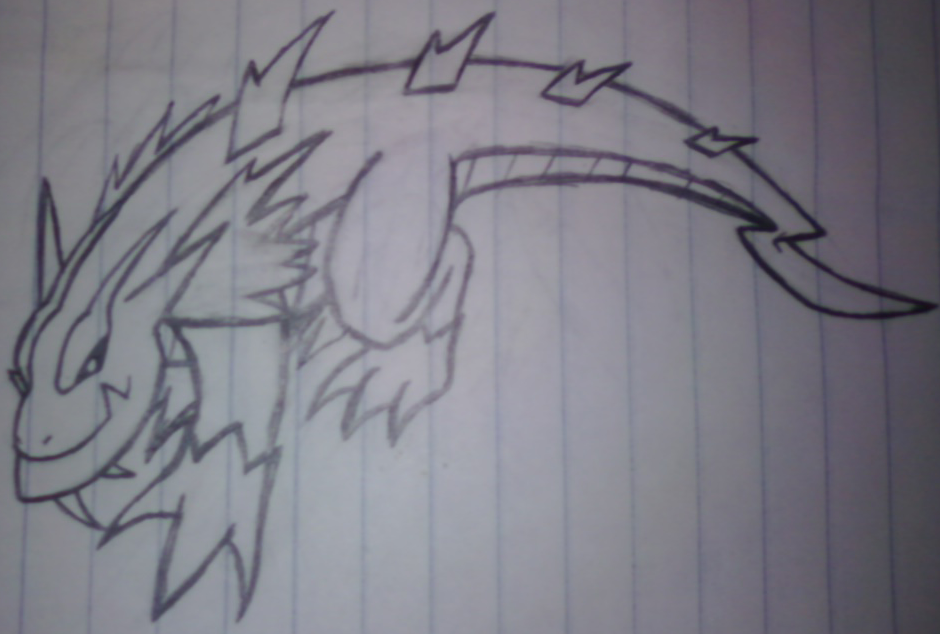
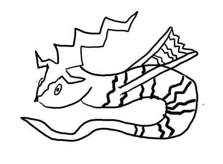
A bit small, yes, but that's because, after a lot of tinkering, I realised my computer wasn't precise enough and did it by hand. Unfortunately, the line came out as blue, so it looks a bit odd (or maybe it's an electrical current...), even without the not-so-subtly positioned lightning bolts just about everywhere.
A bit small, yes, but that's because, after a lot of tinkering, I realised my computer wasn't precise enough and did it by hand. Unfortunately, the line came out as blue, so it looks a bit odd (or maybe it's an electrical current...), even without the not-so-subtly positioned lightning bolts just about everywhere.
Dang, I wish I was the first to give an opponent for it to battle. I would have said Metagross because it's the most common pokemon on the CAP server so it would be very cool to see.
Man for that shopping job you did I'll make the animation for you anyways, but give me some time. these things take forever to finish!

I had a go at making it look a bit more bulky...
Edit: hold up a sec, needs to be resized.
Edit edit:

woops..ignore the dude at the bottom >.<
What do you guys think? Better?
Sorry if it seems a little messy, i had to rush it a bit.
Veedrock - Now that you mention it, it does look like a stereo-typical rock pokemon what with it being all dinosaur-like and such.. I was going for a sort of wyvern look (hence the filename - Wyvolt [Wyvern + Voltage >.> how lame] )
Whatever, all comments appreciated. :)
Edit: hold up a sec, needs to be resized.
Edit edit:
woops..ignore the dude at the bottom >.<
What do you guys think? Better?
Sorry if it seems a little messy, i had to rush it a bit.
Veedrock - Now that you mention it, it does look like a stereo-typical rock pokemon what with it being all dinosaur-like and such.. I was going for a sort of wyvern look (hence the filename - Wyvolt [Wyvern + Voltage >.> how lame] )
Whatever, all comments appreciated. :)
Man for that shopping job you did I'll make the animation for you anyways, but give me some time. these things take forever to finish!
I'll shop stuff anytime, it gives me something to do. But hell, if I get to see a cool animation cause of it it's even better! If you need me to fix anything else, go ahead and ask.
EDIT: Buffalo, the image isn't there as of this post.
buffalo, I don't think it's rock at all other than that it looks like a dino, but I definitely see the dragon in that. Nice work, but I do think he could lose 10 pounds on the belly and arms. I realize you were bulking him up but I think it's a little much on the overweight side, unless you were going for that
buffalo, I don't think it's rock at all other than that it looks like a dino, but I definitely see the dragon in that. Nice work, but I do think he could lose 10 pounds on the belly and arms. I realize you were bulking him up but I think it's a little much on the overweight side, unless you were going for that
Thanks man, and yes i was sort of aiming for that look. I didn't want to make it too muscled or it would look like a physical attacker, so i decided to go for a sort of strong-fat look. (Also im a total fat mon lover. Snorlax ftw)


sketch I made.
positive head, negative tail, magnet feet, static body.


Buffalo, yours looks like what would happen if a crocodile and a jolteon had babies. Maybe you could take that different ways but I think it's a good thing. ;)
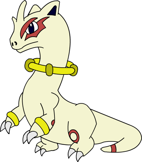
@InHell 13. Looks very good, The ring around the neck is a great touch. Although, the ears give it too much of a mammilian appearance I think, that's just my two cents.
@InHell 13. Looks very good, The ring around the neck is a great touch. Although, the ears give it too much of a mammilian appearance I think, that's just my two cents.


I actually rather like your design, Buffalo, but I find it's currently suffering from a bit of visual noise. Namely, all the jagged lightningy protrusions coming out of his head, limbs and tail.
I understand that they are an important element of his design, and I'm not suggesting you remove them, but perhaps he may benefit from a more thoughtful rearranging of these ridges. I make the analogy of visual noise as a contrast to visual music; where some parts of the design may be 'quieter' or more subdued in order to make the 'louder' more pointed edges more impressing. A lot of the ridges on his body, particularly on the arms and tail, seem superfluous and I think if you bunched up the details into 'pockets' of information rather than scattering them a little here and there, you'd have a more cohesive design.
And yeah, fatmon rock. I never got this business of imposing idealized human proportions on monsters.

Cartoons, you and your dragon fatmon are awesome.
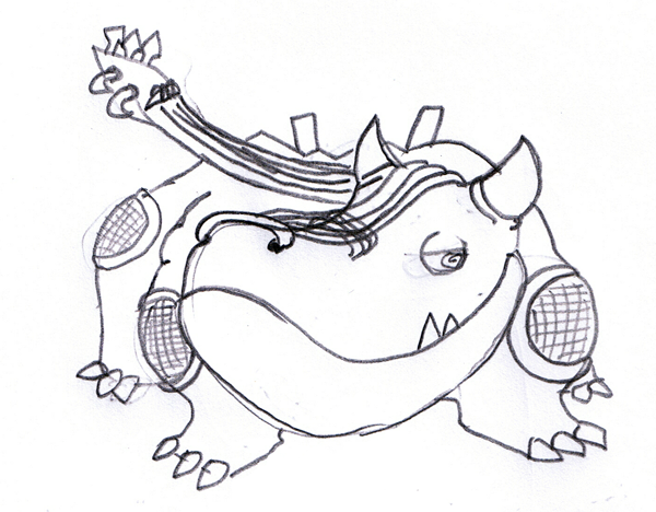
Rough sketch of my dragon. I took a totaly different approach and focused on a more grounded dragon.
Naturally, there can be no better source of inspiration for something of that design than our very own Komodo Dragons here. They are very bulky, very powerful, and very mean. I believe I incorporated both types accurately in this design while still sticking to the style.
Let's make Komogon feel welcomed while I clean up his sketch and color it. I also based some of his design elements from an old Maverick I made a few years back from my old Megaman X fangame, Bolt Strike Eel:
http://i10.photobucket.com/albums/a110/kingofanime/Rockman X Team Command/image-4.jpg
this is my cap submission. can you guess what it is based on?
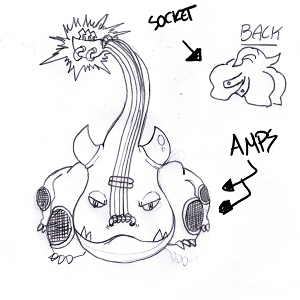
if you didnt guess it even with the blatantly obvious words and arrows, then i guess i need to train my drawing skills X) it's supposed to be an electric guitar dragon. and while i really like the concept, it... really doesn't look so good. but damn, i wanted to participate in a CAP eventually, and i thought, why not start by here?
when this pokemon is attacking, he raises the upper 'guitar' part, see it as like, the fire on cyndaquil's back. he raises that one thing to intimidate the opponent and launch attacks.
its tail is modeled after an electrical socket. i wanted to try something different from the common dragon.
I understand that they are an important element of his design, and I'm not suggesting you remove them, but perhaps he may benefit from a more thoughtful rearranging of these ridges. I make the analogy of visual noise as a contrast to visual music; where some parts of the design may be 'quieter' or more subdued in order to make the 'louder' more pointed edges more impressing. A lot of the ridges on his body, particularly on the arms and tail, seem superfluous and I think if you bunched up the details into 'pockets' of information rather than scattering them a little here and there, you'd have a more cohesive design.
Thanks Cartoons! I'm not sure i understand exactly what you mean, but if you're saying "It's too busy" kind of thing then i see what you mean. See i was going for an all over "rough skin" look because i didn't want to have a big softy if that ability had actually ended up being chosen, but i guess i went a bit overboard. I don't think the sketchy style i used to draw it helps either haha.
Edit: I tried to modify it a little, but every time i take one ridge or spike away i feel it looks sort of unbalanced or uneven maybe - as i said, i was going for an all over rough look. I don't seem to have the ability to make a judgement call on placing these spikes so i think ill leave it for now at least. But yeah thanks, i definately appreciate your help. :)

this is my cap submission. can you guess what it is based on?
if you didnt guess it even with the blatantly obvious words and arrows, then i guess i need to train my drawing skills X) it's supposed to be an electric guitar dragon. and while i really like the concept, it... really doesn't look so good. but damn, i wanted to participate in a CAP eventually, and i thought, why not start by here?
when this pokemon is attacking, he raises the upper 'guitar' part, see it as like, the fire on cyndaquil's back. he raises that one thing to intimidate the opponent and launch attacks.
its tail is modeled after an electrical socket. i wanted to try something different from the common dragon.
This one caught my attention along with Cartoons! can't wait for your color selections for this. I like this.


this is my cap submission. can you guess what it is based on?
if you didnt guess it even with the blatantly obvious words and arrows, then i guess i need to train my drawing skills X) it's supposed to be an electric guitar dragon. and while i really like the concept, it... really doesn't look so good. but damn, i wanted to participate in a CAP eventually, and i thought, why not start by here?
when this pokemon is attacking, he raises the upper 'guitar' part, see it as like, the fire on cyndaquil's back. he raises that one thing to intimidate the opponent and launch attacks.
its tail is modeled after an electrical socket. i wanted to try something different from the common dragon.
Haha, electricguitarmon. That's really creative, but it reminds me of a hippo more than a dragon. o.O Or is that just me...
Haha, electricguitarmon. That's really creative, but it looks like a hippo more than a dragon. o.O Or is that just me...
The horns probably seperate it from an appearance of a hippo. If it didn't have the horns it would defenitly look like a Ground/Electric.
Changed outline, and tidied over the pen marks.

Ignore the random electricity in the top left-hand corner. Any thoughts?
Ignore the random electricity in the top left-hand corner. Any thoughts?

First, I'd like to say that even though there have been submissions that weren't my cup of tea, I have a great deal of respect for anyone who plucks up the courage to put something up here. One of my very good friends is an art student and I know how hard it is both to draw and to learn how to draw.
Mutant, I love these. The first one has the look of graceful power--something that I personally think Dragon-types seem to lack in Pokémon. Sure, there are plenty that look beefy (Salamence) or vicious (Garchomp), and some are cute (Dragonite) or sculpted (Altaria)...
But nothing seems to match up with the sleek, beautiful, fierce picture I have in my head. Certainly not as well as your first sketch. Add in some equally gracile wings, possibly a more 'elegant' variation on Charizard's wings, and this thing would look just as bad-donkey as it should.
The second sketch is also very good, though I agree that I think it's not quite as great as the first. Certainly it carries the more savage side of the Dragon type, and with proper accents it could be a very good option as well.
Either way, you've pretty well secured my vote. The only other thing I'd ask for is the addition of hind legs, but if the final pic looks half as good as these sketches I'd be happy either way.

I'll just leave this for the night since I need to work on other stuff.

Basically, let's take a stegosaur but replace its plates with light bulbs. Also yellow-purple complementary colors.
This is extremely cute! It's also a pretty nice concept for the Elec/Dragon. Then again, there's a ton of entries so far that I really have my eye on. I think the Yellow and Purple were excellent color choices (my opinion anyway).
Is it me or does its tail remind anybody else of Pachirisu? Meh, anyway, this is a very nice sketch actually.
In terms of "Badass" Dragon designs, I'm loving Cartoons!'s submission at the moment (definitely what a badass Elec/Dragon would look like IMO).

Might as well try.
First, hastily drawn attempt, pretty simple and straightfoward. I tried for a cutish look while still having a dragon like look to it(kinda...). I don't like it much, I'll try again later. Also, ignore the fact that the part of the body outline is going through the wing thingy, I just forgot to erase it. Oh, and the wings are supposed to be like a power-plug kind of thing.
Ugh just realized this is way to similar to draniti/draganair.


- Status
- Not open for further replies.