
-
Follow our Instagram!
-
The moderators of this forum can be found in the CAP forum staff directory.
-
Welcome to Smogon! Take a moment to read the Introduction to Smogon for a run-down on everything Smogon, and make sure you take some time to read the global rules.
You are using an out of date browser. It may not display this or other websites correctly.
You should upgrade or use an alternative browser.
You should upgrade or use an alternative browser.
CAP 8 CAP 8 - Art Submissions
- Thread starter CyzirVisheen
- Start date
- Status
- Not open for further replies.

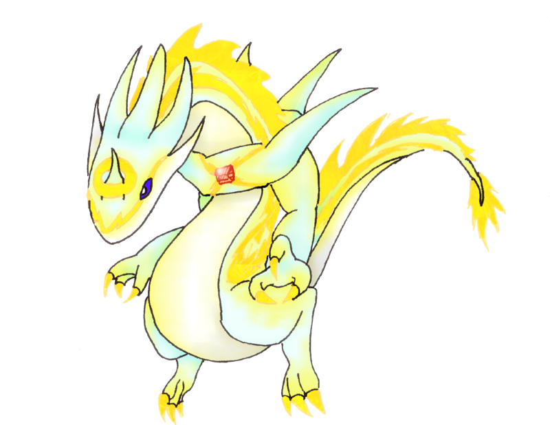

Redesign, to reflect bulkiness. Comments appreciated.


Wow, very nice FM. One of my favorites right now, seems pretty original.
The only thing is that the bluegreenish thing around the neck (front part, not back) seems a bit awkward.
Still, nice design.
The only thing is that the bluegreenish thing around the neck (front part, not back) seems a bit awkward.
Still, nice design.

*snip*
Thinking about removing the crescents on the wings.
When I saw this on the first page I thought "wow I'm voting for this"
Then you colored it.
If you set it to something way simpler and no crazy texture things, it will have my vote.
I love Cartoons' oriental one, as well as Atyroki's design. Wyverii's original one shows potential as well as pkmn-taicho321's. Taicho's final work looks REALLY promising. I personally don't know if I like the cutesy look of Caladbolg's, but I could see them working as well. On Atyroki's, I personally like the random pink thrown in, maybe because I am a fan of CMYK, but others apparently do not. Maybe it could be substituted for a dull, dark blue like in Cartoons' mane. However, after seeing Misaki's post, I love the pink. Gee posted another that caught my eye featuring the pink, but to me it looks like a mash-up of Cartoons' design and a Flaafy. Not to say it's a rip-off, or that I don't like it, but I think that may be an issue.
I personally couldn't see AragornBird's lightbulbasaur working well, but it's a cool design. His second one, the mystical black/aqua one, was really good, however, and I feel it has definite potential. DougJustDoug's viper-esque one looks cool as of now, but I want to see an update on it.
While it didn't get much commentary, both of Yilx's designs were REALLY cool. I'd love to see completed forms of those as well.
Doomsday's amplifying dino needs a little work, as well as InHell's, but once again, I see potential.
While well done, Elagune's staff carrier just is not fitting the bill here for me. His second one, the ghost-ish one...I love it, but like others mentioned, it beckons to Rev a little too much, and for the limited amount of CAP's, I feel there should be more variety.
I know it's a bit scattered, but I hope I covered every one of them that caught my eye. While I may not have much art here, I am a lifelong artist (going to college for it, in fact) so hopefully you can take it to heart or at least consider it.
Some really great work here, guys. Keep it up.

These are my current favorites, and what I consider real gems so far.
Notable mention goes to Buffalo Wings too. Drawing itself is great, but I didn't like the design all too well :/ Great work nonetheless, keep it up ;D
Code:
[IMG]http://i293.photobucket.com/albums/mm54/CyzirVisheen/Photo174.jpg[/IMG]

I love this design more than any of the others.
I felt that this emphasized the Electric element
more so than dragon, something I was really looking for in the design,
 since *most* of the dragons are really repetitive here so far.
Very unique and wonderful design in my opinion.

[IMG]http://img.photobucket.com/albums/v407/Yilx/elecdragr2.jpg[/IMG]

The reason I liked this design was because of, again,
 the electric element of it. I love the storm cloud idea,
 and this makes great use of it.
Would love to see a colored version ;)

[IMG]http://img4.imageshack.us/img4/815/eledra.gif[/IMG]

PINK AND FLUFFY <3333333333

[IMG]http://img404.imageshack.us/img404/1089/cap8.jpg[/IMG]

Cute. Adorable. Purdy. Funny.
Not too dragon-y. Original and awesome ;)

[IMG]http://i179.photobucket.com/albums/w291/CactuarJoe/CAP9Concept1.jpg[/IMG]

If this wins I will in fact support mold breaker.

[IMG]http://i59.photobucket.com/albums/g317/LolliChan703/newpokepsd.jpg[/IMG]
This drawing is a lot better than the other one imo.
 It shows less of that "ZOMG DRAGON FURY"
and more of a "I'm chill, but don't fuck with this" sorta vibe,
which is really cool.

[IMG]http://i44.tinypic.com/dwxgsh.png[/IMG]

Best use of an appliance theme so far, love it.
Keep the dark blue color though!

[IMG]http://ivnbvn.com/images/dragonzap.jpg[/IMG]

Cartoons is a genius, and I LOVE this design.
I wouldn't be surprised if this thing was in a Zelda game or something.
 Definite contender.
You are free to say I have a nasty mind... but for some reason I imagine it akin to flicking boogers. In other words picking his nose and flinging lighting bolts... a disturbing imagine. I think you just scarred me! Nevertheless I love it :D. Apparently flygon doesn't like people flicking electric boogers at it!My earlier drawings were pretty rough, so I've drawn up a cleaner image of my dragon to allay some of the comments about the sketchy lines it's gotten.
My intention for this Pokemon is that it's kind of an asshole. It's bigger and stronger than you are and it's going to exploit that to the fullest. Not malevolent in nature, but could care less if his actions result in harm done to others.

Ok, I redesigned the body entirely and added a few things.
First of all I gave him a smile. :D I decided that I didn't want it to look like it was suffering anymore. Second, I added some spikes to add to the dragony look to it. Thirdly I made the legs go with the color of the head and added little tazers on the arms. (I'm a dork I know, but I just couldn't resist >.>) Now if anyone wants to help me on fixing the mouth up a bit I'd greatly appreciate it, I've never been amazing at mouths like that... I know I won't win this or anything, but I'd like to improve this as much as possible anyways.
EDIT: wait, I forgot some shading. *goes off to fix that*
EDIT2: Fixed
Okay, here's my first submission. I know itz messy but, I will fix dat. Suggestions please!


Onward, onward.
I know it was suggested to make the wing blue, like his markings, but I decided against it- I feel the design really needs a third color to make it shine, and at least in the first example, the wings' overlap with his horn adornment of the same color would make the two seemingly meld, which is no good.

Continuing with the initial direction, tweaking colors and fussing with the initial style of swoopy markings.

Then we have this. OH SNAP UNEXPECTED TWIIIIST. Decided to run in a different directions with most of the markings, to both simplify the design (was concerned it was getting too crowded) and give it a more Electric feel.
However, if approval runs more towards the first image, I'll definitely continue with that way; as well as taking into account any opinions on colors or design. I did try to slim the fellow's gut down a bit, and as per earlier commentary, I'll probably smooth the curve of his back a touch.
I know it was suggested to make the wing blue, like his markings, but I decided against it- I feel the design really needs a third color to make it shine, and at least in the first example, the wings' overlap with his horn adornment of the same color would make the two seemingly meld, which is no good.
Continuing with the initial direction, tweaking colors and fussing with the initial style of swoopy markings.
Then we have this. OH SNAP UNEXPECTED TWIIIIST. Decided to run in a different directions with most of the markings, to both simplify the design (was concerned it was getting too crowded) and give it a more Electric feel.
However, if approval runs more towards the first image, I'll definitely continue with that way; as well as taking into account any opinions on colors or design. I did try to slim the fellow's gut down a bit, and as per earlier commentary, I'll probably smooth the curve of his back a touch.

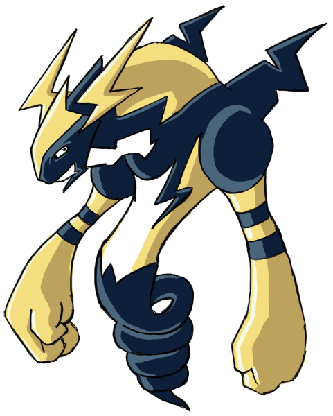
I took into account some of the worries about how the previous design turned out, and so I cranked out this one. It should look a lot more like a Dragon/Electric now. And thanks, Cartoons, it's good to be back.
Damn thats good.
I don't even mind the spiral tail.
You could easily just "serpentine" it out though, too. (in an "electric" sort of way)
I think pkmn's is probably my 2nd favorite.
DJD - i'm not feeling yours this time around. And yours have frequently been among my favorites. It just doesn't feel like it has any life to me.
Cartoons - I think ur initial sketches were better than your most recent. Its an excellent concept though.
Onward, onward.
I know it was suggested to make the wing blue, like his markings, but I decided against it- I feel the design really needs a third color to make it shine, and at least in the first example, the wings' overlap with his horn adornment of the same color would make the two seemingly meld, which is no good.
Continuing with the initial direction, tweaking colors and fussing with the initial style of swoopy markings.
Then we have this. OH SNAP UNEXPECTED TWIIIIST. Decided to run in a different directions with most of the markings, to both simplify the design (was concerned it was getting too crowded) and give it a more Electric feel.
However, if approval runs more towards the first image, I'll definitely continue with that way; as well as taking into account any opinions on colors or design. I did try to slim the fellow's gut down a bit, and as per earlier commentary, I'll probably smooth the curve of his back a touch.
I really like your design, but is there any way you could make it less smeary?

I seriously think this needs more love.
Im in love with this design.
I really like your design, but is there any way you could make it less smeary?
No worries. My linework isn't the best, but I'm definitely going to smoothen it out and such as best I can and clean up leftover marks from my earlier scribblings; I'm far from the final stages yet. Rest assured that the final product will look much cleaner.
A colored version. Unfortunately, the scanner decided that it won't scan the outer edges well.


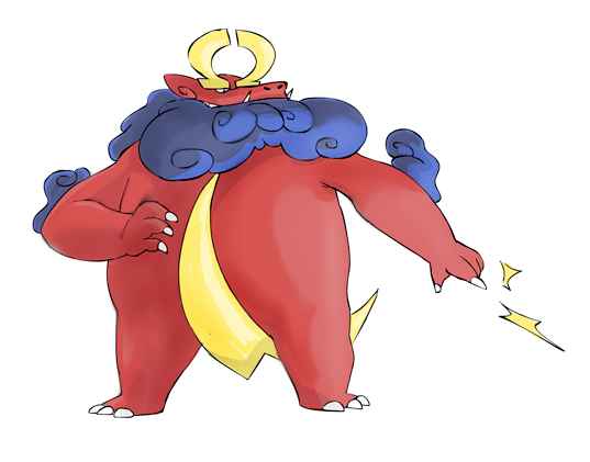
Wow. There are some absolutely amazing designs in here.
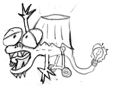
Since I resently got a scanner, I thought I'd try my luck at this. Here's a quick WIP sketch I made.
I figured that since CAPs have usually been violent and bloodthursty, something a tad dopier and sillier could break the ice.
It's a Lamp Lizard!
Since I resently got a scanner, I thought I'd try my luck at this. Here's a quick WIP sketch I made.
I figured that since CAPs have usually been violent and bloodthursty, something a tad dopier and sillier could break the ice.
It's a Lamp Lizard!


Ok, so I'm definitely sticking with the darker color scheme. It was my intention to make Circuitmon look like kinda like wiring, so I'm glad someone noticed it :)
Favorites so far are pkmn-taicho's and CactaurJoe's.
Favorites so far are pkmn-taicho's and CactaurJoe's.

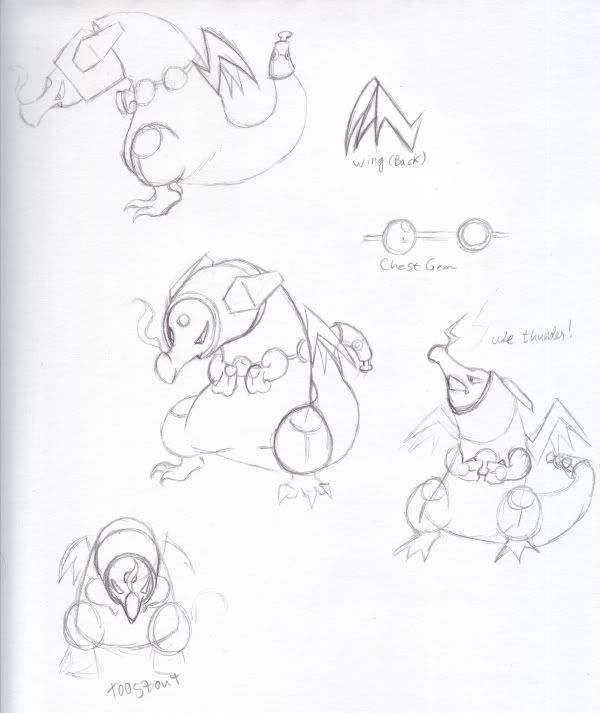
After playing around with the design, I think this is the one I'll be going with. Removing the black sheathe thing around his torso helped make it a lot more sleek, as did moving the wings down. Bisecting the body with a line of circles helps tie the whole design together better, but I'm still a bit torn on the line of circles on the "helmet" part - I can't decide if it makes it too busy or not.
Anyway, thoughts, criticisms, whatnot. I'll see if I can't post an inked and colored version later in the evening.

Wow. This is my favourite so far
I took into account some of the worries about how the previous design turned out, and so I cranked out this one. It should look a lot more like a Dragon/Electric now. And thanks, Cartoons, it's good to be back.
CactaurJoe: The one near the center of the page is great, the head especially. I think you should go with that.

My earlier drawings were pretty rough, so I've drawn up a cleaner image of my dragon to allay some of the comments about the sketchy lines it's gotten.
My intention for this Pokemon is that it's kind of an asshole. It's bigger and stronger than you are and it's going to exploit that to the fullest. Not malevolent in nature, but could care less if his actions result in harm done to others.
True to the bully nature, though, its cowardliness is made apparent when confronted with a real challenge.

Heh heh. Very nice personality to your artwork. I like that! You kinda have my attention in terms of the "badass"-looking dragon. Mythical looks are always a crowd pleaser... at least, in my opinion.
Ok, I redesigned the body entirely and added a few things.
First of all I gave him a smile. :D I decided that I didn't want it to look like it was suffering anymore. Second, I added some spikes to add to the dragony look to it. Thirdly I made the legs go with the color of the head and added little tazers on the arms. (I'm a dork I know, but I just couldn't resist >.>) Now if anyone wants to help me on fixing the mouth up a bit I'd greatly appreciate it, I've never been amazing at mouths like that... I know I won't win this or anything, but I'd like to improve this as much as possible anyways.
EDIT: wait, I forgot some shading. *goes off to fix that*
EDIT2: Fixed
I would really like some opinions on this if people are willing, because I really believe that I can still make it better. (I want to too!)
- Status
- Not open for further replies.