Well, this will be my first attempt at drawing in... oh, 7, 8 years? And besides, I had to take a pic with my webcam, since I don't have a scanner. Anyway, here goes. The wings are supposed to be electric rods with static electricity, though because I'm more than a bit rusty, it may not come through. I'll try to do a quick color, but it's still a bit sketchy as it is, so it may not be the cleanest.

-
Follow our Instagram!
-
The moderators of this forum can be found in the CAP forum staff directory.
-
Welcome to Smogon! Take a moment to read the Introduction to Smogon for a run-down on everything Smogon, and make sure you take some time to read the global rules.
You are using an out of date browser. It may not display this or other websites correctly.
You should upgrade or use an alternative browser.
You should upgrade or use an alternative browser.
CAP 8 CAP 8 - Art Submissions
- Thread starter CyzirVisheen
- Start date
- Status
- Not open for further replies.


Anioda: I think my favorite part of that design is the rods on the head. It looks a lot like a crown - you should play up the regal angle. ^^b

My earlier drawings were pretty rough, so I've drawn up a cleaner image of my dragon to allay some of the comments about the sketchy lines it's gotten.
My intention for this Pokemon is that it's kind of an asshole. It's bigger and stronger than you are and it's going to exploit that to the fullest. Not malevolent in nature, but could care less if his actions result in harm done to others.
True to the bully nature, though, its cowardliness is made apparent when confronted with a real challenge.

Great work, love the omega symbol on his head!
I might get something out for this CAP, but I wholeheartedly stand behind your entry..

Anioda, the only thing I dislike at all about your design are the arms. Perhaps something more traditional may best, but otherwise it doesn't look half bad.
Tennisisawesome, my only complaint about your design is that it looks more like some doing Dragon/Electric Jirachi in that thread of in smeargle's studio. Perhaps adding something to make it less sprite-ish? I can't think of anything specific myself, however.
Tennisisawesome, my only complaint about your design is that it looks more like some doing Dragon/Electric Jirachi in that thread of in smeargle's studio. Perhaps adding something to make it less sprite-ish? I can't think of anything specific myself, however.

Anioda, the only thing I dislike at all about your design are the arms. Perhaps something more traditional may best, but otherwise it doesn't look half bad.
Tennisisawesome, my only complaint about your design is that it looks more like some doing Dragon/Electric Jirachi in that thread of in smeargle's studio. Perhaps adding something to make it less sprite-ish? I can't think of anything specific myself, however.
You mean you don't like the pixie sized idea? That was pretty much what my design base was off of; the size. >.> The only thing similar to jirachi that I see is the size. I'm kinda surprised to hear jirachi though, because I thought it looked more azelfy myself. (I guess it's good to hear that it isn't though, eh? :naughty:)

This is my only one, so far. It's more or less based on a Chinese dragon, with some kung-fu thrown in there. I'm not perfectly happy with this one yet, though, so things might change as it goes on.
This is awesome! this wins my vote even though it seems slightly grass oriented.


Sorry, but repost.http://i405.photobucket.com/albums/pp140/Mowz2/scan0003.jpg
Will modify eventually, if needed.
That bottom blank is where my scanner scanned itself...
Elagune and Cartoons!'s designs are really good.


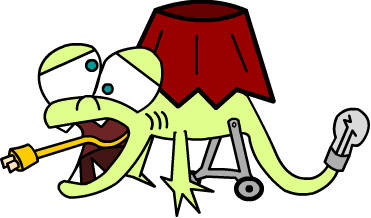
Alrighty, I took the time to doodle my Lamp lizard on the computer and modify a few things. Check him out now I guess.


Elagune's art seems sufficiently badass for me to give it props.
Cartoons! design has a really unique look to it. I'm just kind of debating with myself on whether or not I like how that turns out. The concept is cool, but the fat dragon thing kind of turns me off. I don't think there's really a way to fix one thing without damaging another here, but I'd support it if I had to.
Cartoons! design has a really unique look to it. I'm just kind of debating with myself on whether or not I like how that turns out. The concept is cool, but the fat dragon thing kind of turns me off. I don't think there's really a way to fix one thing without damaging another here, but I'd support it if I had to.


I tweaked my concept a bit.

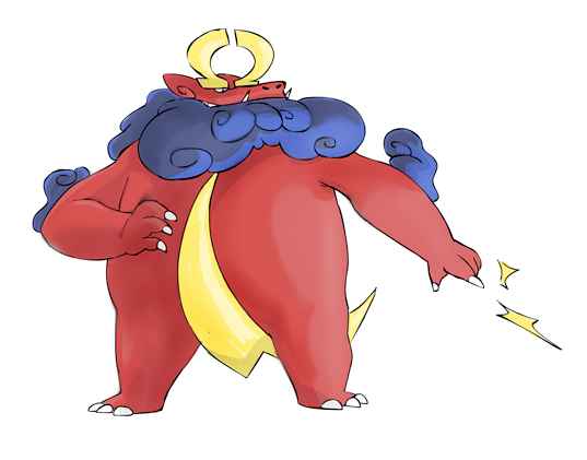
Oh, and now here's a shitty, 20-minute color job in paint and a version with even shittier hands/claws. Hopefully I can get a friend to draw and color this a bit better, but this is what I got with what I have. *shrug*

Tried a brighter, more...electric color scheme.
Link to the first one for reference: http://i44.tinypic.com/dwxgsh.png
I'm kind of attached to my darker color scheme, but what do you guys think? Any suggestions on what to add/remove/edit on either one would be great, too.
Hmm...I'm not sure I quite like either scheme. Perhaps you could try a red/black motif? after all, it is based on alligator clips; you may as well go all out.
Otherwise, though, I think it's great. Nice touch with it being in the shape of an infinity symbol.

I really like this design, and as previously stated, I think it would work very well with Mold Breaker.
Can't wait for a colored version.
What would people think of me adding a cloudy thing to my design? I've been considering it but afraid it might be to cliche. Should I try it and see? Or just let it swirl down the drain with all the other cliche ideas I've been thinking up?

My earlier drawings were pretty rough, so I've drawn up a cleaner image of my dragon to allay some of the comments about the sketchy lines it's gotten.
My intention for this Pokemon is that it's kind of an asshole. It's bigger and stronger than you are and it's going to exploit that to the fullest. Not malevolent in nature, but could care less if his actions result in harm done to others.
True to the bully nature, though, its cowardliness is made apparent when confronted with a real challenge.
I love the personality behind this guy! If I wasn't already sold, the supplemental material's putting me over the top.


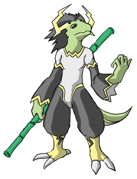
This concept is based on the use of electrons, which give it the electric feel. The lightning symbols across it's body also symbolizes electricity. The electrons orbit on the rings that guard the Pokemon from damage, thus making it more defensive to make it match the style bias.
It's more of a peaceful, cute pokemon that doesn't disturb anyone or anything. I didn't want to make a huge, scary monster thing with three heads that destroy everything in it's path, only a harmless little draco. ^.^

Cartoons!' submission is my favorite. Taicho's and Wyverii's are also good choices, and I wouldn't mind seeing them make it either. Some concepts here are great; I am especially liking the Guitar guy, though as far as Art goes it's not as good as it could be. Unsure if it's been colored yet.

Elagune's submission is my favorite! I like the new one because the last one did seem like a Dragon/Grass pokemon. However, CactuarJoe's also is neat I like it almost as much as Elagune's.
Keep up the good job!
Keep up the good job!
petrie911: I'll try a few red/black schemes when I get back on my good computer (on a laptop right now). Looking at the yellow design, I don't really like it anymore. So, if the red/black doesn't look good I'm using the darker one for sure.
I'm liking Cartoons' dragon, too. Maybe for the next generation, Game Freak can just go to Smogon for pokemon designs...
I'm liking Cartoons' dragon, too. Maybe for the next generation, Game Freak can just go to Smogon for pokemon designs...


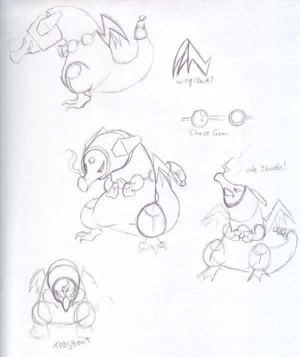
Got a much better quality version of my previous one.
It's missing a few details that the old image had, such as the electricity on the coils around it's tail, but I'll put those in later.
Don't have too many ideas on colors. Was thinking a dark red, green, and yellow mix. Any suggestions?
Comments plz.

What would people think of me adding a cloudy thing to my design? I've been considering it but afraid it might be to cliche. Should I try it and see? Or just let it swirl down the drain with all the other cliche ideas I've been thinking up?
You might as well try it to see how it looks.
If it doesnt look good, then try something else or stick with the original.
Might look pretty cool though.
Cliches arnt always bad. XD

@ Narrd: I like it better with the cloud.

I must concur.@ Narrd: I like it better with the cloud.
On another note that lamp Lizard looks half dead already :/. Almost like it would give you a horrible illness if you came anywhere near it!
- Status
- Not open for further replies.