CAP 8 CAP 8 - Art Submissions

Status
Not open for further replies.
What would people think of me adding a cloudy thing to my design? I've been considering it but afraid it might be to cliche. Should I try it and see? Or just let it swirl down the drain with all the other cliche ideas I've been thinking up?

Personally I think your very first design is great as it is already.
 
Resistance isn't futile!

My tablet PC died, so I have to resort to bad pencil-and-paper sketches. Here's my current sketch, the Resistance Pokemon:


Basically I based the whole design off of resistors. He has ohm symbols for his ears/horns and the universal symbol for resistors on his limbs and tail. On his belly are bands like the ones on resistors, coded to indicate his level of resistance. Each Pokemon of this species has different bands.

Please comment and critique. Specifically, I want to know if he looks leaning defensive enough and if the puffy mane looks ok on him (should I remove the mane altogether or should I change the design of it).
 
2w3b2hz.jpg

The Acid Trip colors on the tail are awesome, but the entire draw doesn't look like a Pokémon.

Good Work =)
 
cap8toad6.gif


Keeping the cloud. That lickitung's got nothing on my 'mon :]

EDIT: actually might keep the legs. More opinions please! :v
 
I'm trying to finalize the legs on my design, and I came up with a couple of variations to see which one people prefer. I'm really torn on how to proceed with the legs, so feedback will be much appreciated. I'm ready to get something inked and colored!

Click the thumbnail pictures below to see the full sketch of each one.

"Forelegs Out"

This one has legs more like a traditional dragon. The forelegs are reaching out a bit, to emphasize that this is a quadruped, not a fish (like some have noticed in other versions)


"Forelegs Tucked"

The forelegs are longer than my previous version, and the claws are shortened. The forelegs are tucked close to the body to convey speed and to avoid detracting from the overall serpentine design.


"Long Claws"


This is the design I posted earlier. The claws are long and aerodynamically positioned to really emphasize the long serpentine body.
 
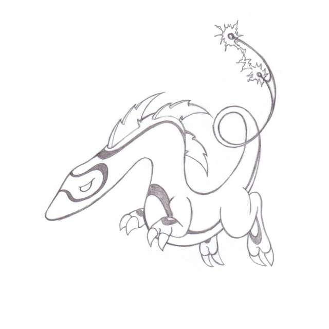
I trying to finalize the legs on my design, and I came up with a couple of variations to see which one people prefer. I'm really torn on how to proceed with the legs, so feedback will be much appreciated. I'm ready to get something inked and colored!

Click the thumbnail pictures below to see the full sketch of each one.

"Forelegs Out"

This one has legs more like a traditional dragon. The forelegs are reaching out a bit, to empahasize that this is a quadriped, not a fish (like some have noticed in other versions)


"Forelegs Tucked"

The forelegs are longer than my previous version, and the claws are shortened. The forelegs are tucked close to the body to convey speed and to avoid detracting from the overall serpentine design.


"Long Claws"


This is the design I posted earlier. The claws are long and aerodynamically positioned to really emphasize the long serpentine body.

I say forelegs out, you have no idea how much I like the design more that way. The two claws look better than three, and when facing outwards they have more body, and instead of looking awkward they look "battle ready". I also like the black coloured areas on them more. Great job!


Also, @ Fenix: Again, I have to say the first one is better, I think the head is the best part, the antler-ish protrusions really make it for me. On a side note have you ever played any of the dragon warrior monsters games (or is it dragon quest monsters?)? The last one looks like a creature from it...I can't recall what it was called, it's mostly the large belly and the fact that it's a dragon that gives it the appearance I guess.
 
With the forelegs out design, youll have to change the head becuase it doesn't match the claw style. It's also a very awkward neck proportion.

Also, why was my design on page 9 completely ignored :(
 
I actually have not, my initial inspiration was just "make a fat dragon". I really didnt want a dragon to begin with, but if it had to be I wanted something different. So I went with a fat dragon, admitedly it was for thick fat.
 
Going to have to go with the "forelegs out" on this one. The third option is probably the next best choice though in my opinion. All three are very good looking though.
 
Urza two other people said cloud was better... I am really not sure though

the cloud is a lot easier to draw though! Still playing around so don't worry

oh and doug the first one does it for me
 
Here's mine so far.
Sorry about the notebook lines, this is too rough an idea to put it on printer paper yet. I started drawing this before I saw Cartoons!'s submission, so no it's not copied >_< [PS His reminds me of Valoo from Wind Waker]
cap8.png

Contrast added for ease of detail viewing.

Its solid, It just doesn't jump out at you as it seems a bit generic.

I really like the wings, it makes it apparent it can't fly, maybe make it look like they aren't attached all the way. I want to see this colored.
 
yah, i saw that. i think there's potential to a legged one...but maybe it should be in a sort of teddy bear posture? i like being able to see the feet. maybe it can be reclining on a cloud?
 
The Acid Trip colors on the tail are awesome, but the entire draw doesn't look like a Pokémon.

Good Work =)

Ummmm...

Do not post that a design does or does not "look like a Pokemon". Such comments are unable to be substantiated or refuted. I don't care if it is "just your opinion" -- it's a bullshit comment. It indicates the existence of an official published Pokemon artistic style guide. Such a guide does not exist, so don't act like you've read it. If you like or dislike a design, that's fine -- but don't imply the existence of defined Pokemon style rules as "reasoning" for your opinion.


evolved :)

electricdragon2evo.png

what do you think ???

thanks for all the comments :).
I'll make some changes on my other idea too, but until tomorrow,
 
I'll probably be voting for Cyzir, assuming he gets rid of the extra heads.

I honestly don't see any Hydra in his picture whatsoever - just a dragon made out of thunderclouds and lightning giving off a Raikou vibe.

(That's a good thing.)

EDIT: Others I support include Doug's (first picture), Aty's and Cartoons'.
 
Finished coloring my design. I was originally coloring up the Komodo dragon design, but then the thought of editing up my Maverick into a pokemon started appealing to me more, so I ended up tweaking that instead. :)

bolteel.png


I may end up coloring the Komodo tomorrow, but enjoy this in the meantime.

EDIT: Limbs are overrated. :o
 
Doug: Forelegs out. You fixed the problem of them being "too short," but they're still short enough to take walking on them out of the equation, still holding to the serpentine style that you're aiming for. The front legs actually appear shorter in that one than the folded.

Cartoons!: Yeah, as I predicted I don't like it as much without the style of the previous picture (which you called "rough," but I personally really liked, and it can't be sprited in that manner, killing it for me).

Elagune: It reminds me of Rev too much =/

KoA: It's awesome, though it looks like a Sandworm or something, not really electric related (also really close to saying it's Gyarados' cousin).
 
Status
Not open for further replies.
Back
Top