CAP 8 CAP 8 - Part 9 - Art Poll 3

Which design should we use?


  • Total voters
    396
Status
Not open for further replies.
As far as I'm concerned, whoever wins, CAP wins. There's not a single submission I'm not completely satisfied with... You guys all did great! Congrats.

I'm honestly torn. I'll vote when I feel a stronger inclination towards one of the candidates :)
Really, they're all too awesome, that's actually my only problem! :p
 
Out of these four, I will compare.

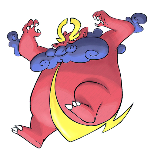
I love the feel of Cartoons!'s dragon. There's just something about an overweight dragon that appeals to me. Maybe it's the fact that I want it to replace Snorlax in my heart (Snorlax was my favorite Pokemon in ADV. Generation), or maybe its because I liked his Luchasquid two CAPs back, that I feel like I owe it to him.

DougJustDoug's is one of the best, if only for pure design. However, it does not fit, in my personal opinion, with the layouts we have already established. However, it's a wonderful Pokemon rendition, and I love it.

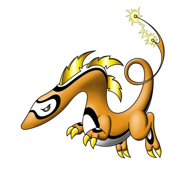
Cyzir's is probably the most unique in pure design. It has the dragon feel, but most of all it scores in the electric feel department. The Pokemon is just vibrating with electricity, and everything about it seems to jump out at you.

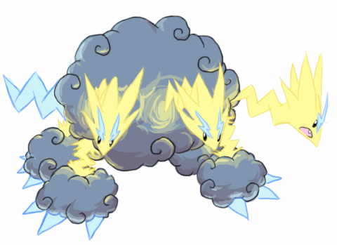
Zanti's is my least favorite out of the four, but I like the stylistic and artistic renditions he managed to cover. It's almost robotic in nature, and the only problem I have is that it feels like it's actually missing the electric type--if only because of its very steel nature.

So, after some deliberation, I must pull for Cartoons! His version is simply amazing, and if it wins, I will put this Pokemon in my permanent team, if only because of how the thing looks. =D
 
Voted for Cartoons.

Cartoons is big and awesome, subtle color scheme that is very dragon while giving a nod to electricity is a plus. Creative styling and loads of character.

Cyzir's is great too. Fantastic idea to make a three headed dragon, since pokemon loves tri-headed stuff (exegg, magneton, dodrio, probo, etc).

Zant, I think you really did a great job with yours. Tons of artistic talent.

DJD, you are a great artist and your shading is surpurb. Personally, I don't like the faux-metallic shading on the fins, it would have looked so much better with a matte finish. I'm a little concerned that your entry breaks the rule of...

"No props, action effects, move effects, or additional objects can be rendered on or around the pokemon. If a prop is part of the pokemon's basic design (ie Farfetch'd Stick), then it is acceptable. A basic rule of thumb is -- anything that would not be appropriate in a game sprite, should not be included in the Main Design."

...but I'm not really sure.

All great entries though, you guys deserved the top spot.
 
Still pulling for Cartoons!, but this top four got it right for sure. I think Zant is a bit underrated - for me, what kind of wrecks it is the strange cropping of the picture, to be honest. If we got a little better of an angle and got to see the whole thing, I might have voted differently, but as it stands Cartoons! has the most complete and interesting entry.
 
I've been pushing for Cartoons! all the way, and I will continue to do so. I just love the goofy yet powerful aura it exudes! I also find it more well-drawn than CyzirVisheen's, who would probably have been my choice if that big ol' bull wasn't in this poll.

BTW, any ideas on how it's supposed to use Shield Dust?
 

Coronis

Impressively round
is a Battle Simulator Moderator Alumnus
Um, how does it break the rules?

Anyway, I voted for Doug because I love the concept of a slim, cool looking dragon(not saying the others aren't cool) that has bulky stats.


"It doesn't fit with the layouts we've already established" lolwut?

@chomzloh people don't seem worried about how kitsunoh can frisk, the art doesn't have to look like it can use one of those abilities.
 
Zantiminous and DougJustDoug didn't really distinguish themselves from the other designs, even if they are amazing, where as CyzirVisheen and Cartoons! are some really original pieces of work. I ended up choosing Cartoons!, simply because it exudes an air of big bully, but I don't mind if Cyzir's ends up winning.
 
Cartoooooooooooooooooooons!!!

I voted cartoons.

Cyzir Visheen got close, but ultimately I had to pick one, so I did it randomly and stuck with it.

DJD's look okay-ish, but it doesn't have that pokemon-y feel to it and I don't like the way the spikes or the tail looks.

Zantimonius doesn't work for me because there isn't much electric to it (save for the body parts that look like household appliances), and robotic things are usually steel, not electric. It also doesn't quite look pokemon-ish to me.

Cartoons fits everything that has been voted for. Shield dust? aren't pretty much ALL electric pokemon (within the game world) able to project a weak electromagnetic field at all times? If you realllly wanna get technical on this, if this field is negatively charged, it repels similarly charged particles (same for positively chraged fields). I'm sure we can have enough imagination to pretend that the pokemon can detect how the incoming whatever (be it poison/sleep powder, spore, ect...), detect it's charge, and change it's own charge slightly to repel it.

Whew.... Anyway, cartoons's looks great too. It could be seen as Zeus, but it also has some striking similarities to Japanese folklore. It's also unique in it's build. It is bipedal, but it doesn't look saurian, like most of the other dragon-types, and instead of being tall and thin, it is rotund and stocky, which makes it look a bit comical compared to the other entries.
 

jrrrrrrr

wubwubwub
is a Forum Moderator Alumnusis a Tiering Contributor Alumnusis a Top Contributor Alumnusis a Battle Simulator Moderator Alumnus
voted for DJD. Cartoons!'s doesnt look like a dragon, Zant's looks too much like Flygon, and i dont like the concept of cyzirs cloud-body pokemon.

DJD's is exactly what I think an Electric/Dragon would look like.

Although, these drawings are way better than anything that I could ever do...congrats guys!
 
Voted for cyzirviseens drawing.

The drawing from Cartoons doesn't look like a dragon.
The drawing from Zantomius looks more like something you can build with lego.

(I don't say these drawings suck, I just say that they don't fit the kind of pokemon that people are looking for now.)

So I have to choose between DJD and cyzir.
If the pokemon had the levitate ability then I wouldve probably picked Doug's one but instead it has the static ability which nobody with common sence will use.

So I vote for cyzir's drawing for above reasons which has potential of being cooler looking than it looks right now.
 
I really don't like Cartoons! design that much, mainly because it doesn't have a dragon feel to it. (then again, neither does Altaria/Flygon, but they somewhat resemble dragons. I don't see any resemblance here). Cyzir's and Doug's appeal the most to me.

I'm going to have to stick with DougJustDoug for my vote, just because of how cool the design looks. For anyone who complains "Doug's doesn't look bulky", let me inform of you Shaymin-L, who has 100/100/100 defenses, and doesn't look bulky at all. The same goes with Celebi and Jirachi, who also have 100/100/100 defenses.
 
http://upload.wikimedia.org/wikiped...iao-Qianlong-bridge-rebuilding-stele-3610.JPG

Sure the humanoid body is still there, but I say there's enough to recognise. A dragon is a very widely-spread term and has never truly been defined (other than mythical reptile). We have the standard Western variant, the Hungarian horntail comes to mind, and the standard Chinese, serpentine dragon. But it doesn't stop there. The above link is a sculpture also referring to Chinese mythology, there even are Persian dragons and back in the day of the Greek there were creatures we refer to as dragons today, such as the hydra, etc.

And at this very date, this http://www.richardbradley.net/shotsinthedark/wp-content/uploads/2009/03/komodo-dragon1.jpg is the closest thing to a dragon strolling the earth.

Not voting for Cartoons! because it is not referring to your preferred kind of dragon is fine, we all have our preferences, but don't go throwing around that it isn't a dragon. All of these designs wouldn't have made it this far if they didn't resemble both the electric and dragon types. Every single design is excellent in it's own way and all of them deserve to win.
 

Bass

Brother in arms
is a Forum Moderator Alumnusis a Top CAP Contributor Alumnus
Just so you all know, since many of you have have seemed to forgot, the new rule darkie posted still applies to this poll, not just the competitive ones.

General posting rules in the Art Submissions thread, in general, apply here as well. In particular, comments that state that "X's submission does not look like a pokemon" will not be tolerated, and a lot of you guys seem keen to comment on that.
 
Out of the top two contenders i'd go for Cartoons!'s submission. It's got such great character I can imagine him leaping off the screen. It's quite captivating really. He's also got the badass creature look going for him without being all sharp angles. I also love Windwaker and that helps too, haha.

Such great talent here.
 

Korski

Distilled, 80 proof
is a CAP Contributoris a Forum Moderator Alumnus
Originally Posted by by Fat Sc4rfCh0mp
For anyone who complains "Doug's doesn't look bulky", let me inform of you Shaymin-L, who has 100/100/100 defenses, and doesn't look bulky at all. The same goes with Celebi and Jirachi, who also have 100/100/100 defenses.
That's because they're the legendary pixie pokemon or whatever. Each generation has one (I'll add Mew to your list) and they all have the same stats, all 100, that don't at all reflect their appearance. I'm guessing this CAP is not one of those.

But in any case, no one should have to defend DJD's design for not looking bulky enough. It looks cool. That's all that matters. All the designs look cool. There is no other criteria. It is what it is and people will vote how they vote.
 
It has a rendered move effect (the electrical current that is passing through his tail) unless it's some kind of yellow, zig-zagish blade or something -- which I doubt it is.
It was assumed that the current was part of its design, and not a move effect. Charizard has a flame on its tail, and that is not a move effect. Or, for a better example, when charging attacks, Typhlosion and Blaziken have flames, but do not when at rest; the flames are still specific elements of their design.
 

KoA

Sorry, I thought anteaters were real
is an Artist
Tough call between Cyzir's and Cartoons!

My decision will forever be a mystery to you guys.

Regardless of the winner, I got some work to be starting now. <3
 

Calad

Hero of the Blue Flames
is an Artist Alumnus
Cloudmon has to be one of the best designs of Cyzir, and one of the top designs in whole CAP!. It's unique and deserves to win!

CAP Art Polls have been highly competitive since CAP4 approximately. Now, in CAP 8 is difficult to choose a winner.
 
Tough call between Cyzir's and Cartoons!

My decision will forever be a mystery to you guys.

Regardless of the winner, I got some work to be starting now. <3
Except all of our polls are public. We can clearly see that you voted for Cartoons!, which is why all of these posts that tell us who everyone voted for are strictly, well, useless.
 

KoA

Sorry, I thought anteaters were real
is an Artist
Well I was kinda hoping the irony of my statement would be caught but I guess we all like to assume I'm retarded. :|
 
I was really into Cartoons' design but when it comes down to it its main typing is Electric and cyzir's fits the bill.
 
Status
Not open for further replies.

Users Who Are Viewing This Thread (Users: 1, Guests: 0)

Top