
-
Welcome to Smogon! Take a moment to read the Introduction to Smogon for a run-down on everything Smogon, and make sure you take some time to read the global rules.
You are using an out of date browser. It may not display this or other websites correctly.
You should upgrade or use an alternative browser.
You should upgrade or use an alternative browser.
Pokemon Black & White, aka Gen 5. Coming to Japan in Fall 2010.
- Thread starter Firestorm
- Start date
- Status
- Not open for further replies.


...it has the colors light blue, darker blue, and white+orange nose. Compared tooo Squirtle's blue, orange shell, tan underbelly, and white outline.The water one is overly detailed, has too many colors and just looks clusterfuckish as hell.
Compare that to the simple design of Squirtle. A turtle that stands on its too legs. I KNOW!
And what the fuck is that? A polar bear? A snowman? An otter?
Also a shell.
If you can't tell that's an otter there's something wrong.

Otter.
The shape of the head and ears, although a little bulbous, is like an otter, it has a tail and feet similar to an otter, the freckles under its eyes suggest follicles for whiskers (Like otters have), it has a seashell on its stomach just like how otters' feeding habits are. (Cracking shellfish with a rock while on its stomach)
I don't know why so many people can't see it, considering that half the people in here have said it already along with the physical evidence.
It's an otter.
Except Squirtle's colors actually made, you know, sense....it has the colors light blue, darker blue, and white+orange nose. Compared tooo Squirtle's blue, orange shell, tan underbelly, and white outline.
Also a shell.
If you can't tell that's an otter there's something wrong.
He didn't have a blue head and a purple body and green legs. It was unified.
Plus that... thing has more of these stupid little unnecessary details that are the cancer killing Pokemon design. What the hell is that shell pattern thing on its belly? [I guess it's from that thing about otters doing something with things on their bellies... I guess?]
It just looks stupid. Like you know these "match 3 body parts" games that children play?
It's like someone matched the body, head and limbs of three different Pokemon.

Nobody here's said they aren't buying it, we just like to point out what's shit and what isn't.Honestly, if your not going to buy a game or use certian things solely because of their looks, then why play games when your just going to complain about usless crap that doesn't matter in the long run?
Speaking of which, and this is something I said as early as when Zoroark was shown [and got banned for a month, yippy!] but this generation reeks of over-design.
Look at the girl protagonist, Zoroark/Zorua, the starters... there's just too many shit details, like they're in a kingdom hearts game or something.
And the coloring schemes could use some work. What's wrong with the pig's faaaace?
^I'm pretty sure its holding a shell, that's not a design.
And its coloration isn't too bad, except for its all-white head. Nothing compared to the grass starter though.
I don't see his second hand holding it... but dear God please tell me it doesn't hold it.

The four horsemen as concepts, War, Famine, Disease, and Death, would not be too hard to convey. For war a steel-typed Sword, Famine a Skeletal ghost type, Disease a poison type that resembles a bacterium or virus, and death a dark type that resembles the grim reaper (imagine an empty robe with a scythe).
As for the water type I can see it either going rock type and using that shell as a shield or weapon, or mayhaps it goes a special type and uses the shell as a sort of focus ala abra line's spoons. Fire I foresee becoming a tank, as pigs and wild hogs are well known for toughness and strength; look for something like High HP/Str/Def, mediocre SDef, and low Speed/SAtk. Grass looks like it'll be fast and physical, look for Dragon as a lizard, poison as a snake, or a slight chance of electric with the yellow colouring.
As for the water type I can see it either going rock type and using that shell as a shield or weapon, or mayhaps it goes a special type and uses the shell as a sort of focus ala abra line's spoons. Fire I foresee becoming a tank, as pigs and wild hogs are well known for toughness and strength; look for something like High HP/Str/Def, mediocre SDef, and low Speed/SAtk. Grass looks like it'll be fast and physical, look for Dragon as a lizard, poison as a snake, or a slight chance of electric with the yellow colouring.
Otter.
The shape of the head and ears, although a little bulbous, is like an otter, it has a tail and feet similar to an otter, the freckles under its eyes suggest follicles for whiskers (Like otters have), it has a seashell on its stomach just like how otters' feeding habits are. (Cracking shellfish with a rock while on its stomach)
I don't know why so many people can't see it, considering that half the people in here have said it already along with the physical evidence.
It's an otter.
Also, according to Serebii, the Japanese type on the CoroCoro page translated to say it was the "Sea Otter Pokemon". You can't more definite than that.
Artix, how about you look at an actual picture of a sea otter before you start whining about how the color scheme for the Water starter doesn't make sense:
The fur on the head is way paler than the fur on the body. Sure, it's not pure white, and the fur on the body isn't blue, but this is Pokemon. The art is supposed to be exaggerated and colorful. Also, if you're going to complain that the new starters aren't realistic enough, I wouldn't use Squirtle as a standard. Last time I checked, no living turtle had a giant, feathery tail.


Nobody here's said they aren't buying it, we just like to point out what's shit and what isn't.
Speaking of which, and this is something I said as early as when Zoroark was shown [and got banned for a month, yippy!] but this generation reeks of over-design.
Look at the girl protagonist, Zoroark/Zorua, the starters... there's just too many shit details, like they're in a kingdom hearts game or something.
And the coloring schemes could use some work. What's wrong with the pig's faaaace?
I may have not played Kingdom Hearts but i know enough that they look nothing like anything from KH so your just pulling random games to try and justfiy your arguements which shockingly, doesn't work.


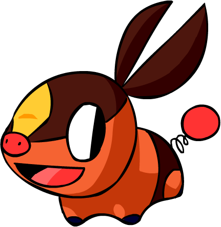
HOW CAN YOU SAY NO TO THAT FACE?
Over-design? Did you look at that pig? Nothing special about it, really, with the only notable features other than its general shape being the ears and tail. The grass starter has only the scarf thing and tail tip as a decoration, and the protagonists are just wearing simple clothes that I could imagine any normal person their age wearing (Not a fan of the booty shorts, but I could really care less).
The otter-starter is the only factor revealed to us that has been over-designed in any sense. Besides, it's not like other Pokemon in the game aren't complex visually.
The otter-starter is the only factor revealed to us that has been over-designed in any sense. Besides, it's not like other Pokemon in the game aren't complex visually.
The girl is more recent it seems.
just look at those shorts.
ogle those legs.
oh god.
Dude. She's still only like 12. Don't be a creep.
Seriously though, I heard they just leaked the female play character for Generation Six:


Personally, I have always loved all the water starters, they've always been my favorite, but this water starter is by far my least favorite design. I don't think it is over-designed like people are saying, I just don't like the color scheme used or its head. Well, hopefully he'll grow on me like mudkip did.
Also: a reptile grass-starter? didn't see that one coming nintendo...
Also: a reptile grass-starter? didn't see that one coming nintendo...

hm. Claw sharpen doesn't seem that useful. With only +1 attack and no speed boost, you're still gonna get run over by scarfers. Plus low accuracy moves aren't that good to begin with... (100 bp Iron Tail, 100 bp Dragon rush, etc)
It would work on more slower bulky pokemon. Dragon rush is better then outrage with a claw sharpen. In the long run at least.hm. Claw sharpen doesn't seem that useful. With only +1 attack and no speed boost, you're still gonna get run over by scarfers. Plus low accuracy moves aren't that good to begin with... (100 bp Iron Tail, 100 bp Dragon rush, etc)
- Status
- Not open for further replies.