
-
Follow our Instagram!
-
Curious about what we're currently doing about bots? Check out the latest updates from staff in this thread.
-
Welcome to Smeargle's Studio! Please be sure to review the studio rules. Feel also free to check out our hub to learn more about this place!
-
Welcome to Smogon! Take a moment to read the Introduction to Smogon for a run-down on everything Smogon, and make sure you take some time to read the global rules.
You are using an out of date browser. It may not display this or other websites correctly.
You should upgrade or use an alternative browser.
You should upgrade or use an alternative browser.
nj art
- Thread starter Nastyjungle
- Start date


Nastyjungle said:thanks a heap Nasty =D hes adorable <3for .Rain.


PurpleMush said:You cease to amaze me Nasty, the best part about your art is that there are so many different styles! I don't know which one to expect when I check your thread for new art. And is there anything I can call you besides Nasty? It sounds nasty :p
Hehe, Nasty is fine, I'm pretty used to being called it.
And thanks a bunch!
Oh, and since I've gotten a few questions or comments regarding how I do things, here's a poor man's tutorial that I threw together for you guys. Hope you find it helpful/informing.
Tutorial
Step 1: Base Sketch
I always start out with a very basic sketch. These don't involve much, just an establishing of shapes and what sort of pose I'm going to use. They take only about 30 seconds, but are an important step, because they give me a base to make my real sketch.

Now we start with the real sketching. First I make a new layer, and then I set the base sketch on a low opacity and make a polished one on top. It doesn't matter what color or brush size you sketch in, I used a bluish color and 6px brush. Making a good base sketch is a key point in the lineart step, because you already want the lines you will be drawing mapped out. Making decisions on the lineart step about where things should be is generally a bad idea, so having the clearest sketch possible is good. I did an alright sketch here, the head was very well planned (didn't have any problems inking it), but I got sloppy with the legs (which gave me problems later on). After you finish making the real sketch, hide the base sketch, as you won't need it anymore.

Alright, now we get down to the nitty-gritty. In my personal opinion, lineart is the absolute most important step in making a picture. The lineart is the total base of the picture, and the glue that holds it together. No amount of coloring can save bad lineart...so you have to get it right! I ink in straight 0/0/0 black, with the default 1px brush. There aren't any fancy tricks to straight, consistent lines here, just practice and a steady hand. I find that the pen tool generally looks pretty cheap, so doing it by hand is the best, in my opinion. Anyways, I've put my sketch at a low opacity to do my lineart. All of the lineart should be on only 1 layer, and no coloring should be on this layer at all.

More lineart process...

Final lineart is done, finally! You should spend a bulk of your time doing the lineart, I usually take about 1 to 2 hours depending on the complexity of the picture (but very small pictures can take a lot less, like the picture of Bachuru, which took only 20 minutes to ink). At this point, you can hide your sketch completely, as you won't need it anymore, and it just gets in the way.

Lastly, a small tip: none of this was inked at 100%. Trying to ink at regular size tends to lead to very wobbly, wiggly lines, so I do most of my inking at 500% to 700% zoom. Going in farther can be a bad idea as well, as you loose the sense of where things are supposed to be.

There will be lots and lots of layers involved from here on out. Coloring all on one layer can really trip you up later, so doing it in multiple layers is recommended. I make a layer under my lineart layer, and put in base colors. Instead of guessing colors, I rip specific colors directly from the sprite using a program called GetColor!. Lastly, I apply a subtle gradient to give it a little flavor. Any gradients you use should be incredibly subtle, because very bold and loud gradients look pretty cheap.

Shadows should be on a new layer, separate from the base layer! This step can be a little tricky, because it's hard to imagine where light is coming from sometimes. If it helps, draw a little lightbulb where you want your light to emanate from, it sometimes helps me know where shadows will rest if you think about it like that. To get a shadow color, just take your base color and move each RGB slider down a few. I blur the edges of my shadows on places where I think it's appropriate, fur, cloth, things like that. Crimgan's body is made of scales, so I leave a hard edged shadow. Now for highlights. If there are a lot of them, or you don't want to mess up your shadow layer, make a new one. In this picture, I went ahead and just made them on the same layer as my shadows. Highlights are a little different, and I almost always blur them, no matter what surface. Really bold highlights tend to detract from a picture more than add to it; you can even choose to omit highlights completely. I add little white specs after that, to make the surface seem shiny. Generally, you don't want to do too much of this, or else whatever you're drawing starts to look like a rubbery material. I probably did a little too much in this picture, but oh well.

This was actually a mistake that ended up looking pretty good. I was making an alternate version of Crimgan in its regular color, and I accidentally had that version's shaded part visible while I was coloring at some point, and I ended up playing with the opacity a bit and using it. The red and blue really made the shadows stand out in a nice way.

This is the texture step. It's 100% optional, but sometimes textures can give a nice flavor to your picture. It's very simple, just color in the whole of your picture with whatever texture you want. All textures should be on their own layers, and those layers should be ABOVE color layers, but BELOW lineart layers. I use two textures here, a paper texture...

...and a custom texture I made myself (you can see it in nearly all of my similar pokemon pictures) which looks kind of like the tread of a tire.

Now, obviously, we can't have these at 100% opacity, so let's tone it down a bit. This step can be a make or break for a picture. Textures are meant to be on a picture to add a little something, not to become the main focal point. You don't want a texture overshadowing all of your hard work, do you? So, don't do something like this...

...but DO do something like this. In the end, my paper texture ended up being at 7% opacity, and the tire treads at only 2%. Also, accidentally, while doing this tutorial, I forgot to turn on my black shadows layer...it's the layer I do directly after the lineart step, which are pure black shadows that are treated as lineart. You can see them in this picture but not in any previous picture, but they were meant to be there the whole time. Whoops.

Phew! Hope it helped/shed a little light on how I do things!

Nice tutorial. I don't have photoshop, so I found it interesting.
The Crimgan is great! I don't like its normal colors that much, but the shiny colors are better; they make it seem Grass/Dragon, which I like very much. Leaf wings and orange thorns. And then there's Bachuru, of course ^_^
The Crimgan is great! I don't like its normal colors that much, but the shiny colors are better; they make it seem Grass/Dragon, which I like very much. Leaf wings and orange thorns. And then there's Bachuru, of course ^_^

This would have been so useful when I still had a working tablet/iScribble (even though that only has 3 layers :B).
Also, heck yeah, Rhapsody.
Also, heck yeah, Rhapsody.


Has my request been lost in the mail? I was about to say again, but last time you were working on it so... :D
There's no particular rush, I was just curious.
The way you incorporate texture is very interesting, and now I know how you get your lines so smooth! Thanks for posting that tutorial :)
There's no particular rush, I was just curious.
The way you incorporate texture is very interesting, and now I know how you get your lines so smooth! Thanks for posting that tutorial :)
Alchemator said:Has my request been lost in the mail? I was about to say again, but last time you were working on it so... :D
There's no particular rush, I was just curious.
The way you incorporate texture is very interesting, and now I know how you get your lines so smooth! Thanks for posting that tutorial :)
Yes it has definitely been lost, I don't recall a request put in by you.
Go ahead and repost and I'll get on it.


Nastyjungle said:for stellar
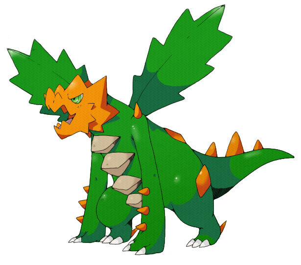
lol shiny kurimugan looks like a christmas tree :P

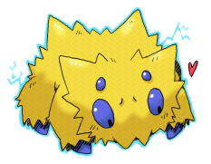
baby. Electric. SPIDDDDAAARR~.
Your style is so cute! I love your regular stuff, too!
Your style is so cute! I love your regular stuff, too!

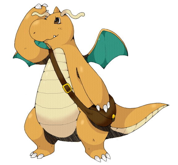
lineart for Kevin Garrett's burungeru
color coming soon
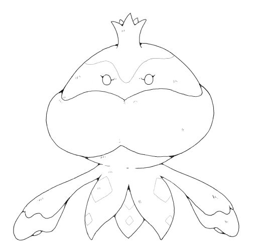
color coming soon


bossungeru
Looks awesome so far, can't wait for it to be finished as usual!
Kevin Garrett's burungeru


That is so cool. Thanks.

Dammit since you posted the tutorial all I can see is tire tracks...
awesome stuff though, I love the Spider.
awesome stuff though, I love the Spider.
part of a wip
i prefer ho-oh but i drew lugia first anyways
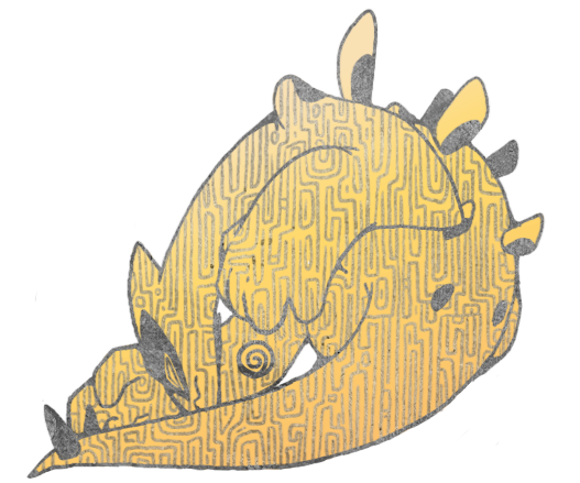

i prefer ho-oh but i drew lugia first anyways
Hide


whoooooooa.
that texture reminds me of unown or something and it looks so pretty asdfghskja
If Ho-Oh is better then I'm gonna explode with glee soon.
that texture reminds me of unown or something and it looks so pretty asdfghskja
If Ho-Oh is better then I'm gonna explode with glee soon.
yeah i pretty much texture raped this one
i didn't even actually draw with the real brush, just the texture, i feel so cheap
i didn't even actually draw with the real brush, just the texture, i feel so cheap

Edit: Oh and also, I will mostly be working to finish all of my smog art before I finish any more requests. Thanks for the patience.