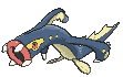
There are going to be a lot of these, but here's one that bothers me in particular among the flying sprites

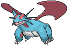
Now, Salamence's flying pose looks stupid in its own right, but compare it as well to its original sprite. The sprite looks imposing, gives it weight standing on all fours with that huge tail and very angular head in profile, like you're hoping this thing doesn't turn and notice you. The flying model takes away that sense of strength by having it look like it's just suspended in mid-air, takes away a significant part of its mass by hiding the tail, underlines how those wings really shouldn't lift it (even if we know they wouldn't, it's more pronounced when it's constantly hovering in a way where even proper wings wouldn't work), and makes the head spikes look so much thinner and takes away their menace making them look more like "thorns" than spikes. And maybe this particular part is just me, but the expression looks tired, rather than vicious with the top one open and baring fangs.