That Walrein is a serious badass.

-
Check out the relaunch of our general collection, with classic designs and new ones by our very own Pissog!
-
Welcome to Smeargle's Studio! Please be sure to review the studio rules. Feel also free to check out our hub to learn more about this place!Welcome to Smogon! Take a moment to read the Introduction to Smogon for a run-down on everything Smogon, and make sure you take some time to read the global rules.You are using an out of date browser. It may not display this or other websites correctly.
You should upgrade or use an alternative browser.ArtJustArt - The Art of DougJustDoug
- Thread starter DougJustDoug
- Start date
 I added a new sketch of Skarmory to my upcoming artworks. See the first post of this thread. Don't pay too much attention to the wings. I plan to make them a little larger if possible. They're too small for the size of the body and talons. But, I ran out of space on the paper. When I digitize it, I can make the wings as big as needed. I'll also tweak their shape. I want them to look like knife blades.
I'm not terribly excited about this one, but I do like all the sharp edges and angles on it. At this point, I'll probably do this after all the other sketches.
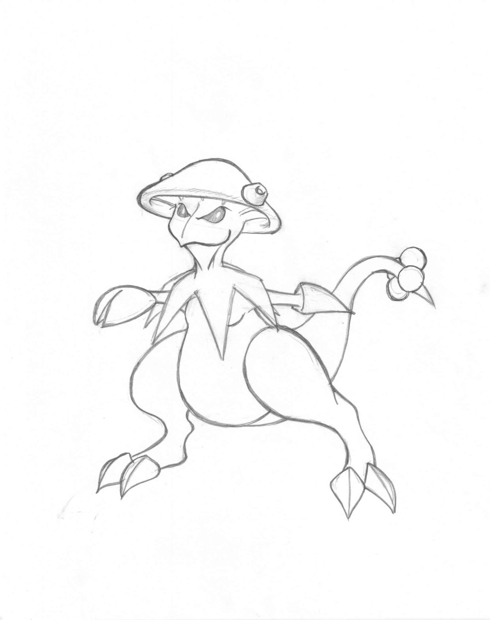
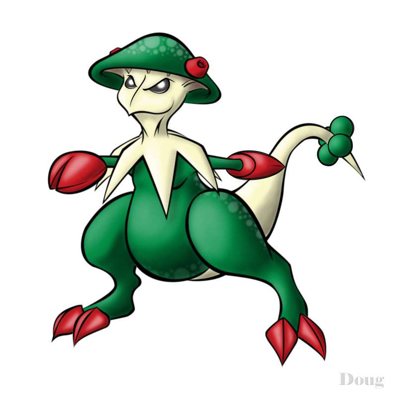
Breloom
This has always been my favorite grass pokemon, the others don't even come close. One of the highest attack stats in the game, unique typing, and the only viable user of a 100% sleep move. With D/P, the fighting 'shroom gained a spectacular new ability and physical grass moves. This little guy is one of a kind.
Reference
Here's the game sprite and Ken Sugimori's original design:


Sketch
Click the thumbnail to see the full original sketch:

Description
I was excited about this when I first did the sketch. But after doing some other sketches and finished works, my interest in this waned. It turned out fine, but there was nothing to really get me interested in it.
I added a few flourishes to the base design, but tried not to stray too far. In general, I tried to make Breloom a little "sharper". The claws, the petal-things draped around his neck, the tail -- I made all of these pointy, as opposed to rounded. I did the same thing on the face, giving him almost a beak-like nose and a furrowed brow. In the base sprite, Breloom has this vapid look in it's face. I tried to give it a little more punch.
I also added spots to his head, back, and abdomen. Many mushrooms have spots, so a mushroom pokemon can have them too. This was a last-minute decision on my part. After coloring everything, I just felt like the design was lacking something. The spots were a way to dress it up a little bit and get away from a fairly boring three-color scheme.
This one ended up about the way I expected. It's not OMG-incredible, but I don't think it's too bad either. If there are any other Breloom fans out there, perhaps you'll appreciate my attempt to breath a little life into this wonderful little pokemon. I hope the rest of you like it as well.Nice works, I like the way your making them all looking evil.I would say Breloom is my favorite out of the set. It's claws look quite deadly, but at the same time, it's oddly cute. The lighter green spots are also a nice touch. I also like it a lot- I used one in my party to beat Ruby version. :)Y'know, I just love the way you make the pokemon seem so formidable. Not to the extreme where they're hardly recognizeable (I've seen some insane stuff done to the original starters), but enough so they reflect the mayhem they can cause.
Something I'd love to see done would be Cacturne. I remember I had a Cacturne with me my first playthough Ruby, but in subsequent months/years abandoned it for Breloom, despite Cacturne's cooler looks. Then I learned of the potential D/P brought Cacturne... and fell in love with the guy all over again.
As far as pokemon go, I think Cacturne is one of the most innately evil-looking, and would love to see what you could do with him. I just want to see if you could out-do the creepiness of this Cacturne: http://sbkmulletman.deviantart.com/art/It-s-Father-s-Day-34945090 (warning: severed pikachu head in cake). Especially, since it would be just Cacturne, and not these other characters taking away the creepy spotlight...
I just added a sketch of Lanturn to the sketches section in the OP. It's a little plain (like many sketches), but I think it could look really cool when I ink and color it.
I will be inking and coloring Garchomp next. I have high hopes for that one. We'll see how it turns out.
While I freely admit that I don't like drawing "cute" pokemon, I did a sketch of the three Legendary Pixies. They do not look mean or intimidating at all. I'm almost finished with it. I'll post the sketch soon.
@Chronosquare - The Cacturne suggestion is awesome. I've always liked Cacturne. I think he could be made to look like a badass without making him unrecognizable. I definitely plan to work up a sketch on him. Thanks for the suggestion!
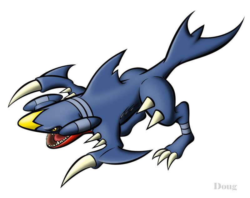
Thanks to everyone that has posted compliments to my stuff. Hearing positive feedback just makes me want to do more art. It's incredibly inspirational. Negative feedback is oddly inspirational as well. Go figure.... Although art threads don't get a lot of traffic here at Smogon, it's nice to know that some people are looking at this stuff. I plan to keep cranking it out, either way. Thanks for the comments!May I just say that I truly respect your devotion to your work doug. I do not post here much as I have come to see despite my intense competitive spirit during the RBY and GSC days, I have sense faded in my poke battling skills. Amazing artwork. The Breloom and Swampert sketches are my favorite. Also, am I the only one that doesn't get why a shark is suddenly a ground dragon? Just saying...
I would love to see you try and make my favorites Electrode and Shuckle terrifying monsters, like Shuckle doing a Rollout that would snap the bones of a Lugia. The idea is cool in my head at least. Keep up the awesome work and much respect and admiration.I love that Garchomp, seriously. You made it look more shark like, which is how I like to see them drawn. X3
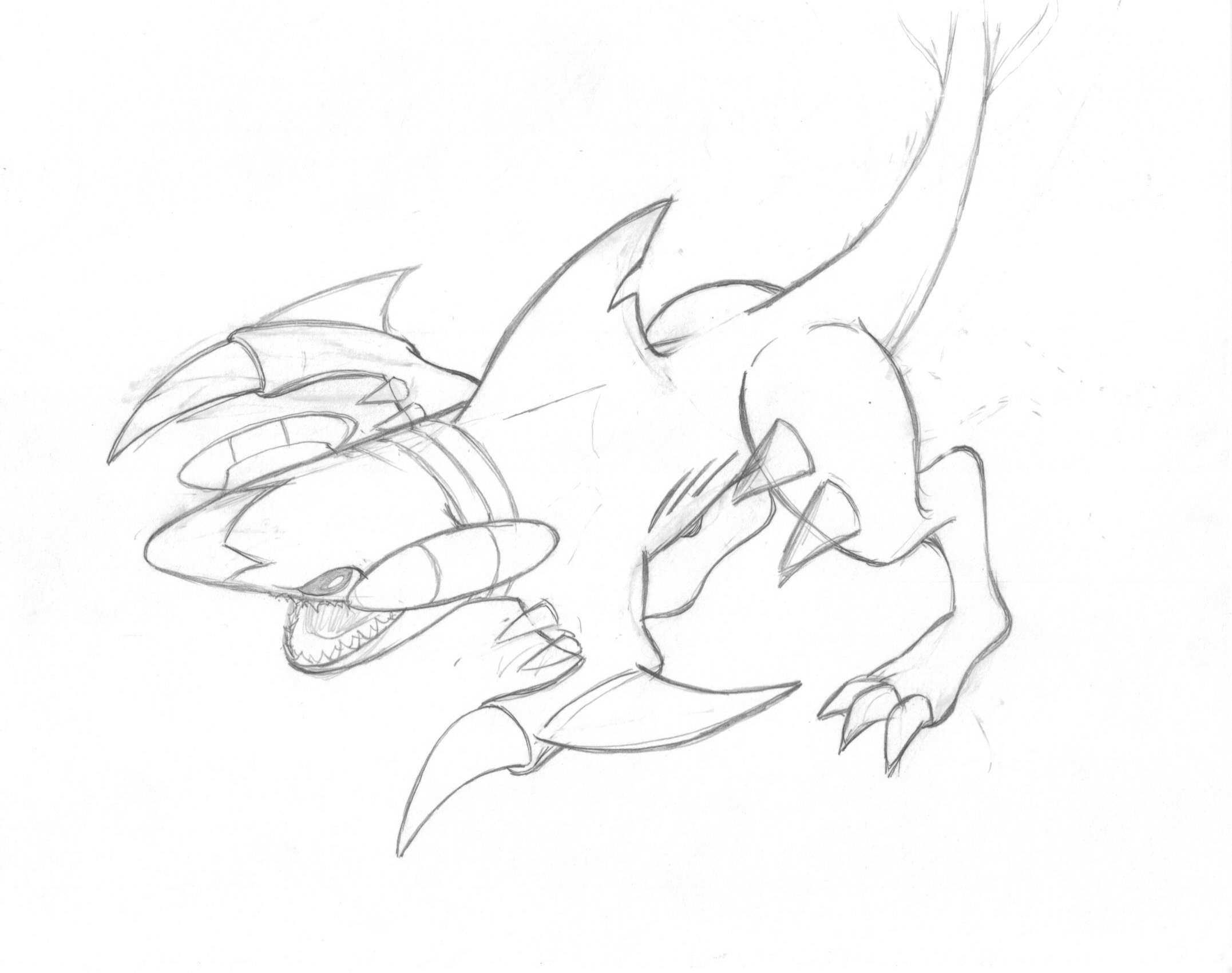
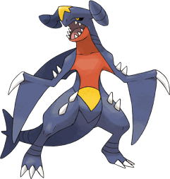
[THREAD=35119]Click here to see my full Gallery in the OP of this thread.[/THREAD]Garchomp
There's no question about it: Garchomp is the most devastating pokemon in the current OU metagame. Uber-level base stats, perfect typing, and frighteningly powerful moves. It truly has no counters. I've used this pokemon quite a bit and I've had it used against me. If there is one pokemon in the whole pokedex that should look scary, it's this guy. Ladies and gentlemen, I present to you, the most threatening pokemon in the game....
Reference
Here's the game sprite and Nintendo's original design:

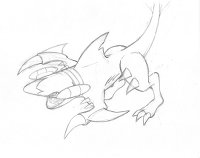
Sketch
Click the thumbnail to see the full original sketch:
Description
When I first got the idea for an art thread, I did a few pics in advance so I could load the gallery with some content fairly quickly after introducing my thread. As somewhat of an afterthought, I decided to include some sketches of "upcoming" pics. Unfortunately, I didn't have many sketches lying around. So I whipped up a few one day, without thinking too much about them. This Garchomp picture was the last of that initial flurry of sketches. I didn't put much thought into it.
I've always felt that Garchomp looked a little bit silly, which is a total injustice to it -- since it is so amazingly powerful. The game sprite looks kinda "gangly", IMO. So, I thought, "What if I make Garchomp lean forward?" That would mitigate some of the gangliness, and I could point all those sharp things forward in a sort of "torpedo-attack position". I'm really glad I made that decision, because I think the pose is the single best aspect of the picture. I've never seen another drawing with Garchomp in this position, so I should get a few originality points, if nothing else.
I wasn't really intending to make it look too shark-like. Yes, I know Garchomp is based on a shark. But, I wasn't trying to emphasize it. I just leaned him forward and started adding all the elements from the base design, with a little more bulk and strength. As the sketch unfolded, I realized "Damn! This thing really looks like a hammerhead shark in this position." So I went with it.
I minimized the fins on its arms because when they were long, they got in the way of everything. I also changed up the legs, which was one of the riskier decisions on my design. I was afraid they looked too weird with all those joints, but I think they have a certain animal authenticity that the sprite lacks.
I had a many, many problems with the tail. If you look at the original sketch, I really had no idea where I would go with the tail. The sketch indicated I would curl the tail around in some fashion. But, the perspective on that didn't work out. So I decided to send the tail straight back behind him, and stylized the fins to be more "swept back" and graceful. Unfortunately, those swept-back fins lengthened the tail considerably, so I had to shorten the tail base to compensate and keep the overall proportion of the design in check. If you look at the Nintendo design, you'll notice two rings near the end of the tail. Garchomp has rings like this elsewhere, notably around its neck, "hammerhead things", and ankles. I really couldn't include the rings on the shortened tail, even though I think it would have balanced the colors a bit better. I had to choose between the cool sweeping tailfins, or the stripes. Cool tailfins won.
The worst part about this pose, is that it hides all the interesting colors on Garchomp. Garchomp's back is fairly bland when it comes to coloring. All the color is on its belly, which is facing the ground in this pose. So I tried to make up for it with more advanced shading and highlights. This is probably the most sophisticated shading/highlighting I have done so far. Garchomp has lots of "parts", so it was quite a chore to apply light and dark in all the right places. I also cheated several times for dramatic effect. Nothing big, but for example, if you look at the little highlights on his eyebrow and his backfin "notch" -- those are not technically correct according to the logical light source. They are flourishes that accentuate the drawing. Most people likely never notice this stuff consciously, but I think it adds to the overall drawing effect. Even if they are wasted pixels, I love little details, so it's fun for me. I decided to not use any skin texture (unlike most of my other pics). I think the smooth, untextured skin makes Garchomp look sleek and fast.
After posting the sketches, this one received the most attention. Many people have replied that they have been waiting for me to finish it. Expectations like that make me nervous, so I tried to put a little extra effort into it. Despite all my earlier misgivings, I am very pleased with the end result. For those of you that have anticipated this pic, I hope I came through for you.At first I thought it looked a bit like a JSF and a lot of features seemed out of place, like the teeth randomly all over its limbs...until I realized I never saw them on his official art and in-game sprite before. Another reason why I guess it looks unfamiliar to me is because you see its back and hardly any of its belly, which takes away a lot of the red and yellow that the in-game sprite has.
But after taking all that into consideration that's a fine piece of art for Garchomp. He definitely looks less dragging and more ready for action. Really like the fin, the teeth and its tail.
I like the other ones as well, although I am overall not the biggest fan of Pokemon straying very far from how they're pictured to me in the actual games (which is why I like aragornbird's art so much - his art could actually be in the game, and in most cases it should be!). I thought at first I wouldn't like yours either when seeing the thumbnails, but it turned out the power of your work is in the detail rather than the overview.
Not very fond of how Walrein's whiskers were handled though, but everything else is very cool. Keep going! Oh my god, that colored Garchomp is even more impressive than I first imagined to be.
Seriously, kudos to you!
edit:For those of you that have anticipated this pic, I hope I came through for you.
hahah yes, you have! Wow, that Garchomp is seriously awesome.
Very well done! Honestly this is the very first time I'm visiting this thread, and I must say I'm very impressed with your work, Doug. I love them all, seriously. I hope one day you'll draw a Dewgong, which is my personal favourite Pokemon. :) But don't consider this a request; I'd be happy to see any other Pokemon artwork you'd like to draw.
The Garchomp and the Walrein are especially impressive!