• Check out the relaunch of our general collection, with classic designs and new ones by our very own Pissog!

Blue Frog's Thread Spam

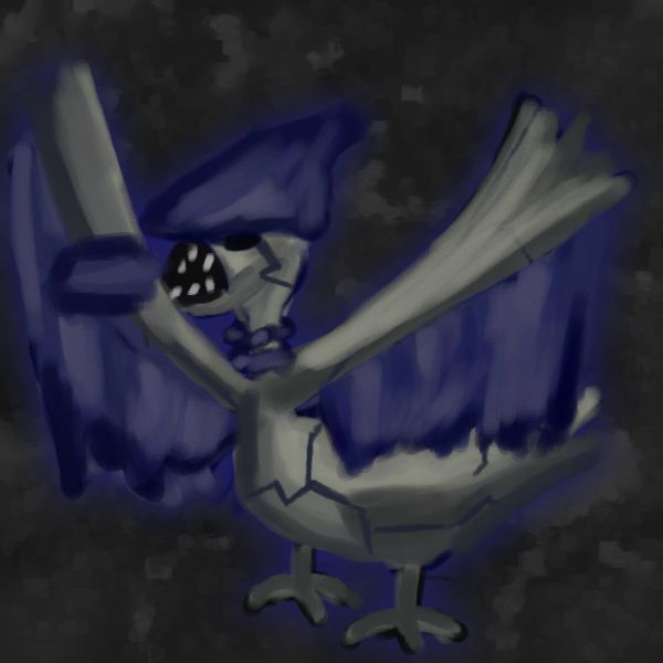
Alright, here's an attempt of a retype. This is supposed to be a Dark/Fire Skarmory, but I can't draw fire, so it looks kind of stupid.

Untitled14_zpsaab46c45.jpeg


If anyone cares, I am taking requests, so if any of the better, more experienced artists aren't available, you can always come here.
 
oh look another update


Name: Fleasance Type: Bug Base Stats: 135/80/80/20/50/20

Name: Pulsac Type: Bug/Dark Base Stats: 155/100/100/40/75/40
 
Wow thanks man! This is pretty good
3VzJGDX.gif

Also dat hp on your fleamons
Z1tyGPK.gif
I guess that reflects to their tenacity IRL...

WOAH THESE EMOTICONS ARE LIKE THE BEST THING EVER
Thanks so much, though, Magistrum. I felt really honored to be able to do a request for you, since you're so good, definitely much better than I am. I'm glad there are so many incredible artists here on Smogon who I can learn from.

Now, on to today's update:


I never really thought about it, but Shedinja is essentially a Ninjask corpse. When you get a Shedinja in game, what really happens? I mean, do you just pick up the skin of your Pokemon after it sheds? That's pretty weird and psychotic if you ask me. If my Pokemon's lifeless exoskeleton suddenly sprouted a halo and came to life, I'd try to kill it as fast as possible.

Anyway, about the drawing itself, I tried using textures for the first time, and I think it came out pretty good. It was really hard to make Ninjask look cute.
 
I mentioned before how some of my fakemon designs were done when I was a lot younger, and consequently sucked completely. I was contemplating whether or not to even post these, but if I took out all the bad designs, there would only be like, 2 left, so here they are (brace yourself):

Name: Potbin Type: Grass Base Stats: 40/30/90/90/90/20
Name: Vasod Type: Grass Base Stats: 65/40/130/130/130/30

The sad thing is, I genuinely thought that these two were good designs, and they even inspired my "Potmon" design for CAP5, which was equally as terrible.

Here are two more designs that are a bit better than the ones above, since just including those two would be quite underwhelming, if you ask me.

Name: Pinchfant Type: Water Base Stats: 30/135/60/15/30/75
Name: Crushtacean Type: Water Base Stats: 70/165/100/30/70/100

I decided to add this in order to make a crab trio (this thing, Crawdaunt, Kingler).

Even these two aren't that great; the only thing I really like about them are their names.
 
I wanted to try a different style for this closeup, although my closeups are getting progressively less close up, so I'm not even sure if this counts anymore.


I'm really happy with how this thing came out.
 
love the ninjask and your close ups:) were you taking requests??
if so could you draw me a lapras close up?
 
Sooooooo bored in school today; I drew this throughout the day on the back of my Chinese homework


Ellie Goulding is the best singer ever, just sayin'. I hope some of you guys agree with me.
 
I drew this because I wanted to try doing lineart.


It didn't work out too well, obviously.


Normal types are weird. They have huge expansive movepools and they still suck completely. I just think its funny how a derpy dog thing can have more superpowers than the entire Justice League combined.
 
ooooh, quintuple post! More (bad) fakemons for you:

Name: Petroc Type: Rock/Ground Base Stats: 50/105/115/15/55/10

Name: Minerode Type: Rock/Ground Base Stats: 80/135/145/45/75/30
 
I hate to keep updating this, but I just tried using a new drawing app and the lineart was infinitely easier:

 
Hey! Whichever program you're using, that new piece's lineart is much better than previous pieces. It's still a bit messy (that just takes time and patience to get right) but the lines seem a lot cleaner and the whole piece seems brighter than your others. Keep it up :)

also my god six posts in a row i had to break the streak
 
I think you can also benefit by attaching your lines and cleaning up the line overlaps a bit more. Echoing Ritter's crit, the lines are still a bit messy so if you took the time to attach the lines better and paid attention to where the lines meet, then I think the lineart could be better. Also, pay attention to your coloring to because I see the coloring cross the lines, giving it a more unclean look. As for hands, I think you should shape your hand in the pose you want it to be and then copy it off. But hands are really difficult to draw so practice makes perfect.
Anyways, I hope I helped!
 
Yeah... I'm probably going to stick to painting for the most part, but it would be cool to be able to do lineart, since I guess it'll add more variety to my stuff.


Stupidest shit ever.
 
For Compton Kid:


I hope you don't mind that I tried doing a bit of a completely different style for this closeup.
 
Back
Top