CAP 21 CAP 21 - Sprite Submissions

Status
Not open for further replies.

DougJustDoug

Knows the great enthusiasms
is a Site Content Manageris a Top Artistis a Programmeris a Forum Moderatoris a Top CAP Contributoris a Battle Simulator Admin Alumnusis a Smogon Discord Contributor Alumnusis a Top Tiering Contributor Alumnusis an Administrator Alumnus
Moderator
Base Sprite & Mega Evolution Sprite

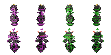
Because CAP 21 is a Mega Evolution project, this Spriting stage will be different than any past CAP project. All spriters will submit TWO complete sprite sets, one Base sprite set (front and back) and one Mega Evolution sprite set (front and back), to make a legal final submission. The Base and Mega Evolution Sprite Sets by each spriter will be voted TOGETHER as a single submission. We will not choose a Base Sprite independent from the Mega Evolution Sprite.


Sprite Rules
  • Sprites should be inspired by the winning designs from the Art Poll. It does not need to be an exact rendition of every detail of the designs; "artistic license" is granted to all spriters. However, drastic deviation from the selected art designs is discouraged.
  • All sprites (front and back) can have a maximum size of 96x96.
  • All sprites (front and back) must have a complete, unbroken, distinguishable outline. It does not need to be a black outline, but it must be clearly distinguishable from the adjacent interior colors of the sprite
  • No action effects, move effects, environment effects or additional objects can be rendered on or around the pokemon.
  • Sprites must be in PNG format.
  • Use 8-bit truecolor (aka 8-bit RGB) or less. This does NOT mean 256 color mode.
  • Use transparent backgrounds.
  • All sprites must be scratch sprites that are completely original works by the spriter. Fusions of other sprites or pixel-overs of other artist's lineart (including the main design) are not allowed.
  • Do not alter, fuse, recolor or otherwise modify another spriter's submission unless the original artist explicitly gives permission.
  • All sprites (front and back) must use roughly the same size and pose when compared to each other.

Final Submission Post

All spriters must make a final submission post conforming to the sprite rules (listed above) and the following:
  • The post must have "Final Submission" (in bold) as the first line, with the sprites at the top, and any additional description or comments (if applicable) below them.
  • Final submissions must contain a minimum of 4 sprites - Front Normal, Front Shiny, Back Normal, Back Shiny. If spriters choose to include gender differences (Male and Female versions of each) then 8 sprites must be submitted. Gender differences are NOT required.
  • Only submit ONE PNG that contains all the submitted sprites. Please do not submit separate images for every sprite. One "cutsheet" makes it easier for mods to track submissions and ensure each complete set of sprites stay intact.
  • Only make one (1) final submission post.

All legal final submissions will be included in the sprite poll.

Advice for Spriters

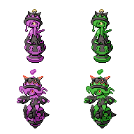
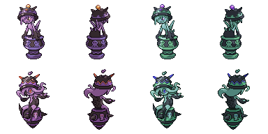
There are 8 possible sprites in a Sprite Set:
  • Front Normal Male
  • Front Normal Female
  • Front Shiny Male
  • Front Shiny Female
  • Back Normal Male
  • Back Normal Female
  • Back Shiny Male
  • Back Shiny Female
In most cases, spriters post a Front Normal sprite first. Once feedback comes in and the poll nears, they make the other sprites. You do not have to make different Male and Female sprites. Typically there are only minute differences between male and female sprites, but some spriters make noticeable changes between genders, which is also fine. Shiny coloring is completely up to the spriter to choose, even if the design artist posted suggested shiny coloring with their art design submission. Please look at your transparent sprites against different colored backgrounds, not just white. In Pokémon Showdown, the sprite will be displayed on multiple background colors in battle.


Art Designs:

Base Forme


Mega Evolution


---

CAP21 so far:

Typing: Rock/Poison
Abilities:
Base - Regenerator / Mold Breaker
Mega - Magic Guard
Stats:
106/105/65/75/85/104 > 106/135/75/85/125/114

Leadership Team:

jas61292 - Topic Leader
imanalt - Typing Leader
DetroitLolcat - Abilities Leader
sparktrain - Stats Leader
HeaLnDeaL - Movepool Leader

Concept:
Name: Typing Underdog

General Description: A Pokémon which utilizes an undervalued typing to its full potential, by playing towards both its strengths and weaknesses.

Justification: Each typing possesses a unique set of characteristics, causing all of them to perform very differently in various aspects of battle. However, not every typing has been granted the opportunity to display this potential, being forced into suboptimal roles by virtue of stats, ability and movepool, and therefore often being labelled as “bad”.
This concept aims to do a detailed analysis on the primary function of such a typing along with its potentially unexplored capabilities, by creating a Pokémon that that emphasizes the typing’s most prominent traits and utilizes them effectively.
This approach will not only allow us to widen our understanding on the unique niche and preferred playstyle of the typing, but will also give us additional insight on the mechanics that lead to success and failure of the typing when comparing CAP to the wielders in the lower tiers.

Questions to be answered:
  • What are the most important traits the Pokémon gains from the chosen typing, both positive and negative?
  • Is quality or quantity of weaknesses/resistances/immunities more relevant to the chosen typing? What does this mean for the way it is played?
  • How significant is the niche provided by the typing in OU? Are there any striking flaws in the typing that can’t be played around and prevent the Pokémon from performing reliably?
  • How reliant is the typing on stats, ability and movepool in order to succeed in OU?
  • Are the unique characteristics granted by the typing enough to set the Pokemon apart, or does it face strong competition for its role from Pokémon of other types?
  • Is there any distinct playstyle that suits the chosen typing the best? Or can the same typing be utilized in an entirely different approach to similar success?
  • How important is a type’s versatility for its overall success?
  • Is a single Pokémon capable of portraying most relevant aspects of the entire type?
 
Here is my front sprite:


I already received some comments on it at PS!, but some more pointers on how to improve the sprite are always welcome!

Since I love those animations that show the progression of a sprite...:
 
WIP Post:


I'm not very comfortable with this thing's size: with roughly the same head size as Machop, the entire sprite sits taller than Machamp. Not sure how to fix this...

Also I never want to sprite a pot again. Screw me, that bottom part was hell.


noobiess
Long time no see fellow red-blind spriter.

Comments:
- The pot in particular is very well done - a smooth, solid, coherent shape.
- The sludge covering its face is definitely too...sharp-looking. You might want to round it off - a good reference is Slugma.
- Maybe try slightly bigger eyes? Were it not yellow, it'd be hardly visible.
- I suggest you make both of her arms slightly...wider. They need the look of weight, which I don't think your sprite has accomplished yet.
- The spikes on its back are a bit too vertical - if you angle them more horizontally, they might stick out better.

All the best.
 
Last edited:
An update on the sprite:

I also played around with changing the 'hue', and ended up with a neat shiny sprite:


Ice-Cold Claws, Good to see you around here too. Colorblinds should stick together ^^
I like the sprite so far, especially the pot (despite the pain you have through to sprite it), but the face look really creepy withough the slime as hair.
I also struggled with the size, since it is a very vertical sprite. What I did is make CAP21 bend forward to make it a bit less vertical. For you, I would say it depends on the pose. I can't give you any specific advice since your body is still a bit too "flow-y" to see the actual pose of the body.
 
So I ended up shrinking it a little.


I basically lifted Yilx's pose completely - it's a great feminine pose that gives a seductive edge to our CAPmon.
As to how well I delivered it...well. I think the sprite ended up a bit chaotic.

This isn't complete - I'm still figuring out how to shade the slime hair and front arm. Total pains.

noobiess

Nice! Much better.

The shiny is pretty alright, but I can't believe you didn't take the more obvious toxic green. Shall I reserve that color? :D

And yeah - good choice of the pose by the way, now I see why you did it - really makes the whole sprite clearer. Mine did end up pretty....cluttered.

EDIT:
Very slight edits, now with shiny selection.


Let's see - a nice, radioactive toxic slime green to highlight the Poison type, or a crappy mud brown to bring out the Rock type?

RE-EDIT:
Also Mega.


This may be the hardest sprite I've ever worked on. Haven't mustered the courage to sprite the hair for this one.

Also I have no idea what's going on with Mega Crucibelle's arm and leg on the left, so I just made all the limbs symmetrical.

RE-RE-EDIT:


Hell yeah.

No idea how to texture/shade rock, particularly those leg plate things, but otherwise I consider this my magnum opus in scratch spriting.
 
Last edited:
WIP


This is my first time spriting anything for CAP, and I thought that now would be as good a time as any to start up pixel art for the first time in years. I've got the front sprite and front shiny done so far, but I plan to do both the backs and the Megas as well. (I did consider scaling down the original pic and working from there but that would be against the rules. I hope what I've come up with is different enough!)

I picked a nice blue and green for the shiny color scheme because Crucibelle reminds me a lot of a certain slime girl from a certain anime. I made sure however to give the hair a light blue-green tint instead of outright green, both to keep her distinct from said slime girl and to prevent the color palette from going all over the place.
 
Looks like spriting isn't as hot anymore, I remember when the Tomohawk spriting thread went up to - was it 10 pages? Oh well, I still love this.


Mmmmm. Personally I'm digging the green, makes Mega Crucibelle look like something straight outta Ben 10.

Falchion
Hi, welcome to spriting!

Erm, before I start on anything else - take another pokemon sprite from here and compare it with yours.
I'm not sure what software you're using to sprite those, but basically, pixel art for pokemon sprites doesn't involve the smooth gradienting of colors. While there is no actual limit on the total number of colors in a sprite, spriters usually agree on 16 (including black and the background). Currently your sprites stand at....erm...like a lot.

If you're using a more sophisticated software with a layer system, I suggest you trace over your sprites on a new layer with one single black color, fill it with one single purple, and so on - then you do the shading and shining with other distinct shades of black and purple, such that there are ~16 colors in total used on the sprite.

Good luck! And also, you're not on a bad start - the overall shape is coherent, and the shine effect is quite nice - all the better if you can scale the effect down to a few colors.
 

Ssensenh

deerfish
is an Artist Alumnus
just some random thoughts of mine that might not help a lot but i hope they do yeh:
noobiess I think the arms look a little too thin and the goo looks too spiky, but overall it's great. 8D
Ice-cold Claws I esp love those little bubbles above the mega sprite. xD The mega's face looks too small though. o: As a personal pref I like the shiny caramel goo.
Falchion Your sprite looks really antialiased; it wouldn't fit in with a normal Pokémon sprite. Also for your colors, monochromatic shading is generally outclassed by analogous shading, so mix your hues up a little. :D
 
Ice-cold Claws and Ssensenh: Thank you kindly c: Yeah, it was probably my mistake to use smooth shading for my first attempt, but I have an idea of where the lights and shadows go at least. I actually have the non-shaded version in a separate file and I will definitely work towards a flat-cel shading for my next go.


Here's an improved flat-shaded sprite; I fixed up the bottom of the pot because it was too wide for my taste before, and I think it looks better now.

Also, general thing regarding this design: Am I like the only one who integrated the liquid oozing from the pot into my sprite? Not to nitpick here, but, uh, I don't see that with any of the others... ^^;
 
Ice-cold claws I like how it turned out. The colors of the shiny match nicely together.
The mega looks clean, and I especially love the texture of the rocky parts.
If I must give any comments; I personally would add shade on the 'smiley hair' just beneath the lid of the pot.
Falchion You can see that you are not familiar with pokémon sprites, but taking that into account you did a nice job. I think for you it is best to focus some more on the line art of the sprite, since it could be cleaner. There are also some proportions that aren't correct.
 
An update on the sprite:

I also played around with changing the 'hue', and ended up with a neat shiny sprite:


Ice-Cold Claws, Good to see you around here too. Colorblinds should stick together ^^
I like the sprite so far, especially the pot (despite the pain you have through to sprite it), but the face look really creepy withough the slime as hair.
I also struggled with the size, since it is a very vertical sprite. What I did is make CAP21 bend forward to make it a bit less vertical. For you, I would say it depends on the pose. I can't give you any specific advice since your body is still a bit too "flow-y" to see the actual pose of the body.
Heh, nice! It looks like it's up to something sinister, I like it. The goo looks a bit too spiky though. Still an awesome sprite.

Ice-cold Claws and Ssensenh: Thank you kindly c: Yeah, it was probably my mistake to use smooth shading for my first attempt, but I have an idea of where the lights and shadows go at least. I actually have the non-shaded version in a separate file and I will definitely work towards a flat-cel shading for my next go.


Here's an improved flat-shaded sprite; I fixed up the bottom of the pot because it was too wide for my taste before, and I think it looks better now.

Also, general thing regarding this design: Am I like the only one who integrated the liquid oozing from the pot into my sprite? Not to nitpick here, but, uh, I don't see that with any of the others... ^^;
Welcome to spriting, my friend. I like the effort you put into it, but it seems a bit... off... compared to the other submissions. You might want to try shrinking it a little and fix up the head and arms.
Looks like spriting isn't as hot anymore, I remember when the Tomohawk spriting thread went up to - was it 10 pages? Oh well, I still love this.


Mmmmm. Personally I'm digging the green, makes Mega Crucibelle look like something straight outta Ben 10.

Falchion
Hi, welcome to spriting!

Erm, before I start on anything else - take another pokemon sprite from here and compare it with yours.
I'm not sure what software you're using to sprite those, but basically, pixel art for pokemon sprites doesn't involve the smooth gradienting of colors. While there is no actual limit on the total number of colors in a sprite, spriters usually agree on 16 (including black and the background). Currently your sprites stand at....erm...like a lot.

If you're using a more sophisticated software with a layer system, I suggest you trace over your sprites on a new layer with one single black color, fill it with one single purple, and so on - then you do the shading and shining with other distinct shades of black and purple, such that there are ~16 colors in total used on the sprite.

Good luck! And also, you're not on a bad start - the overall shape is coherent, and the shine effect is quite nice - all the better if you can scale the effect down to a few colors.
It's amazing. 8D I'm surprised nobody else has made a sprite for Mega Crucibelle. Don't change a thing.


Backsprites.
Gonna leave a blank for Mega Crucibelle's back, at least until her model sheets are up.
Also her butt/leg looks terrible. Looks like I don't know my sitting tentacle anatomy D: help

Ssensenh Heh, thanks! Erm - their heads are actually the same size, just that the hair/hat differences make it look that way. It's just about right, since in the artwork Mega Crucibelle does have a roughly smaller head. It's also the same size as Roselia's.
I'll post the full set of shiny options once I settle the back - thanks for the input!

noobiess Thank you! I can see where your suggestion is coming from - the hair does look quite flat on both forms - but I couldn't pull off the shading realistically like you did, because in my sprites the helmets just fit over their head (instead of being larger). I might still play around with it, thanks for suggesting.

Mega-Pokebattlerz Thanks man, peace. :toast:
 
Last edited:

HeaLnDeaL

Let's Keep Fighting
is an Artistis a Forum Moderator Alumnusis a CAP Contributor Alumnus
Moderator Announcement: We hope to close this thread in approximately 48 hours. If you wish to enter, please make a post marked Final Submission in bold and include complete sprite sets for both the base and mega forms. Good luck to everyone, and I hope we can get multiple final subs in time!
 
I actually worked on the back sprite yesterday:

I probably will be able to work on the mega tomorrow, but I'm not sure I will be able to finish it in time.
I will certainly post here tomorrow with an update (and if I will be able to finish it in time or not).
 
It's been a while since I've done any sprite work, but here's a recent update and a WIP back sprite as well! I'll probably get started with the Mega once I move to the DC area next week.


After I shrunk and retraced the entire sprite, I made the head and hands a little smaller, relatively speaking. I think it looks better now.

And I also realized a little too late that I forgot to put the rim on the lid for the back sprite, but that's something I can fix when I do the shading. I also plan to redo the skull patterns on the pot of the back sprite as well, since I used a mirror image of the front sprite as a starting point to save time.
 

HeaLnDeaL

Let's Keep Fighting
is an Artistis a Forum Moderator Alumnusis a CAP Contributor Alumnus
Tagging Ice-cold Claws so that he knows about the deadline, since he's the only one who hasn't replied since my last warning. There's roughly 24 hours left to post a final submission.
 
Tagging Ice-cold Claws so that he knows about the deadline, since he's the only one who hasn't replied since my last warning. There's roughly 24 hours left to post a final submission.
...And if nobody else posts a final submission by tomorrow, can you extend the deadline? I'm actually working on my own submission, but I've only got the front sprite done so far.
 
Tagging Ice-cold Claws so that he knows about the deadline, since he's the only one who hasn't replied since my last warning. There's roughly 24 hours left to post a final submission.
Yup - sorry, was trapped in a wifi-free village for the new year. Gonna have it up in 2 hours.

Good luck everyone, all the best!

Edit:
Ugh.....damn it. My sprite set is all ready for submission, but why the hell does the wifi work only for my phone and not my laptop?

- sent from my phone.
 
Last edited:
I'm also pro for extending the deadline. I just did the line art and color choice of the mega but I probably won't be able to finish it all today (still needed to recover from New Year so didn't sprite as much as I wanted ^^)
Probably I will need a day extra (2 days max) to make a final submission.
But of course it is up to HeaLnDeaL...

Ps: Ice-cold claws, your sprite of mega crucibelle looks amazing!
 

HeaLnDeaL

Let's Keep Fighting
is an Artistis a Forum Moderator Alumnusis a CAP Contributor Alumnus
After talking with the other mods, the sprite deadline has now been extended another 48 hours. Remember, a legal submission must include sprite sets for both the base and the mega.
 
don't mind me just doing my thing


I've re-shaded the sprite in flat-cel, and started up work on the Mega as well. The right arm looks a little too big, though, so I may have to reposition it for the final version. and do the back sprite completely from scratch orz
 
Final submission


Tomorrow I'll recheck if my submission is legal and maybe do some minor edits and edit the final submission (advice or comments are welcome!)

Falcion - I think your backsprite is great! I don't know if you based it on the 3D model, but if not, it is really impressive! For the mega, the angle of the sprite if wrong. It looks like the "camera" is in flight perspective, while pokémon sprites doesn't have these. Other then that, I would focus on further smoothening the line art. For the shading on the base form; it also isn't in the same style of pokémon sprites. The light comes from left (above) while based on your sprite it looks like it comes from the right (and the light source looks much lower). Overall I think these are first great steps to being a great sprite artist! I would advise you to certainly keep spriting after this, maybe focussing more on basic things like fusions and recolors to get used to the pokémon spriting style.
 
Status
Not open for further replies.

Users Who Are Viewing This Thread (Users: 1, Guests: 0)

Top