
My favorite right now is Wyverii's; it looks very much like something Pokemon would make, yet it stays true to the design itself. The size is very good, but it still maintains that "dainty" or "tiny" factor that this Pokemon has. Good job.

-
Smogon Premier League is here and the team collection is now available. Support your team!
-
Follow our Instagram!
-
The moderators of this forum can be found in the CAP forum staff directory.
-
Welcome to Smogon! Take a moment to read the Introduction to Smogon for a run-down on everything Smogon, and make sure you take some time to read the global rules.
You are using an out of date browser. It may not display this or other websites correctly.
You should upgrade or use an alternative browser.
You should upgrade or use an alternative browser.
CAP 14 CAP 3 - Sprite Submissions
- Thread starter Elevator Music
- Start date
- Status
- Not open for further replies.
hahaha i already took out that line wyverii. i saw that right after i posted, and i changed it. still, thank you :)
so, i worked on a back sprite and i whipped up a shiny

edit: i made changes according to your suggestions quan :)
so, i worked on a back sprite and i whipped up a shiny
edit: i made changes according to your suggestions quan :)


I made a few minor tweaks and came up with a possible shiny coloring:

I call it the "volcano shiny", because it is supposed to play up the lava angle with earth tones and lots of red and yellow. Definitely not a final shiny coloration, but it's my current fave.
Working on backsprites now.
I call it the "volcano shiny", because it is supposed to play up the lava angle with earth tones and lots of red and yellow. Definitely not a final shiny coloration, but it's my current fave.
Working on backsprites now.
Doug. That Shiny Coloration is beautiful. :) Great Pose. I love everything about it. *gushes*

beep beep I come bearing this sprite
I'm gonna work on a shiny coloration now, and I think to myself - how is it that everyone isn't doing green and blue?
EDIT: Immediately after posting I realized the cone sat too high/far back on the body so I fixed it.


So! Other than adjusting the curve of the had, which I had done beforehand, I'm also trying a blobbier lava inside the shell. The 'pit' at the bottom forms from the lack of bottom lava. :P I tried shading the head to define it from the neck more, but I figured I'd have to shade a bunch differently if I wanted the cels to look in-place. That idea is still up as an option, though!
Make sure that your snail's lips are up and down, not left and right, everyone!
Comments:
- breh: I suppose. Foongus provides proof of that habit in pokemon. I wanted the eyes to look somewhere and be livelier. :)
- Asylum_Rhapsody: Well, sorry about that. Although a radical deviation is quite... radical. What about different lamps entirely?
- DrOfla: Still less rectangular, like Wyverii mentioned.
- GreenWailord: ... Did you take that from Asylum? That's quite... extreme.
- Doran Dragon: I just want to say, I think you have the best lava lamp shape out of all of us. :D It's so round and perfect. Can I suggest to make the head look less bulbous or the neck to be slightly thicker? It looks quite brainy from where it currently is.
- ikasu: Not bad of a difference, actually! You still need work with making the sprite smoother in shape and in shading; hence, Wyverii's post.
- Wyverii: I wouldn't say Aragornbird's perfect. I can nit-pick it, if you'd like. :P As for your sprite: The curves of the base and the cap don't match up completely; the base's right side should be shifted up to keep that horizontal symmetry. I think some shading (if possible) for the head can define the shape some more. I would otherwise have to mention the curves seeming rather geometric to you!
- elementalpenguin: The sprite makes me think the snail is angry and wants to put 'em up. XD I find that hilarious. But I think the lighting needs to be a bit brighter, to fit Pokemon's coloring. Otherwise, the lamp's cap has to fit the contour of the shape more; the base's curve and the lamp's curve aren't parallel or imply parallelism. You do have nice curves on the body of the sprite, so that shouldn't be too big an issue to correct.


I made a few adjustments based off of what Wyverii (Great tutorial/critque btw) and Quanyails said. Now it looks much smoother, much rounder, and less awkward. Now to get started on the back sprite! Thanks for the feedback :)
Also, Im really liking how everyone's sprites of the snailmon are coming along. I mostly want to see an animated version of this, but all in due time a suppose.
Edit:

Made back sprites, Woo! Not sure how to feel about the front right leg, just looks awkward to me. Also, making shiny colors is fun!


Doran, these colors (especially the shiny ones) are really trippy, which I think is appropriate for a lava-lamp Pokemon. The pose, too, is excellent. One suggestion I have is to make the head stand out a little more against the shell in the background, perhaps by increasing the outline around the head/neck.
Doug, this are amazing, and so is the shiny coloring, but the position of its lips look a little odd. Right now, to me, it looks like it's kissing the base of its neck. Perhaps tilting its mouth up a little more so that the "head" is looking more up might prevent the awkwardness of this pose.
So far I'm really loving these backwards-looking poses. Keep up the great work!
Im not gonna add another layer of outline, so i made the outline on the head black, also i have made some changes to the backsprite as suggested by birkal in #cap


Made some tweaks to the main one that mostly regarded miniscule shading things and then did a shiny.


Oh wow, can I just take a moment to appreciate the use of the word "innards" for the lava lamp? What if those actually were its organs!
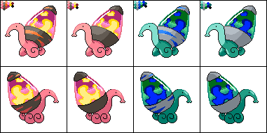
Rad new shiny, Wyv.
Rad new shiny, Wyv.

I love your green shiny Wyv, because it reminds me of the colours deep, deep underwater near volcanic vents.


the cones seem somewhat . . . smooshed, making them awkwardly short and wide.Any thoughts?
and the face is long, droopy and held awkwardly, which takes away from its cuteness and personality


Abird, the curve of the shading inside the shell is the only thing that really gets me about your sprite. I feel that a Gen V sprite would, more than likely at least, have one continuous color with shading around the edges, in the shadow of the end cap. It is, after all, glass.
Re-positioning the shell made the shadow where it meets the body rather weird. Methinks there should be a bit more shadow on the body at that point, and that the shadow shouldn't tuck in to the leg like that.
Re-positioning the shell made the shadow where it meets the body rather weird. Methinks there should be a bit more shadow on the body at that point, and that the shadow shouldn't tuck in to the leg like that.

I suggest a) making the head a bit smaller and not as extended. Just a few extra pixels ,ale it look awkward. And b) the lamp "cone" or tip or whatever looks hella weird being bigger in diameter than the lava lamp where they meet. Other than that, good work :)
I'd just like to say, in regards to blastoiseboy's comments - I agree the head should be smaller, ikasu, but I like that the cone tip is wider. It looks more realistic to me.
@Wyv - I have a small suggestion. On the shiny, I think you can afford to make the base/highlight red brighter because of being against a complement. Right now the shading on the "lava" isn't really coming through.
EDIT:
 Adjusted hue and outline shading, fixed perspective on leg nearest viewer.
@Wyv - I have a small suggestion. On the shiny, I think you can afford to make the base/highlight red brighter because of being against a complement. Right now the shading on the "lava" isn't really coming through.
EDIT:
been busy with life and what not, but I'm lovng this new lava lamp-mon. Doug it's awesome to see how far you've come as a spriter in recent caps, and aragonbird and wyverii are as impressive as ever.

- Status
- Not open for further replies.