CAP 5 Pre-Evo - Part 2 - Art Submissions

Status
Not open for further replies.
I figured out that no one likes the leaf mask... so I changed the head.

The leaves next to its eyes resemble Malaconda's eye-leaves, but there are less of them. The spot on the forehead serves to fill up empty space, since it makes the head look a little less plain. This'll be my final submission unless someone suggests a drastic change.
 

paintseagull

pink wingull
is a Top Artistis a Forum Moderator Alumnus
Final Submission


----

Comments:
Shanimanim: This concept could really work but the proportions are making it kind of freaky right now. The thin tail in contrast to the big apple, the tiny legs and fat body, and the huge head with the sightless eye.. if you could design-ify this further into the realm of pokemon cartoons would help communicate this better. (Making it more realistic than sugi-style is of course allowed, but I think this is on the extreme side.)

noobiess: How about the green-yellow of the spots for the head colour? Or the yellow apple colour from Malaconda?

Aquakip: Love the changes.. looks great! (Mentioned this in PM as well but the shadow needs to be removed for final submission)

Hollymon: nice work! your design's made some great improvements

The Steam Punk: It definitely looks better without the leaf mask!
 
Final Submission

Final Submission


Thanks for the feedback guys. Most obviously, I changed the head to make it more anaconda/jungle snake like. I'm a bit happier with how this one turned out.
 
Final Submission


Tried to make the apple more apple-shaped for you. Also got rid of the frippery around the hole, as much as I liked that more.

Now for my feedback:
Knickles: looks alright, though I wonder if the green buds are a little too small, considering this is a prevo and it has to be a smaller sprite than the main CAP.

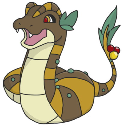
Paintseagull: Nice and simple. Can't say I like the rattle on the end, but what the heck, Ekans did that too and I don't complain about that :v

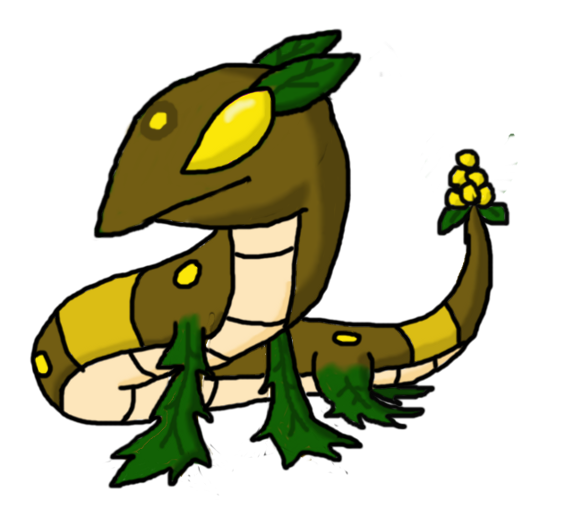
Elcheeso: Really nice snake head there, but that fruit on the tail is more "jack-o-lantern rutabaga" than "happy apple".

Shanimanim: Yours is one of the few entries I can honestly say I like and dislike for the same reasons. Namely, the sicknasty details. It's great as artwork, but not as Pokemon artwork. And before any of you get up my grill for being a "doesn't look like a pokemon" hater, what I'm concerned about here is the spriters, should this one win, having too much creative liberty in building the sprite, or worse, attempting to include as much detail as possible, to the point where the sprite really does look like it was made for a different series.

Noobiess: love it. please please please go with the green head.

Aquakip: yours is really lovely. At this point I think you should go around the edges and even up the line thickness, to make it pretty both out and in!
 
Final Submission


That's it!
Aquakip: Incredible. I really like it.
Mos-Quitoxe: Looks a little innocent for a Dark-type, but so cute! :)
paintseagull: Nice, really simple and straightforward.
 
Final submission


Thanks for reminding me Mos, I knew I had forgotten something. It's meant to be a young apple so that's why the shape isn't pure apple and has the sprouts at the end.
 

DetroitLolcat

Maize and Blue Badge Set 2014-2017
is a Forum Moderator Alumnusis a CAP Contributor Alumnus
Hmm, more people have requested a deadline extension, and I'd hate for people to have to submit less-than-their-best work because of a deadline! Another 12 hours will be added to the Final Submission deadline, so submissions now close at

10 PM CST on Saturday, June 15 2013.

If that deadline is still unreasonable then please notify me, I'm still more than open to honoring extension requests if you could use a few more hours to post your best work.

Use this time to comment on each other's artwork, please! Remember to label your work as a Final Submission in some way or it will not advance to the art poll.
 
I decided I'm not going to enter a final submission. I think there are some other designs that deserve alot more to win and I would hate it if my design ended up winning it stead of theirs.

aquakip: I like the change. Even though the cuteness factor decreased, it sertainly looks more vicious.

Paintseagull: Oh the cute face it gone :'( I really loved that somewhat chubby face. The design still rocks though.
 
awww, but noobiess, you have an awesome submission. :c
i really like the pose in particular - it reminds me a lot of rayquaza's pose on the emerald boxart.
besides, if people like the other designs more, they'll win anyway, ja?
[also it would be cool for you to win after that unfortunate problem with the malaconda sprite - miniconda would make a good comeback!]
 
Noobiess, I agree with Shiruba in that your design is too good not to submit, and if your design is better it will win. I don't see any problem there.
 

DetroitLolcat

Maize and Blue Badge Set 2014-2017
is a Forum Moderator Alumnusis a CAP Contributor Alumnus
I need another half hour, can you extend the deadline for a little longer?

Yes. You're not the only person who has requested an extension :)

Everyone still working and finalizing their work shouldn't feel rushed. For a prevo Art Poll, we can wait a little while in order for everyone to submit their best work.

I'll probably close this up before I go to bed, but I promise you that's not for a while and you all have plenty of time to put the finishing touches on your work.

Carry on!
 

DetroitLolcat

Maize and Blue Badge Set 2014-2017
is a Forum Moderator Alumnusis a CAP Contributor Alumnus
And that's the end of that!

Ten legally submitted entries will advance. Thank you to everyone who posted in this thread, engaged themselves in discussion/creation, or involved themselves in any way in this step!

Now, let's see whose art reigns supreme! What shall the Son of Malaconda's visage be? Vote, heathens, or face the wrath of the One True Snake!
 
Status
Not open for further replies.

Users Who Are Viewing This Thread (Users: 1, Guests: 0)

Top