It looks a little bit too small, bgg1996. DPPt has 80 by 80 sprites, not 64 by 64 sprites. Your sprites would work GREAT for Gen III, but I think that it needs to be a little bit bigger. No offense. On the other hand that may just end up being your sprite's gimmick.

-
Smogon Premier League is here and the team collection is now available. Support your team!
-
Follow our Instagram!
-
The moderators of this forum can be found in the CAP forum staff directory.
-
Welcome to Smogon! Take a moment to read the Introduction to Smogon for a run-down on everything Smogon, and make sure you take some time to read the global rules.
You are using an out of date browser. It may not display this or other websites correctly.
You should upgrade or use an alternative browser.
You should upgrade or use an alternative browser.
CAP 9 CAP 9 - Sprite Submissions
- Thread starter Plus
- Start date
- Status
- Not open for further replies.

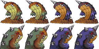
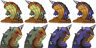
Well guys, it was a blast working on Mr. Blubbers here, but I think I've done all I can with him so I'm putting him up to be readily available for the polls. This is my
Final Submission

This sprite is meant to emphasize the usage of perspective and dynamics made famous by the original Red and Blue. I ditched the static, boring poses and went with something action-packed and menacing. Nothing is as dynamic as a land whale bursting from the sand screaming like a hell hound!
To better emphasize the Dark typing, I tried to make him look menacing, and that is why the face is as fierce as it is. This is a DARK narwhal, so naturally it is going to have a sinister, vile look when it emerges from the ground to stalk prey. The front end light source also heps further this view by providing dramatic emphasis on the beast's face.
For those remarking on how it is thin compared to the original art, May I redirect your attention to Pikachu. Pikachu's original art depicted it as a fat yellow mouse creature, but his current sprites have noticed a substantial amount of weight loss. I took a lil artistic license with Collosoil's physique, but it isn't too noticeable and it fits with the vision I was going for.
So there ya have it. I put about as much work into this as my original Syclant sprite from over a year ago. I wish the rest of the entries luck in the polls too. :)
Final Submission
This sprite is meant to emphasize the usage of perspective and dynamics made famous by the original Red and Blue. I ditched the static, boring poses and went with something action-packed and menacing. Nothing is as dynamic as a land whale bursting from the sand screaming like a hell hound!
To better emphasize the Dark typing, I tried to make him look menacing, and that is why the face is as fierce as it is. This is a DARK narwhal, so naturally it is going to have a sinister, vile look when it emerges from the ground to stalk prey. The front end light source also heps further this view by providing dramatic emphasis on the beast's face.
For those remarking on how it is thin compared to the original art, May I redirect your attention to Pikachu. Pikachu's original art depicted it as a fat yellow mouse creature, but his current sprites have noticed a substantial amount of weight loss. I took a lil artistic license with Collosoil's physique, but it isn't too noticeable and it fits with the vision I was going for.
So there ya have it. I put about as much work into this as my original Syclant sprite from over a year ago. I wish the rest of the entries luck in the polls too. :)
Well guys, it was a blast working on Mr. Blubbers here, but I think I've done all I can with him so I'm putting him up to be readily available for the polls. This is my
Final Submission
This sprite is meant to emphasize the usage of perspective and dynamics made famous by the original Red and Blue. I ditched the static, boring poses and went with something action-packed and menacing. Nothing is as dynamic as a land whale bursting from the sand screaming like a hell hound!
To better emphasize the Dark typing, I tried to make him look menacing, and that is why the face is as fierce as it is. This is a DARK narwhal, so naturally it is going to have a sinister, vile look when it emerges from the ground to stalk prey. The front end light source also heps further this view by providing dramatic emphasis on the beast's face.
For those remarking on how it is thin compared to the original art, Maybe I redirect your attention to Pikachu. Pikachu's original art depicted it as a fat yellow mouse creature, but his current sprites have noticed a substantial amount of weight loss. I took a lil artistic license with Collosoil's physique, but it isn't too noticeable and it fits with the vision I was going for.
So there ya have it. I put about as much work into this as my original Syclant sprite from over a year ago. I wish the rest of the entries luck in the polls too. :)
Yep, I must agree, the sand change made it look a lot better... and made it look at an angle where it wasn't belly-flopping.
It also looks like it's just popped out, and is ready to pound the daylights out of secondary users! (and anything else, for that matter)
Right now, I'd have to say, this is my favorite sprite.
(EDIT: Ninjaed, by the very person I'm commenting on, so I had to edit)

I did a touchup or two on the backsprite, made a female, and now have this:
Male/Female difference is that the drill coloration is inverted. Idid this since I didn't want to do what everyone else did and felt like doing something different. So, tell me what you guys think. Is it ready to be a FS?
EDIT: Made the thumb-fin a bit more distinct on the backsprite.
Male/Female difference is that the drill coloration is inverted. Idid this since I didn't want to do what everyone else did and felt like doing something different. So, tell me what you guys think. Is it ready to be a FS?
EDIT: Made the thumb-fin a bit more distinct on the backsprite.

Bull of Heaven
Guest
Final Submission
My favourite by far. The dynamic pose works well for this guy. Most of the sprites make him look like he's just some asshole sitting there, but this one clearly wants to eat you.


Well guys, it was a blast working on Mr. Blubbers here, but I think I've done all I can with him so I'm putting him up to be readily available for the polls. This is my
Final Submission
This sprite is meant to emphasize the usage of perspective and dynamics made famous by the original Red and Blue. I ditched the static, boring poses and went with something action-packed and menacing. Nothing is as dynamic as a land whale bursting from the sand screaming like a hell hound!
To better emphasize the Dark typing, I tried to make him look menacing, and that is why the face is as fierce as it is. This is a DARK narwhal, so naturally it is going to have a sinister, vile look when it emerges from the ground to stalk prey. The front end light source also heps further this view by providing dramatic emphasis on the beast's face.
For those remarking on how it is thin compared to the original art, May I redirect your attention to Pikachu. Pikachu's original art depicted it as a fat yellow mouse creature, but his current sprites have noticed a substantial amount of weight loss. I took a lil artistic license with Collosoil's physique, but it isn't too noticeable and it fits with the vision I was going for.
So there ya have it. I put about as much work into this as my original Syclant sprite from over a year ago. I wish the rest of the entries luck in the polls too. :)
This is my favorite CAP sprite so far. The pose is extremely creative and differs from most of the other Collosoil sprites. The shading of the sand is excellent, as well as the Dark-themed shiny sprite. The eyes and horn were drawn perfectlly for a darker pose. The skinny body is not much of a problem and you fixed it up a bit. Sorry if anyone disagrees with this post but I simply HAD to comment on this amazing sprite. This is probably going to persuade me to start a CAP team on the side of standard.
Great job everyone else too. Best of luck with the voting!

I'm no spriter, but I'd say that one of the problems with the back spikes is that they just look like they're floating behind the rest of the body, instead of sticking out of it. (Because of the lack of value change around them.) Other then that, it's amazing.


Final Submission
Yeah, I'm done. Sorry to those whose suggestions went undone but to be honest, I'm completely satisfied with the way the sprites are.
Good luck, guys. :)


Yeah, I'm done. Sorry to those whose suggestions went undone but to be honest, I'm completely satisfied with the way the sprites are.
Good luck, guys. :)

Well, I'm back and I'll only be commenting on those of you who haven't made your final submissions yet.
@ aragornbird: I'm liking the curly pattern on the female. It makes its looks, well, a little more feminine. The lack of scars is a recurring theme for the female, but that's alright. She looks good without those.
One question, though; is it me, or did you edit the sand around Colosoil to make it look less like he was stuck in the dirt than before? Either way, it does, in fact, look better now than before from that standpoint.
@ XandZero2: I really like your take on the male/female differences by inverting the colors on the drills. They are quite different indeed (pun intended). The arm on the backsprites is also improved.
I'm thinking that you're ready to make a final submission with this bad boy once you put in a transparant background for your sprite set.
For those of you who have made your final submissions, I bid you all good luck. For those of you who are still working on it, I bid all of you guys good luck as well.
Well, seeing as I'm coming into this late, having been really busy and missing all the earlier votes for CAP9, I was gonna bow out of participating, much as I love being a part of this, and especially since I adore Cartoons and Aragornbird's submissions.
But I was supremely bored today and whipped up a sketch for a potential sprite and might go ahead with it. :)
http://img2.imageshack.us/img2/1159/cap9g.png
I wanted an energetic pose that wasn't sitting in the ground, but wasn't flying either, so I settled on this. It's still got some issues with the posing, but I'm fairly happy for now. Thoughts?
Well, seeing as I'm coming into this late, having been really busy and missing all the earlier votes for CAP9, I was gonna bow out of participating, much as I love being a part of this, and especially since I adore Cartoons and Aragornbird's submissions.
But I was supremely bored today and whipped up a sketch for a potential sprite and might go ahead with it. :)
http://img2.imageshack.us/img2/1159/cap9g.png
I wanted an energetic pose that wasn't sitting in the ground, but wasn't flying either, so I settled on this. It's still got some issues with the posing, but I'm fairly happy for now. Thoughts?
wow that pretty kick a** you should really put a rush on that so you can get into the final submissions!
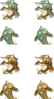
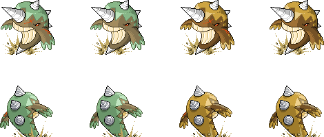
FINAL SUBMISSION
So, yeah, since no-one has complained about it and I've actually had someone compliment it, here's my Final Submission.
The sprite is based off of how a whale breaches from the water. I converted the water to somewhat rocky dirt, and voila! My sprite! I picked the colors using other Pokemon as mediums and then darkening or grayscaling them down to give it a more "Dark-Type" feel. The Shiny was also based on this idea, thus the black and purple. The creases actually came to mind from looking at the supporting material and corrupting it somewhat.
Overall, I think I learned a lot from this and have become a better spriter b/c of it. This was actually my first Backsprite, believe it or not. Anyways, I wish everyone luck, come poll time. :)

Go with it! Great pose! On another note, Wyverii's shiny sprite is amazing! Between her, Cartoons, aragornbird, DougJustDoug, KoA, and XandZero2, this will be the toughest sprite poll yet!Well, seeing as I'm coming into this late, having been really busy and missing all the earlier votes for CAP9, I was gonna bow out of participating, much as I love being a part of this, and especially since I adore Cartoons and Aragornbird's submissions.
But I was supremely bored today and whipped up a sketch for a potential sprite and might go ahead with it. :)
http://img2.imageshack.us/img2/1159/cap9g.png
I wanted an energetic pose that wasn't sitting in the ground, but wasn't flying either, so I settled on this. It's still got some issues with the posing, but I'm fairly happy for now. Thoughts?


I decided against making the front sprites bigger, but I did make the back sprites bigger.
I also added a shade to the sand.(yes, some sprites are shaded like that)
I didn't make the front sprites bigger for 2 reasons.
1. It's a normal pokemon, so I gave it a normal sprite. Just because the maximum is 80x80 doesn't mean the sprite has to be like that. Ex:

2. When I tried enlarging it, the sprite didn't look very good.
All that, and nobody even likes it. Oh well, maybe it will show in the polls.
Criticizism is welcome.
I might finalize it soon.

Goddammit Wyverii, stop having such a good entry. Now I actually have to think about who I vote for. -_-

I must say, I'm loving these, and they are making it very hard for me to decide on my favourite:
KOA: The fact that your sprite is so damn dynamic has always lured me too it. the only thing I can kind of see is maybe making the body a couple of pixels wider at the top of the belly, but other than that, a firm favourite.
Cartoons!: What can I say. Your sprite is almost perfect in every way. The effect of a big fat whale staring down on you is nothing short of terrifying. Great Work.
Pkmn-Taicho321: I absolutely adore your front sprite. The only thing putting me opff is that back-sprite. If you fix that up, you will be my vote for this CAP.
The best part is, I can think of a name for AMC for all of them.

Clawed Nyasu,if you manage to pull that off I think it would be great. Definitely one of my favorite poses. I love that it so obviously is a narwhal but doesn't look like a water type in any way, while it captures the "ground" feel perfectly. I really hope you can make it before the deadline.
Lots of strong submissions. Cartoons and KoA are still the frontrunners for me, but there are plenty other sprites that I could easily see winning this. Great job.
Lots of strong submissions. Cartoons and KoA are still the frontrunners for me, but there are plenty other sprites that I could easily see winning this. Great job.


I updated my backsprites to try and add a little shadow and variation to make the drills look less disconnected than previous versions. I think these sprites are getting pretty close to final.

- Status
- Not open for further replies.