Approved by DHR-107
Posted on behalf of Darquezze (Any mentions of "I" or "me" are in reference to him, not myself)
Goals
Revamp areas in CAP with inconsistent and substandard portrayals of CAP mons
Standardize aspects of CAP to help prevent these sorts of things from happening.
Specifications
Many of CAP’s inconsistent portrayal of CAP mons came from the Generation 5 project, the CAP Sprite Revamp, in which CAP community members updated the sprites of all Gen 4 CAP mons. In this period, many elements of these Pokemon would change. And while these changes made sense for the time as generation 5 had a new art style the Pokemon needed to follow, many elements that got changed I think have an ethical issue that hasn’t really been brought up besides the first attempt at flavor consistency thread opened by MrDollSteak. CAP uses a democratic system to decide what aspects of a CAPmon stay and go. However, this system was not used during the revamp and many winners had their work arguably nullified. I will acknowledge that while the original winner’s works are still implemented on Pokemon Showdown for Generation 4 metas and due to the different art style it was necessary to change certain aspects like updating sprites to have less colors, it wasn’t just sprites that got changed. Design features, shiny colors, color palettes, and base stats that don’t follow the stat nerfs applied to their final evolutions all got changed. These contents may be considered downgrades to those that originally voted for the process, create inconsistencies in how these Pokemon are portrayed, and also complicated future processes but I’ll get into the specifics later.

3D Color Palettes:
Pokemon like Mumbao, Kitsunoh, and Volkraken have their shiny palettes changed in ways that are noticeably different from the originals. With 3D Pokemon models, there are many Pokemon who have had their shiny palettes altered while keeping the spirit of the original alive, like Espeon here. People don’t really seem to have a problem with these shiny palette changes so far but I think there should be some sort of standard as to what changes can be made. Volkraken is a much more significant change, going from a crimson red shiny to a magenta shiny compared to Mumbao and Kitsunoh. Modelers already communicate with the original creators of a design and the CAP moderators during the modeling process so I think a line of text on the 3D CAP Smogon page is all that would be required for this. Kitsunoh is an odd case where its shiny and sprite were revamped from Gen 4 to Gen 5 but the model makes a compromise for a mix of the two colors. Crucibelle had its eyes changed from purple and yellow for visibility reasons.

Design changes:
Syclant
Syclant’s design in its Gen 5 sprite was simplified, mainly the third pair of wings being significantly reduced in size and less spots on Syclant’s body. There is a model reference sheet by Yu IOTJ that fuses elements from the many Syclant depictions over the years and could be used as a standardization for both sprites and models of the Pokemon.

Flarem
The head frill leaf, the color of Flarelm's wood, skin color, and the head, cannon and feet designs and shapes are different. MrDollSteak created a set of sprites below the current sprites showcasing what the original design would look like in sprite form. The current sprites are a big change in design and a sprite update or an artwork update could be held as well like those similar to pre-evo processes with existing designs. How this would be held is something that could be discussed in how to approach. Especially in a project that requires other fan projects to follow their depictions perfectly.

Pyroak
The most complicated history out of all the CAP mons. First off, the design differences. The main one being the differently colored skirts. A yellow skirt is what’s seen on the original artwork but the CAP Sprite Revamp process changed the skirt’s color. This led to the pre-evos being affected from the sprite revamp like Flarelm’s green skirt. Other differences from the different sprites from Gen 4 to Gen 5 include a differently shaped head, eye, leg, feet shape, less numbered holes on its back, and shinies being changed. MDS made and I updated sprites for Pyroak to better reflect its original design but with room for interpretation if a vote on which skirt color and shiny colors happen. Pyroak and Flarelm do have gender differences so there could be a compromise made with having both skirts and shiny colors.
Another issue involves the Pyroak nerfs which made its line’s stat spread messy. Pyroak has 70 SP.ATK and 65 SP.DEF post nerf which leaves Flarelm with 75 SP.ATK and 70 SP.DEF and Embirch with 65 SP.ATK and 40 SP.DEF. For a simpler process in the future, if a CAP mon’s stats get changed in the future, the stats to the pre-evos should also be looked at as well. However there are cases like Torracat and Incineroar where the pre evolution has a higher Speed stat than its final evolution.

Fidgit
While I much respect how the sprite revamp team managed to make a sprite for this unique CAP mon, the result is a sprite much different than the original sprite and design. From inconsistent wristband shapes and colors, the sprite can be argued to be not up to par with the original. Art is subjective and while I have no statistical proof of the following claim, I’ve seen many people who are unsatisfied with the BW revamp sprite and I think it should warrant a new sprite poll. Below is a sprite by Modeling Clay in which it shows what a new sprite for Fidget could look like. Of course you can argue that there’s arguably other sprites in CAP that could use a revamp but Fidgit is in a unique situation where the process was not done via vote.

Cyclohm/Pre Evos
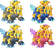
While Cyclohm’s sprite stayed pretty much unchanged, there is however, an odd decision that happened during the CAP Sprite Revamp process, and that was the drastic change to the shiny which turned from a blue shiny, to a pink shiny. Shinies at the time were voted alongside sprite polls which means people would have voted for this shiny to win, but it got replaced later on. Unfortunately for people who like the original blue shiny too, bringing it back would be very messy due to the pre-evos’ shinies being influenced by the modern one. So to vote out the current pink shiny for the original shiny would ruin the theming the line has going on. I did suggest making the shinies a gender difference but it has been pointed out to be tacky. The simplest solution would be to just keep the current pink shiny but if people really want to have both shinies, I think a lot of people would have to argue for it. Cyclohm does have a gender difference which adds a swirl to the female so you could add the new shinies there, however the pre-evos do not so there would be no theming there. But I have made a sprite set to show how you could handle the shiny differences. But to reiterate, this seems messy.

Protowatt
I’ll be quoting MDS for the Protowatt. “Protowatt's is definitely the less egregious of the three and can probably stand as is, but now that its model has been recently finalized, it is clear that the extent to which its segments are pronounced is different between the model and its sprite and artwork. With both its sprite and artwork appearing to be completely flat, while the model has clearly raised segments with the yellow stripes wrapping around the bottom more like the real life anatomy of a shrimp. While I think it's generally less noticeable as a problem, I do believe that it will be harder to remodel the design than it would be to replace the sprites and artwork to be more pronounced. Another minor difference is that the model's eyes are red rather than black.”

Voodoll/Voodoom
Voodoom’s gender differences between the models and sprites are inconsistent. Due to technical difficulties, instead of adding the patches seen on the sprites, the model simply swaps the two main colors depending on Voodoom’s gender. MrDollSteak’s solution is to just replace the BW sprites to do the same thing as the models currently are and to also give Voodoll the same gender difference.

Conclusion/What changes could be made to prevent this from happening again?
CAP has usually been pretty consistent on how they represent CAP. This is mostly an issue seen in older CAPs that was brought upon because the lack of our current modern standards. All this could be touched upon by the CAP moderators or by the community and could fix all these inconsistencies once and for all. However, I do think slightly stricter rules or more clarification as to what can pass could also be improved. Pre-evos being looked at when their evolutions get a nerf process would also quicken situations like Pyroak if it ever happens again. Finally, I think some sort of CAP Flavor committee or a thread for people to post future complaints regarding CAPs that don’t age well or have inconsistent portrayal could help keep CAP more organized.
Posted on behalf of Darquezze (Any mentions of "I" or "me" are in reference to him, not myself)
CAP Flavor Consistency.
Goals
Revamp areas in CAP with inconsistent and substandard portrayals of CAP mons
Standardize aspects of CAP to help prevent these sorts of things from happening.
Specifications
Many of CAP’s inconsistent portrayal of CAP mons came from the Generation 5 project, the CAP Sprite Revamp, in which CAP community members updated the sprites of all Gen 4 CAP mons. In this period, many elements of these Pokemon would change. And while these changes made sense for the time as generation 5 had a new art style the Pokemon needed to follow, many elements that got changed I think have an ethical issue that hasn’t really been brought up besides the first attempt at flavor consistency thread opened by MrDollSteak. CAP uses a democratic system to decide what aspects of a CAPmon stay and go. However, this system was not used during the revamp and many winners had their work arguably nullified. I will acknowledge that while the original winner’s works are still implemented on Pokemon Showdown for Generation 4 metas and due to the different art style it was necessary to change certain aspects like updating sprites to have less colors, it wasn’t just sprites that got changed. Design features, shiny colors, color palettes, and base stats that don’t follow the stat nerfs applied to their final evolutions all got changed. These contents may be considered downgrades to those that originally voted for the process, create inconsistencies in how these Pokemon are portrayed, and also complicated future processes but I’ll get into the specifics later.
3D Color Palettes:
Pokemon like Mumbao, Kitsunoh, and Volkraken have their shiny palettes changed in ways that are noticeably different from the originals. With 3D Pokemon models, there are many Pokemon who have had their shiny palettes altered while keeping the spirit of the original alive, like Espeon here. People don’t really seem to have a problem with these shiny palette changes so far but I think there should be some sort of standard as to what changes can be made. Volkraken is a much more significant change, going from a crimson red shiny to a magenta shiny compared to Mumbao and Kitsunoh. Modelers already communicate with the original creators of a design and the CAP moderators during the modeling process so I think a line of text on the 3D CAP Smogon page is all that would be required for this. Kitsunoh is an odd case where its shiny and sprite were revamped from Gen 4 to Gen 5 but the model makes a compromise for a mix of the two colors. Crucibelle had its eyes changed from purple and yellow for visibility reasons.
Design changes:
Syclant
Syclant’s design in its Gen 5 sprite was simplified, mainly the third pair of wings being significantly reduced in size and less spots on Syclant’s body. There is a model reference sheet by Yu IOTJ that fuses elements from the many Syclant depictions over the years and could be used as a standardization for both sprites and models of the Pokemon.
Flarem
The head frill leaf, the color of Flarelm's wood, skin color, and the head, cannon and feet designs and shapes are different. MrDollSteak created a set of sprites below the current sprites showcasing what the original design would look like in sprite form. The current sprites are a big change in design and a sprite update or an artwork update could be held as well like those similar to pre-evo processes with existing designs. How this would be held is something that could be discussed in how to approach. Especially in a project that requires other fan projects to follow their depictions perfectly.
Pyroak
The most complicated history out of all the CAP mons. First off, the design differences. The main one being the differently colored skirts. A yellow skirt is what’s seen on the original artwork but the CAP Sprite Revamp process changed the skirt’s color. This led to the pre-evos being affected from the sprite revamp like Flarelm’s green skirt. Other differences from the different sprites from Gen 4 to Gen 5 include a differently shaped head, eye, leg, feet shape, less numbered holes on its back, and shinies being changed. MDS made and I updated sprites for Pyroak to better reflect its original design but with room for interpretation if a vote on which skirt color and shiny colors happen. Pyroak and Flarelm do have gender differences so there could be a compromise made with having both skirts and shiny colors.
Another issue involves the Pyroak nerfs which made its line’s stat spread messy. Pyroak has 70 SP.ATK and 65 SP.DEF post nerf which leaves Flarelm with 75 SP.ATK and 70 SP.DEF and Embirch with 65 SP.ATK and 40 SP.DEF. For a simpler process in the future, if a CAP mon’s stats get changed in the future, the stats to the pre-evos should also be looked at as well. However there are cases like Torracat and Incineroar where the pre evolution has a higher Speed stat than its final evolution.
Fidgit
While I much respect how the sprite revamp team managed to make a sprite for this unique CAP mon, the result is a sprite much different than the original sprite and design. From inconsistent wristband shapes and colors, the sprite can be argued to be not up to par with the original. Art is subjective and while I have no statistical proof of the following claim, I’ve seen many people who are unsatisfied with the BW revamp sprite and I think it should warrant a new sprite poll. Below is a sprite by Modeling Clay in which it shows what a new sprite for Fidget could look like. Of course you can argue that there’s arguably other sprites in CAP that could use a revamp but Fidgit is in a unique situation where the process was not done via vote.
Cyclohm/Pre Evos
While Cyclohm’s sprite stayed pretty much unchanged, there is however, an odd decision that happened during the CAP Sprite Revamp process, and that was the drastic change to the shiny which turned from a blue shiny, to a pink shiny. Shinies at the time were voted alongside sprite polls which means people would have voted for this shiny to win, but it got replaced later on. Unfortunately for people who like the original blue shiny too, bringing it back would be very messy due to the pre-evos’ shinies being influenced by the modern one. So to vote out the current pink shiny for the original shiny would ruin the theming the line has going on. I did suggest making the shinies a gender difference but it has been pointed out to be tacky. The simplest solution would be to just keep the current pink shiny but if people really want to have both shinies, I think a lot of people would have to argue for it. Cyclohm does have a gender difference which adds a swirl to the female so you could add the new shinies there, however the pre-evos do not so there would be no theming there. But I have made a sprite set to show how you could handle the shiny differences. But to reiterate, this seems messy.
Protowatt
I’ll be quoting MDS for the Protowatt. “Protowatt's is definitely the less egregious of the three and can probably stand as is, but now that its model has been recently finalized, it is clear that the extent to which its segments are pronounced is different between the model and its sprite and artwork. With both its sprite and artwork appearing to be completely flat, while the model has clearly raised segments with the yellow stripes wrapping around the bottom more like the real life anatomy of a shrimp. While I think it's generally less noticeable as a problem, I do believe that it will be harder to remodel the design than it would be to replace the sprites and artwork to be more pronounced. Another minor difference is that the model's eyes are red rather than black.”
Voodoll/Voodoom
Voodoom’s gender differences between the models and sprites are inconsistent. Due to technical difficulties, instead of adding the patches seen on the sprites, the model simply swaps the two main colors depending on Voodoom’s gender. MrDollSteak’s solution is to just replace the BW sprites to do the same thing as the models currently are and to also give Voodoll the same gender difference.
Conclusion/What changes could be made to prevent this from happening again?
CAP has usually been pretty consistent on how they represent CAP. This is mostly an issue seen in older CAPs that was brought upon because the lack of our current modern standards. All this could be touched upon by the CAP moderators or by the community and could fix all these inconsistencies once and for all. However, I do think slightly stricter rules or more clarification as to what can pass could also be improved. Pre-evos being looked at when their evolutions get a nerf process would also quicken situations like Pyroak if it ever happens again. Finally, I think some sort of CAP Flavor committee or a thread for people to post future complaints regarding CAPs that don’t age well or have inconsistent portrayal could help keep CAP more organized.