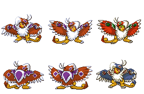
I really love these, Wyv, but I have a few thoughts that I think could improve the quality substantially. My biggest critique is on the face. Right now, it doesn't look fierce, it looks slightly scrunched up. His forehead has a weird angle on the viewer's left, and the eyes seem strange to me. I think going with a more Tyranitar-eye look would be better. Here's a reference to show you what I mean. See how the pupils are directed and filled in? I think that'd look much better than the way you currently have CAP1's eyes, which is as thin slit pupils. Also, I think it could use a little more grin on it, instead of the hardly noticeable mouth you have now. Just some food for thought, anyway; I think the back sprites are marvelous.Wyverii said:http://i165.photobucket.com/albums/u65/wyverii/TomohawkSet.png
I think you should try to make your own, personally!Mektar said:So... should I ditch my Pixel-over and try a scratch sprite? Or would it be OK if I gave Cartoons! half credit for it?