Hi, I'm Purple (or Kitty, or Gkitty, or. whatever else really)!
I've been trying to convince myself to draw more, and I'd really like to try engaging with the Smogon community more. I think I finally have enough things that I like to make an art thread, which is neat. I'm a furry so that's what mooooost of my art tends to be, but I also really enjoy drawing Pokemon fortunately!
To start the thread, I'll showcase some of the Pokemon- or Smogon-related things I've done relatively recently. Full images will be behind spoiler tags for post length purposes, as well as some personal commentary on the piece.
Feel free to ask my any questions, offer some advice on things I've said I'm less pleased with about my pieces, comment in general, etc. All I ask is please be nice 2 me because if you're mean to me then youre being mean to just a little kitty and that's certified uncool.

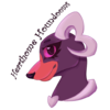
Ye olde Hearthome Houndooms logo, which I think I made back around... 2022? It's been a while. This one was made relatively quickly, so it's always felt basic. I'm a fan of how the paws came out, and the expression is cute, but I've grown dissatisfied with the floating pose, and I feel the Hearthome motif isn't strong enough even though I have the Hearthome Ribbon on the collar and the heart spade.
So, this year, for the upcoming season in the little league I'm in, I decided it's time for a pupdate.
This is the new, shiny, updated logo! I like how this one is a bit more color-accurate while still being pink-toned, and I like that the shading has more texture. I'm very proud of my design choices with forming the horn as a heart, which also doubles as the number "3" since my abbreviation in spreadsheets is usually HHH!


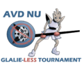
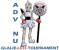
This is the first piece I did from The Workshop! It took me a longer time than I'd like to admit. I like my expressions and the shading on the trophy, but feel the rest of my shading and my typography could use some improvements.
This was the first version for the RUWC logo as requested in The Workshop! I did take some creative freedom with positioning and all, but I loved the idea of Goodra-H with the tail being a globe, so I really wanted to try it. I really like the woodgrain pattern I drew into the sign, and the shading of the slime, though feel the clarity of my pose/silhouette could use work.
Second version of the RUWC logo, with alterations requested by the requester - trying more typical earth colors, greener slime, and making it more clear that the globe is the tail/shell. I like the vibrancy in this one! I do think the extra colors make it more eye-catching.

 feedback appreciated as long as you're nice about it. thank youuuuu for looking at my art mwah