Hey everyone! So I recently bought a Wacom Bamboo tablet (best $80 I've spent in a long time) because I wanted to try my hand at drawing digitally. I've been drawing traditionally for about 2 years and taking art classes for half that, once I realized that what I was drawing actually resembled what I was aiming for! However, I didn't draw often at all, perhaps once every few weeks whenever I got into the mood, and only recently, say October 2011, did I realize that it wasn't enough and I was not really getting better. I got what my art teacher always describes as an "art attack" and filled up a notebook with petty sketches that I added to daily, up until I got my tablet for my new laptop I got for Christmas. After taking a month to get used to it, I started lurking around here for tutorials (Nastyjungle was such a huge help) and eventually I worked up the courage, along with some encouragement from my good ol' #dw buddy Birkal, to post my stuff here!
What I hope to gain from this is of course some solid constructive criticism. Also, please please please chuck some ideas my way. Most of the time, the reason why I let my laziness stop me from drawing is because I don't really have a good idea. Keep in mind that I'm very very slow, however, so I'll likely prioritize any ideas based on how much I like them. As for what I use, I use GIMP (no, I can't get Photoshop) and my Wacom tablet, but I also have art class so if I need ideas for a project (My next project is blended color pencil, for instance) then I'll probably steal them from here.
I have always envied artists, and thought for most of my 18 years that this was a skill forever out of my reach. Even though the stuff here isn't absolutely amazing, I'm very satisfied with what I've done, and that I have finally achieved what I never thought I would. That said, here's my modest gallery, arranged by category and newest to oldest:
I've been kinda meh about drawing in the past 2 months or so, what with the excitement of VGC and new games to play sopping up all my time, plus my new job. So when I got back into Pokemon and built an awesome LC team, I figured I'd whip up some pictures to help get myself back into the art mood. Mienfoo here is the first!
I thought I was being too timid with shading in the past, so I tried using it a lot more and I think it makes a big difference. I always thought my stuff was too flat, and now I don't feel like that about this. I'm also very happy with how the legs turned out, since they are usually my weakness. The head, however, took at least an hour and a few different shapes before I could settle on one I sort of liked, and I'm still not too pleased with it. I also don't like Mienfoo's eyes, and I mean that in a general sense and not how I drew them. I think they look too soulless, but they didn't look right unless I drew them like that so I did. Overall, though, I think this is my best work yet, and all I had to do was stop being so stingy with the shading!
I started this one before my trip to Disney at the end of April, and have been distracted since then by the trip and my AP Stats project. I loved the Spyro game (there is only one in my eyes) as a kid, and the first thing I said when I saw Accelgor at the beginning of 5th gen was "egg thief". The egg's a little small though, so maybe he's stealing Spyro's lunch instead of his kin.
When I first started this project, I did my sketch and whatnot, and then went to Bulbapedia to get a reference. Unintentionally, I realized that my sketch looked almost exactly like Sugimori's official art. This sort of cheapens this for me a little bit, but I was just too lazy to try a different pose, and besides, I couldn't think of one that would look better than this. One thing this project proves is that I don't have a steady hand at all. I have a lot of work to do on that. Otherwise, I can't tell if I like how it turned out or not. It looks curiously flat, except for the scarf thingy, which looks pretty good in my opinion.
This is the cover art for my AP Stats project on hax. I did a test to see if a significant number of games are determined heavily by luck. The result? Unurprisingly, the answer is yes, a significant number of games are decided by luck.
As for the picture, I absolutely could not find any work-safe (curse you Google image search!) references for the angle I wanted to draw this thing at, which was a more birds-eye view from behind, so I pretty much just enlarged its back sprite. I think I like this better than my original plan. I have a tough time drawing quadrupeds, especially with body length and the legs. I always make the body too long or the legs too skinny, and usually both. The target was also pretty lazily done, but since this is due tomorrow, I had to ship it out as quickly as I could.
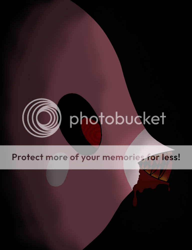
Someone called Luvdisc the most useless Pokemon since Farfetch'd. That just...angered it.
I wanted to try and make an image shrouded in darkness, so I took poor Luvdisc and turned it into a psychotic man-eater. I've also never drawn blood (or any other liquid for that matter) so this is also new. One problem I ran into was how I inked it. Some of it is inked (the teeth) while the rest either isn't or is hidden by the black background. I tried to make the whole thing not inked, but the teeth got way too complicated for my feeble little mind to comprehend, so I backed out of that idea like a wimp and am now left with "cheap" looking teeth. I'm also not sure about the blood effect on the teeth. I like it but I also think it's a bit too cheesy. In spite of this, I'm definitely still satisfied with how this turned out.
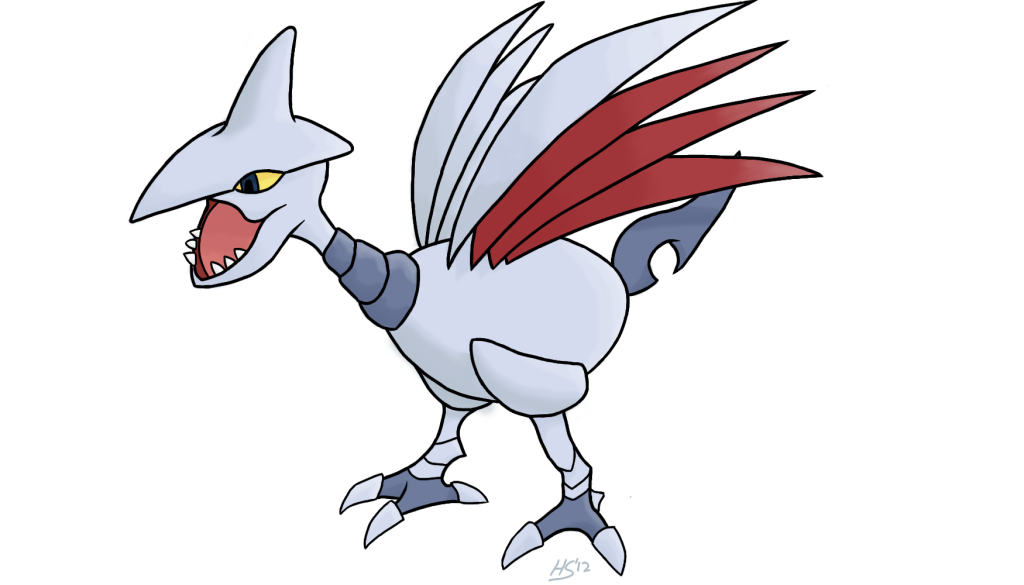
A new student teacher is in my high school art class, and she is having us do woodburning, which is taking an image, replicating it on a slab of wood, and using a hot metal pen to burn it into the wood. Once the student teacher said birds work the best, I immediately started scrolling through a mental list of Flying-types, and I soon settled on Skarmory. While everyone was ripping pictures off Google and out of magazines, I thought: "Why not draw my own picture?" As far as I know, no one else in my school even has a tablet, so I'd stand out like a sore thumb (and perhaps even earn a perfect grade for it).

This is the first part of a series (that I hope I don't get too lazy to finish) where I'm going to be immortalizing my favorite and best team, and the one that got me hooked into 5th gen, in ART. Choice Scarf Gengar is my lead, so naturally it goes first.
I tried a different style of inking than normal, going for thicker, longer lines with the pressure sensitivity enabled. I'm really satisfied with this, but I'm not too sure that I placed the highlights correctly, and the arm the Choice Scarf is wrapped around is pretty suspect. I also tried out a new shading technique, but now I'm afraid it looks too much like a gradient (which it isn't).
EDIT: I looked at this on one of the Macs at my school and it looks like the texture is at 50% opacity and not 5%, which makes it look super gross. It looks fine on my laptop, so if it looks like texture-y garbage to you then I apologize.
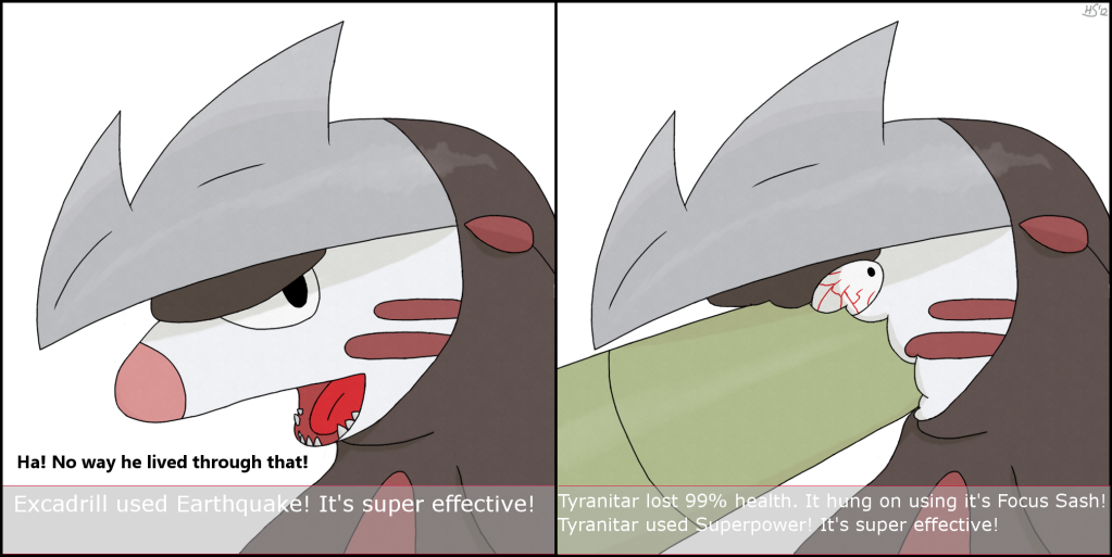
This is the picture I'm most proud of right now. This picture is based off of my favorite Tyranitar set, Focus Sash Tyranitar, and its main target of Excadrill. I'm very pleased with how this turned out (I didn't even have to give up!), but if I could change anything later on, it would be the mouth in the first panel. I couldn't find a single reference picture of Excadrill with its mouth open, so I improvised.

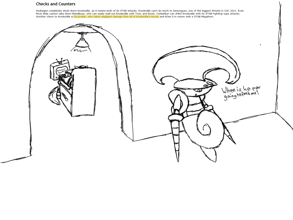
This is an unfinished picture, also based on a typo I found, stating Mew could OHKO Escavalier with Fire Blast without any "boots" (boosts). I finished the whole thing, up until the Fire Blast, when I realized that I couldn't make a fire to save my life. The technique I used to make Breloom's Spores didn't work, and after a few more attempts in different fashions, I just decided, "They're playing charades now!" and finished it off.
First full color picture I ever did on my tablet. I think it was a very good start, except for one thing: that god-awful motion blur. It's only a slight exaggeration to say that I spent half of the 14+ hours doing this picture, and the other half trying to make the motion blur look good. Eventually, I gave up, which is sad, but I just wanted to move on by that point.
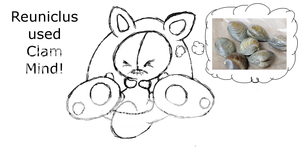
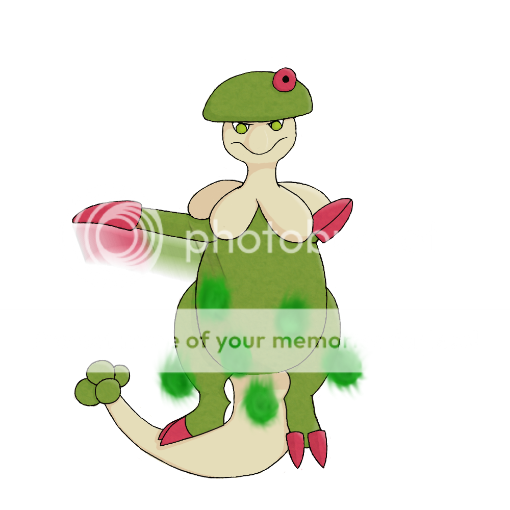
When I got my tablet, I was also deep within my project to wipe the uploaded Pokemon analyses clean of any typos whatsoever (I'm still doing it too). As such, I sometimes came across typos that I think are pretty funny, and they inspire me to draw something about them. This is one such picture. "Calm" and "Clam" are easily interchangeable on accident, so I made this as a result.
This was the first "real" sketch I did on my tablet, and I was still getting used to it. I really don't like the way Krookodile looks, but I did my best.
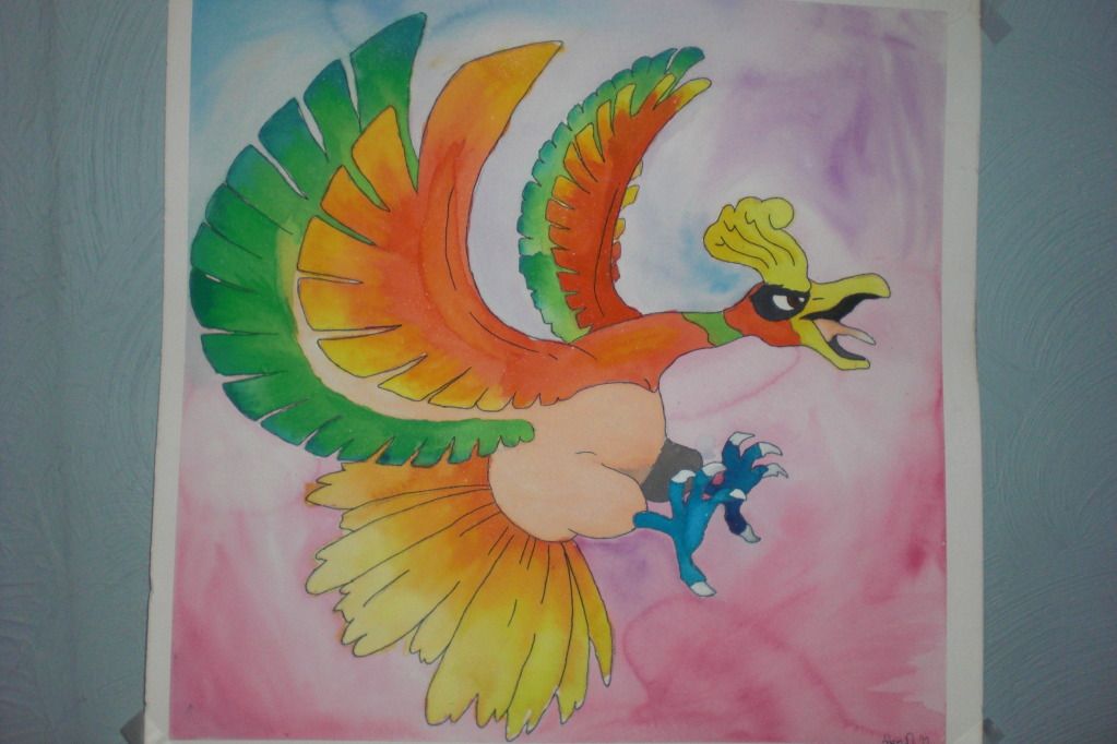
I need a digital camera that doesn't suck the color out of everything. This is my first experience with watercolors, so I'm not too sure how well I did, but I'm very pleased with the results. At least I am in real life. It looks way too desaturated in the picture I took, so I'll do my best to get a better one.
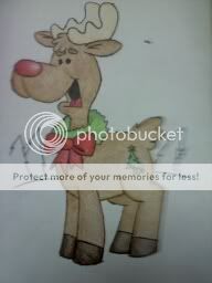
Christmas Card picture I drew for a class-wide art project to send cards to a local nursing home. Yes, it has a cutie mark, my own personal touch.
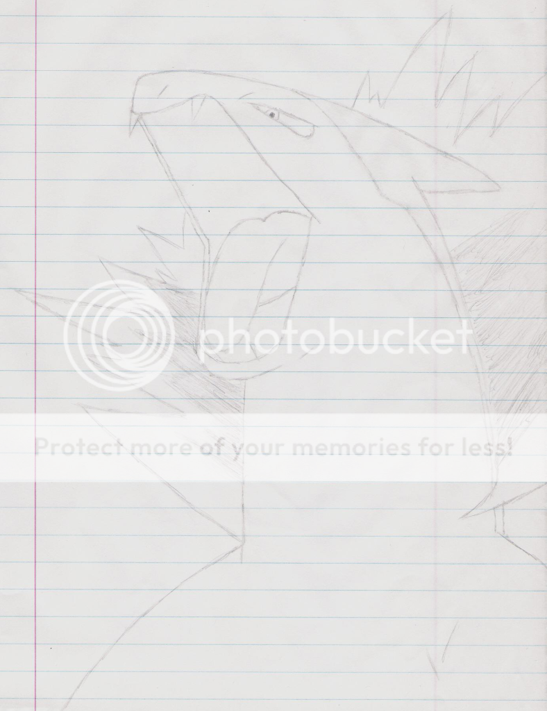
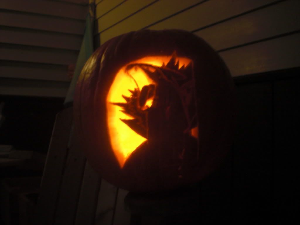
This was the series of drawings that convinced me that maybe, just maybe, I was cut out for this. What I did was stare at a picture and try to replicate it as closely as I could. Sure, these aren't original poses, but I figured that I could learn something from copying them. Gotta steal a few teams before you can build your own, right? As a side note, the Typhlosion picture I made into a pumpkin carving 2 years ago:
That's all I have right now. Thanks a lot for taking a look at my thread, and I hope you enjoyed the stuff I have!
What I hope to gain from this is of course some solid constructive criticism. Also, please please please chuck some ideas my way. Most of the time, the reason why I let my laziness stop me from drawing is because I don't really have a good idea. Keep in mind that I'm very very slow, however, so I'll likely prioritize any ideas based on how much I like them. As for what I use, I use GIMP (no, I can't get Photoshop) and my Wacom tablet, but I also have art class so if I need ideas for a project (My next project is blended color pencil, for instance) then I'll probably steal them from here.
I have always envied artists, and thought for most of my 18 years that this was a skill forever out of my reach. Even though the stuff here isn't absolutely amazing, I'm very satisfied with what I've done, and that I have finally achieved what I never thought I would. That said, here's my modest gallery, arranged by category and newest to oldest:

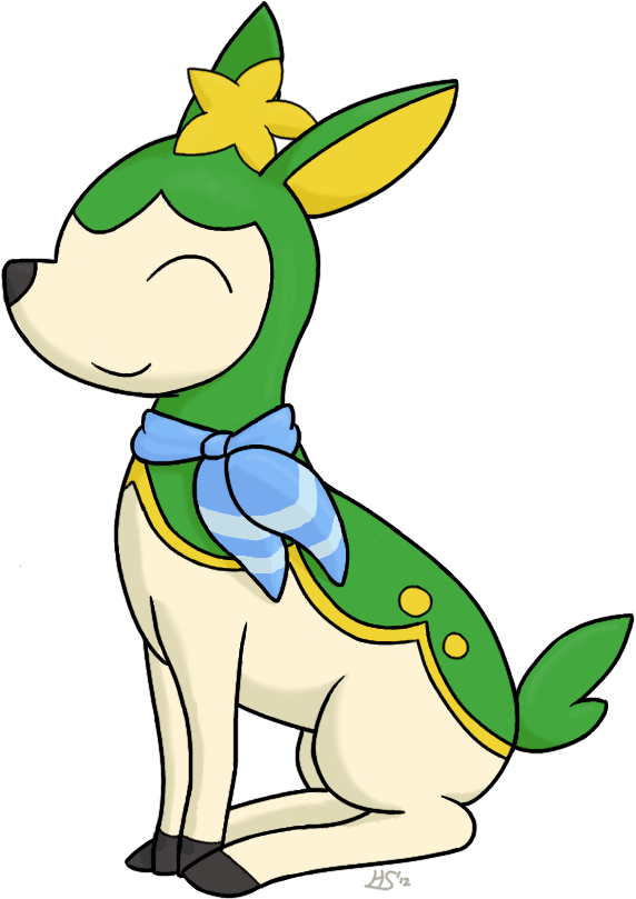
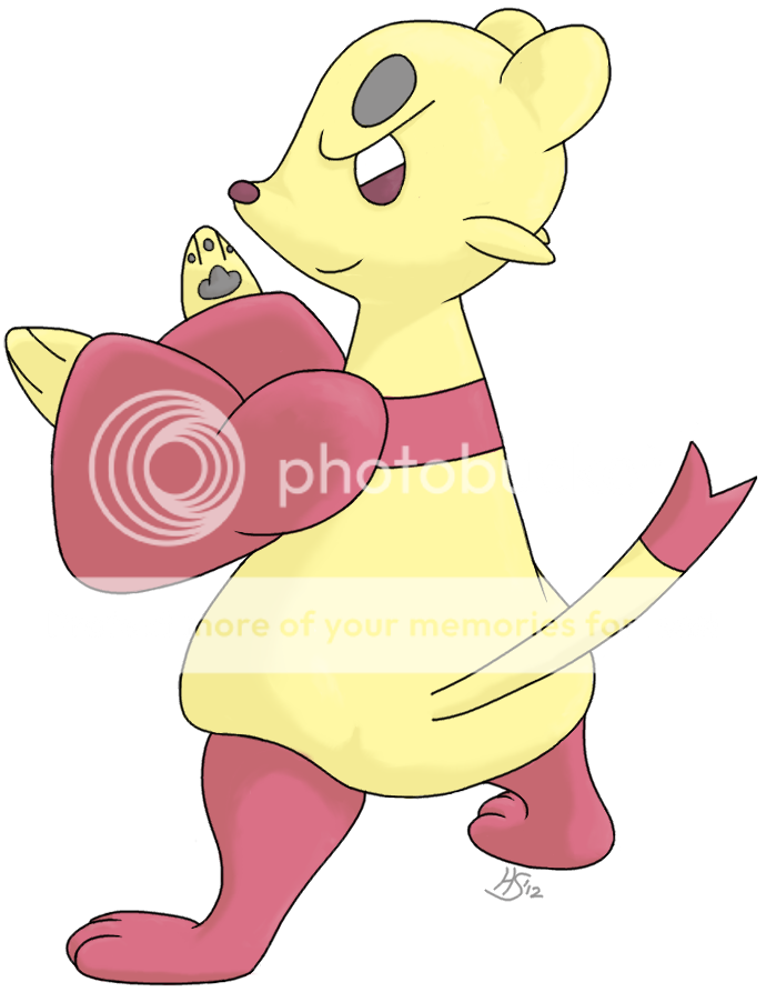
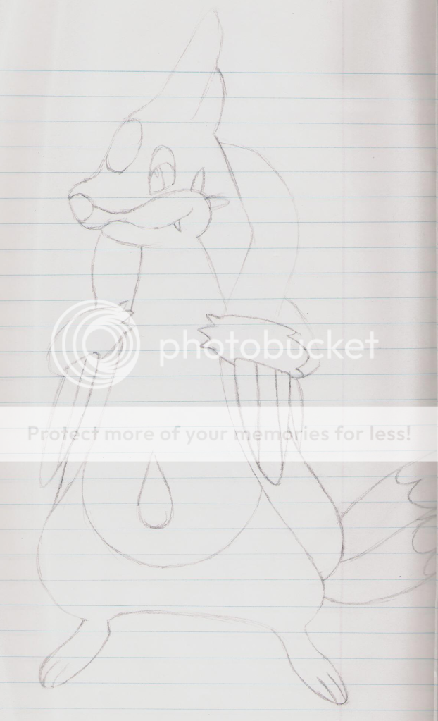
I've been kinda meh about drawing in the past 2 months or so, what with the excitement of VGC and new games to play sopping up all my time, plus my new job. So when I got back into Pokemon and built an awesome LC team, I figured I'd whip up some pictures to help get myself back into the art mood. Mienfoo here is the first!
I thought I was being too timid with shading in the past, so I tried using it a lot more and I think it makes a big difference. I always thought my stuff was too flat, and now I don't feel like that about this. I'm also very happy with how the legs turned out, since they are usually my weakness. The head, however, took at least an hour and a few different shapes before I could settle on one I sort of liked, and I'm still not too pleased with it. I also don't like Mienfoo's eyes, and I mean that in a general sense and not how I drew them. I think they look too soulless, but they didn't look right unless I drew them like that so I did. Overall, though, I think this is my best work yet, and all I had to do was stop being so stingy with the shading!

I started this one before my trip to Disney at the end of April, and have been distracted since then by the trip and my AP Stats project. I loved the Spyro game (there is only one in my eyes) as a kid, and the first thing I said when I saw Accelgor at the beginning of 5th gen was "egg thief". The egg's a little small though, so maybe he's stealing Spyro's lunch instead of his kin.
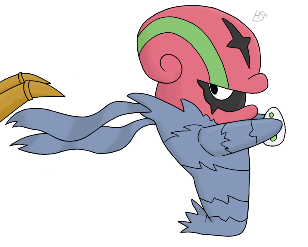
When I first started this project, I did my sketch and whatnot, and then went to Bulbapedia to get a reference. Unintentionally, I realized that my sketch looked almost exactly like Sugimori's official art. This sort of cheapens this for me a little bit, but I was just too lazy to try a different pose, and besides, I couldn't think of one that would look better than this. One thing this project proves is that I don't have a steady hand at all. I have a lot of work to do on that. Otherwise, I can't tell if I like how it turned out or not. It looks curiously flat, except for the scarf thingy, which looks pretty good in my opinion.

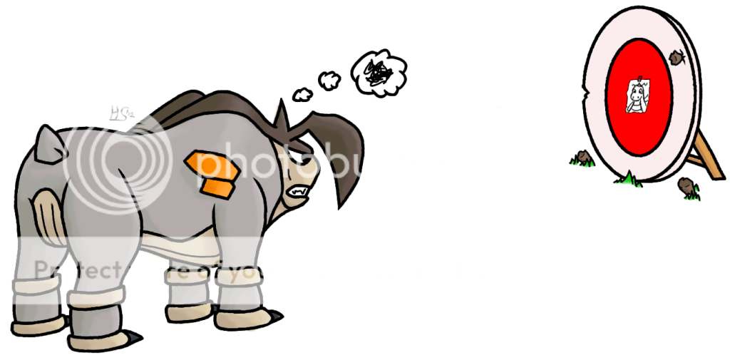
This is the cover art for my AP Stats project on hax. I did a test to see if a significant number of games are determined heavily by luck. The result? Unurprisingly, the answer is yes, a significant number of games are decided by luck.
As for the picture, I absolutely could not find any work-safe (curse you Google image search!) references for the angle I wanted to draw this thing at, which was a more birds-eye view from behind, so I pretty much just enlarged its back sprite. I think I like this better than my original plan. I have a tough time drawing quadrupeds, especially with body length and the legs. I always make the body too long or the legs too skinny, and usually both. The target was also pretty lazily done, but since this is due tomorrow, I had to ship it out as quickly as I could.

Someone called Luvdisc the most useless Pokemon since Farfetch'd. That just...angered it.
I wanted to try and make an image shrouded in darkness, so I took poor Luvdisc and turned it into a psychotic man-eater. I've also never drawn blood (or any other liquid for that matter) so this is also new. One problem I ran into was how I inked it. Some of it is inked (the teeth) while the rest either isn't or is hidden by the black background. I tried to make the whole thing not inked, but the teeth got way too complicated for my feeble little mind to comprehend, so I backed out of that idea like a wimp and am now left with "cheap" looking teeth. I'm also not sure about the blood effect on the teeth. I like it but I also think it's a bit too cheesy. In spite of this, I'm definitely still satisfied with how this turned out.

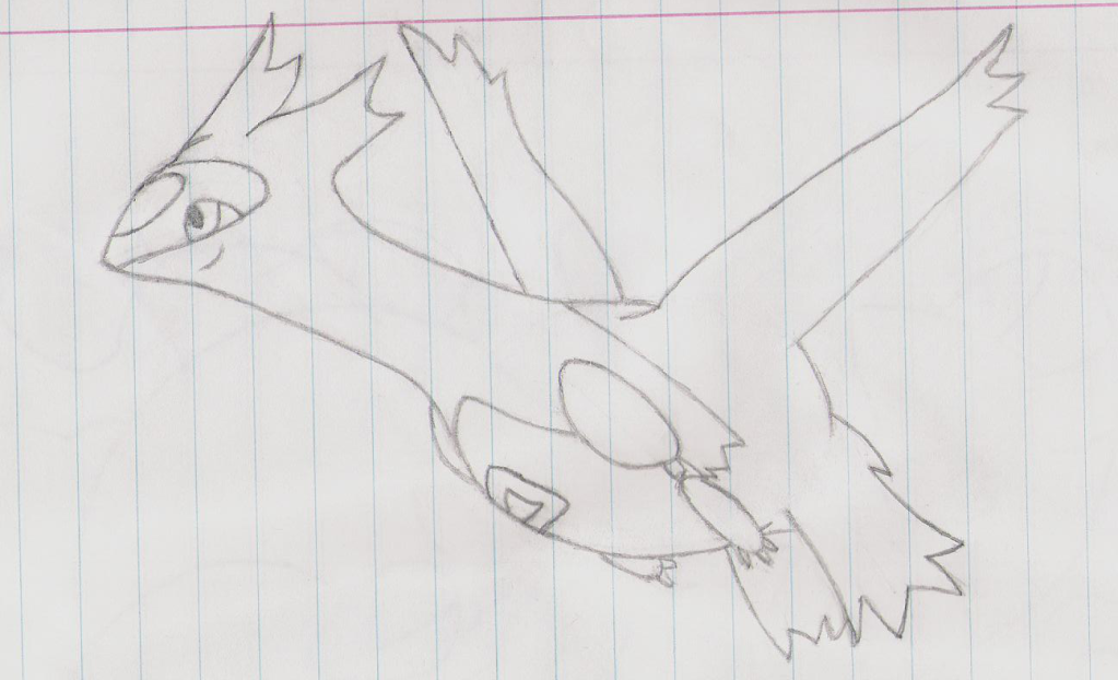
A new student teacher is in my high school art class, and she is having us do woodburning, which is taking an image, replicating it on a slab of wood, and using a hot metal pen to burn it into the wood. Once the student teacher said birds work the best, I immediately started scrolling through a mental list of Flying-types, and I soon settled on Skarmory. While everyone was ripping pictures off Google and out of magazines, I thought: "Why not draw my own picture?" As far as I know, no one else in my school even has a tablet, so I'd stand out like a sore thumb (and perhaps even earn a perfect grade for it).

This is the first part of a series (that I hope I don't get too lazy to finish) where I'm going to be immortalizing my favorite and best team, and the one that got me hooked into 5th gen, in ART. Choice Scarf Gengar is my lead, so naturally it goes first.
I tried a different style of inking than normal, going for thicker, longer lines with the pressure sensitivity enabled. I'm really satisfied with this, but I'm not too sure that I placed the highlights correctly, and the arm the Choice Scarf is wrapped around is pretty suspect. I also tried out a new shading technique, but now I'm afraid it looks too much like a gradient (which it isn't).
EDIT: I looked at this on one of the Macs at my school and it looks like the texture is at 50% opacity and not 5%, which makes it look super gross. It looks fine on my laptop, so if it looks like texture-y garbage to you then I apologize.

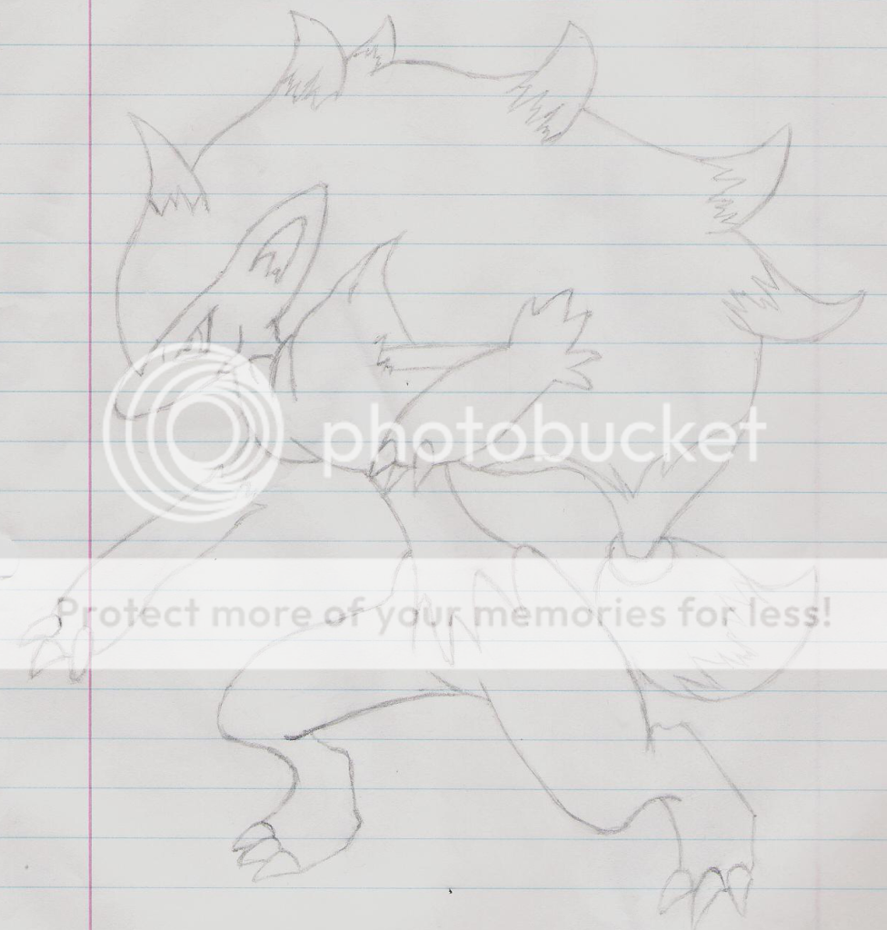
This is the picture I'm most proud of right now. This picture is based off of my favorite Tyranitar set, Focus Sash Tyranitar, and its main target of Excadrill. I'm very pleased with how this turned out (I didn't even have to give up!), but if I could change anything later on, it would be the mouth in the first panel. I couldn't find a single reference picture of Excadrill with its mouth open, so I improvised.

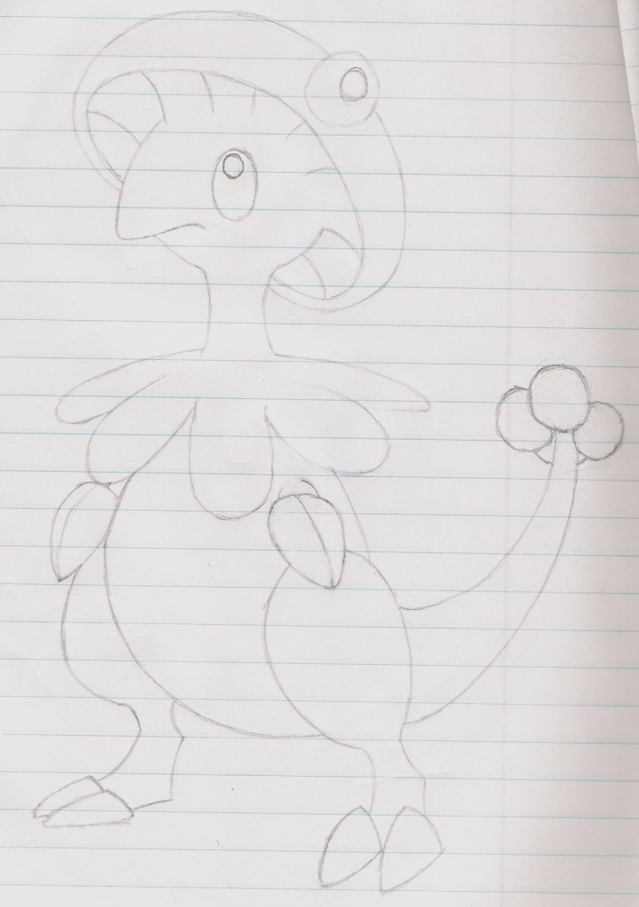
This is an unfinished picture, also based on a typo I found, stating Mew could OHKO Escavalier with Fire Blast without any "boots" (boosts). I finished the whole thing, up until the Fire Blast, when I realized that I couldn't make a fire to save my life. The technique I used to make Breloom's Spores didn't work, and after a few more attempts in different fashions, I just decided, "They're playing charades now!" and finished it off.

First full color picture I ever did on my tablet. I think it was a very good start, except for one thing: that god-awful motion blur. It's only a slight exaggeration to say that I spent half of the 14+ hours doing this picture, and the other half trying to make the motion blur look good. Eventually, I gave up, which is sad, but I just wanted to move on by that point.

When I got my tablet, I was also deep within my project to wipe the uploaded Pokemon analyses clean of any typos whatsoever (I'm still doing it too). As such, I sometimes came across typos that I think are pretty funny, and they inspire me to draw something about them. This is one such picture. "Calm" and "Clam" are easily interchangeable on accident, so I made this as a result.

This was the first "real" sketch I did on my tablet, and I was still getting used to it. I really don't like the way Krookodile looks, but I did my best.

I need a digital camera that doesn't suck the color out of everything. This is my first experience with watercolors, so I'm not too sure how well I did, but I'm very pleased with the results. At least I am in real life. It looks way too desaturated in the picture I took, so I'll do my best to get a better one.

Christmas Card picture I drew for a class-wide art project to send cards to a local nursing home. Yes, it has a cutie mark, my own personal touch.


This was the series of drawings that convinced me that maybe, just maybe, I was cut out for this. What I did was stare at a picture and try to replicate it as closely as I could. Sure, these aren't original poses, but I figured that I could learn something from copying them. Gotta steal a few teams before you can build your own, right? As a side note, the Typhlosion picture I made into a pumpkin carving 2 years ago:

That's all I have right now. Thanks a lot for taking a look at my thread, and I hope you enjoyed the stuff I have!