• Follow our Instagram!
  • Curious about what we're currently doing about bots? Check out the latest updates from staff in this thread.
  • Welcome to Smeargle's Studio! Please be sure to review the studio rules. Feel also free to check out our hub to learn more about this place!
  • Welcome to Smogon! Take a moment to read the Introduction to Smogon for a run-down on everything Smogon, and make sure you take some time to read the global rules.

★ Professor Smeargle V2

Kaiju Bunny

♥・゚: * ̄(♡ㅅ♡❀) ̄
is a Site Content Manager Alumnusis a Top Artist Alumnusis a Community Leader Alumnusis a Top Community Contributor Alumnusis a Smogon Media Contributor Alumnusis a Battle Simulator Moderator Alumnus
OP here

Untitled62_20230509204225.png

Welcome!

Have you ever wondered how some of your favorite artists on the site create some of the wonderful pieces that they do? Looking for some tips and tricks on how to improve your own artistic process? Want to get into art, but you're not entirely sure on where to start? Look no further!

This thread will act as a community gateway on how you can get started on improving and sharing your skills with other artists in the community! In addition, we'll offer plenty of resources for you to peruse at your leisure that might not be specifically touched on in the thread itself. This includes updating this op every time we notice an especially handy tutorial or tip that could help any artist out!


Smeargle's Studio Forum Resources
RMA #2: Rate My Art!
Smeargle's Studio Discord Server
Arts & Culture Room on Pokémon Showdown!


3D Modeling Resources
Blender Instructional Video Collection (by Blender Guru)


Animation Resources
Animation / Art Resource Collection (by PuccaNoodles)
Animation / Illustration YouTube Channel (by Ethan Becker)


Art Protection Resources
Glaze Project (by University of Chicago)


Character Design Resources
Visual Library (by Character Design References)


Color Tips Resources
Color Picking Tips (by unknown)


Figure Drawing Resources
Stock Model Photography Collection (by JookpubStock)
Pose Search (by x6udpngx)


Hand Resources
Draw Better Hands Now (by Marco Bucci)
Hands 101 (by Joshua Taback)


Perspective Resources
How to find the true center of a rectangle in perspective (by @skulptduggery)
Reference Angle (by Art Technologist)
Animal Photo Art Reference Search (by x6udpngx)


Pokémon Design References
Pokémon Model Sheets


────────────────────────
Kiwi Resources
Pissog Resources
Zatqer Resources
Deka__ Resources
DaWolfKid Resources

If you'd like to share some of your own tips, tricks, and tutorials, you are heavily encouraged to do so here in this thread! We're excited to see your skills continuously improve and grow! Happy arting~!​
 
1683983066913.png

Do you ever sit down, draw a piece and then contemplate the entire point of those hours just because, “This isn’t even my style.” Don’t worry, that’s pretty much all of us, except the first person with a pen and paper.
To be able to absorb all of this information as best as you possibly can, you need to be at least decent at colour, form, line, shape, space, texture and value.
Before you can even start finding your style, you need to find what you like. An artist who has a style that you would love to draw in. You can use Pinterest or a Twitter scroll-through to find them, but it might be as simple as a popular manga artist. For me, that’s Gege Akutami’s Jujutsu Kaisen and Tatsuki Fujimoto’s Chainsaw Man.

Copying and Tracing:
How do I draw inspiration from their style? That’s the fun part, you don’t. Unless you’ve already been drawing for a long time, you’ve probably not developed a set-in-stone sense of the fundamentals, so learning these fundamentals at an early stage of art should be done by the dreaded copying and tracing techniques. “Oh no… copying and tracing is plagiarising!”, arguably, it’s not plagiarising unless you pass it off as your own original work. Why should you copy and trace though? It teaches you, or gives you an idea of their techniques. I recommend you:
  1. Get a sketchbook, and don’t be fancy with it. It’s for learning, not for showing off
  2. Copy everything you like. It doesn’t just have to be 1 particular style, because that’ll just teach you how to replicate. Copy from a variety of styles to learn their techniques, but focus on the ones you like. Note that it takes time to develop the techniques, but they’ll come eventually. Just keep buying sketchbooks and drawing
  3. Draw digitally, it’s much easier to chuck in colours in digital.
  4. Look back, if you aren’t seeing a difference in your ability, then you’re probably not even learning
1683983077452.png

The reason I recommend a sketchbook is that it forces you to composite your works and guess where things go. There’s also no undo, especially if you draw in pen. Some of these images below were drawn in pen to force myself not to erase anything. Here’s a few of my copying sketches:
1683983089257.png

1683983104257.png

(These were initially drawn on paper and then traced in digital!)​

Making your own thing:
Woah, it’s time to make your own art! This stands as a test to see how well you’ve absorbed information of techniques. You can do this as often as you’d like, there’s no boundaries on it. I would recommend however, to do a piece solely to assess your style. One way you can do this is to take an image from real life, and characterise/stylise it.

If you like drawing cars, find a realistic image and draw it how you like to. If you like to draw Pokemon, find any Pokemon official art that you like and stylise it. If you like drawing humans, take a figure pose and stylise it. You can probably get the gist.

However, I especially recommend doing a DTIYS (Draw this in your own style). This forces you to apply your techniques on a piece you like, and see where your style has gone. Here’s some examples of my own, but you can also refer to to see the Studio’s very own DTIYS event (Woah it's all coming together)
1683983158315.png
1683983167640.png
1683983197579.png

1683983239016.png

(Some of my recent artworks and a DTIYS)

*I'd like to note that, as a good measure, you should be copying and tracing whatever styles you like,
not to completely steal from them but to learn their techniques. Over time, you'll find your style changing
as you develop more skills in art. You don't have to be consistent unless you're doing something that
requires consistency (e.g. comics). Let your style grow as you grow, you'll always find something you
want to improve on
1683983313694.png

(Professor Smeargle agrees ^)
​
Hopefully this helps! I'm excited to see what the rest of you can put together. Could be anything from a tutorial on figure drawing to layer masking. Have fun :toast:
​
 

Attachments

  • 1683983304412.png
    1683983304412.png
    21.5 KB · Views: 284
Why your sketch looks better than the lineart
portrait human_20230520093517.png
​
a lot of artists say that cleaning up the sketch makes its worse. this is because of a few things:

  • The sketch itself is sloppy and has lots of different lines, making it hard to find the one correct line when inking
  • The extra lines provide fluidity and energy to the pose, as well as hide the actual form so the form must be interpreted.
    • But there's also nothing wrong with giving your final art extra lines for energy too. Make sure your final refinement isn't sloppy, but you can have crosshatching and extra lines to show motion. Just dont have chickenscratch lines that coincidentally happen to work as energy. Draw your lines with intention.
  • With sketches, the brain will automatically interpret the best looking one out of all the lines. Sketches give the viewer alternative interpretations, while lineart doesn’t. This means that unless you are completely correct with the lineart, it will look worse than the sketch.
    • As mentioned before, your lines should be intentional. By not allowing alternative interpretation, you can create really intricate and great looking forms with lots of detail. Your linework needs to be done well though. Follow through with your strokes. Learn when to use thick and thin lines.

For lineart, learning to control the lineweight goes a LONG way.

Thicker lines
- close to the camera
- areas of shadow
- edges of a form

Thinner lines
- further away
- areas in light (if you imagine there's a highlight, you can even just not draw a line entirely at that area! It will look like a light shining through and obscuring the edge of the object)
- details within an object

Using these rules of thumb will create a lineart hierarchy that is both more readable/pleasing to look at, as well as more detailed as the lineart itself is adding information like light/shadow.

if you follow all of these rules and it STILL looks bad, the problem might not be the linework but actually another fundamental. For instance, if you have a chickenscratch sketch it might look fine, but when you refine it could look bad because, for instance, you could have bad anatomical fundamentals that the sketch is hiding. In this case, work on your anatomy, not your linework.
credits: paraphrased from this dude in an art server (FullHeartContainer#0777)
 
SmartSelect_20230521_085251_Clip Studio.jpg

Hi! Today I wanted to share with you all my process for painting mons in watercolours.
DISCLAIMER: all of this is self taught and refined through trial and error so i'm not saying this is objectively right, there may still be some mistakes I haven't realised yet. This is just what I found to work best for me.
The software that I'm using is Clip Studio Paint and the brushes that I'm using are all basic and pre installed. This should also work in Procreate and Photoshop (as all brushes on CSP are exportable) but I can't guarantee it for other art softwares. Now, let's begin.
I step
SmartSelect_20230521_090528_Clip Studio.jpg

The first step is sketching the mon you wanna paint and doing the lineart. I chose a Shuppet for this tutorial because it's hella cute and also because this method really shines on simpler pokemons without too many details, so if you have to paint an Eternatus don't use this method. I'm also not gonna go over the full process of sketching and lineart because it's not the goal of this tutorial, but I'm gonna give you a few tips:
- don't work with a completely white background, you only have one pair of eyes, don't tire them too much
- the eraser is your best friend
- never use pure 100% black. thank me later
SmartSelect_20230521_091505_Clip Studio.jpg

I used the basic g-pen to draw the sketch and the basic pencil to draw the lineart.
II step
SmartSelect_20230521_092717_Clip Studio.jpg

The goal of this step is to assess where the light is coming from and which area is in the dark. Go to a new layer (below the lineart) and fill the shape of your mon with a neutral grey (it doesn't have to be precise). Now grab your eraser tool and erase the areas that are in the light. Then make a new layer and color the areas in the dark with a darker grey. Lastly, merge this two layers, set the opacity to 30% and hide it for the time being. We will use it later.
III step
SmartSelect_20230521_093952_Clip Studio.jpg

We are almost to the fun part. Digital watercolours do not work well while floating on a blank canvas, they need a white background for them to work. So we will create a layer behind the lineart with 100% white and this time IT HAS TO BE PRECISE. In order not to miss anything, create a background layer filled with a vibrant color, like red for example. Then (on a different layer) close any open spot in the lineart with a pen

SmartSelect_20230521_093255_Clip Studio.jpg

and then use the bucket tool to fill your shape with white. Make sure your bucket tool has "refer multiple" checked. Then color with a pen the space near the lineart, as the bucket isn't perfect.
Screenshot_20230521_093214_Clip Studio.jpg
SmartSelect_20230521_093750_Clip Studio.jpg

Now, the important part of this step is to REPEAT IT FOR EVERY AREA THAT'S DIFFERENT FROM THE REST. Shuppet is a simple mon and one could argue that it only has one single connected area, but we have to distinguish between the area in the foreground (the head) and the area in the background (the body). With other, more complicated, mons it's absolutely essential to make a different white shape for every color and every part that's behind or in front of another.
Now hide the red layer and we're ready for the fun part.
IV step
SmartSelect_20230521_111431_Clip Studio.jpg

Finally the fun part: painting! In order to paint with watercolours, we must first (for every different white part) make a new layer and CLIP IT TO THE WHITE LAYER below it.

Screenshot_20230521_094227_Clip Studio.jpg

Watercolor is not gouache: if you add paint, that area will be darker, it doesn't matter how light the color you added is. So, the method to paint light is: not painting at all! Referencing the LightShadow layer you did in step II, paint with the color of your choice avoiding the light areas.
For the same reason you need to color with just one single brush stroke, without ever taking the pen off, otherwise you will have dark areas where the two strokes meet. Repeat one or two times to stabilize your color and we're done! For reference, I'm using the rough wash brush that should be included in the basic CSP brushes

Screenshot_20230521_094345_Clip Studio.jpg

Repeat this process for the body and we are ready to move on the next step.
V step
SmartSelect_20230521_100508_Clip Studio.jpg


Now, my method to render shadows with watercolors is to use warm colors if the base color is cold, and cold colors if the base color is warm. In this case I went with red because I wanted my shuppet to be more purple overall, but other colors that work well in this case are orange and yellow. The main rule here is: have fun! Try every color you want, experiment and find your favourite. To apply them, simply create another layer over the base color ones, clip it and start painting. Of course, the thing of painting with a single stroke still apply.
Final step
SmartSelect_20230521_101138_Clip Studio.jpg

As I said earlier, this method doesn't work well with small details but every mon has some detailed part: the eyes! You can draw these with any method you like. My suggestion is to use the same brush you used for the lineart, but it's really up to you.
Bonus step
SmartSelect_20230521_101538_Clip Studio.jpg

This step is completely optional and I always always forget this BUT it does look good with some variety in the lineart. To do this, simply make a new layer above the lineart layer, clip it and use whatever color you like.
Illustration123.png

I hope you found this helpful or at least interesting and if you have any questions please ask. Have fun drawing! :D​
 
Last edited:
Deka___ said:
How to start STUDYING ART


I made this video about a year ago for some students of mine, but it's applicable to anyone starting out learning art so if you're a beginner definitely give it a watch.
I wish I listened to this when I was a beginner omg. I love your tip at 8:53, that's something I only found out about recently. Looks like it's useful for everyone!! Nice job Deka
 
Taught a class on brush work and edge control today, just thought I would share the main points here:

There are three main types of edges: Hard, Soft, and what I call "fractured"

Types of edges
1692595474832.png


When painting in shapes, each shape of VALUE or COLOR should have variation in its edges, they should not all be hard or soft.

Edge variation
1692595287633.png

Check out the following amazing piece of art by @YU2MARU on twitter, notice how each of the shapes used in Scizor have variation in their edges.

Scizor pic
1692595618762.png

edge explanation
1692595869328.png

Some more tips:

We get lively BRUSH WORK by adjusting our brush marks as little as possible after putting them down.

If a brush mark isn't working, CTRL Z it away instead of messing with it too much.

A standard work flow can be: Put in shape -> Adjust edges with a brush/mixer tool.

We adjust our edges depending on the form we are defining.

Use the BIGGEST brush you can for the best effect.


Here are some examples that I did for the class:

class examples
1692596116883.png


1692596127487.png


If anyone is interested in art classes, I teach through my Patreon here: https://www.patreon.com/DekaDigitalPainting

Have a good one! If you have any questions about edges feel free to ask!


A quick video I made about the importance of keeping up our speed while doing art and how to do it.

The main points:

-Working fast helps us to learn faster

-It helps us to thumbnail, which in turn helps us to not waste time rendering a mediocre sketch


How can we do it?

-Prioritize your main big, medium, and small shapes. (composition)

-Make sure your perspective is correct from the start.

-If something about these two just isn't working and isnt being resolved relatively quickly, trash it instead of wasting time on it.
 
Last edited:
How to make logos
by Pissog with the help of Kalalokki
​
Hi! My name is Pissog and in the last year most of the commissions I made were logos. Since I had no background in logo making, I made a ton of mistakes which have been huge learning experiences, so today I wanted to share with you what I've learned and my personal process of a logo making.

DISCLAIMER: all this stuff is completely self taught and is in no way an objective law, just what I found it works better for me. If you enjoy a very different process I'm in no way implying that you're doing it wrong. Also, you may notice that some of the logos I will use as examples to illustrate a rule will often times break another rule. This is because a) As I said, this was a trial and error process. With many many errors. b) Sometimes you can break a rule if you think the final result will be better without it or even to save you some trouble. The important thing is to do it consciously, I think.

step 1: Vibes
Before even forming an idea for our logo, we should start by deciding which kind of vibes we want for our logo. In my experience there are two kinds of vibes that work very well: witty and aurafarming.

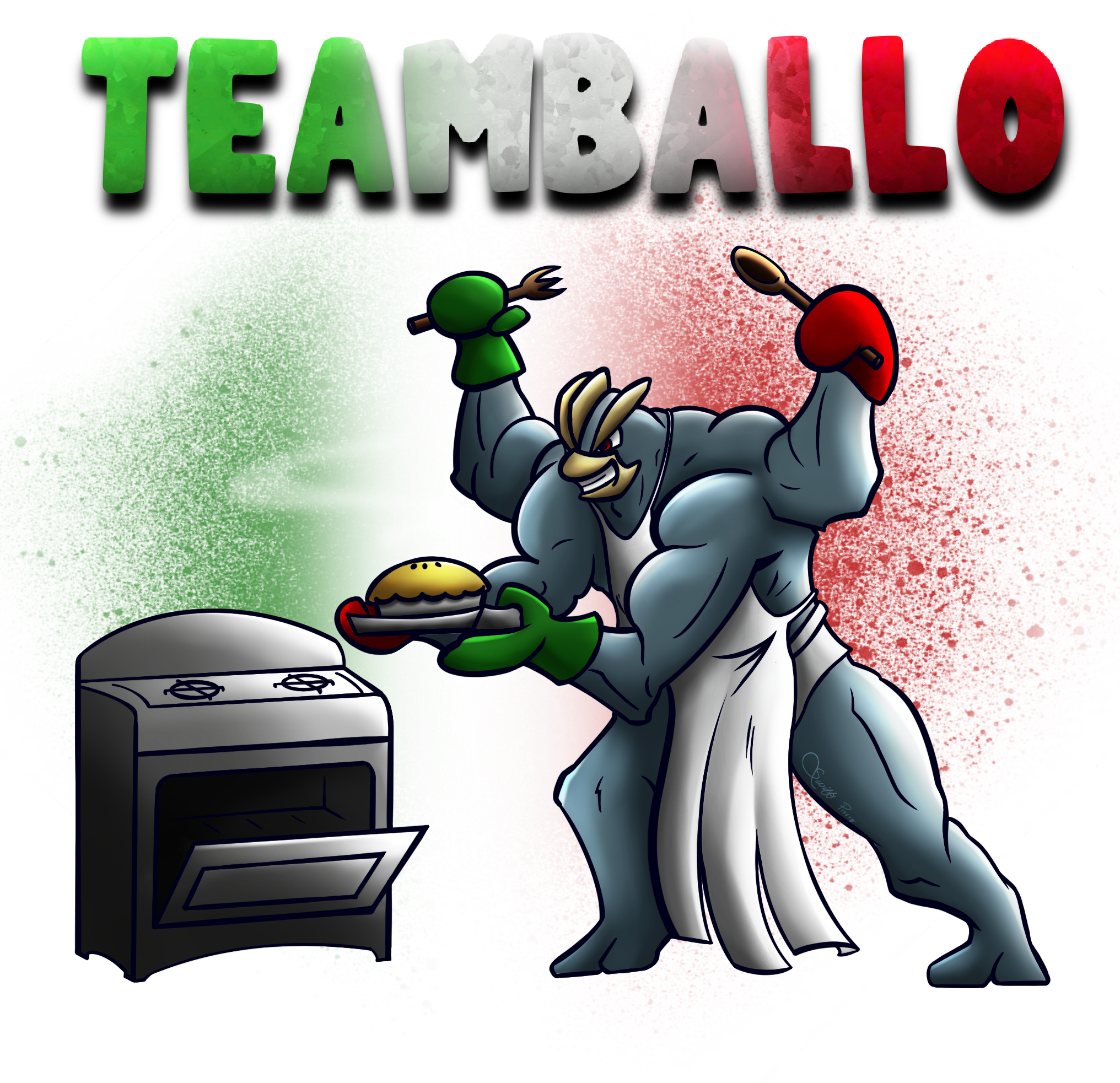
- witty: we want to draw some sort of joke or pop culture reference. For example:
xM3CufU9TmiarLJfXgqq4A.png

(kind of a bad art but forgive me, it's almost 4 yrs old) Teamballo is pronounced like "timballo", an italian dish. Also big muscular machamp in an apron funny.
The intrinsic risk in making a witty logo is that it heavily depends on the quality of the joke. If the joke is cringe then the logo will be cringe as well.
The key to make a good witty logo is the ability to tell a story (the joke) with as little elements as possible. Logos should be simple and immediate. Too many elements will clutter the image and the final product will be a mess. In my opinion a good compromise are puns: putting the joke in the text portion of the logo will put less burden on the drawing.

- aurafarming: it basically consists in drawing a cool pokemon being cool. For example:
illustration9_0-7-png.722027

The intrinsic risk in making an aurafarming logo is that your drawing must be good. If your cool mon has (for example) wrong proportions it will instantly lose all of its aura. For this reason I suggest drawing cool mons with simpler designs, i.e. don't draw an Eternatus if you can. The key to make a good aurafarming logo is the pose. Choosing a weird angle and exaggerating your perspective will add a ton of dramatic effect to your logo. A good resource for drawing weird angle are 3d models; you can find most of them here https://sketchfab.com/nguyenlouis32 (s/o Finchely who told me about this site). Of course you can also make a good aurafarming logo with zero perspective if you do it consciously.

step 2: Form an idea
We've choosen our vibes, now it's time to form an idea on what to actually draw. What do I do if I don't have any ideas? Look around for inspirations! Steal like an artist! Good places to scavenge are present or past tournament threads, power ranking articles, and art threads from prominent artists like Zracknel , Blazenix or Bummer.
As for non-pokemon inspirations, almost anything has a logo nowadays, search for online galleries on sites like Pinterest and are.na (https://www.are.na/kristina-lee-qdjalawlnha/logo-x-olympics).

step 3: Proportions
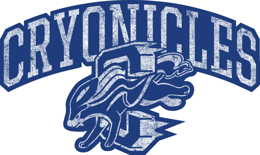
There are three possible proportions for a logo (for any 2 dimensional image, really): horizontal, vertical, and square. Each has its own uses and merits, and we need to choose early on which one to adopt. For the sake of Smogon uses, horizontal and square are easily the most common and useful. Horizontal excels at main logos representing for example a whole tournament, since its mostly going to be seen at the top of forum threads like a banner or in like a video thumbnail that is always horizontal. But if the logo is for a team or for something that is going to be featured on merch, something closer to a square is preferred. Team logos are mostly going to be visible next to another team's logo in a matchup, so having them be as close in format as possible to each other makes them come across best in the limited space. Vertical on the other hand works great on merch or if it's something that's going to be viewed standalone on like a phone screen. You can also have parts of a logo be another format when used as an element of its own, like this example for a main logo vs its smaller version used in users' signatures:
AM7m9J2e5wujiNmixrXwOQ.png
cryos1.png

step 4: Composition
Now that you have your idea is time to start sketching! The first step when sketching is assessing your composition. The recipe I tend to use is the following:
1. Choose a geometric form, it can be a square, a circle, a triangle, a spiral, whatever you want as long as it is clear. The final drawing will have to be either confined in the form or strongly follow the direction of the form. For example:
illustration20_4-png.698029


2. Big - Medium - Small. We should (almost) always include three elements: one big, one medium and one small. Composition means guiding the eye, making it see what we want it to see. And the eye will first look at the big element, then the medium one and lastly it will see the small one. For example:
illustration37-2-1-png.798461

step 5: Colors
Balancing colors is essential in the making of a good logo just as in the making of any art piece. What I try to use is the 60-30-10 rule: you should try to have 60% of the piece made up of one color (and small variations), 30% of a second color and 10% of a third color. For example these can be the flag colors of the wcop nation who commissioned you, or the main colors of the pokemon you chose to aurafarm. e.g:
illustration9_0-7-png.722027

That being said, you can absolutely use less than three colors, it's maybe even better as it is simpler. It's a bit harder but you can use negative space to make up for the lost colors.
One important thing to keep in mind that's unique to logos is that flat colors are almost always better than soft hues! There are two main reason for that: the first is that simpler is better. We don't want to do an elaborate illustration, we want to make a simple, snappy logo that instantly coomunicates the vibes we've chosen and that is easy to remember. The second reason is that it is way easier to print. If you're making a logo for a client that wants to sell it on t-shirts or other merch, they will always choose the logo with the flattest colors. If you're not planning of doing logos for merch then soft hues are fine but it's still better to use a linear gradient than something like a soft brush.
Another thing worth mentioning is that nowadays everything (apps, websites, merch like t-shirts, etc.) has a dark version and a light version. As such, your logo should be designed to look good in both modes. This can be done by simply add some white outlines (layer > effect > border) or by fixing the background.

Step 6: Simplify simplify simplify!
I already mentioned it in the previous sections but logos should be simple and immediate. Do not render it like you would with an illustration, small details will NOT make it better! We humans excel at pattern recognition: we only need a few shapes and colors to instantly recognize a familiar pokemon (especially if we lost to it countless times on the ladder). Some easy way to simplify are the following:
- use straightedge and/or compass lines.
- instead of coloring the shaded areas with darker hues, go pitch black and incorporate them in the lineart.
- if your pokemon has some weird small designs that you don't know how to incorporate without cluttering the image, you can just bend your pose or place your text to hide that little peculiarity.

And that is all! Happy drawing!
 
Last edited:
CLIP STUDIO PAINT BRUSH RESOURCE
1000047850.png


Hello, my name is DaWolfKid and today I'm gonna go over some of my favourite brushes alongside other things from the clip studio paint assets store. I'll talk about how I use them and how you can get them so let's get started c:

DISCLAIMER
These brushes only work in clip studio paint and are based off my three years of usage.
I will not being going over the use of stamps or gradients in this guide.
If people find this useful I could do this for other programs in the future so lmk!

How to install content
Hide
First you need to search up 'clip studio assets' on any search engine which should take you to here
Screenshot_20260521_154941_Chrome_1.jpg


Next use the search bar to search for your content, can be by name, ID, or just a description of what you're looking for such as 'watercolour pencils'

For this example I searched by the content ID and found the brush I'm looking for which I'll then click on.
Screenshot_20260521_172948_Chrome.jpg


You'll then open the brushes page which will include the information provided by the brush creator, this normally includes pictures of the brush being used or artworks created using it.
Click download and hop back to clip studio paint.
Screenshot_20260521_160100_Chrome.jpg


When you open the application, go to the main menu and click the little arrows pointing at each other
Here you can watch your brush download, when it says 'process successful', it has fully downloaded.
Screenshot_20260521_160114_Clip Studio.jpg


You can then open a new canvas by clicking the 'draw' icon in the top left corner. Once opened, click the arrow pointing down in a box (circled)
Screenshot_20260521_161030_Clip Studio.jpg


You'll then have this box pop up
Screenshot_20260521_161039_Clip Studio.jpg

You should find your new brush under the 'material not added to paint' and 'downloaded materials'
Downloaded materials has every material you've ever downloaded for future reference.
Select your brush by clicking the box until it is ticked, then select 'add pallet'

Then your done, you can use or adjust your brush however you like now!
Screenshot_20260521_161054_Clip Studio.jpg

Are these brushes free?
Hide
A good majority of these brushes are free to download from the clip studio assets store. However, some cost clippy points so I will quicky go over how what they are. I've also provided free similar alternatives in the non-extras and auto action/misc sections.

Clippy points are an in app currency that you can earn by either participating in login events or by uploading an asset and charging clippy points for others to download. You can technically earn them by paying for a monthly gold membership, but it is not cheap and I do recommend waiting for a free handout.
I get all mine from login events where all you need to do is open the app and head to the event page, the points were then added to my account at no additional costs. They tend to do a big one in January for the new year. The assets I have chosen do not cost a lot of clippy points so it will not take long to save up enough points to get everything.

SKETCHING BRUSHES
Hide
Froggy Pack – Froggy Pencil
Content ID: 1912331

My main sketching brush, the froggy pencil is a gritty, textured, pencil-like brush which I use for sketching and planning out my drawing. Wouldn't say it's the most realistic looking pencil brush but it became my go to starting brush when making art.
Froggy Pencil.png


SketchBrush Aura
Content ID: 1828173

One of my newer finds but definitely one worth sharing here. The sketchbrush aura is a more rough textured pencil that works well for both sketching and even lineart.
It's good for sketching and looks really good when used with fast brush strokes, if I need a more detailed or cleaner sketch, I use this brush.
SketchBrush Aura.png

LINEART BRUSHES
Hide
Froggy Pack – Froggy Shading/Lines
Content ID: 1912331

Probably my favourite brush on the entire list and my default lineart brush. The froggt shading/lines brush is a smooth pen that slightly thins out and fades. Good for very clean lineart and cel-shading as well which I also use it for. I like to adjust the brush thickness while doing my lineart and I find this brush blends in with itself well so the lines connect nicely.
1000047866.png

SU- cream pencil
Content ID: 1761353

A more pencil feeling brush which I use when I want lineart with a more textured and thicker look. I tend to use it on a smaller size so it has a thick look but as you increase the brushes size, it becomes a more traditional looking thick pencil, kinda a bit charcoal looking to with the right amount of pressure.
SU Cream Pencil.png


Froggy Pack 2.0 – Rough Inker
Content ID: 1820324

The most gritty of the lineart brushes, the rough inker is a grain style brush that gives your lines an interesting look.
I want to use this brush more, I only recently found it and it's different from other brushes I've traditional used for lineart. Almost has a semi crayon or rough ink feeling, hence the name.
Rough Inker.png

PAINTING BRUSHES
Hide
Soft Water Brush
Content ID: 2085170

Free alternative
Cotton Candy Painter
Content ID: 2081216

A very silky and semi-opaque brush that can be used for creating soft artworks. It lightly blends into itself and with other colours similar in value. I use it mainly for clothes and water but I can see it having many different uses.
Soft Water Brush.png


Soft fluffy paint
Content ID: 1843958

Free alternative
Soft Paint
Content ID:1798017

Another very soft paint brush but a bit different to the last brush.
Good on a singular layer, you can keep painting on top of this brush to create more thicker painterly look. Is also slightly textured which is neat.
Soft Fluffy Paint.png

Oil Brush
Content ID: 1875289

Free alternative
Messy Brush Set (Specifically the Hatch Paint and Hatch Bash brushes)
Content ID: 2221797

This brush is super fun, it's an oil painting brush! Super thick and with a hatch styled textured, I love using this brush for nature, grass in particular looks really good with this brush.
Oil Brush.png

AUTO ACTIONS/MISC
Hide
close and fill tool without gaps
Content ID: 1759448

This tool is beyond useful!
It's a lasso tool that instead of selecting, fills the area you draw around.
I use this for shading sometimes and for filling in my base layer in one action.
Get your lineart and check if there's any gaps between lines, this won't work properly if there is. Turn on the reference layer icon shown below. Then just lasso around your drawing and boom, it will fill your lineart! You don't even need to be neat, just a huge circle around your drawing will fill it.
1000047873.jpg


Sticker Outline
Content ID: 1795758
The most frequent auto action I use, the sticker outline does exactly what the title suggests, creates a outline around your art.
First, either flatten your image (which is what I do after saving a backup with all my layers separate) or put your layers into folders.
Next, go to your auto action menu and select this auto action. Then double click the text 'sticker outline' and check if it's set to 'draw outline'
Adjust your line width (I normally do 15-25) then hit ok and that's it.
1000047875.jpg

1000047876.jpg

Pixel Brushes Mega Pack
Content ID: 1969097

Figured it was worth mentioning you can do pixel art in clip studio paint. The program wasn't made for this purpose so if you're only focusing on pixel art, you should look into Aseprite or something dedicated to it.
It's still fun to do in clip studio paint and the pixel brushes mega pack has everything you need to get started. Has brushes, auto actions, and stamps so definitely check it out if you wanna try out pixel art.

EXTRAS: no pictures in this section
Hide
STAMPS AND STICKERS
Stars from the Galaxy Brush set
Content ID: 1758879

Ice Butterfly
Content ID: 1717386

Dust brushes
Content ID: 1583768

Halftone Airbrush
Content ID: 2130841

Kirari
Content ID: 1699632

The flowers dance in a mess
Content ID: 1781011

Star Glitter Brush
Content ID: 2114029

Pop Deco Brush Set:
Content ID: 2187023

GRAIDENTS
24 Quick Skies
Content ID: 1800702

Soft atmosphere Gradient
Content ID: 1765102

Empty color gradient set
Content ID: 1723549

Fairy Dust Gradation
Content ID: 2169605

Pastel Dreams Gradation Set
Content ID: 2168255

QUICK RAINBOW BRUSHES TUTORIAL:
Hide
Quick bonus on how to make a brush that changes colours every stroke and a two colour gradient brush. You can do this on any brush, but some work better then others so play around until you're happy with the result.
For the colour chaging brush, first pick a brush and duplicate it, you can do this by hitting the + button underneath your brush list. Name the brush anything and hit ok. Then hit the wrench button in tool settings, this'll open the tool menu. Go to 'colour jitter' and copy the settings in this picture.
That's it, brush it ready to use!
1000047878.jpg

1000047880.png

For the two colour gradient brush, repeat the steps until you get to the tool settings.
First do the colour jitter settings then the ink ones as shown below.
Then go back to colour jitter and select the icon next to 'blend with subcolour'
Copy the settings shown here and then you're done.
This should work, but if it doesn't please lmk, I spent a while figuring this one out so idk if I lucked out. Should look like the picture below, the colour changes depending on how much pressure you apply.
1000047881.jpg

1000047882.jpg

1000047884.jpg
1000047883.jpg

Duo Colour.png

Well this turned out longer then I thought it be but I hope it's useful or at least interesting to read, enjoy!
 
Last edited:
Back
Top