Welcome to Smogon! Take a moment to read the Introduction to Smogon for a run-down on everything Smogon, and make sure you take some time to read the global rules.
Yea. The original Chinese riddler is the one who posted about it, which is why it’s getting traction / is something to watch out for.
The tl;dr is
- Paradox Suicune is Water/Fire, has Protosynthesis, and has a sig move (Hydro Steam) that gets a power boost in Sun on top of the Proto boost. Presumably Water-type.
- Paradox Virizion has a sig move (Psyblade) that gets a power boost in Electric Terrain. Presumably Psychic-type.
- The moves are not Fire- or Electric-type.
So basically added something (the typing and boost thing) to things we already know.
Honestly the idea of the moves that do get boost in their dedicated terrain is interesting, and this Hydro Steam would allow P-suicune to be in sun (for protosyntesis) without nerfing itself.
My guesses on the type reasonings are that P-Suicune is part Fire due to Ho-oh creating the Legendary Beasts while P-Virizion being part Psychic is as a foil towards the Swords of Justice's Fighting type and as a more metaphysical contrast towards the quartet's "earthy" typings (Steel, Grass, Rock, Water).
Apologies if this has been answered, but looking at the incomplete/datamine available info on Bulbapedia has me curious.
The Adamant/Lustrous/Griseous Cores and such were reclassed from Key Items to Held Items in SV, as I understand, and their only function is changing the forms of the Creation Trio. Origin Palkia and Dialga only work with these items anyway. but does Giratina still transform with the Griseous Orb, or only the Core now (given the LA items seem to be either identical or strict Downgrades from the Orbs as Held Battle Items)?
Only the Cores, but I recall reading about the cores ALSO giving the boost to STAB moves.
Honestly, they should have stayed as Key items ala Glacidea. It overcomplicates things, and people won't use them in VGC over Zacian and Kyogre/Groudon anyway.
You never know, both Palkia and Dialga did see a lot of VGC play due to Trick Room shenenigans and being very strong Dynamax abusers.
The nerfs to Zacian also may or may not make it a way less interesting option since it can't basically ignore Intimidate this time around, and Calyrex can't use Dynamax to get around the spread move denials either (though it can change type now).
Lot of things can happen in VGC :P
I'm willing to guess that the sprites were all added in the last Home update just because that had the Battle Data that uses most of these
Probably just have them all on deck already just in case they want to use them for other things. Maybe they'll redesign the dex in Home to use these, that'd be nice.
By the way and we've known this since SV came out but it is wild to me that Urshifu still only has one sprite for itself. It doesnt even get a placeholder sprite like Eternamax Eternatus does.
They made one for Ash-Greninja (removed!), visisble in the replies, and Eternal Floette (unexistinced!) but god forbid you can tell the two bears apart.
I am still a stickler for the old 2D sprite art but seeing all of the Pokemon lined up in this new artstyle actually looks... not bad. Some really neat design choices in some of them, like Mega Salamence's sprite doing a sitting pose instead of having its arms tucked in.
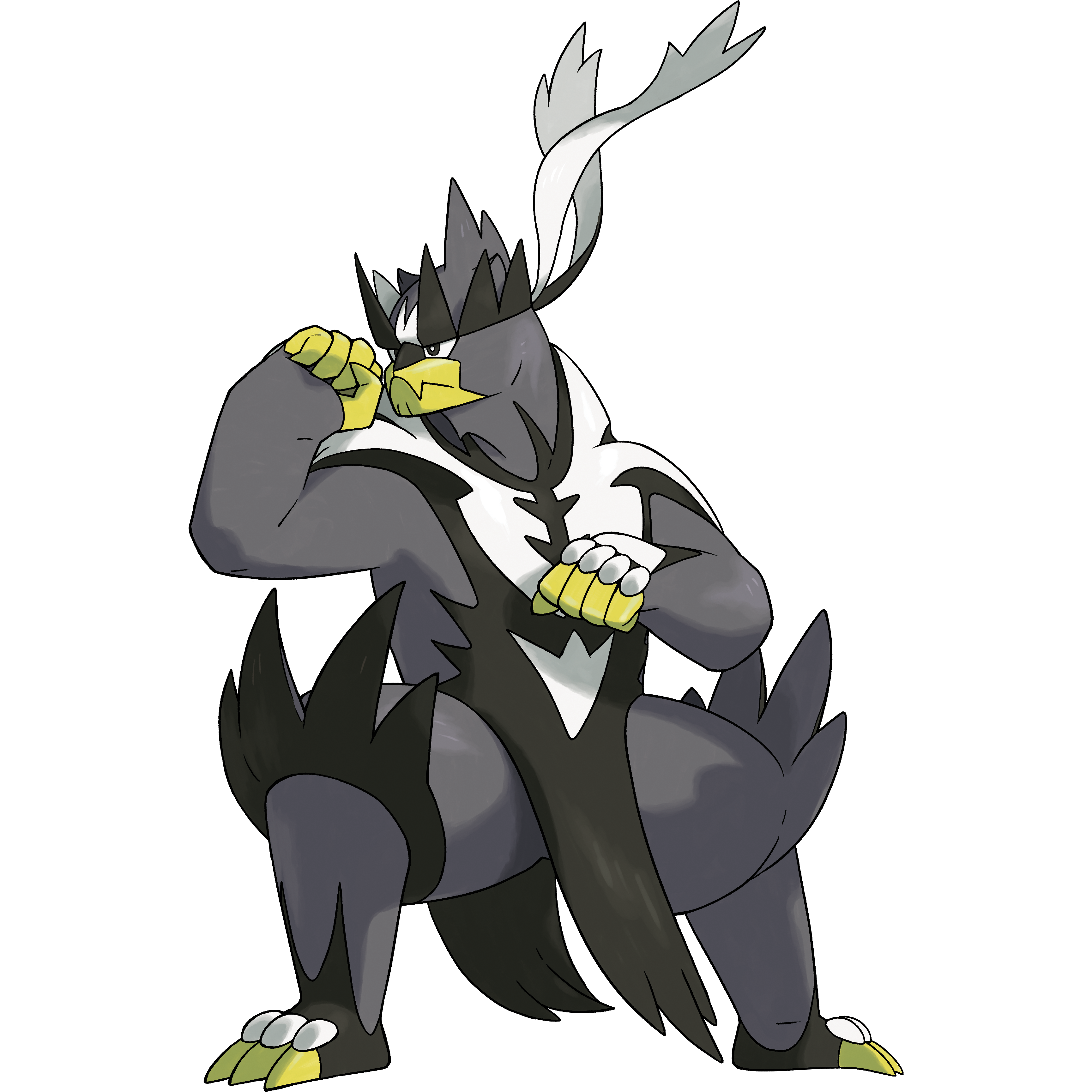
they have different head pieces. Dark's fur on the back of its head and the headband spike upward, and the tassels also float higher. Water's headband is downward facing, doesn't have the back spike up and the tassels flow downard and around.
It's a relatively subtle difference but also we have all 5 versions of Genesect here, and the only differences between them are a barely noticeable color on the cannon.
i appreciate that the mons have a consistent style or will for a while, considering i really miss bw-style sprites outside of smogon, even if dexit is not a one-off thing
It bugged me a lot that both Let's Go and SwSh didn't really update all the menu mini sprites in the new style, and we were stuck with clashing looks; Gen VI had updated the entire dex, despite the same style being consistent from gen III to V, but seeing only some fully evolved species use the Switch style was unaesthetic.
The fact that EVERYTHING got those (except poor Urshifu not getting its styles to really shine) is awesome. Hoping we get to see the entire Dex in a single game once again.
they have different head pieces. Dark's fur on the back of its head and the headband spike upward, and the tassels also float higher. Water's headband is downward facing, doesn't have the back spike up and the tassels flow downard and around.
It's a relatively subtle difference but also we have all 5 versions of Genesect here, and the only differences between them are a barely noticeable color on the cannon.
Nah, even that is in fact just a posing thing and it's definitely intentional that it's only visible while they're in battle!
Their 3D models are identical, and they have always (even in SwSh) been indistinguishable outside of battle, not just in their icons but also in their idles when you call them onto the overworld and now (in SV) also on their summary pages.
To a degree, it's kind of the point of Urshifu as far as I can tell: the design is deliberately tailored to create interesting visual contrasts between these forms (like how some of its fur is white on top and black on the bottom, specifically so that Single-Strike looks like it has more black accents and Rapid-Strike looks like it has more white accents, but it all comes down to the way they're posed and the only difference is the direction their fur is pointing).
The concept of Urshifu's forms rests on the fact that they're the same Pokémon but have mastered different styles of martial arts and all of their differences come from that, and I think that would be... less effective? if there were permanent physical differences between the forms.
Like, they could design them that way, but I just feel like the design is more interesting for leaning on details that can scan differently depending on the way Urshifu carries itself.
Finding opportunities to display both Urshifu in the same pose and outright show us that there are no physical differences is a nice way to express this and makes the much more obvious contrast between them in battle feel more interesting in my opinion.
The fact that their icons aren't just in their battle poses anyway is a little silly, because it has mechanical implications on Team Preview, but I think that's intentional too even if I'm not a fan of it
Edit: pfff the official art actually gets this wrong
The bit where the spiky fur around its head is white on top and black on the bottom is reflected in the in-game model, which is what's used as the basis for the HOME renders:
(you can see the backs of the spikes on the other side of its head are white, which is why they appear fully white in Rapid-Strike which has them pointing down)
but the official art actually misses this, and Single-Strike Style's fur is black on both sides:
I knew I wasn't crazy when I said the model was set up this way, but I get the confusion now--
I mean okay but Xerneas has a separate "in battle" and "out of battle" form that gets different sprites so there's...really no reason to not have Urshifu to have different sprites to reflect the styles of the Pokemon in battle
I mean okay but Xerneas has a separate "in battle" and "out of battle" form that gets different sprites so there's...really no reason to not have Urshifu to have different sprites to reflect the styles of the Pokemon in battle
As Hermatite touched upon, Urshifu having one menu icon for both styles most likely boils down to Team Preview. In SS, GameFreak didn’t want the opposing player to know which Urshifu style you selected by glancing at its icon. The only way to continue this in SV when HOME compatibility opens is to have the same menu icon for both styles.
They definitely could have had three icons total for Urshifu (one for each style and then a “neutral” one for Team Preview), but unlike Xerneas, Urshifu doesn’t have an “inactive” form, much less one that has had an official name since the Pokémon’s debut.
Plus the whole deal of Southern Kalos being geographically equivalent to the raised area of land in Northeastern Paldea. And the entire deal of Megas not being "only a thing in this region", and instead being seen in a Gen I homage just before XY's release, playable in 4 different regions, and still going strong in GO and the like. They aren't quite the same deal as the other 3 gimmicks.
We are also only 3 years away from the 30th anniversary, and, NGL, I hope they wait until then for the next gen rather than pushing it by 2025.