
-
Check out the relaunch of our general collection, with classic designs and new ones by our very own Pissog!
-
Welcome to Smeargle's Studio! Please be sure to review the studio rules. Feel also free to check out our hub to learn more about this place!Welcome to Smogon! Take a moment to read the Introduction to Smogon for a run-down on everything Smogon, and make sure you take some time to read the global rules.You are using an out of date browser. It may not display this or other websites correctly.
You should upgrade or use an alternative browser.Super Spriting/Trainer Card/other art nonsense thread
- Thread starter DM
- Start date
- Status
- Not open for further replies.
 hey guys, I fiddled around with my avatar, how is it?mantyke-eh i like the other one, it had more variation.I feel the same way. The colours were less dull and more balanced on either side.PAINT is probably your best choice, psycho trainer
K thanks DWCPAINT is probably your best choice, psycho trainerits great for a first time.Hey everyone I want to get into the Spriting biz with you guys, here's the first thing I've ever created

It's just a recolour of my avatar w/ TTars colours
Good and simple. Best way to go for someone new. Just one thing, though, be careful of those outlines.Hey Here is my second sprite it is a recolor of butterfree using blissey's colors

And here is my third a recolor of charizard using blastoise's colors

Here is my first fusion Ganglax!

Please rate my sprites!Right. First of all, the quality of Butterfree is very poor. What file are you saving it as? PNG is the best option.
Next up: Charizard. Not too bad. Pay attention to the outline though. This is important. On Pokemon spirits even the outline is shaded. See all that red around it? You should change that to dark blue. On Blastoise that would be found on the outline, paricularly on the bottom and right.
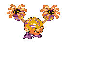
As for Ganglax, well, you can see that it is poorly done right? This is partly because you chose some fairly incompatable sprites to fuse. Try using Porygon-Z next time. He is one of the easiest Pokemon to fuse if you make him the base.
One other reason that that sprite isn't too good is that you tried too much too soon. To cut that much or Gengar requires a fair amount of knowledge of scratchg work which you will only get after time spent spriting. Can't you see the lack of outline on Gengar there and how diffrent it is to Snorlax?
In addition, the red you used for the belly conflicts violently with the purple from Gengar. I told you to use subdued tones, yes? Well the red which you seem to have taken from the eyes is too bright for that much use. After a while you will learn when to use such bright colours but for now keep them dull.
Now for me to issue you some homework:
1. Recolour some not too complicated sprites using the colours of other sprites. If the number of shades for each colour does not match, then use a diffrent Pokemon. Pay acrefull attention to the outlines too.
2. When you feel confident with how the basic colour system works, recolour a Pokemon using your own custom colours. To make your own custom colours, if you do not know, is to double click on a present colour which will bring ap a box. Click the button to expend the box and chose a colour on the square halfway up. First find your basic colour. This should be the colour that is not a highlight or shading. Try to match the shade that you are replacing until you get more experianced. Put the colour under the corrosponding colour for the sprite that you had extracted as I showed you. Repeat for each shade. To change the shade, use the bar next to the box.
Okay?
______________________________________________________________________________
Now, Psycho Trainer. Never use a black background. It makes the outline hard to fix if you ever want to change the background colour. Also a black background is never the best way to display a sprite. Just look at his toe nails! They only exist as white dots.
The same outline advice that I gave to Weavile Tamer applies to you too. You should also try the tasks I suggested for him to do.
______________________________________________________________________________
It may seem like I was a little harsh with my critisisms. Don't worry. The two of you are new two this. Keep trying and you will get better. Trogdor, for example, has not been here long and he has gotten much better. He still has quite a way to go but so do we all. I look forward to you posting some great work of your own in the near future.As for Ganglax, well, you can see that it is poorly done right? This is partly because you chose some fairly incompatable sprites to fuse. Try using Porygon-Z next time. He is one of the easiest Pokemon to fuse if you make him the base.
Theres no such thing as "incompatable" sprites to fuse, they are all pixels, and pixels go well with other pixels.
Sure you have to scratch more and is generally more time consuming, but everything is possible.Yeah, but some Pokemon go really well together. Others do not. It is a fact. Sure there are all pixels, but it is the arrangement of pixels that is important. When you get into patterns the rules change.
I get what you mean and I agree, but you must admit that some Pokemon are much tougher than others to fuse, yes?
.
.
.
.
.
.
You agree? Good. Hence, sprites that are hard to fuse are not compatable. It was probablly my use of the word incompatable that made you say that, right? I wasn't suggesting that fusing them was impossible. Just hard.
And don't you think that Gengar/Snorlax would fit into that catagory? Especially for a beginer.Yes I had some resisizing issues with butterfree I will make more soon but after the ganglax I decided to make this it probably sucks but oh well
I call it graveleepNot bad. The colour of Graveler is not quite right and the mirrored Lileeps does not look right. Use the B sprite next time (the second frame). It is good for your second attempt though.
But you should really spend some more time doing recolours first okay?Ok it took me like 10 minutes to make this but here it is I call it ...mudkip
 Yes I had some resisizing issues with butterfree I will make more soon but after the ganglax I decided to make this it probably sucks but oh well
I call it graveleep
Much better, but still bad.
Never use mirrored sprites in the same one (unless you know what your doing) and avoid making completely straight lines (between graveler and lileep)
And Shineenigma, yeah you know what I meant.Ok Pyr0.
Weavile Tamer, you use colours at the top of the scale didn't you? Really, thake them from midway down. They look much better on your sprite.which sprite?Any sprite. Trust me. Colours picked halfway to grey are much nmore natural. They suit your sprite much better. Also, try to match shades better.- Status
- Not open for further replies.


