-
Follow our Instagram!
-
Welcome to Smeargle's Studio! Please be sure to review the studio rules. Feel also free to check out our hub to learn more about this place!Welcome to Smogon! Take a moment to read the Introduction to Smogon for a run-down on everything Smogon, and make sure you take some time to read the global rules.You are using an out of date browser. It may not display this or other websites correctly.
You should upgrade or use an alternative browser.The Smog needs your help!
- Thread starter TAY
- Start date
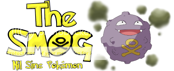
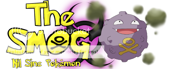
 Ok, I absolutely love Dragonknight's. Is there anyway that you could do a version with a smokescreen instead of the plain purple oval?
I love how you used the symbol on Koffing itself (although not the whole Koffing) to make the O. Making the font of the rest of the letters the same as its symbol was a nice touch as well. If it had a smokescreen as the background I am sure it would look ten times better.So far. I like, Cartoon's 2nd, firestorms's 2nd, cactuar joe's second, and dragonite08's second.
They all seem amazing. Cactuar Joe, if you color it, maybe people will like it even more?
Cartoon's has a simple yet good and cool design.
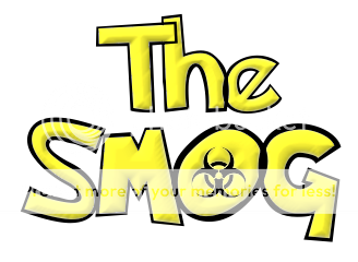
Firestorm's one is simple, yet cool.
Dragonite's idea is just original. I like it, but could use a little work. First, I love almost all the ideas here - Cartoon's, Cactuar Joe's, and especially Bugmaniacbob's and Dragonknight08's.
I'm not an artist though, so could someone consider this concept?
Bugmaniac's Alakazam concept is brilliant, but maybe change the Pokemon itself? Like Garchomp reading the Smog? Lots of fantastic logo work in this thread -- great job everyone that has made submissions!
I think Firestorm's logo is the best aesthetically, as it looks very much like a "real" magazine logo. Cartoons has a very clean submission as well. I like the artistic creativity on Cactuar Joe's design, but it doesn't look as "serious" as I would like for this logo. But that's just my taste. If we are going for a more whimsical angle, then CJ's logo is the best of the bunch.
I really like one subtle implication of Bugmaniacbob's design. Since Alakazam is known as one of the most intelligent pokemon in the world (possessing an IQ over 5000), it's cool that it is shown reading The Smog. It implies that our magazine is intended for intelligent members of the Pokemon community.
NOTE: Alakazam is actually considered the second most intelligent Pokemon. Uxie is considered the most intelligent, since it is the legendary pokemon that created all knowledge in the world. Maybe we should work up a Uxie logo?
Nah... Zam's way cooler.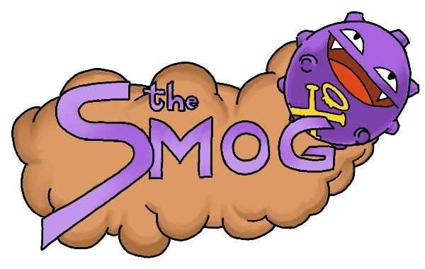
A quick, tentative color job. NOTE: Alakazam is actually considered the second most intelligent Pokemon. Uxie is considered the most intelligent, since it is the legendary pokemon that created all knowledge in the world. Maybe we should work up a Uxie logo?
Interesting idea...

... or maybe not. Perhaps Metagross?
Anyway, I feel I'm rapidly losing ground in the competition. Which is bad, because I've run out of imagination, and from that, ideas. And I only have MSPaint, no scanner and no digital camera. What I'm trying to say is, does anyone have any bright ideas?
Back on topic, my most recent stab at the subject:

Any thoughts? I like Firestorm's logo best; it's nice, clean, and simple. I don't think it's a good idea to make the logo overly complicated, because then it looks less professional and gives more of a "busy" "chaotic" feel.I liked the idea of using the poison symbol on Koffing as the "o" in Smog. So, I came up with this:

I can change the colour of the letters and the outline if they don't look good. If you have any suggestions, please let me know. Thanks.
EDIT: Alternate design, tiny changes. Letter colour and smoke.

I'll shade it in later on, maybe tomorrow.I think the koffing is wearing glasses on solstice's one. While the Koffing is nice, next to no one will understand the Poke-braille. No one that doesn't already know the magazine's name without looking it up (and that'll annoy people imo).
Also I think Solstice's is funny. I think the line is supposed to be a nose?
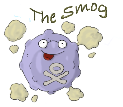
I still don't think we should use an existing Koffing drawing for the logo :|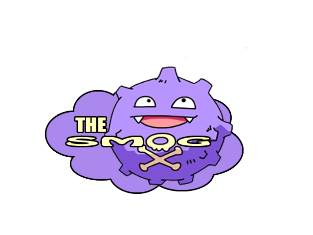
did as ln and tangerine told, fixed the font and the background. :)Screw Koffing, go with Snorlax!
Gah, I'm posting so many ideas. D:
You might want to make "SMOG" more legible and less squashed-up.