
-
The moderators of this forum can be found in the CAP forum staff directory.
-
Welcome to Smogon! Take a moment to read the Introduction to Smogon for a run-down on everything Smogon, and make sure you take some time to read the global rules.
-
Congrats to the winners of the 2023 Smog Awards!
CAP 10 CAP 10 - Art Submissions
- Thread starter beej
- Start date
- Status
- Not open for further replies.


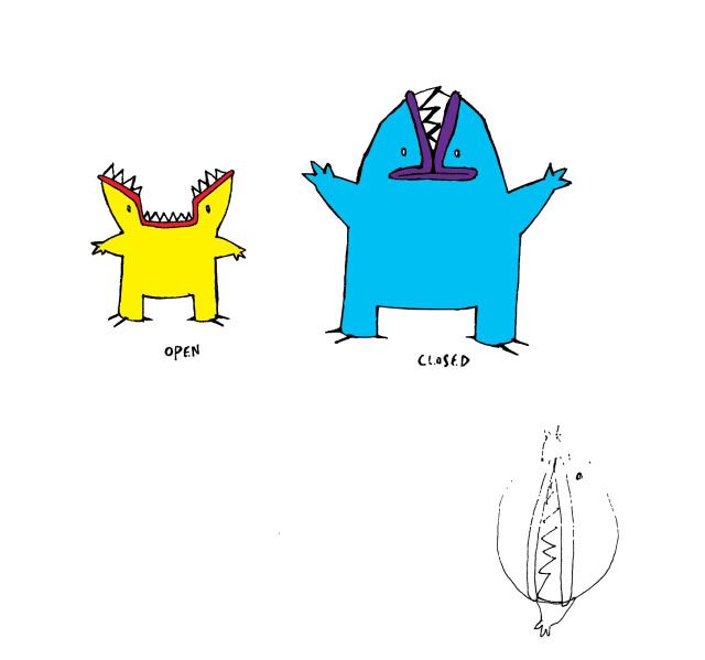
Ooo, I like this one better than your last one! EES SO KEWT!Well, here goes. It's based off an electric eel and a mudpuppy. It's tail is its primary means of attacking and allows it to jolt forwards quickly. The electric charge in its body gives its eyes a luminescent glow.
http://fc03.deviantart.net/fs70/f/2010/083/1/8/Rawr_by_invaderscandal.jpg


nardd: I'm liking this one, along with Paras Hilton's and Rocket Grunt's design. My only gripe is the magnet on it's head; it's what 'seperates' it from Starmie, but it kind of feels out of place; kind of 'slapped' on it. May I suggest something else, like a lightning bolt? Or removing it completely, and trying to do something to the rest of the design instead?
I'm curious on what the circles will end up being like. Will they be all glowy and stuff?
I'm curious on what the circles will end up being like. Will they be all glowy and stuff?

Second go at the second concept..

Colour scheme

Made it seem like it has armor of some kind...hopefully it looks electricy this time..xD

Colour scheme

Made it seem like it has armor of some kind...hopefully it looks electricy this time..xD


To those of you questioning the anatomical correctness of curved beaver teeth, I think you might be surprised how curved a beaver's teeth really are! Yes, most goofy cartoon pictures of beavers show the teeth as straight, flat squares. But from my limited research into beaver dental science (I'm no expert on animal biology) -- a beaver's teeth are actually very curved.
I looked up a few pictures of beaver's teeth and skulls, and found a few interesting examples. Here's a picture that shows the growth pattern of a beaver's teeth.
As you can see, the teeth are curved. And, if you look at the extended growth path of the upper teeth -- they have a very pronounced curved growth pattern.
I also found this picture of a beaver fossil skull.
Although this animal lived a very long time ago, you can see it is not completely unprecedented or outside the realm of reasonable beaver physiology -- for a beaver's teeth to be very long and curved, almost like tusks.
But regardless of whether my beaver's teeth are anatomically consistent with real life or not -- is somewhat irrelevant.
With #2 in mind -- I plan to experiment with a couple of things:
These changes are very easy to do, so I don't mind giving it a shot -- if people think it might improve the design overall. I'll post the changes a little later.
I looked up a few pictures of beaver's teeth and skulls, and found a few interesting examples. Here's a picture that shows the growth pattern of a beaver's teeth.
As you can see, the teeth are curved. And, if you look at the extended growth path of the upper teeth -- they have a very pronounced curved growth pattern.
I also found this picture of a beaver fossil skull.
Although this animal lived a very long time ago, you can see it is not completely unprecedented or outside the realm of reasonable beaver physiology -- for a beaver's teeth to be very long and curved, almost like tusks.
But regardless of whether my beaver's teeth are anatomically consistent with real life or not -- is somewhat irrelevant.
1) This is pokemon. Arguing what is "scientifically correct" is pretty silly for a beaver that shoots lightning bolts and pops out of a pokeball. I think we all know that science is pretty much thrown out the window in Pokemon.
2) It doesn't matter what is right or wrong scientifically, what matters is what looks best and "feels right" for the average person looking at the design.
2) It doesn't matter what is right or wrong scientifically, what matters is what looks best and "feels right" for the average person looking at the design.
With #2 in mind -- I plan to experiment with a couple of things:
- I'll make a design with the teeth a little shorter. I think the curved teeth make the design look sleeker and more offensive, and gets away from the "goofy Bibarel" look. But, the length of the teeth may be a sticking point for some of you that just don't like the idea of a beaver with long curved teeth.
- I'll also make a version with teeth both shorter and flatter. I fear this will make it look a bit too silly, and too much like Bibarel -- but it's worth a look. I definitely think it will make the design look more "beaver-like", so that could be worth it.
These changes are very easy to do, so I don't mind giving it a shot -- if people think it might improve the design overall. I'll post the changes a little later.
Made some anatomy edits to my guy, along with a SUPER CRAPPY COLORING JOB OF FAIL™!!! 8D

*Cough*, anywho, I made him overall a lot more mammalian to hopefully distinguish him from Swampert, with cat-like ears and hind legs. Palette is very subject to change, but I liked the idea of a primarily blue-while coloring, as that's not too common among Electric-types (Pachirisu comes to mind). I gave him what looks almost like circuitry along the fingers; I see it as using this to channel electricity into other parts of its body (will probably add more going up the arms and leading down the legs.
He's still under heavy revision, so any comments are appreciated! :)
~Nyasu

Changed his crown a little and thanks to a friend he has a nickname! Cucaster! Don't ask why, I know I didn't, but somehow it grew on me.

Pretty cool concept, but I dislike the colours. At the moment, it reminds me too much of Empoleon... Anyway, I'd say it could look better with more yellow, and less blue. Maybe a yellow/brown body?Second go at the second concept..
Colour scheme
Made it seem like it has armor of some kind...hopefully it looks electricy this time..xD

That is seriously cool. I like the beaver one as well.Second go at the second concept..
http://img510.imageshack.us/img510/2733/gaviwattnew.jpg
Colour scheme
http://img389.imageshack.us/i/gaviwattc.jpg/
Made it seem like it has armor of some kind...hopefully it looks electricy this time..xD

I decided to change my design a bit. I still wanted to keep the same idea, an actual water pokemon with electricity running through it via nervous system, but my original design didn't look correct in relation to the stats this CAP might have. I was in class today doodling and I decided to mess around with a bulkier version of my design.
 Here is the supporting art from the other one I made, I feel that it applies much better to this version though.
http://i731.photobucket.com/albums/ww313/MarceloSM/supportingmaterial.png
It's also pretty obvious that CAP 10's speed is going to be pretty good, at the same time though it's still going to be fast. Despite this design's bulkiness it still can be really fast, think Mario Sunshine where Mario can jet around by launching water behind him from his FLUDD, or something like Iceman from X-Men when he rides his ice. More supporting art to come!
For comparisons sake here is the original submission.
http://i731.photobucket.com/albums/ww313/MarceloSM/rsz_cappoke2.png
SEO, I actually liked your original design much, much better. It is a valid point to try to incorporate some of the stats into the design, but the bulkiness in this case doesn't work, at least not for this viewer. Your original actually looked both bulky, fast, and offensive whereas this design feels as if bulk has taken precedence over the other traits.
Either way, there are many examples of pokemon that don't look the way their stat spreads would suggest. Would you think umbreon that slow, or lanturn with that singular hp, or cresselia as having all 3 defensive stats 120+? Admittedly, most pokemon do look as their stats suggest, but what does it matter in the science of pokemon?
Either way, there are many examples of pokemon that don't look the way their stat spreads would suggest. Would you think umbreon that slow, or lanturn with that singular hp, or cresselia as having all 3 defensive stats 120+? Admittedly, most pokemon do look as their stats suggest, but what does it matter in the science of pokemon?
The stat spread suggests that this pokemon's design should emphasis a high HP and speed. My original design was made before the stat poll was finished and of course emphasized a more offensive stat spread. As it is now though, there is little emphasis on its offensiveness and more on its ability to switch in, take a hit, and hit back before the other pokemon has a chance to hit back. I still kind of think that my first design looked too frail to have that massive HP stat. Regardless I still wanted to post another one since my original submission got almost zero attention. Ill put the original in my my previous post and see what people say.
VKCA
(Virtual Circus Kareoky Act)
DJD: I think your design might be improved if it had longer arms and or legs, I think it would make it even less like bibarel. I do prefer the curved teeth though, as it does make it look less like a dumb beaver, and more like a ravage animal that would rip your throat out.

Final Submission
Main Entry:

Supporting Material:
http://i165.photobucket.com/albums/u65/wyverii/bipolarsupportingmaterial.png
The idea for a polar bear came from the word polar, as a pun on the electrical term and a need to find a marine animal without screaming water. It's of my opinion that water should feel secondary to the electric according to our types and to add a little varity.
I'll try and let the artwork speak for itself for the rest.
Note: the supporting material has a rough estimation of what the height would be, of course it can be any height in future.
Good luck guys and gals =p

Final Submission
Meh this wasn't getting much attention anyway, so I decided to just round it off.
===============
Main Entry:

The orb in its centre controls every polarised segment of its body, allowing it to form into pretty much any shape to counter what it needs to.
Supporting Material:
http://i306.photobucket.com/albums/nn259/Alchemator/CAP13normTransp.gif
http://i306.photobucket.com/albums/n...CAP10Tbolt.jpg
http://i306.photobucket.com/albums/n...CAP10Brine.jpg
http://i306.photobucket.com/albums/n...CAP10Avoir.jpg

I don't even know what this is anymore, and because of that I've done no more than a rough coloring to get a sense of its anatomy better...

It should be noted that this is supposed to be an overhead view; the top is the ridge, not the tail.
The idea was to take the see-through domed forehead of the Barreleye Fish and use that as an encapsulation for a soft, maleable plasma/jelly body and eyes (a face) that looked upwards. I settled on using the body shape of sea scorpions (which are extinct animals) because the barreleyefish's body was too plain. However, the plated segments of the sea scorpion looked too defensive, so I changed the design to something softer. As a result, it ended up like this and now it's starting to resemble a squid... :V
Definitely not a final version; looking for input for a better design.

I like both designs equally. the old design had an artificial looking crown, which added to it's whimsical appearance. this one looks more natural, yet still retains the whimsical uniqueness I liked about the design. Also diggin' the name. (Sea) Cucumber + Caster (magic/wizard) fits it's appearance quite nicely :D*Pic*
Changed his crown a little and thanks to a friend he has a nickname! Cucaster! Don't ask why, I know I didn't, but somehow it grew on me.
Chordata

Its based on a seahorse, with water rings swirling around it. With those "rings" it can mold its water into different shapes. Its tail constantly flickers with lightning. Having this shape it allows for use of flamethrower, and for lots of defensive attacks/healing attacks because of the water whips and the swirling rings around it.The seahorses' whips would allow it to form all sorts of weapons and what not form the water, It could also have lots of paralyzing moves in its arsenal, because it can run electricity through its body and send shock waves into its opponent. Please critique and comment, I did this on my DSi using colors. I hope you like it

Its based on a seahorse, with water rings swirling around it. With those "rings" it can mold its water into different shapes. Its tail constantly flickers with lightning. Having this shape it allows for use of flamethrower, and for lots of defensive attacks/healing attacks because of the water whips and the swirling rings around it.The seahorses' whips would allow it to form all sorts of weapons and what not form the water, It could also have lots of paralyzing moves in its arsenal, because it can run electricity through its body and send shock waves into its opponent. Please critique and comment, I did this on my DSi using colors. I hope you like it
thanks for the help sezja, you were right
heres what the first design looks like with what you suggested
but like supernes said, it looks like i made a ghost or rock type now
i could try to recolor it like a lightbulb but instead i remixed the shape
just trying to make it look more like a battery/broken fuse/florescent bulb/dunkleosteus haha
so this is what i came up with
again im not too sure about the colors

(uncolored version here)
thank youu

its like an electron


Thought I take I crack at this (srry I suck at coloring :P)

This guy is based of the basilisk (you know, the lizard that runs on water?) anyway, I had this idea for a fakemon before but i tweaked it to have the electric type incorporated into it. I figured its muscles would create electricity to power its muscles sort of like electrike does.
This guy is based of the basilisk (you know, the lizard that runs on water?) anyway, I had this idea for a fakemon before but i tweaked it to have the electric type incorporated into it. I figured its muscles would create electricity to power its muscles sort of like electrike does.


That looks very cool, but have you stopped to consider that it might look a little too much like an Ice/Electric type? I mean, come on, it's a polar bear. A penguin or something would be ambiguous enough to be either, but polar bears have a primary affinity with ice.Main Entry:
http://i165.photobucket.com/albums/u65/wyverii/bipolar-4.png
Supporting Material:
http://i165.photobucket.com/albums/u65/wyverii/bipolarsupportingmaterial.png
The idea for a polar bear came from the word polar, as a pun on the electrical term and a need to find a marine animal without screaming water. It's of my opinion that water should feel secondary to the electric according to our types and to add a little varity.
I'll try and let the artwork speak for itself for the rest.
Note: the supporting material has a rough estimation of what the height would be, of course it can be any height in future.
Good luck guys and gals =p
For the design itself, I have no complaints. The ability thread has strong support for Intimidate, and if CAP10 does get it, I would like for the Pokemon to actually look tough. We might not be necessarily hung up on appearance or flavor, but damn it, it's still important.

rocket: I definitely like that design better.. although you may want to play around with the tail coloring/shape a bit.. the alternating red/greenish lights remind me of Christmas almost.. Possibly could make those frayed wires at the end of the tail look like a coily lightbulb filament? Either way it's a great improvement on your first one and I like it.
for myself I added some description and new drawings to my final submission on page 16
for myself I added some description and new drawings to my final submission on page 16
- Status
- Not open for further replies.