
I'd say that my favourite so far are Doug's followed by Wyverii's. Unlike some I really like the hidden flying aspect of the stork.The only thing that bothers me about Doug's design is that it's left hand looks a bit like it's bending the wrong way. It kinda feels that it it were angled slightly differently it might seem a little more natural.

-
Check out the relaunch of our general collection, with classic designs and new ones by our very own Pissog!
-
The moderators of this forum can be found in the CAP forum staff directory.
-
Welcome to Smogon! Take a moment to read the Introduction to Smogon for a run-down on everything Smogon, and make sure you take some time to read the global rules.
You are using an out of date browser. It may not display this or other websites correctly.
You should upgrade or use an alternative browser.
You should upgrade or use an alternative browser.
CAP 6 CAP 6 - Art Submissions
- Thread starter darkie
- Start date
- Status
- Not open for further replies.
Haha KoA that is win. I love the long sensei style tache! Looking forward to colour.
Exclamation Point that could easily turn into an awesome Duckbilled Platypus.
What do you mean you wont touch it? It has to be in colour to be eligible for submission. Come on, it could turn out great! :-)
Exclamation Point that could easily turn into an awesome Duckbilled Platypus.
What do you mean you wont touch it? It has to be in colour to be eligible for submission. Come on, it could turn out great! :-)

To KoA: I think it's a good design,it just looks like too much of a man with a tail and not enough like a merman. If you replaced its legs with a fin and made it a little bulkier, I think it would be really good.


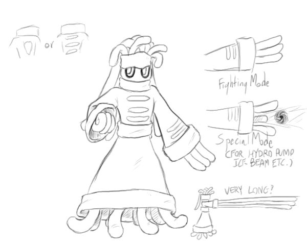
Full position set. This lot can be used as reference for markings and colour scheme if this design is picked to go through to spriting. The action poses will be posted separate from this set once complete. There's an addition of wing markings as suggested by NichMcCoolStratus. The stiff feathers on the wings are used to block opposing attacks and slash. (Note: back view is actually a reversed position from the front view. It keeps things consistent.)
The poses coming up will probably be a fighting attack pose, a water attack pose, an "unaware" meditate pose and a defensive pose.
I know this design isn't for everybody especially with the hidden flying element but i'm not in this purely to win. I'm in this because nobody else would (probably) make this type of design. I think that people are a bit too constricted by stereotypes when it comes to design so I do tend to think up odd concepts. As for my current favourite, it is Estranged's fighting fish.
Just for that artwork, I will personally quit spriting and all artistic works if that doesn't win. The gracefullness of that design, the badassness of it's side view (which makes me want it as a digimon but w/e) This has to win wyverri. Storkmon FTW!
One minor nitpick, those light blue markings on it's face don't really stand out that much, perhaps make it black?


KoA that's freakin awesome!
Doug the change you made to the hands was definitely an improvement. Great job there.
The betta looks pretty good too. Nice job on it!
Atryoki, I love the anemone (anemoninja is a cool nickname)! I hope you decide to color it in.
This is going to the toughest decision ever.
Doug the change you made to the hands was definitely an improvement. Great job there.
The betta looks pretty good too. Nice job on it!
Atryoki, I love the anemone (anemoninja is a cool nickname)! I hope you decide to color it in.
This is going to the toughest decision ever.


Made a pixelated version because it's much easier for me to shade, and it looks alot better without the white-space :S
That does look better, I think that you could try the face mask as a shell-ish fin type thing, similar to the arms and shoulders, I think it would give it a bulkier look.
Nice!
Nice!

KoA: The tail on your warrior is a little weird.. positioning wise


Made a pixelated version because it's much easier for me to shade, and it looks alot better without the white-space :S
If you change anything, I will personally hunt you down and kill you. That is a fantastic design, Atyroki!

Ok, then... after a tweak in it's size... here you go.
My first art submission, and it was designed by me on my comp.

It's a deep sea form of a dragon-tadpole thing. It has big claws and teeth so it looks cool to me :) This is a computer design but I am pretty handy with pencils, so give me a couple tips to improve my work and I might get a better pose for you guys.
My first art submission, and it was designed by me on my comp.
It's a deep sea form of a dragon-tadpole thing. It has big claws and teeth so it looks cool to me :) This is a computer design but I am pretty handy with pencils, so give me a couple tips to improve my work and I might get a better pose for you guys.
If you change anything, I will personally hunt you down and kill you. That is a fantastic design, Atyroki!
Well It'd be nice meeting you I suppose, but I'll have to reject your offer :D (So yeah, no plans to change it)

Final Submission
Main Design:

Albeit a bit late for having been on a trip, I present my design for CAP 6. Like Cartoons!, I had decided to base it on Mexican wrestlers, though as the picture shows, I placed the concept on top of an elephant seal. I tried several times to rework it after seeing the squid, but honestly I couldn't (it looked extremely ridiculous as a Greco-Roman wrestler, I tell you). Still, since my pokémon's body plan is essentially different than Cartoons!', I feel submitting it should not be inconsiderate.
Anyway, I chose a male elephant seal because their fights for mates and territory, though rarely fatal, are incredibly brutal. Also, the way they move on land, proppelling themselves with their fins, reminds me of a luchador impulsing himself with the ring's ropes. (On a side note, these animals can outrun a human being over sand like that!)
Extra pictures:
- Preparing to crush a... rival?!
- Quick back view of the head
Main Design:
Albeit a bit late for having been on a trip, I present my design for CAP 6. Like Cartoons!, I had decided to base it on Mexican wrestlers, though as the picture shows, I placed the concept on top of an elephant seal. I tried several times to rework it after seeing the squid, but honestly I couldn't (it looked extremely ridiculous as a Greco-Roman wrestler, I tell you). Still, since my pokémon's body plan is essentially different than Cartoons!', I feel submitting it should not be inconsiderate.
Anyway, I chose a male elephant seal because their fights for mates and territory, though rarely fatal, are incredibly brutal. Also, the way they move on land, proppelling themselves with their fins, reminds me of a luchador impulsing himself with the ring's ropes. (On a side note, these animals can outrun a human being over sand like that!)
Extra pictures:
- Preparing to crush a... rival?!
- Quick back view of the head


Albeit a bit late for having been on a trip, I present my design for CAP 6. Like Cartoons!, I had decided to base it on Mexican wrestlers, though as the picture shows, I placed the concept on top of an elephant seal. I tried several times to rework it after seeing the squid, but honestly I couldn't (it looked extremely ridiculous as a Greco-Roman wrestler, I tell you). Still, since my pokémon's body plan is essentially different than Cartoons!', I feel submitting it should not be inconsiderate.
Anyway, I chose a male elephant seal because their fights for mates and territory, though rarely fatal, are incredibly brutal. Also, the way they move on land, proppelling themselves with their fins, reminds me of a luchador impulsing himself with the ring's ropes. (On a side note, these animals can outrun a human being over sand like that!)
I like this. I'd personally get rid of all of the extra detail on the belly and have it match his nose coloring.
I'd also like it more if the top head didn't have the faux stitching or light blue color too. Too many details and it won't translate well to a potential sprite.
And because I can't make a post without contradicting myself, I'd like to see some tusks!
Wiverii art looks great, but.... its looking flying. I love the idea of going off the stereotypes, but.... its looking flying. Another point: they want to give it High HP/high defences ( it will need to take TTars, Zapdos and Strata...), as you can see in the base stat spread poll. The BSSpread for this thing is 80/120/70/115/90/105 (fast an strong, but kinda frail)
So far, I like Caladbolg, Wyverii, Antarctros, and Cartoons

Hazmat, you have some excellent points there. I didn't remove it completely but I've simplified the belly design, and changed the top color to the match the nose's, and I like it better myself already. Stitches stay, but I changed the top color to match the stripes to simplify the color scheme further. The results can be seen in the post above. (Original picture here)
That's mainly because of the black outline. A sprite would probably solve that, if the design reaches that stage.
Antarctros: I like the idea, but for some reason the underbelly looks very detached from the rest of the body, like he's holding a surfboard in his teeth. :S
That's mainly because of the black outline. A sprite would probably solve that, if the design reaches that stage.

Hazmat, you have some excellent points there. I didn't remove it completely but I've simplified the belly design, and changed the top color to the match the nose's, and I like it better myself already. Stitches stay, but I changed the top color to match the stripes to simplify the color scheme further. The results can be seen in the post above. (Original picture here)
That's mainly because of the black outline. A sprite would probably solve that, if the design reaches that stage.
Much better. I'd say remove the stitch and tie still to unify the piece, but if you like them -- keep them :) . The tusk looks much better too!

That's the point of Wyverii's design and is purposeful; she meant to create a water/fighting type that had flying characteristics, so that flying attacks could be justified on it. She went with it because she thinks people are too constricted by stereotypes, and makes odd conecpts because of that. I really don't see her changing it in that respect, since it having flying aspects is the entire point of the design.Wiverii art looks great, but.... its looking flying. I love the idea of going off the stereotypes, but.... its looking flying. Another point: they want to give it High HP/high defences ( it will need to take TTars, Zapdos and Strata...), as you can see in the base stat spread poll. The BSSpread for this thing is 80/120/70/115/90/105 (fast an strong, but kinda frail)


A nice concept, I'd say. It's pretty natural and, say, "pokémonish". I think the triangular mark would be better; this pokémon already has a lot of... lines.
Wiverii art looks great, but.... its looking flying. I love the idea of going off the stereotypes, but.... its looking flying.
Flygon looks like a Bug/Dragon, or Dragon/Flying to me; Sceptile could be a Grass/Dragon, but is only Grass. Why do we always have to have bird pokémon as Flying-types?
Also, being "secretly Flying-type" may be good for it, as it would mean access to Roost =D
The latest, please forgive the fact that his head is disjointed D:
What a G. This has got my vote for the moment! :D
Cartoons! I seriously think that it needs "an evolution." Give it some armor or something? Not that the animation isn't a work of genius :3
- Status
- Not open for further replies.