
-
Check out the relaunch of our general collection, with classic designs and new ones by our very own Pissog!
-
The moderators of this forum can be found in the CAP forum staff directory.
-
Welcome to Smogon! Take a moment to read the Introduction to Smogon for a run-down on everything Smogon, and make sure you take some time to read the global rules.
You are using an out of date browser. It may not display this or other websites correctly.
You should upgrade or use an alternative browser.
You should upgrade or use an alternative browser.
CAP 6 CAP 6 - Art Submissions
- Thread starter darkie
- Start date
- Status
- Not open for further replies.

Aragornbird, if you're going to add guns, I'd go all out and make it a pistol. I see the cannon influence, but I also see a vacuum cleaner. Maybe make it a little wider as it approaches the end?
I'm glad I'm getting some more support! This is by far the most competitive art submission CAP thus far IMO.
I'm glad I'm getting some more support! This is by far the most competitive art submission CAP thus far IMO.

Final Submission
Main Design

Supporting Material
Alternate Color
Attacking with tail and fist
When I started thinking of a design to submit for CAP 6 I had a couple ideas, but decided to go with the platypus idea I had. I originaly doodle a platypus pokemon during class a few weeks ago, and when I saw the Water/Fighting typing I knew that it would work well. I put together the original sketch, then refined it so it resembled a platypus more. When I visuallize this guy attacking I see it using its tail and fists for powerful physical attacks, and shooting special attacks from it's mouth.
Main Design
Supporting Material
Alternate Color
Attacking with tail and fist
When I started thinking of a design to submit for CAP 6 I had a couple ideas, but decided to go with the platypus idea I had. I originaly doodle a platypus pokemon during class a few weeks ago, and when I saw the Water/Fighting typing I knew that it would work well. I put together the original sketch, then refined it so it resembled a platypus more. When I visuallize this guy attacking I see it using its tail and fists for powerful physical attacks, and shooting special attacks from it's mouth.

Well, I have to finalize my design pretty soon.
So anyways, I erased any extraneous lines on the last drawing so that it looks more simplified. The pistol now looks sort of like a mini cannon, which still works since pirates use cannons all the time.
I'll be experimenting with color palettes tomorrow, after I go to the dentist to get my teeth pulled.

If you don't mind me saying, I like the concept, but I agree that the pistol looks like a vacuum hose. I also don't like the feet--they remind me of clown shoes or Ronald McDonald feet... and finally I think the cutlass looks a little flimsy.
Elegy of Emptiness: I like your new submission much better! Really it's quite good. The only comment I have now is that I think the head looks too much like Totodile's--color and all.


Well, I have to finalize my design pretty soon.
So anyways, I erased any extraneous lines on the last drawing so that it looks more simplified. The pistol now looks sort of like a mini cannon, which still works since pirates use cannons all the time.
I'll be experimenting with color palettes tomorrow, after I go to the dentist to get my teeth pulled.
I must say I preferred it with the said "extraneous lines". It just looks too simple now. And I also think the pistol/vacuum hose is kinda forced, better keep it with two boxing gloves.

Well, I have to finalize my design pretty soon.
So anyways, I erased any extraneous lines on the last drawing so that it looks more simplified. The pistol now looks sort of like a mini cannon, which still works since pirates use cannons all the time.
I'll be experimenting with color palettes tomorrow, after I go to the dentist to get my teeth pulled.
Yeah, I defiantly liked it better in pistol form. The hose feels out of place. I also liked the extra lines, as the "weapons" should be different colors than the poke itself, or it'll just come out looking a bit deformed


Well, I have to finalize my design pretty soon.
So anyways, I erased any extraneous lines on the last drawing so that it looks more simplified. The pistol now looks sort of like a mini cannon, which still works since pirates use cannons all the time.
I'll be experimenting with color palettes tomorrow, after I go to the dentist to get my teeth pulled.
Again, I'd just submit a colored version of your first draft. I personally feel that you're needlessly overcomplicating a great initial idea with too much baggage.
There are plenty of pokemon who can shoot ice beams without actual guns, barrels, or even holes.
Murkrow: Color doesn't matter. In fact, my submission might be changed again before you know it.
And what's wrong with Ronald's shoes? Pokemon is a child's game and Ronald is a child idol.
Nothing's wrong with anything; it's a matter of preference. I'm saying I would prefer a pirate squid without broad, flat feet because they remind me of clown shoes--but that's just my opinion.


Again, I'd just submit a colored version of your first draft. I personally feel that you're needlessly overcomplicating a great initial idea with too much baggage.
There are plenty of pokemon who can shoot ice beams without actual guns, barrels, or even holes.
I second this.
Everyone has great suggestions! So hard to choose!
@ Aragornbird: I like it better without the pistol. And, as other people have said, I liked it when the tentacles formed sort of a "beard".
@ Aragornbird: I like it better without the pistol. And, as other people have said, I liked it when the tentacles formed sort of a "beard".

Final Submission
Main Design:

Supporting Material:
Images:
CAP6 used Power Whip! It's super effective!
Scizor used Bullet Punch! It's not very effective...
CAP6 used Recover!
CAP6 used Thunder Wave?!
CAP6 used Sky Uppercut!
CAP6 used ThunderPunch?! It's super effective!
CAP6 development: (1)-(2)-(3)-(4)-(5)-(6)-(7)-(8)-(9)-(10)
Backstory:
This design was one of two I have developed during the course of CAP 6's art submissions. In the end, this design proved to be more popular than my other design, a Mantis Shrimp. I wanted to design something this CAP that was slightly unorthodox and based on a never-before-done animal, but looking down the list of sea creatures not yet done by Game Freak, there wasn't much of a selection left. At first I laughed at the thought of a Sea Anemone even resembling a fighting type, but it seemed like a neat idea, so along with the Mantis Shrimp I began to develop the ideas.
The final build of the Anemoninja (nicknamed so by a few people in the art submission thread) resembles a long haired chinese martial artist. Its tentacles are built for stretching long distances quickly, and even though it can destroy rocks with ease this way, it can't lift objects and enemies quite as easily. The Anemoninja's body looks quite soft (being an anemone and all), but it's actually pretty solid, and can take the heavy pressure of the deep ocean floor. Its tentacles are a brilliant blue-to-purple gradient, and its body light yellow and orange, with blue markings on it. Its tentacles can also emit electricity, to stun prey and to detect and scare off would-be preadators. Because of the electricity, its blue tentacles and body markings glow brightly on the ocean floor, luring both prey and predators towards it. However, the electricity it expels from the tentacles cannot inflict any noticeable damage, and is only good for dectecting and scaring off enemies. Additionally, it can't can't constantly keep up the increased electrical current for very long, only lasting a few seconds. Direct contact with the tentacles in that charged state on the other hand can result in a severe paralyzing shock, allowing the Anemoninja to easily feast on its prey.
Despite its innate fighting ability, once it starts to fight or hunt it becomes completely oblivious to everyone and everything around it, except its target. It won't even notice the enemy has maximized its attacking power or agility. While hunting it will lock on to and attempt to paralyze and devour anything that comes within 3 feet of it, even much larger creatures, resulting in the Anemoninja losing a limb or two. Even then, it doesn't notice its missing arm until it tries to catch prey or attack with it. The Anemoninja can easily and rapidly regenerate the missing limb though, and once it finishes the Anemoninja once again completely focuses on its target.
End Comment: I put a lot of love into my design this CAP (maybe too much, even >_>;) It may not be quite as unique or as cool as many of the other designs, but I had a lot of fun working on it, and I hope it shows in its design (and this post as well)
Main Design:
Supporting Material:
Images:
CAP6 used Power Whip! It's super effective!
Scizor used Bullet Punch! It's not very effective...
CAP6 used Recover!
CAP6 used Thunder Wave?!
CAP6 used Sky Uppercut!
CAP6 used ThunderPunch?! It's super effective!
CAP6 development: (1)-(2)-(3)-(4)-(5)-(6)-(7)-(8)-(9)-(10)
Backstory:
This design was one of two I have developed during the course of CAP 6's art submissions. In the end, this design proved to be more popular than my other design, a Mantis Shrimp. I wanted to design something this CAP that was slightly unorthodox and based on a never-before-done animal, but looking down the list of sea creatures not yet done by Game Freak, there wasn't much of a selection left. At first I laughed at the thought of a Sea Anemone even resembling a fighting type, but it seemed like a neat idea, so along with the Mantis Shrimp I began to develop the ideas.
The final build of the Anemoninja (nicknamed so by a few people in the art submission thread) resembles a long haired chinese martial artist. Its tentacles are built for stretching long distances quickly, and even though it can destroy rocks with ease this way, it can't lift objects and enemies quite as easily. The Anemoninja's body looks quite soft (being an anemone and all), but it's actually pretty solid, and can take the heavy pressure of the deep ocean floor. Its tentacles are a brilliant blue-to-purple gradient, and its body light yellow and orange, with blue markings on it. Its tentacles can also emit electricity, to stun prey and to detect and scare off would-be preadators. Because of the electricity, its blue tentacles and body markings glow brightly on the ocean floor, luring both prey and predators towards it. However, the electricity it expels from the tentacles cannot inflict any noticeable damage, and is only good for dectecting and scaring off enemies. Additionally, it can't can't constantly keep up the increased electrical current for very long, only lasting a few seconds. Direct contact with the tentacles in that charged state on the other hand can result in a severe paralyzing shock, allowing the Anemoninja to easily feast on its prey.
Despite its innate fighting ability, once it starts to fight or hunt it becomes completely oblivious to everyone and everything around it, except its target. It won't even notice the enemy has maximized its attacking power or agility. While hunting it will lock on to and attempt to paralyze and devour anything that comes within 3 feet of it, even much larger creatures, resulting in the Anemoninja losing a limb or two. Even then, it doesn't notice its missing arm until it tries to catch prey or attack with it. The Anemoninja can easily and rapidly regenerate the missing limb though, and once it finishes the Anemoninja once again completely focuses on its target.
End Comment: I put a lot of love into my design this CAP (maybe too much, even >_>;) It may not be quite as unique or as cool as many of the other designs, but I had a lot of fun working on it, and I hope it shows in its design (and this post as well)

OMG I love it. Your supporting material is awesome. I especially like the Thunder Wave pic.
In general, I love how the arms resemble miniature buds. Like this hydra [not an anemone, but a cnidarian at least]:
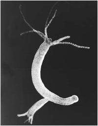
And I think we need more invertebrate-based Pokemon in general. You have my vote!
In general, I love how the arms resemble miniature buds. Like this hydra [not an anemone, but a cnidarian at least]:
And I think we need more invertebrate-based Pokemon in general. You have my vote!


And I think we need more invertebrate-based Pokemon in general. You have my vote!
Personally I like my CAPs to actually have a spine. However that is a kick-ass design like I've said before on #cap Cyzir.

Well, I can already say that Anemoninja, Luchasquid, and my own design have my votes :/
(Presuming that we can vote on 3 pieces of art as in previous polls)
(Presuming that we can vote on 3 pieces of art as in previous polls)
Well, I can already say that Anemoninja, Luchasquid, and my own design have my votes :/
(Presuming that we can vote on 3 pieces of art as in previous polls)
<@tennisace> darkie
<@darkie> what
<@tennisace> how many options
<@tennisace> will we be able
<@tennisace> to
<@tennisace> vote
<@tennisace> for
<@tennisace> in the art poll
<@tennisace> ?
<@darkie> 1
This just in on #cap.
<@tennisace> darkie
<@darkie> what
<@tennisace> how many options
<@tennisace> will we be able
<@tennisace> to
<@tennisace> vote
<@tennisace> for
<@tennisace> in the art poll
<@tennisace> ?
<@darkie> 1
This just in on #cap.
wow, that's a shame. I have a feeling there will be a few close ties.

I'm sad that I can't participate in this CAP (too busy studying!), but I just want to say I like Atyroki's, but Caladbolg and Wyverii's are my favorites.

As of now, the Anemoninja has my vote.
I might be for supporting the fighting stork if it was changed to a color scheme not already used by Wingull and Pelliper, thus associating it to Water/Flying type in my mind right when I see the art. Just my opinion on it though :)
I might be for supporting the fighting stork if it was changed to a color scheme not already used by Wingull and Pelliper, thus associating it to Water/Flying type in my mind right when I see the art. Just my opinion on it though :)
As of now, the Anemoninja has my vote.
I might be for supporting the fighting stork if it was changed to a color scheme not already used by Wingull and Pelliper, thus associating it to Water/Flying type in my mind right when I see the art. Just my opinion on it though :)
You know how many people would complain about it not looking water enough if I changed the blue right? I also wasn't aware that Wingull/Pelipper had red in it either. ;p The colour scheme's pretty much set in stone from the very beginning and no matter how I colour it there's still going to be compliants of it being flying. Gotta take the good with the bad.

I'm definitely throwing my vote your way, Wyverii. Absolutely think the design of the stork is genius and innovative. And it has this really cool and Pokemon-ish vibe. Definitely love it.
This is only really my second attempt at drawing using Paint.net (I've always used MSPaint before) so forgive if the technical side is a bit lacking. I think I'll change this to be my final. Opinions?

Gosh, the art poll should happen any hour or day now! I hope plenty of designs make the cut!
Gosh, the art poll should happen any hour or day now! I hope plenty of designs make the cut!
- Status
- Not open for further replies.