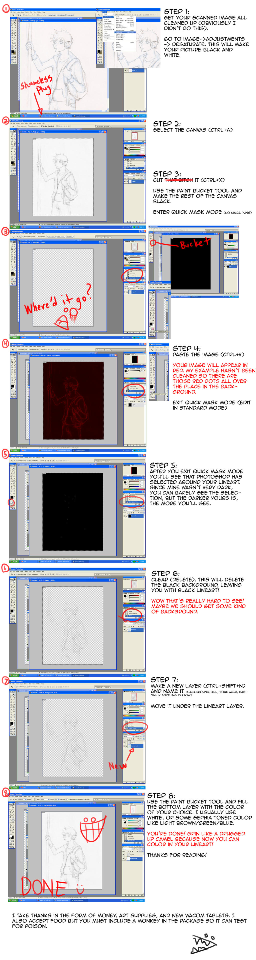
MS Paint Doesn't *Completely* Suck (a tutorial)
Guide to MS Paint (Windows 7 Edition)
So, usually when one thinks of MS Paint, crappy stick figures come to mind. And it's true that MS Paint does have its limitations-- it's certainly not Photoshop. There are no layers, no brush sensitivity, and only a few brush sizes to choose from. But for those who can't afford something like photoshop, MS Paint isn't actually as horrible as people make it out to be. The main thing is knowing how to get by the limitations of the program.
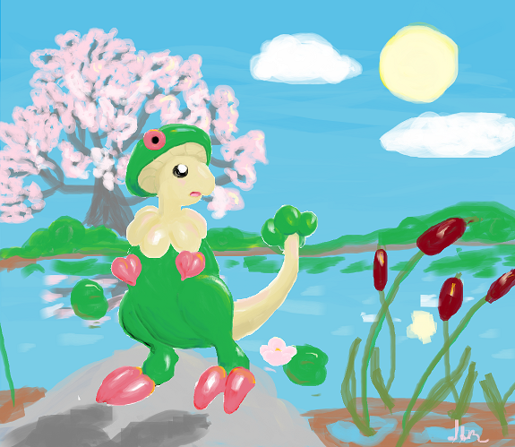
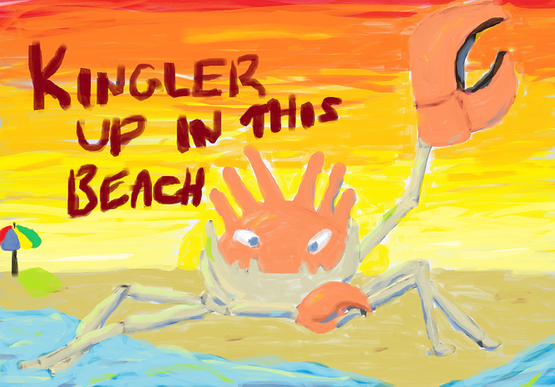
With just a mouse and MS Paint, I've been able to make stuff like this:
Someone who actually has had training in art with stuff like anatomy and light and shading and all that jazz would be able to do even better (I haven't taken an art class since middle school, and I only started drawing again a few months ago).
I'm going to do this tutorial using a simple pokemon,
Magnemite, since doing anything really complicated would take forever. Usually, for my sanity, I'll track down the sprite on Bulbapedia and paste it in the upper right-hand corner for reference.
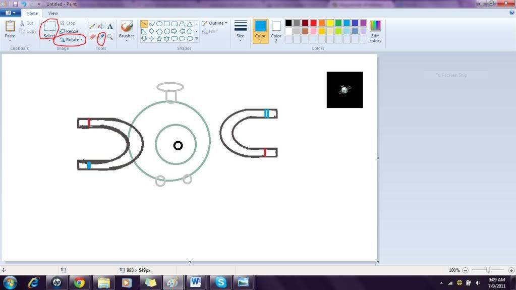
First thing's first-- Sketch
Soooooo I suck at line art, and MS Paint does nothing to help, especially when using a mouse. In fact, it pretty much mocks my every attempt to make straight lines. So I don't even really try anymore. Instead, I think of whatever Pokemon I'm drawing in terms of the
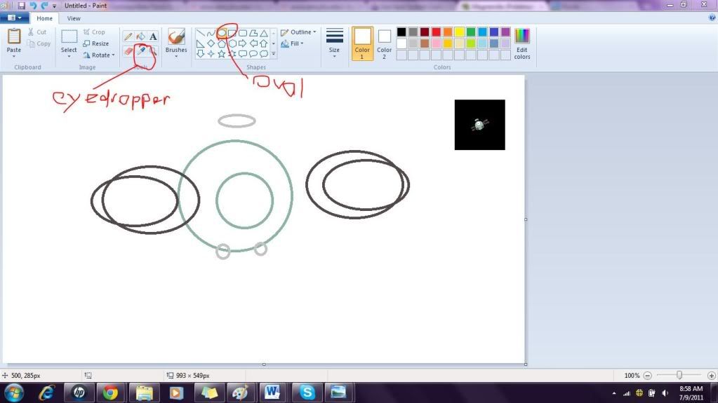
basic shapes in the MS Paint toolbox;
ovals are generally best since there are no sharp edges, but the
straight line tool is OK if there is really no way to think of the Pokemon in terms of ovals.
Usually, I'll use the
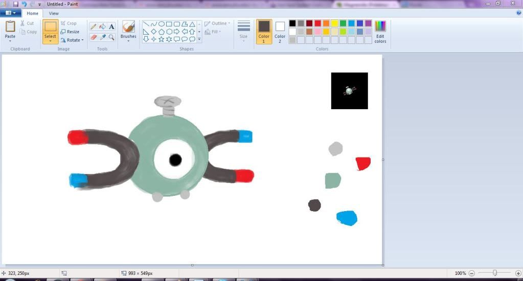
eyedropper tool to get basic colors I need from the sprite as the line base. Notice how I move the things that are supposed to be more posterior (in this case, Magnemite's right magnet) off to the side rather than attach them to the rest of the line art right away.
Cleaning Up the Sketch
After I'm done with the ovals, I'll clean up the sketch and correct any lines that don't look quite right. The
straight line tool,
curve tool, and
eraser tool are my best friends in this stage.
It doesn't have to be perfect by any means (you're just going to be painting over it anyway), but it is extremely helpful to capture the basic shapes at this stage.
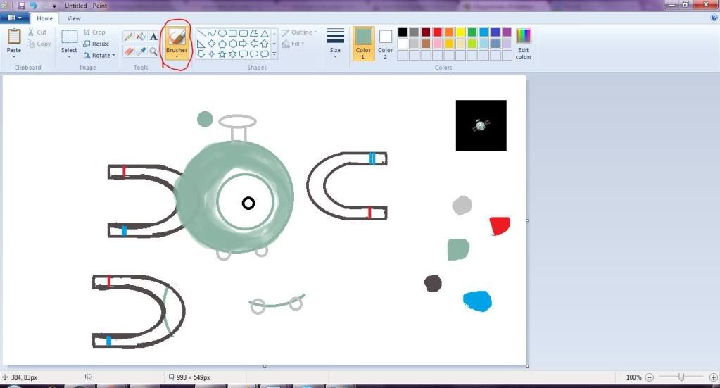
Begin to Paint
At this stage, copy and paste elsewhere any line art that you think you might accidentally paint over so that it's not lost forever. Then, start painting!!!
The
brush tool (circled in red) has a few different options; I prefer the
Watercolor brush (lower left-hand corner of the drop-down menu you get from clicking that box), because it's somewhat transparent but still gives you a paint-like texture. It looks nothing like watercolors, though-- in general, the brushes are poorly named.
You can experiment to see which ones you like best, but in my opinion, the watercolor brush really is the superior option in most cases for basic painting.
You can select different sizes of paint brush by clicking the big button on the top menu that says
"Sizes". There are only four different sizes for each brush, though, so it's kind of annoying, but it's easy enough to get used to.
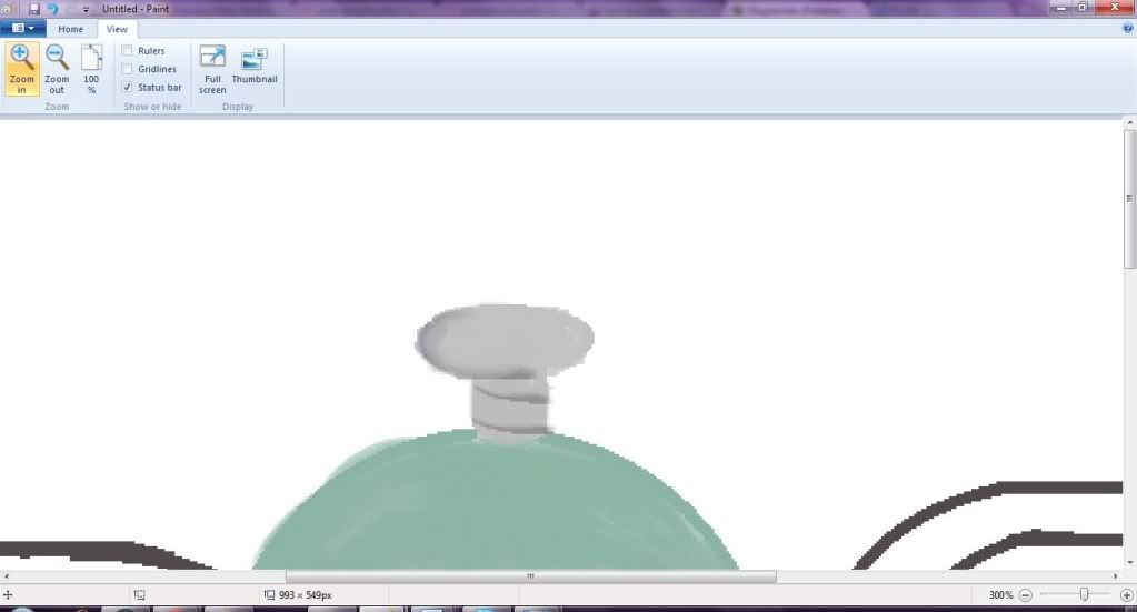
Beginning to shade
When you have enough of a part of the Pokemon colored in, you can start to shade that part.
Usually, I like to zoom in on the part that I'm shading so that I can be more precise. Above, I've zoomed in on Magnemite's screw, and I'm just beginning to shade it.
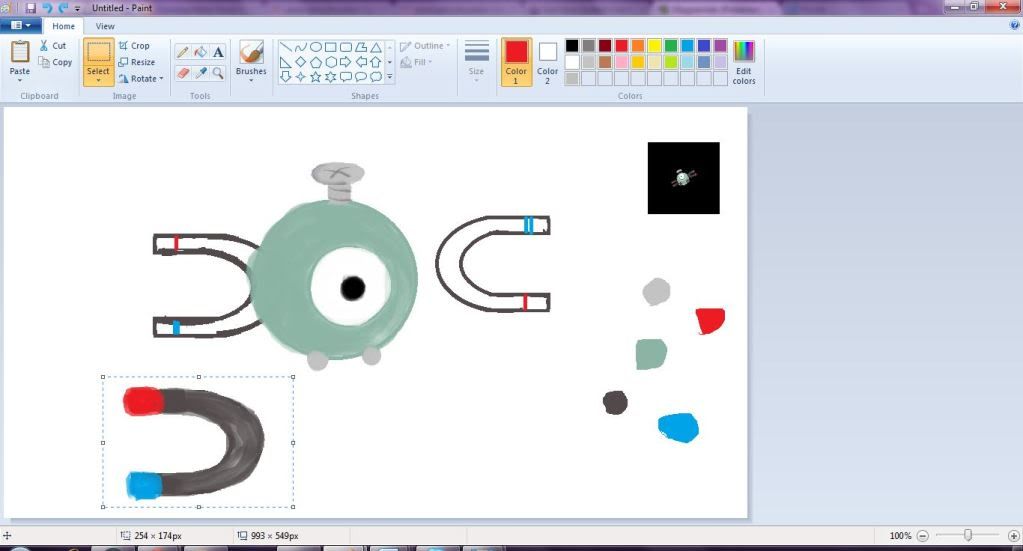
Compensating for lack of layers
As I've said before, MS Paint doesn't have layers. That means you can't just do a different part of a pokemon on a different layer, and you have to know what colors actually work in terms of shading rather than playing around with transparency.
To compensate for the former, you can just color a problematic part of a Pokemon elsewhere, and when you're done, just select it (make sure you select
Transparent Selection on the drop-down menu) and drag it to its destination, like so:
You can copy, paste, and drag parts as often as you'd like, so take advantage of this.
Now, this is MS Paint, so of course there are drawbacks to this method. The main one, which is extremely annoying, is that the brush makes the edges of the selection white, and it's glaringly obvious when you try to paste a part elsewhere. To make the white parts blend in with their new surroundings, go to the
Brush Tool, select the
Colored Pencil, and blend until you're satisfied. The colored pencil is also useful for more subtle shading effects.
Playing with Color
The last thing I do to an image is the more complex shading. To do this, I use the
watercolor brush in whatever color I think would look best (usually, yellowish colors for highlights and purplish colors for shadows, but it varies) and applying liberally to the area I'd like shaded. I do this with a medium-sized brush relative to the area I'm working on. Then, I switch to a bigger brush and paint over the bright patches of shading in the color the area originally was. This sort of mimics the effects of playing with transparency in photoshop, but it's a bit harder, so you might have to experiment a bit with color before you find the shades that are exactly right.
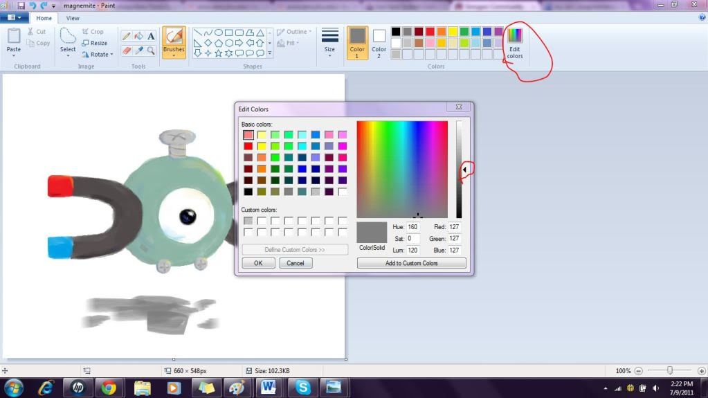
If the color you want is a bit darker or lighter than the color you have, use the
eyedropper tool and click the
edit colors button afterwards, and then slide the arrow up and down the gradient until you find your desired color. Then, click the
Add To Custom Colors button and click OK. (all the relevant buttons are circled in
red in the picture below:
If the color you want is in between the color you used to shade something and the color of the base coat, just use the
eyedropper tool on the area where those colors blend, click the
undo button, and re-shade in your new color.
In general, just experiment, and if you don't like what you see, just click Undo and try again. Eventually, you'll get what you want.
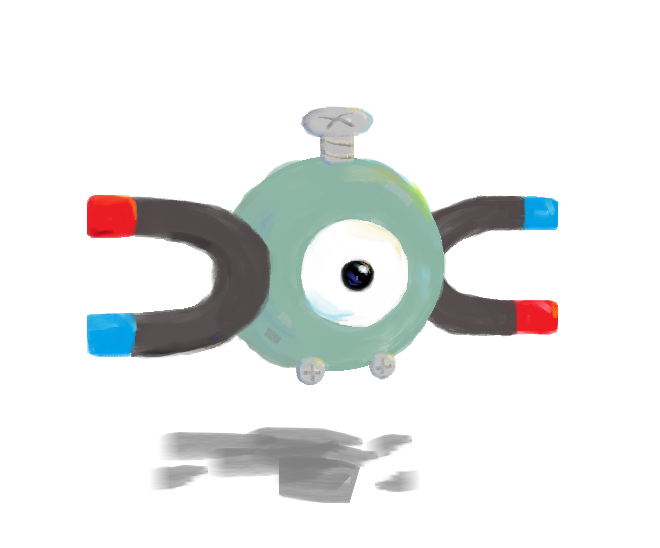
Finished Product
After you're done with all the coloring and shading, crop your image, and you're done! Here's Magnemite:
Of course, you can also work on a background for your Pokemon, too! I was just lazy this time. If you're going to do that, open a separate MS Paint window and work on it there. Then, copy and paste your Pokemon into the picture and smooth out the transition with the colored pencil. Or else work on it in the same window, but good luck not coloring over some of the lines of your Pokemon.
Well, that's it. Hope you enjoyed reading!