CAP 11 CAP 11 - Art Submissions

Status
Not open for further replies.

Yilx

Sad
is a Top Artist Alumnusis a Smogon Discord Contributor Alumnus
I hope this isn't too many in too short a period of time, but if it is please merge it with my previous post...

Working on the second design as the first one didn't have a very good silhouette at all and looked too much like Yellow Devil


Next update will only be available next week. :(
 
Yilx: Not bad! It reads very nicely as a silhoutte, but I find the design just a little too cluttered for my taste. Also think it looks more like a chibi human than a Pokemon.

ckpmax: That is very cool, but I guess you're right; it does look a little too much like Blaziken. To be brutally honest, I think you might have to explore several other ideas other than this one. I think the tuxedo is a particularly great touch, and you're a really good artist, but I don't really see how this design can be made any more original.
______________________________________________________________________


10 minute draft job here. Going more for a minimalist approach this time round. Whaddya think? I figure it could use a little more Poke-fying, but that's just me.
 
@ckpmax1108: As awesome as ever! Think it looks fine for the color scheme as it is. The design is like the opponsite in color and form which is WHY the two types make sense. Its like Irony, a dark/Fighting type is White and Sleek gives it kind of the ironic BA that doesn't stick to the normal rules

@Ylix - at first, I didn't really like the rough, but after it was cleaned up, it looks very nice.

@Snow Leopard - Well it was darker in the original drawing but the scanner screwed up the colors. I'll try to put out another drawing, using some tips from Cpkmax.

Speaking of irony, I like how chomzloh was talking about how he doesn't think Max could make the Tuxedo-mask BA anymore original, when the design he submitted was of a ninja. Irony at its finest.
 
Zakki: If you take offense at my earlier comment on ckpmax's artwork, then feel free to tell me directly rather than by launching an insult on both me and my submission.

Let me clarify on my earlier statement. I'm not saying that I don't find the design interesting. However, I feel it's too similar to Blaziken at the moment, and by virtue of its inspiration (a fighting chicken), it will be very difficult to reduce that similarity. That doesn't mean I dislike the design, or won't vote for it in the polls, but I'm just saying that there are probably many other ideas ckpmax could work on that might come across as more unique.
 
Gotta say that my favourite so far has to be Wyverii's - not only does it look awesome, but it doesn't look like its stats lean overwhelmingly towards physical attacks, which a lot of the other designs do, even if the designs themselves are fantastic.
 
Well in the time it took me to make this, the thread went from 2 pages of posts to 7, having skimmed over the last 5 pages I can say that my chances of coming second to Paras Hilton have gone from unlikely to 0. Great art guys, I just felt like posting mine seeing as I had spent the time on it.

It is meant to actually look like a dark fighting type Togekiss which is why I have the three spikes on the head etc.


I just looked at everything a little more closely and Wyverii's is easily my favourite. It looks just like a pokemon (I know we aren't meant to say this but its just so true). In my opinion it also shows a perfect mix of Dark and fighting.
 
Yilx said:
Since togekiss' pokedex entry says it only appears where there is happiness I was aiming for something that would be easily misunderstood

kind of like if you see a big, burly gangster guy and a thin lanky man next to a beaten up dude, who would you suspect? the gangster of course... I tried to do something that would bring out 'misunderstood'
This is a very cool approach. I was actually saying yesterday on IRC that I am tired with art concepts that are both male and female. I'd really enjoy something that's either all-female, all-male, or genderless to break the mold. So far, all we've got is Stratagem. This concept and style would be a great opportunity to explore that a bit.

I particularly like your second sketch, though you've got to be careful when doing humanoid Pokemon to not make them too obviously human.
chomzloh said:
Looked through the entire thread so far, and the only design that really made sense for me was Wyverii's. It's straightforward, not excessively flashy, and is clear enough for everyone to see its inspiration at a glance. Cartoons' also has something interesting going on, but the idea strikes me as a little too grotesque to be really appealing.

I can't help but notice a bit of a problem in this particular CAP; it seems too many new artists are tacking on long descriptions to their submissions explaning them, which really shouldn't be necessary. A good design should be, and often is, catchy and immediately understandable.
I want to quote this for emphasis because I especially agree with it. An artistic design must speak for itself and not be too obscure. I also agree with his points regarding 'Toons!'s idea.
 

DougJustDoug

Knows the great enthusiasms
is a Site Content Manageris a Top Artistis a Programmeris a Forum Moderatoris a Top CAP Contributoris a Battle Simulator Admin Alumnusis a Smogon Discord Contributor Alumnusis a Top Tiering Contributor Alumnusis an Administrator Alumnus
Moderator
Here is the inked and colored version of my "Jack the Ripper" design.


I've been cooking up some interesting backstory for "Ripjack" (my working name for this guy). If I end up using this design, I'll post a full description later.
 
they look like the things from scooby doo movie O_O

i really like dougs the ripper, but thats likely because he is one of the most interesting criminals in history. i think it should look just a bit more bulky considering its a fighting type as well as more defensive than other sweepers.
 
Lots of absolutely fabulous designs in here guys. I'd love to comment on them all, but I have little time at the moment.


When I think Dark, I think of sneaky bastards and opportunists (i.e. sucker punch, pursuit and snatch). For this CAP, I envisioned a smug, dirty fighter. Jestler (excuse the pun) here has the impish grin and a deceptive body structure. It's body has a pixy-shape, which for some unexplainable reason explains good ST and SS-ratings. There's also a few small references to Togekiss, but I am thinking of removing the belly pattern altogether (which would look more like this) and the colours are subject to change.

I would really appreciate some feedback, because there's a lot of choices in the design I'm not a 100% certain about. So any suggestions would be most welcome.
 

Arkeis

(づ。◕‿‿◕。)づ
is a Top Artist Alumnusis a Community Leader Alumnus
New version of the werewolf. Unfortunately, the werewolf looks more like a physical sweeper than a special one, so I'll have to do something about that. Also made a new cat Pokemon using the same color scheme. It obviously needs more work, however, it's more feminine and less physical than the wolf.


Might have another idea later today.
 
I definately favor my lizard/raptor concept over my werewolf. I'll be finishing up my re-designed raptor. Any ideas for a color scheme?
 
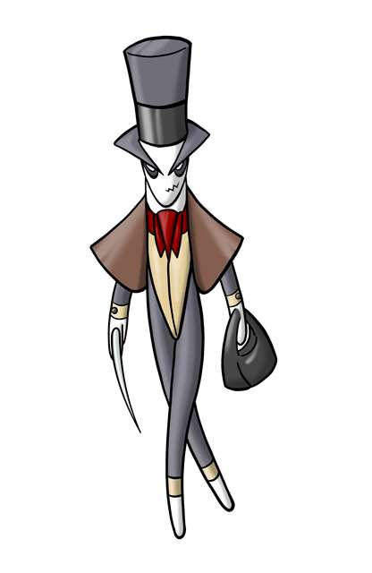
But is there anyway to make it a tad better? Any suggestions?
I absolutely adore what you have thus far, and I've been looking at it and considering ways in which you could alter the design.

I propose you invert the black/white parts of the eyes, making them more similar to those of the Hoenn trio (with the vibrant colour on black). This will aid in making it look more like a Dark-Type, along with (not to cause any offence) making it look less like its head was pulled from a Sonic the Hedgehog character (and the current similarity is marginal at best, though differentiating it will help to prevent people criticising that in future).

I'd also like to suggest you do something about its crotch as, at the moment, it has an Action Man/Ken "bump" and it's rather disturbing; even if you altered it by reposing the Pokémon it would be an improvement. Perhaps you could attempt something else, though without making it seem like a Blazaking's crotch for fears of design-cloning accusations.
If I may, I'd suggest bringing the tuxedo further around the Pokémon's waist and having it split more close to the hips at a more severe angle (would also most likely require a more pronounced "tail" of the tuxedo).

Lastly, you may wish to consider curving the beak downwards to make it look more severe, vicious, etc. This of course may lead to its appearing more closely related to Blaziken, so I understand why you might avoid it.

At any rate, you may not agree with me, but hopefully this will help you.
Good luck!
 
@aragornbird: lookin' good man! I personally like both concepts; on the one hand I like the werewolf better, but it definitely looks ore like a physical sweeper than a special one, like you said. The cat seems like it could go physical or special, but also looks less bad ass. Oh well.

@SEO: Yours reminds me of a mix of Ben 10 aliens :P looks pretty good, lookin forward to seeing the finished product.

@ZakkiOrichalcum: It looks really freakin awesome, don't get me wrong, but it's a bit... much. It's a lot to take in and kind of distracting. Just my opinion, and like I said, I think it looks cool.

@ckpmax1108: Wow. Just wow. There are a lot of really great submissions so far, but I've got to say, I think yours is my favorite.
 
I might as well put this thing here. (Apologies for the horrible illustration.)


Hopefully, at least one person will like it. However, I'm surprised that nobody else has suggested an ogre/oni for a Dark/Fighting concept.
 
@ZakkiOrichalcum: It looks really freakin awesome, don't get me wrong, but it's a bit... much. It's a lot to take in and kind of distracting. Just my opinion, and like I said, I think it looks cool.
Thanks, I'm going to post a final one in a little bit, but I will keep that in mind. I'll probably tone down the parts just a little bit. Parts I'm defiantly keeping: Shrunken Gyarados head (might be move some where else other than the tail), Scizor Hand, Houndoom Skull, Spoink pearl, Kitsunoh mask, and I think the Jewel of one of the elves on the mask isn't too much. Any other suggestions before I finish the final?

Cpkmax1108: Idea for more dark-ie flare; instead of full on Rooster, Cockatrice yells Dark type so much more. Just add some snakey parts, and snakes like under the coat tail. I can send over a tech-design if you need something to understand more.


Fuzznip, do you know when the finals are due?
 

SJCrew

Believer, going on a journey...
is a Tiering Contributor Alumnusis a Battle Simulator Moderator Alumnus
Rats! I knew someone would think this is steel....So if I portray Rooster with a bit more of a fighting style it'll be more Fighting-type-ish?

Hmmm...I think both Taekwondo and Muay Thai both fit perfectly with Roost's style. Cockfigthing does include kick strikes and thrusts/jabs(pecks)

What if I drop the leg sycthes then (although I don't what too - those things are sick) and bulking up the legs more...would that help?
Maybe you can fix the pose, but it doesn't look Steel at all. Seriously, even Lucario being a Steel type is a stretch.
 

macle

sup geodudes
is a Top Tutor Alumnusis a Site Content Manager Alumnusis a Social Media Contributor Alumnusis an Artist Alumnusis a Forum Moderator Alumnusis a Tiering Contributor Alumnusis a Top Contributor Alumnusis a Smogon Media Contributor Alumnusis a Battle Simulator Moderator Alumnus
Gun6, I think you should try to make ogre look more stronger with the arms and stomach. They seem kinda blah but with some muscles i think it would look much better. Also try different facial expression on it. The current one is good but i think there could be an amazing one hiding.
 

Just making the outline for this one before I color or make a better concept to see if people like it. The "points" are retractable.
 

X-Act

np: Biffy Clyro - Shock Shock
is a Site Content Manager Alumnusis a Programmer Alumnusis a Smogon Discord Contributor Alumnusis a Top Researcher Alumnusis a Top CAP Contributor Alumnusis a Top Tiering Contributor Alumnusis a Top Contributor Alumnusis a Smogon Media Contributor Alumnusis an Administrator Alumnus
Just wanted to commend everyone for some very good illustrations already. I'm rather enjoying this art thread, like I do for every CAP I've participated in, in fact. :)
 
Two of the coolest concepts I've seen are C~Dog's drawings. The Golem-type thing and the cymbal monkey both look incredible and really look like a dark/fighting type.
 

Arkeis

(づ。◕‿‿◕。)づ
is a Top Artist Alumnusis a Community Leader Alumnus
IDEA!

I've finally found a concept I can work with. I'll take a black panther and give it an ancient Mayan/Aztec outfit. Panthers are already bulky and strong creatures. Decorating it with some mystical jewels will give it some Special characteristics while still retaining its physical qualities.

Here is a sketch:


I'll try to polish it up some more, but I can't do much since I am posting from work again.
 
Wow, there are some great, GREAT fakemon ideas here! xD I'm proud to have made an account while CAP 11 was going on. xP

Anyways- expect a drawing from me soon. I'm not all that good with artwork, though. Dx

Anyways, the ones that really impressed me were Paras Hilton's and SEO's. But i'm still looking through the thread, so. xD

 
Status
Not open for further replies.

Users Who Are Viewing This Thread (Users: 1, Guests: 0)

Top